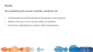
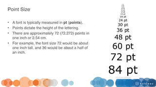
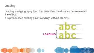
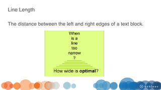
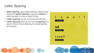
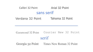
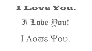
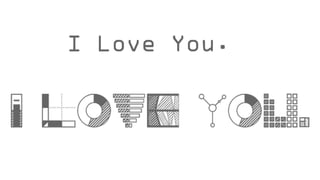
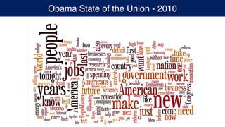
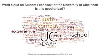
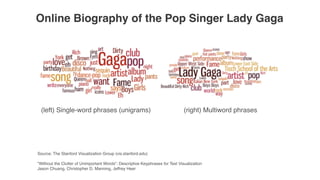
The document provides an overview of typography and data visualization design. It discusses goals of understanding fundamentals of typography and graphics and exploring the use of font and its effect on emotion. It covers typography terminology like point size, leading, letter spacing. It discusses how typography is used in data visualization and why it is important. It also talks about how fonts can connote different emotions and personalities and provides examples of research studies on the influence of fonts. Lastly, it provides tips for effectively combining fonts in designs.


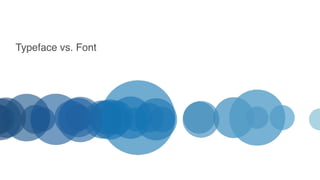
![Typeface vs. Fonts [A Song vs. an MP3]
These two words are commonly used interchangeably, but they have two very
separate meanings.
• Typeface is used when describing the what you see. It is an abstract way of
describing the way a specific collection of letters or characters looks or feels.
“This typeface really pulls the whole design together” [A Song]
• Font describes the physical embodiment or tangible representation of the
collection of letters and characters.
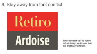
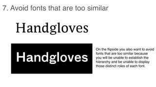
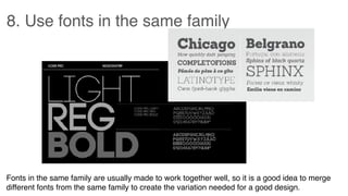
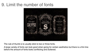
“You should change the font size to 14pt so it fits in the box” [an MP3]](https://image.slidesharecdn.com/11-230510050003-1a0b54f4/85/11-Typography-data-visualization-pdf-18-320.jpg)


![Things I Know About Type [Field Guide]](https://cdn.slidesharecdn.com/ss_thumbnails/thingsiknowabouttype-fieldguide-121030022134-phpapp02-thumbnail.jpg?width=640&height=640&fit=bounds)


