Downloaded 53 times
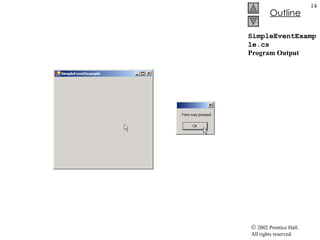
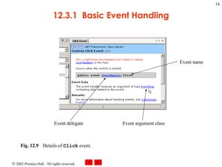
![SimpleEventExample.cs 1 // Fig. 12.7: SimpleEventExample.cs 2 // Using Visual Studio .NET to create event handlers. 3 4 using System; 5 using System.Drawing; 6 using System.Collections; 7 using System.ComponentModel; 8 using System.Windows.Forms; 9 using System.Data; 10 11 // program that shows a simple event handler 12 public class MyForm : System.Windows.Forms.Form 13 { 14 private System.ComponentModel.Container components = null ; 15 16 // Visual Studio .NET generated code 17 18 [STAThread] 19 static void Main() 20 { 21 Application.Run( new MyForm() ); 22 } 23 24 // Visual Studio .NET creates an empty handler, 25 // we write definition: show message box when form clicked 26 private void MyForm_Click( object sender, System.EventArgs e ) 27 { 28 MessageBox.Show( "Form was pressed" ); 29 } 30 31 } // end class MyForm Create an event handler Signature of the event handler Reference to the object that raised the event ( sender ) Reference to an event arguments object ( e ) Class EventArgs is base class for objects with event information](https://image.slidesharecdn.com/csphtp112-110805005327-phpapp01/85/Csphtp1-12-13-320.jpg)
![LabelTextBoxButtonTest.cs 103 this .displayPasswordLabel.Size = 104 new System.Drawing.Size( 264 , 23 ); 105 this .displayPasswordLabel.TabIndex = 2 ; 106 107 // 108 // LabelTextBoxButtonTest 109 // 110 this .AutoScaleBaseSize = 111 new System.Drawing.Size( 5 , 13 ); 112 this .ClientSize = 113 new System.Drawing.Size( 292 , 133 ); 114 this .Controls.AddRange( 115 new System.Windows.Forms.Control[] { 116 this .displayPasswordLabel, 117 this .inputPasswordTextBox, 118 this .displayPasswordButton}); 119 this .Name = "LabelTextBoxButtonTest" ; 120 this .Text = "LabelTextBoxButtonTest" ; 121 this .ResumeLayout( false ); 122 123 } // end method InitializeComponent 124 125 // end collapsible region started on line 53 126 #endregion 127 128 /// <summary> 129 /// The main entry point for the application. 130 /// </summary> 131 [STAThread] 132 static void Main() 133 { 134 Application.Run( new LabelTextBoxButtonTest() ); 135 } 136 #endregion signal the end of the collapsible region](https://image.slidesharecdn.com/csphtp112-110805005327-phpapp01/85/Csphtp1-12-32-320.jpg)
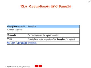
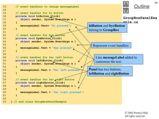
![GroupBoxPanelExample.cs 1 // Fig. 12.22: GroupBoxPanelExample.cs 2 // Using GroupBoxes and Panels to hold buttons. 3 4 using System; 5 using System.Drawing; 6 using System.Collections; 7 using System.ComponentModel; 8 using System.Windows.Forms; 9 using System.Data; 10 11 /// form to display a groupbox versus a panel 12 public class GroupBoxPanelExample : System.Windows.Forms.Form 13 { 14 private System.Windows.Forms.Button hiButton; 15 private System.Windows.Forms.Button byeButton; 16 private System.Windows.Forms.Button leftButton; 17 private System.Windows.Forms.Button rightButton; 18 19 private System.Windows.Forms.GroupBox mainGroupBox; 20 private System.Windows.Forms.Label messageLabel; 21 private System.Windows.Forms.Panel mainPanel; 22 23 private System.ComponentModel.Container components = null ; 24 25 // Visual Studio .NET-generated Dispose method 26 27 [STAThread] 28 static void Main() 29 { 30 Application.Run( new GroupBoxPanelExample() ); 31 } 32 messageLabel is initially blank GroupBox (name mainGroupBox ) Panel (name mainPanel) Control AutoScroll property set to TRUE](https://image.slidesharecdn.com/csphtp112-110805005327-phpapp01/85/Csphtp1-12-38-320.jpg)
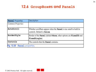
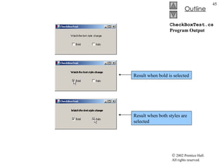
![CheckBoxTest.cs 1 // Fig. 12.24: CheckBoxTest.cs 2 // Using CheckBoxes to toggle italic and bold styles. 3 4 using System; 5 using System.Drawing; 6 using System.Collections; 7 using System.ComponentModel; 8 using System.Windows.Forms; 9 using System.Data; 10 11 /// form contains checkboxes to allow 12 /// the user to modify sample text 13 public class CheckBoxTest : System.Windows.Forms.Form 14 { 15 private System.Windows.Forms.CheckBox boldCheckBox; 16 private System.Windows.Forms.CheckBox italicCheckBox; 17 18 private System.Windows.Forms.Label outputLabel; 19 20 private System.ComponentModel.Container components = null ; 21 22 // Visual Studio .NET-generated Dispose method 23 24 /// The main entry point for the application. 25 [STAThread] 26 static void Main() 27 { 28 Application.Run( new CheckBoxTest() ); 29 } 30 When program start, both Checkbox is unchecked Text property set to Bold Text property set to Italic The Label OutputLabel is labeled Watch the font style change](https://image.slidesharecdn.com/csphtp112-110805005327-phpapp01/85/Csphtp1-12-43-320.jpg)
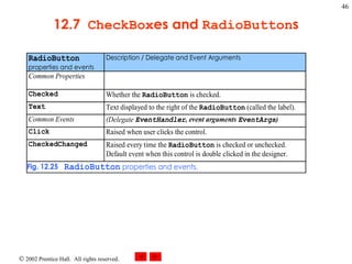
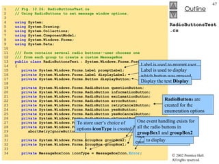
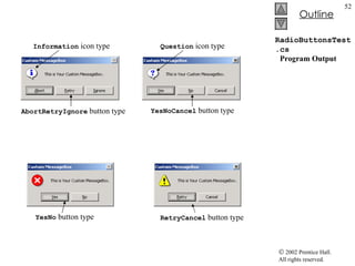
![RadioButtonsTest.cs 35 private MessageBoxButtons buttonType = 36 MessageBoxButtons. OK ; 37 38 /// The main entry point for the application. 39 [STAThread] 40 static void Main() 41 { 42 Application.Run( new RadioButtonsTest() ); 43 } 44 45 // change button based on option chosen by sender 46 private void buttonType_CheckedChanged( 47 object sender, System.EventArgs e ) 48 { 49 if ( sender == okButton ) // display OK button 50 buttonType = MessageBoxButtons. OK ; 51 52 // display OK and Cancel buttons 53 else if ( sender == okCancelButton ) 54 buttonType = MessageBoxButtons. OKCancel ; 55 56 // display Abort, Retry and Ignore buttons 57 else if ( sender == abortRetryIgnoreButton ) 58 buttonType = MessageBoxButtons. AbortRetryIgnore ; 59 60 // display Yes, No and Cancel buttons 61 else if ( sender == yesNoCancelButton ) 62 buttonType = MessageBoxButtons. YesNoCancel ; 63 64 // display Yes and No buttons 65 else if ( sender == yesNoButton ) 66 buttonType = MessageBoxButtons. YesNo ; 67 68 // only one option left--display 69 // Retry and Cancel buttons To store user’s choice of options buttonType is created Object buttonType is a MessageBoxButtom enumeration The enumeration name indicate which button to display Each radio button generates a CheckedChanged when clicked Handlers compare the sender object with every radio button to determine which button was selected](https://image.slidesharecdn.com/csphtp112-110805005327-phpapp01/85/Csphtp1-12-48-320.jpg)
![PictureBoxTest.cs 1 // Fig. 12.28: PictureBoxTest.cs 2 // Using a PictureBox to display images. 3 4 using System; 5 using System.Drawing; 6 using System.Collections; 7 using System.ComponentModel; 8 using System.Windows.Forms; 9 using System.Data; 10 using System.IO; 11 12 /// form to display different images when clicked 13 public class PictureBoxTest : System.Windows.Forms.Form 14 { 15 private System.Windows.Forms.PictureBox imagePictureBox; 16 private System.Windows.Forms.Label promptLabel; 17 18 private int imageNum = -1 ; 19 20 /// The main entry point for the application. 21 [STAThread] 22 static void Main() 23 { 24 Application.Run( new PictureBoxTest() ); 25 } 26 27 // change image whenever PictureBox clicked 28 private void imagePictureBox_Click( 29 object sender, System.EventArgs e ) 30 { 31 imageNum = ( imageNum + 1 ) % 3 ; // imageNum from 0 to 2 32 PictureBox imagePicture use to display one of three bitmap images Includes instructions Click On Picture Box to View Images To respond to the Click event Store the image we want to display Modulus calculation insures that number is between 0 and 2](https://image.slidesharecdn.com/csphtp112-110805005327-phpapp01/85/Csphtp1-12-55-320.jpg)
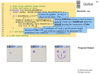
![Painter.cs 1 // Fig 12.30: Painter.cs 2 // Using the mouse to draw on a form. 3 4 using System; 5 using System.Drawing; 6 using System.Collections; 7 using System.ComponentModel; 8 using System.Windows.Forms; 9 using System.Data; 10 11 /// creates a form as a drawing surface 12 public class Painter : System.Windows.Forms.Form 13 { 14 bool shouldPaint = false ; // whether to paint 15 16 /// The main entry point for the application. 17 [STAThread] 18 static void Main() 19 { 20 Application.Run( new Painter() ); 21 } 22 23 // should paint after mouse button has been pressed 24 private void Painter_MouseDown( 25 object sender, System.Windows.Forms.MouseEventArgs e ) 26 { 27 shouldPaint = true ; 28 } 29 30 // stop painting when mouse button released 31 private void Painter_MouseUp( 32 object sender, System.Windows.Forms.MouseEventArgs e ) 33 { 34 shouldPaint = false ; 35 } Creates variable shouldPaint to determine whether to draw on the form The event handler for event MouseDown shouldPaint is set to true when this event occurs Mouse cursor will draw The event handler of event MouseUp shouldPaint set to false, mouse cursor will not draw](https://image.slidesharecdn.com/csphtp112-110805005327-phpapp01/85/Csphtp1-12-59-320.jpg)
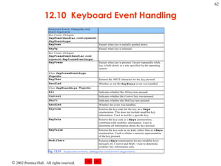
![KeyDemo.cs 1 // Fig. 12.32: KeyDemo.cs 2 // Displaying information about the key the user pressed. 3 4 using System; 5 using System.Drawing; 6 using System.Collections; 7 using System.ComponentModel; 8 using System.Windows.Forms; 9 using System.Data; 10 11 // form to display key press 12 // information--contains two labels 13 public class KeyDemo : System.Windows.Forms.Form 14 { 15 private System.Windows.Forms.Label charLabel; 16 private System.Windows.Forms.Label keyInfoLabel; 17 18 private System.ComponentModel.Container components = null ; 19 20 /// The main entry point for the application. 21 [STAThread] 22 static void Main() 23 { 24 Application.Run( new KeyDemo() ); 25 } 26 27 // display the character pressed using key char 28 protected void KeyDemo_KeyPress( 29 object sender, System.Windows.Forms.KeyPressEventArgs e ) 30 { 31 charLabel.Text = "Key pressed: " + e.KeyChar; 32 } 33 Forms contain two Label s Label for key pressed Label for modifier information Initially empty KeyPress event handler Accesses the KeyChar property of the KeyPressEventArgs object Key pressed as a char Display the key pressed If key pressed is not ASCII, charLabel remains empty](https://image.slidesharecdn.com/csphtp112-110805005327-phpapp01/85/Csphtp1-12-63-320.jpg)

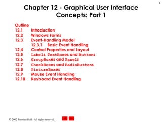
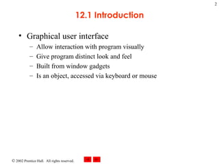
This document provides an outline and overview of Chapter 12 which covers graphical user interface (GUI) concepts in Windows Forms. The chapter introduces GUI components like windows, controls, properties, events and event handling. It describes common controls like labels, text boxes, buttons and how to set properties, handle events, and lay out controls on a form. Code examples are provided to demonstrate creating a simple form with a textbox, label and button to display text on a label when a button is clicked.