Graphical user interfacewith Windows forms:
Creating a Graphical User Interface (GUI) with Windows Forms is a
common way to build desktop applications for Windows using .NET
Framework (typically with C# or VB.NET). Below is a simple
introduction to building a GUI using Windows Forms in C#.
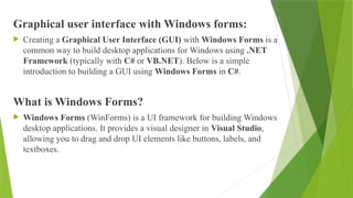
What is Windows Forms?
Windows Forms (WinForms) is a UI framework for building Windows
desktop applications. It provides a visual designer in Visual Studio,
allowing you to drag and drop UI elements like buttons, labels, and
textboxes.
3.
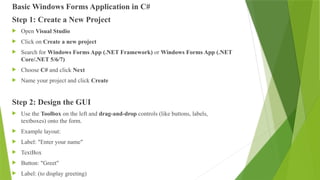
Basic Windows FormsApplication in C#
Step 1: Create a New Project
Open Visual Studio
Click on Create a new project
Search for Windows Forms App (.NET Framework) or Windows Forms App (.NET
Core/.NET 5/6/7)
Choose C# and click Next
Name your project and click Create
Step 2: Design the GUI
Use the Toolbox on the left and drag-and-drop controls (like buttons, labels,
textboxes) onto the form.
Example layout:
Label: "Enter your name"
TextBox
Button: "Greet"
Label: (to display greeting)
4.
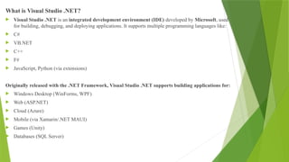
What is VisualStudio .NET?
Visual Studio .NET is an integrated development environment (IDE) developed by Microsoft, used
for building, debugging, and deploying applications. It supports multiple programming languages like:
C#
VB.NET
C++
F#
JavaScript, Python (via extensions)
Originally released with the .NET Framework, Visual Studio .NET supports building applications for:
Windows Desktop (WinForms, WPF)
Web (ASP.NET)
Cloud (Azure)
Mobile (via Xamarin/.NET MAUI)
Games (Unity)
Databases (SQL Server)
5.
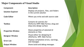
Component Description
Solution Explorer
Displaysall projects, files, and folders
in the current solution
Code Editor Where you write and edit source code
Toolbox
Contains UI controls (for
WinForms/WPF/Web Forms); drag and
drop onto design surface
Properties Window
Shows properties of selected UI
elements or files
Designer Window
Visual editor for designing UI
(WinForms, WPF, Web Forms)
Error List
Displays compilation errors, warnings,
and messages
Output Window Shows build and debug messages
Major Components of Visual Studio
6.
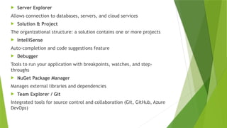
Server Explorer
Allowsconnection to databases, servers, and cloud services
Solution & Project
The organizational structure: a solution contains one or more projects
IntelliSense
Auto-completion and code suggestions feature
Debugger
Tools to run your application with breakpoints, watches, and step-
throughs
NuGet Package Manager
Manages external libraries and dependencies
Team Explorer / Git
Integrated tools for source control and collaboration (Git, GitHub, Azure
DevOps)
7.
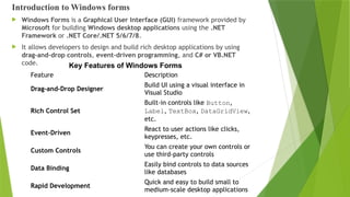
Introduction to Windowsforms
Windows Forms is a Graphical User Interface (GUI) framework provided by
Microsoft for building Windows desktop applications using the .NET
Framework or .NET Core/.NET 5/6/7/8.
It allows developers to design and build rich desktop applications by using
drag-and-drop controls, event-driven programming, and C# or VB.NET
code.
Feature Description
Drag-and-Drop Designer
Build UI using a visual interface in
Visual Studio
Rich Control Set
Built-in controls like Button,
Label, TextBox, DataGridView,
etc.
Event-Driven
React to user actions like clicks,
keypresses, etc.
Custom Controls
You can create your own controls or
use third-party controls
Data Binding
Easily bind controls to data sources
like databases
Rapid Development
Quick and easy to build small to
medium-scale desktop applications
Key Features of Windows Forms
8.
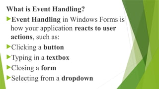
What is EventHandling?
Event Handling in Windows Forms is
how your application reacts to user
actions, such as:
Clicking a button
Typing in a textbox
Closing a form
Selecting from a dropdown
9.
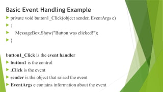
Basic Event HandlingExample
private void button1_Click(object sender, EventArgs e)
{
MessageBox.Show("Button was clicked!");
}
button1_Click is the event handler
button1 is the control
.Click is the event
sender is the object that raised the event
EventArgs e contains information about the event
10.
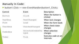
Manually in Code:
button1.Click += new EventHandler(button1_Click);
Control Event Description
Button Click When the button is
clicked
TextBox TextChanged When text changes
Form Load When the form loads
CheckBox CheckedChanged When check state
changes
ComboBox
SelectedIndexCha
nged
When selection
changes
Timer Tick Executes code at set
intervals
11.
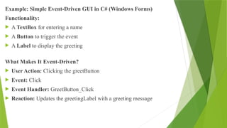
Example: Simple Event-DrivenGUI in C# (Windows Forms)
Functionality:
A TextBox for entering a name
A Button to trigger the event
A Label to display the greeting
What Makes It Event-Driven?
User Action: Clicking the greetButton
Event: Click
Event Handler: GreetButton_Click
Reaction: Updates the greetingLabel with a greeting message
12.
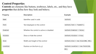
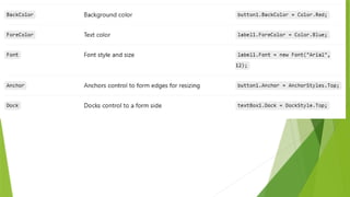
Control Properties
Controls areelements like buttons, textboxes, labels, etc., and they have
properties that define how they look and behave.
14.
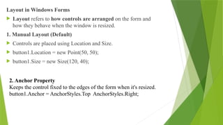
Layout in WindowsForms
Layout refers to how controls are arranged on the form and
how they behave when the window is resized.
1. Manual Layout (Default)
Controls are placed using Location and Size.
button1.Location = new Point(50, 50);
button1.Size = new Size(120, 40);
2. Anchor Property
Keeps the control fixed to the edges of the form when it's resized.
button1.Anchor = AnchorStyles.Top AnchorStyles.Right;
15.
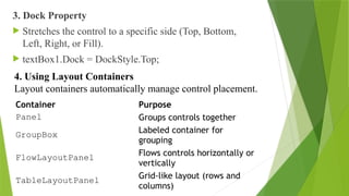
3. Dock Property
Stretches the control to a specific side (Top, Bottom,
Left, Right, or Fill).
textBox1.Dock = DockStyle.Top;
Container Purpose
Panel Groups controls together
GroupBox Labeled container for
grouping
FlowLayoutPanel Flows controls horizontally or
vertically
TableLayoutPanel Grid-like layout (rows and
columns)
4. Using Layout Containers
Layout containers automatically manage control placement.
16.
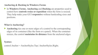
Anchoring & Dockingin Windows Forms
In Windows Forms, Anchoring and Docking are properties used to
control how controls resize or reposition when the form is resized.
They help make your GUI responsive without hardcoding sizes and
positions.
What is Anchoring?
Anchoring ties one or more edges of a control to the corresponding
edges of its container (like the form or a panel). When the container
resizes, the control maintains its distance from the anchored edges.
Syntax:
control.Anchor = AnchorStyles.Top | AnchorStyles.Right;
17.
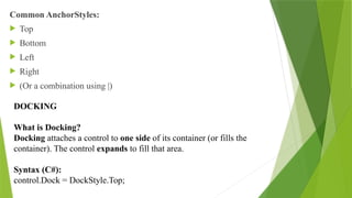
Common AnchorStyles:
Top
Bottom
Left
Right
(Or a combination using |)
DOCKING
What is Docking?
Docking attaches a control to one side of its container (or fills the
container). The control expands to fill that area.
Syntax (C#):
control.Dock = DockStyle.Top;
18.
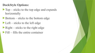
DockStyle Options:
Top– sticks to the top edge and expands
horizontally
Bottom – sticks to the bottom edge
Left – sticks to the left edge
Right – sticks to the right edge
Fill – fills the entire container
19.
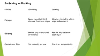
Feature Anchoring Docking
Purpose
Keepscontrol at fixed
distance from form edges
Attaches control to a form
edge and resizes it
Resizing
Resizes only in anchored
direction(s)
Resizes fully based on
dock style
Control over Size You manually set size Size is set automatically
Anchoring vs Docking
20.
windows form controls:
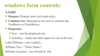
1.Label
Purpose: Display static text (read-only).
Common Use: Descriptive text next to controls like
TextBoxes or CheckBoxes.
Properties:
Text – sets the displayed text.
AutoSize – makes the label adjust its size to the text.
Label lblName = new Label();
lblName.Text = "Enter Name:";
lblName.Location = new Point(10, 10);
21.
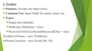
2. Textbox
Purpose:Accept user input (text).
Common Use: Input fields for name, email, etc.
Types:
Single-line (default)
Multi-line (Multiline = true)
Password field (UseSystemPasswordChar = true)
TextBox txtName = new TextBox();
txtName.Location = new Point(100, 10);
22.
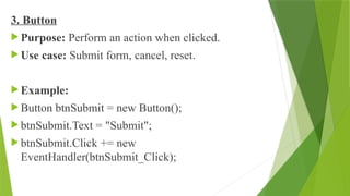
3. Button
Purpose:Perform an action when clicked.
Use case: Submit form, cancel, reset.
Example:
Button btnSubmit = new Button();
btnSubmit.Text = "Submit";
btnSubmit.Click += new
EventHandler(btnSubmit_Click);
23.
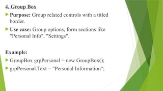
4. Group Box
Purpose: Group related controls with a titled
border.
Use case: Group options, form sections like
"Personal Info", "Settings".
Example:
GroupBox grpPersonal = new GroupBox();
grpPersonal.Text = "Personal Information";
24.
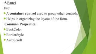
5.Panel
Use:
A container controlused to group other controls.
Helps in organizing the layout of the form.
Common Properties:
BackColor
BorderStyle
AutoScroll
25.
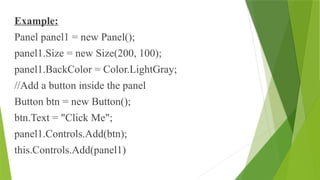
Example:
Panel panel1 =new Panel();
panel1.Size = new Size(200, 100);
panel1.BackColor = Color.LightGray;
//Add a button inside the panel
Button btn = new Button();
btn.Text = "Click Me";
panel1.Controls.Add(btn);
this.Controls.Add(panel1)
26.
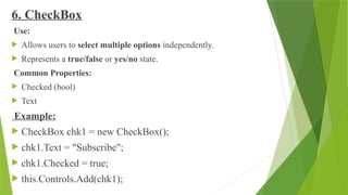
6. CheckBox
Use:
Allowsusers to select multiple options independently.
Represents a true/false or yes/no state.
Common Properties:
Checked (bool)
Text
Example:
CheckBox chk1 = new CheckBox();
chk1.Text = "Subscribe";
chk1.Checked = true;
this.Controls.Add(chk1);
27.
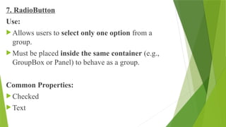
7. RadioButton
Use:
Allowsusers to select only one option from a
group.
Must be placed inside the same container (e.g.,
GroupBox or Panel) to behave as a group.
Common Properties:
Checked
Text
28.
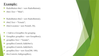
Example:
RadioButton rbtn1= new RadioButton();
rbtn1.Text = "Male";
RadioButton rbtn2 = new RadioButton();
rbtn2.Text = "Female";
rbtn2.Location = new Point(0, 30);
// Add to a GroupBox for grouping
GroupBox groupBox = new GroupBox();
groupBox.Text = "Gender";
groupBox.Controls.Add(rbtn1);
groupBox.Controls.Add(rbtn2);
groupBox.Size = new Size(200, 100);
this.Controls.Add(groupBox);
29.
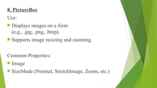
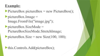
8. PictureBox
Use:
Displaysimages on a form
(e.g., .jpg, .png, .bmp).
Supports image resizing and zooming.
Common Properties:
Image
SizeMode (Normal, StretchImage, Zoom, etc.)
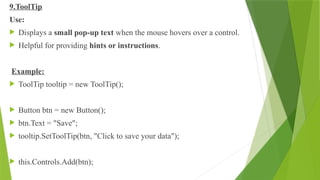
9.ToolTip
Use:
Displays asmall pop-up text when the mouse hovers over a control.
Helpful for providing hints or instructions.
Example:
ToolTip tooltip = new ToolTip();
Button btn = new Button();
btn.Text = "Save";
tooltip.SetToolTip(btn, "Click to save your data");
this.Controls.Add(btn);
32.
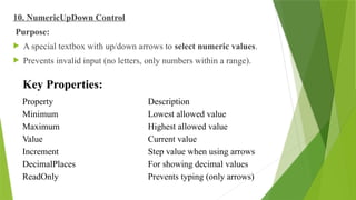
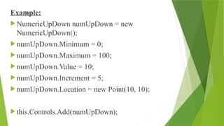
10. NumericUpDown Control
Purpose:
A special textbox with up/down arrows to select numeric values.
Prevents invalid input (no letters, only numbers within a range).
Property Description
Minimum Lowest allowed value
Maximum Highest allowed value
Value Current value
Increment Step value when using arrows
DecimalPlaces For showing decimal values
ReadOnly Prevents typing (only arrows)
Key Properties:
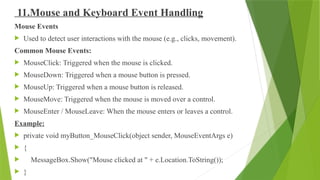
11.Mouse and KeyboardEvent Handling
Mouse Events
Used to detect user interactions with the mouse (e.g., clicks, movement).
Common Mouse Events:
MouseClick: Triggered when the mouse is clicked.
MouseDown: Triggered when a mouse button is pressed.
MouseUp: Triggered when a mouse button is released.
MouseMove: Triggered when the mouse is moved over a control.
MouseEnter / MouseLeave: When the mouse enters or leaves a control.
Example:
private void myButton_MouseClick(object sender, MouseEventArgs e)
{
MessageBox.Show("Mouse clicked at " + e.Location.ToString());
}
35.
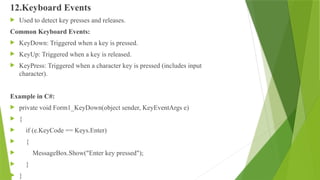
12.Keyboard Events
Usedto detect key presses and releases.
Common Keyboard Events:
KeyDown: Triggered when a key is pressed.
KeyUp: Triggered when a key is released.
KeyPress: Triggered when a character key is pressed (includes input
character).
Example in C#:
private void Form1_KeyDown(object sender, KeyEventArgs e)
{
if (e.KeyCode == Keys.Enter)
{
MessageBox.Show("Enter key pressed");
}
}
36.
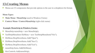
13.Creating Menus
Menusare UI components that provide options to the user in a dropdown list format.
Menu Types:
Main Menu / MenuStrip (used in Windows Forms)
Context Menu / ContextMenuStrip (right-click menu)
Example MenuStrip in Windows Forms:
MenuStrip menuStrip = new MenuStrip();
ToolStripMenuItem fileMenu = new ToolStripMenuItem("File");
fileMenu.DropDownItems.Add("Open");
fileMenu.DropDownItems.Add("Save");
fileMenu.DropDownItems.Add("Exit");
menuStrip.Items.Add(fileMenu);
this.Controls.Add(menuStrip);
37.
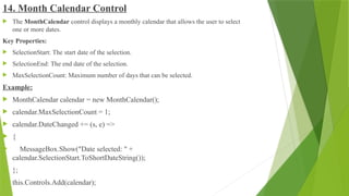
14. Month CalendarControl
The MonthCalendar control displays a monthly calendar that allows the user to select
one or more dates.
Key Properties:
SelectionStart: The start date of the selection.
SelectionEnd: The end date of the selection.
MaxSelectionCount: Maximum number of days that can be selected.
Example:
MonthCalendar calendar = new MonthCalendar();
calendar.MaxSelectionCount = 1;
calendar.DateChanged += (s, e) =>
{
MessageBox.Show("Date selected: " +
calendar.SelectionStart.ToShortDateString());
};
this.Controls.Add(calendar);
38.
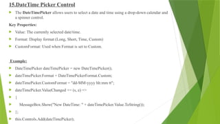
15.DateTime Picker Control
The DateTimePicker allows users to select a date and time using a drop-down calendar and
a spinner control.
Key Properties:
Value: The currently selected date/time.
Format: Display format (Long, Short, Time, Custom)
CustomFormat: Used when Format is set to Custom.
Example:
DateTimePicker dateTimePicker = new DateTimePicker();
dateTimePicker.Format = DateTimePickerFormat.Custom;
dateTimePicker.CustomFormat = "dd-MM-yyyy hh:mm tt";
dateTimePicker.ValueChanged += (s, e) =>
{
MessageBox.Show("New DateTime: " + dateTimePicker.Value.ToString());
};
this.Controls.Add(dateTimePicker);
39.
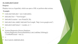
16. LinkLabel Control
Purpose:
Displaystext as a hyperlink, which can open a URL or perform other actions.
Example:
LinkLabel linkLabel = new LinkLabel();
linkLabel.Text = "Visit Google";
linkLabel.Location = new Point(20, 20);
linkLabel.Links.Add(0, linkLabel.Text.Length, "http://www.google.com")
linkLabel.LinkClicked += (sender, e) =>
{
System.Diagnostics.Process.Start(new
System.Diagnostics.ProcessStartInfo(e.Link.LinkData.ToString())
{ UseShellExecute = true });
};
this.Controls.Add(linkLabel);
40.
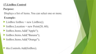
17.ListBox Control
Purpose:
Displays alist of items. You can select one or more.
Example:
ListBox listBox = new ListBox();
listBox.Location = new Point(20, 60);
listBox.Items.Add("Apple");
listBox.Items.Add("Banana");
listBox.Items.Add("Orange");
this.Controls.Add(listBox);
41.
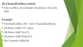
18. CheckedListBox Control
Like ListBox, but includes checkboxes for each
item.
Example:
CheckedListBox clb = new CheckedListBox();
clb.Items.Add("C#", true);
clb.Items.Add("Java");
clb.Items.Add("Python");
this.Controls.Add(clb)
42.
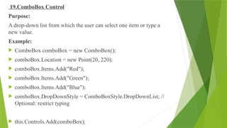
19.ComboBox Control
Purpose:
A drop-downlist from which the user can select one item or type a
new value.
Example:
ComboBox comboBox = new ComboBox();
comboBox.Location = new Point(20, 220);
comboBox.Items.Add("Red");
comboBox.Items.Add("Green");
comboBox.Items.Add("Blue");
comboBox.DropDownStyle = ComboBoxStyle.DropDownList; //
Optional: restrict typing
this.Controls.Add(comboBox);
43.
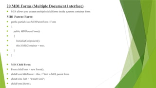
20.MDI Forms (MultipleDocument Interface)
MDI allows you to open multiple child forms inside a parent container form.
MDI Parent Form:
public partial class MDIParentForm : Form
{
public MDIParentForm()
{
InitializeComponent();
this.IsMdiContainer = true;
}
}
MDI Child Form:
Form childForm = new Form();
childForm.MdiParent = this; // 'this' is MDI parent form
childForm.Text = "Child Form";
childForm.Show();
44.
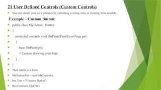
21 User DefinedControls (Custom Controls)
You can create your own controls by extending existing ones or creating from scratch.
Example – Custom Button:
public class MyButton : Button
{
protected override void OnPaint(PaintEventArgs pe)
{
base.OnPaint(pe);
// Custom drawing code here
}
}
Then add it to a form:
MyButton btn = new MyButton();
btn.Text = "Custom Button";
this.Controls.Add(btn);


![[DSC Europe 25] Srdj Stanisic - Local and Private AI in UX.pdf](https://cdn.slidesharecdn.com/ss_thumbnails/vwmetykqmztgmokmmkfa-3-srdjan-stanisic-local-and-small-ai-in-ux-260120105855-55a31869-thumbnail.jpg?width=640&height=640&fit=bounds)
![[DSC Europe 25] Marcos Heidemann - Beyond the Hype: Making AI Coding Assistan...](https://cdn.slidesharecdn.com/ss_thumbnails/eexkhvldrjsopspdjbur-marcos-heidemann-beyond-the-hype-getting-real-value-out-of-ai-assisted-coding-260121115910-7e9d41ec-thumbnail.jpg?width=640&height=640&fit=bounds)


![[DSC Europe 25] Mikhail Rozhkov - AI Product Canvas: From Business Goals to T...](https://cdn.slidesharecdn.com/ss_thumbnails/d53doddtpgfqivmzqel6-mikhail-rozhkov-ai-product-canvas-v1-260121115910-9dd517a7-thumbnail.jpg?width=640&height=640&fit=bounds)

![[DSC Europe 25] Andrzej Kowalczyk - AI - how to start small and grow in the f...](https://cdn.slidesharecdn.com/ss_thumbnails/oy1zmo94qv6vpcqjvno2-andrzej-kowalczyk-ai-how-to-start-small-and-grow-in-the-future-1-260119121559-cf093b23-thumbnail.jpg?width=640&height=640&fit=bounds)
![[DSC Europe 25] Borko Kozomora - Optimizing business workflows with advances ...](https://cdn.slidesharecdn.com/ss_thumbnails/hbgekyb0txw0xpo4yfml-borko-kozomora-leading-ai-transformation-260122103838-cc29ee38-thumbnail.jpg?width=640&height=640&fit=bounds)
![[DSC Europe 25] Tali Fulman - Guild Meetings, Then What? Building Data Commun...](https://cdn.slidesharecdn.com/ss_thumbnails/fgohhi33rwmhqdowdj5k-tali-fulman-guild-meetings-then-what-building-data-communities-that-actually-ch-260120105855-528492c3-thumbnail.jpg?width=640&height=640&fit=bounds)
![[DSC Europe 25] Milovan Jovicic - Beyond AI's Reach: The Enduring Value of Ev...](https://cdn.slidesharecdn.com/ss_thumbnails/pyeij0hurgwq5jugmtnv-2-milovan-jovicic-beyond-ais-reach-the-enduring-value-of-evergreen-design-v2-260120105856-d6ee57e5-thumbnail.jpg?width=640&height=640&fit=bounds)
![[DSC Europe 25] Egor Krasheninnikov - The Control Stack: Building Guardrails ...](https://cdn.slidesharecdn.com/ss_thumbnails/3lzcz7hxqmo51mtalv4u-the-control-stack-260119101520-ea90841a-thumbnail.jpg?width=640&height=640&fit=bounds)

![[DSC Europe 25] Gordana Milutinovic Dumbelovic - From Insight to Oversight: A...](https://cdn.slidesharecdn.com/ss_thumbnails/t7dkjsfxqwwzceropjv4-gordana-milutinovicdumbelovic-from-insight-to-oversight-ai-driven-power-bi-moni-260119121559-9e0bf11b-thumbnail.jpg?width=640&height=640&fit=bounds)
![[DSC Europe 25] Jovan Sumarac - Real-World Applications of Computer Vision in...](https://cdn.slidesharecdn.com/ss_thumbnails/fiksms22smcpopvvld03-jovan-sumarac-real-life-applications-of-computer-vision-in-automotive-systems-260120105855-de622abb-thumbnail.jpg?width=640&height=640&fit=bounds)

![[DSC Europe 25] Tamas Srancsik - How To Teach Your AI Football? An Argument f...](https://cdn.slidesharecdn.com/ss_thumbnails/bcjh1m9xtbosv20ucftb-tamas-srancsik-how-to-teach-your-ai-football-260121115910-08b53e9e-thumbnail.jpg?width=640&height=640&fit=bounds)

![[DSC Europe 25] Josip Saban - Career building for data professionals.pptx](https://cdn.slidesharecdn.com/ss_thumbnails/zroflcttkm1vmli0txea-josip-saban-career-building-for-data-professionals-260123083019-587cdb8c-thumbnail.jpg?width=640&height=640&fit=bounds)
