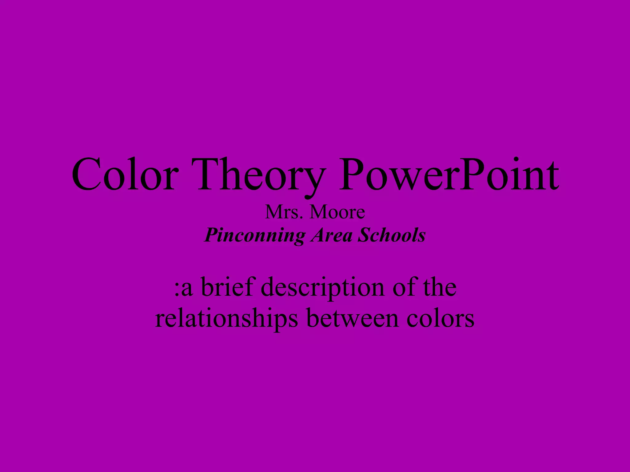
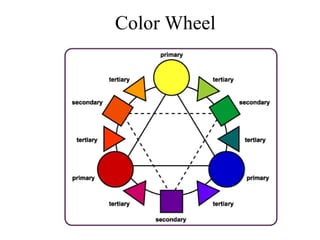
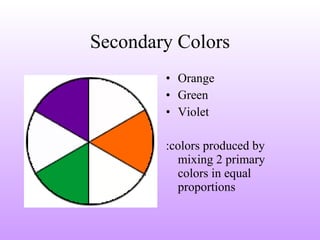
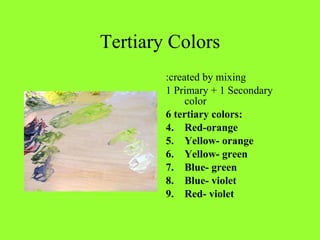
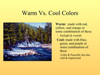
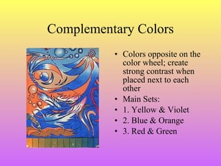
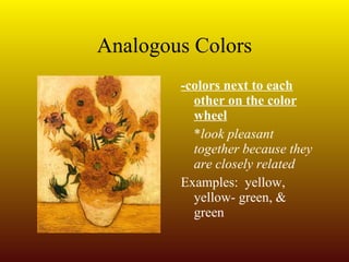
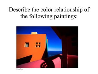
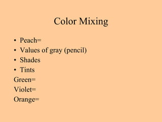
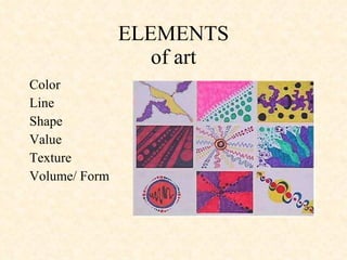
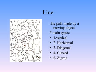
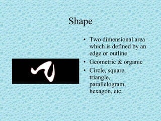
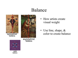
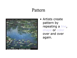
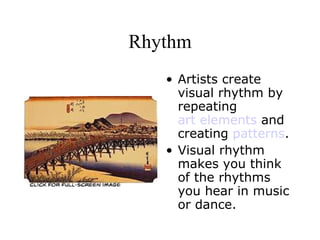
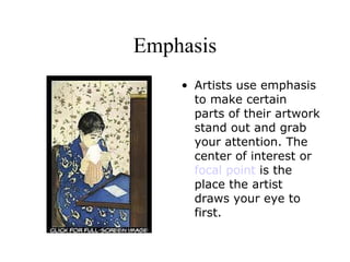
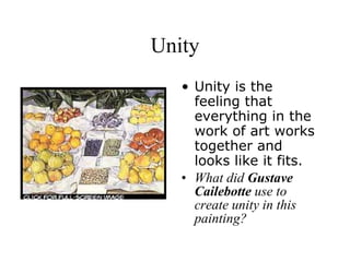
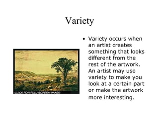
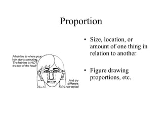
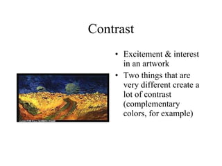
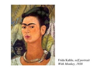
Color Theory PowerPoint Mrs. Moore Pinconning Area Schools :a brief description of the relationships between colors
Color Wheel                                                                
Primary Colors Red Yellow  Blue : With these colors (+black & white) all other colors can be made Can NOT be made by mixing other colors
Secondary Colors Orange Green Violet :colors produced by mixing 2 primary colors in equal proportions
Tertiary Colors :created by mixing 1 Primary + 1 Secondary color 6 tertiary colors: Red-orange Yellow- orange Yellow- green Blue- green Blue- violet Red- violet
Warm Vs. Cool Colors Warm:   made with red, yellow, and orange or some combination of these Sunlight & warmth Cool:  made with blue, green, and purple or some combination of these -Calm & Peaceful, but also cold & impersonal
Complementary Colors Colors opposite on the color wheel; create strong contrast when placed next to each other Main Sets: 1. Yellow & Violet 2. Blue & Orange 3. Red & Green
Analogous Colors -colors next to each other on the color wheel * look pleasant together because they are closely related Examples:  yellow, yellow- green, & green
Describe the color relationship of the following paintings:


Color Mixing Peach= Values of gray (pencil) Shades Tints Green=  Violet= Orange=
ELEMENTS of art Color Line Shape Value Texture Volume/ Form
Line :the path made by a moving object 5 main types: 1.vertical 2. Horizontal 3. Diagonal 4. Curved 5. Zigzag
Shape Two dimensional area which is defined by an edge or outline Geometric & organic Circle, square, triangle, parallelogram, hexagon, etc.
Value Degree of darkness or lightness of a color Chiaroscuro:  method of arranging light and shadow to create the illusion of form (shading)
Volume or Form An object with 3 dimensions- length, width, & depth.  Geometric or free- form Ex.: cone, cube, cylinder, sphere
Texture Tactile quality of the surface of an object or material *Real or Actual- the way objects or surfaces feel or look like they feel; rough, smooth, shiny…
PRINCIPLES of art Advanced Artwork; considered before, after, and during the art process Why abstract art takes skill, too Balance Contrast Proportion Pattern Rhythm Emphasis Unity Variety
Balance How artists create visual weight Use line, shape, & color to create balance
Pattern Artists create pattern by repeating a  line ,  shape  or  color  over and over again.
Rhythm Artists create visual rhythm by repeating  art elements  and creating  patterns .  Visual rhythm makes you think of the rhythms you hear in music or dance.
Emphasis Artists use emphasis to make certain parts of their artwork stand out and grab your attention. The center of interest or  focal point  is the place the artist draws your eye to first.
Unity Unity is the feeling that everything in the work of art works together and looks like it fits.  What did  Gustave Cailebotte  use to create unity in this painting?
Variety Variety occurs when an artist creates something that looks different from the rest of the artwork. An artist may use variety to make you look at a certain part or make the artwork more interesting.
Proportion Size, location, or amount of one thing in relation to another Figure drawing proportions, etc.                                 
Contrast Excitement & interest in an artwork Two things that are very different create a lot of contrast (complementary colors, for example)
Essay Question:  - be able to describe a piece of art using the principles and elements of art.
Describe the following artwork by Vincent van Gogh using the elements and principles of art.
Hints: Organize you ideas first by identifying at least 3 elements and at least 3 principles of art. Elements emphasized:  Color, Form, Value Principles emphasized:   balance, proportion, variety
Essay Response:   Van Gogh utilized many of the principles and elements of art in his  Bedroom at Arles  painting, including balance, proportion, variety, value, color, and form. The balance is asymmetrical with the large bed on the the far right side of the painting. Proportion is exaggerated by the large bed and the extra small pieces of furniture in an abstract perspective scale. Variety in the piece is evident in both color choices (red bedspread vs. green chair seats) and in the amount of details on the wall in contrast to the floor. Value is present in the different shades & tints of the paint used (ex. different shades of light blue in the wall). Color is contrasted using complementary color schemes as well as using cool colors on the background in order for the window and the bedspread (warm colors) to stand out. Form is present in the three dimensional aspect of the furniture in the room, giving the painting a feeling that you could walk into the room at any moment.
Frida Kahlo , self portrait With Monkey, 1938

Color Theory: Pinconning High School

  • 1.
    Color Theory PowerPointMrs. Moore Pinconning Area Schools :a brief description of the relationships between colors
  • 2.
    Color Wheel                                                               
  • 3.
    Primary Colors RedYellow Blue : With these colors (+black & white) all other colors can be made Can NOT be made by mixing other colors
  • 4.
    Secondary Colors OrangeGreen Violet :colors produced by mixing 2 primary colors in equal proportions
  • 5.
    Tertiary Colors :createdby mixing 1 Primary + 1 Secondary color 6 tertiary colors: Red-orange Yellow- orange Yellow- green Blue- green Blue- violet Red- violet
  • 6.
    Warm Vs. CoolColors Warm: made with red, yellow, and orange or some combination of these Sunlight & warmth Cool: made with blue, green, and purple or some combination of these -Calm & Peaceful, but also cold & impersonal
  • 7.
    Complementary Colors Colorsopposite on the color wheel; create strong contrast when placed next to each other Main Sets: 1. Yellow & Violet 2. Blue & Orange 3. Red & Green
  • 8.
    Analogous Colors -colorsnext to each other on the color wheel * look pleasant together because they are closely related Examples: yellow, yellow- green, & green
  • 9.
    Describe the colorrelationship of the following paintings:
  • 10.
  • 11.
  • 12.
  • 13.
    Color Mixing Peach=Values of gray (pencil) Shades Tints Green= Violet= Orange=
  • 14.
    ELEMENTS of artColor Line Shape Value Texture Volume/ Form
  • 15.
    Line :the pathmade by a moving object 5 main types: 1.vertical 2. Horizontal 3. Diagonal 4. Curved 5. Zigzag
  • 16.
    Shape Two dimensionalarea which is defined by an edge or outline Geometric & organic Circle, square, triangle, parallelogram, hexagon, etc.
  • 17.
    Value Degree ofdarkness or lightness of a color Chiaroscuro: method of arranging light and shadow to create the illusion of form (shading)
  • 18.
    Volume or FormAn object with 3 dimensions- length, width, & depth. Geometric or free- form Ex.: cone, cube, cylinder, sphere
  • 19.
    Texture Tactile qualityof the surface of an object or material *Real or Actual- the way objects or surfaces feel or look like they feel; rough, smooth, shiny…
  • 20.
    PRINCIPLES of artAdvanced Artwork; considered before, after, and during the art process Why abstract art takes skill, too Balance Contrast Proportion Pattern Rhythm Emphasis Unity Variety
  • 21.
    Balance How artistscreate visual weight Use line, shape, & color to create balance
  • 22.
    Pattern Artists createpattern by repeating a line , shape or color over and over again.
  • 23.
    Rhythm Artists createvisual rhythm by repeating art elements and creating patterns . Visual rhythm makes you think of the rhythms you hear in music or dance.
  • 24.
    Emphasis Artists useemphasis to make certain parts of their artwork stand out and grab your attention. The center of interest or focal point is the place the artist draws your eye to first.
  • 25.
    Unity Unity isthe feeling that everything in the work of art works together and looks like it fits. What did Gustave Cailebotte use to create unity in this painting?
  • 26.
    Variety Variety occurswhen an artist creates something that looks different from the rest of the artwork. An artist may use variety to make you look at a certain part or make the artwork more interesting.
  • 27.
    Proportion Size, location,or amount of one thing in relation to another Figure drawing proportions, etc.                                 
  • 28.
    Contrast Excitement &interest in an artwork Two things that are very different create a lot of contrast (complementary colors, for example)
  • 29.
    Essay Question: - be able to describe a piece of art using the principles and elements of art.
  • 30.
    Describe the followingartwork by Vincent van Gogh using the elements and principles of art.
  • 31.
    Hints: Organize youideas first by identifying at least 3 elements and at least 3 principles of art. Elements emphasized: Color, Form, Value Principles emphasized: balance, proportion, variety
  • 32.
    Essay Response: Van Gogh utilized many of the principles and elements of art in his Bedroom at Arles painting, including balance, proportion, variety, value, color, and form. The balance is asymmetrical with the large bed on the the far right side of the painting. Proportion is exaggerated by the large bed and the extra small pieces of furniture in an abstract perspective scale. Variety in the piece is evident in both color choices (red bedspread vs. green chair seats) and in the amount of details on the wall in contrast to the floor. Value is present in the different shades & tints of the paint used (ex. different shades of light blue in the wall). Color is contrasted using complementary color schemes as well as using cool colors on the background in order for the window and the bedspread (warm colors) to stand out. Form is present in the three dimensional aspect of the furniture in the room, giving the painting a feeling that you could walk into the room at any moment.
  • 33.
    Frida Kahlo ,self portrait With Monkey, 1938