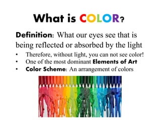
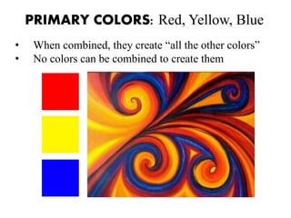
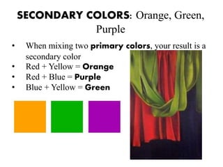
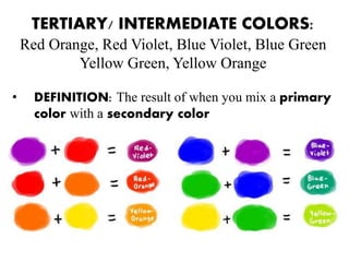
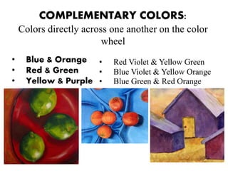
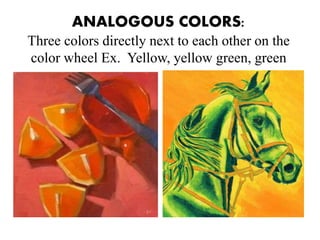
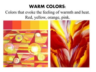
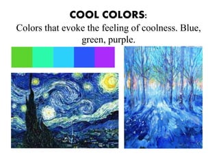
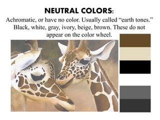
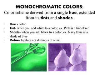
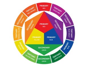
COLOR
What is COLOR?
Definition: What our eyes see that is
being reflected or absorbed by the light
• Therefore, without light, you can not see color!
• One of the most dominant Elements of Art
• Color Scheme: An arrangement of colors
PRIMARY COLORS: Red, Yellow, Blue
• When combined, they create “all the other colors”
• No colors can be combined to create them
SECONDARY COLORS: Orange, Green,
Purple
• When mixing two primary colors, your result is a
secondary color
• Red + Yellow = Orange
• Red + Blue = Purple
• Blue + Yellow = Green
TERTIARY/ INTERMEDIATE COLORS:
Red Orange, Red Violet, Blue Violet, Blue Green
Yellow Green, Yellow Orange
• DEFINITION: The result of when you mix a primary
color with a secondary color
COMPLEMENTARY COLORS:
Colors directly across one another on the color
wheel
• Blue & Orange
• Red & Green
• Yellow & Purple
• Red Violet & Yellow Green
• Blue Violet & Yellow Orange
• Blue Green & Red Orange
ANALOGOUS COLORS:
Three colors directly next to each other on the
color wheel Ex. Yellow, yellow green, green
WARM COLORS:
Colors that evoke the feeling of warmth and heat.
Red, yellow, orange, pink.
COOL COLORS:
Colors that evoke the feeling of coolness. Blue,
green, purple.
NEUTRAL COLORS:
Achromatic, or have no color. Usually called “earth tones.”
Black, white, gray, ivory, beige, brown. These do not
appear on the color wheel.
MONOCHROMATIC COLORS:
Color scheme derived from a single hue, extended
from its tints and shades.
• Hue - color
• Tint- when you add white to a color, ex. Pink is a tint of red
• Shade- when you add black to a color, ex. Navy Blue is a
shade of blue
• Value- lightness or darkness of a hue
What’s the point??
Color Harmony and Color Context
• Color Harmony – Pleases the eye by engaging the viewer
and creating an inner sense of balance and order. When
something is not harmonious, it’s either boring or chaotic. The
human brain will reject under stimulating information. At the
other extreme is a visual experience that is so overdone and so
chaotic, a viewer can’t stand to look at it. The human brain
rejects what it can not organize and what it can not understand.
Color harmony delivers visual interest and a sense of order.
What’s the point??
Color Harmony and Color Context
• Color Context – How color behaves in relation to other
colors and shapes. How it makes a viewer feel.
Color
Color

Color

  • 1.
  • 2.
    What is COLOR? Definition:What our eyes see that is being reflected or absorbed by the light • Therefore, without light, you can not see color! • One of the most dominant Elements of Art • Color Scheme: An arrangement of colors
  • 3.
    PRIMARY COLORS: Red,Yellow, Blue • When combined, they create “all the other colors” • No colors can be combined to create them
  • 4.
    SECONDARY COLORS: Orange,Green, Purple • When mixing two primary colors, your result is a secondary color • Red + Yellow = Orange • Red + Blue = Purple • Blue + Yellow = Green
  • 5.
    TERTIARY/ INTERMEDIATE COLORS: RedOrange, Red Violet, Blue Violet, Blue Green Yellow Green, Yellow Orange • DEFINITION: The result of when you mix a primary color with a secondary color
  • 6.
    COMPLEMENTARY COLORS: Colors directlyacross one another on the color wheel • Blue & Orange • Red & Green • Yellow & Purple • Red Violet & Yellow Green • Blue Violet & Yellow Orange • Blue Green & Red Orange
  • 7.
    ANALOGOUS COLORS: Three colorsdirectly next to each other on the color wheel Ex. Yellow, yellow green, green
  • 8.
    WARM COLORS: Colors thatevoke the feeling of warmth and heat. Red, yellow, orange, pink.
  • 9.
    COOL COLORS: Colors thatevoke the feeling of coolness. Blue, green, purple.
  • 10.
    NEUTRAL COLORS: Achromatic, orhave no color. Usually called “earth tones.” Black, white, gray, ivory, beige, brown. These do not appear on the color wheel.
  • 11.
    MONOCHROMATIC COLORS: Color schemederived from a single hue, extended from its tints and shades. • Hue - color • Tint- when you add white to a color, ex. Pink is a tint of red • Shade- when you add black to a color, ex. Navy Blue is a shade of blue • Value- lightness or darkness of a hue
  • 12.
    What’s the point?? ColorHarmony and Color Context • Color Harmony – Pleases the eye by engaging the viewer and creating an inner sense of balance and order. When something is not harmonious, it’s either boring or chaotic. The human brain will reject under stimulating information. At the other extreme is a visual experience that is so overdone and so chaotic, a viewer can’t stand to look at it. The human brain rejects what it can not organize and what it can not understand. Color harmony delivers visual interest and a sense of order.
  • 13.
    What’s the point?? ColorHarmony and Color Context • Color Context – How color behaves in relation to other colors and shapes. How it makes a viewer feel.

Editor's Notes

  • #14 If your computer has sufficient color stability and gamma correction (link to Is Your Computer Color Blind?) you will see that the small purple rectangle on the left appears to have a red-purple tinge when compared to the small purple rectangle on the right. They are both the same color as seen in the illustration below. This demonstrates how three colors can be perceived as four colors.