Basic Color Theory
DATA Digital Imaging

www.DATA-Di.us
1
The Color Wheel

2

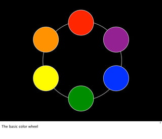
A color circle, based on red, yellow and blue, is traditional in the field of art. Sir Isaac Newton
developed the first circular diagram of colors in 1666. Since then, scientists and artists have
studied and designed numerous variations of this concept.
3

The basic color wheel
4

The 12 part color wheel
Primary
Colors?

5

The colors from which all other colors may be derived
6

Red. Yellow, and Blue
Secondary
Colors?

7

A color resulting from the mixing of two primary colors.
8

Orange, Purple, and Green
What about
Black and White?

9
Black
is
the
absence
of
color

White
is
the
blending
of all
colors

10

Black is not a color- Black objects absorb all the colors of the visible spectrum and reflects
none of them to our eyes.
White is a color- It reflects all the colors of the visible light spectrum to our eyes.
Color Harmony
What we find pleasing to the eye

11
Complementary
Colors?

12

Complementary colors are any two colors which are directly opposite each other on the color
wheel.
13

Red / Green
14

Purple / Yellow
15

Green / Orange
Analogous
Colors?

16

Analogous colors are any three colors which are next to each other on the color wheel.
17
Monochromatic
Colors?

18

A monochromatic color scheme uses variations in lightness and saturation of a single color.
HINT: Mono = ONE , Chroma = COLOR
19

A monochromatic color scheme uses variations in lightness and saturation of a single color.
Mood

20

Color has a physical effect on the human body and can directly effect our moods.
Warm | Active
Colors?

21

Active colors will appear to advance when placed against passive hues.
Most often warm, saturated, light value hues are "active" and visually advance.
22

Active colors will appear to advance when placed against passive hues.
Most often warm, saturated, light value hues are "active" and visually advance.
Cool | Passive
Colors?

23

Passive colors appear to recede when positioned against active hues.
Cool, low saturated, dark value hues are "passive" and visually recede.
24

Active colors will appear to advance when placed against passive hues.
Most often warm, saturated, light value hues are "active" and visually advance.
Colors
from
Nature

25

The natural environment is a great place to find color combinations!
26
Color
Effects

Color is effected by its environment or by colors it is next to.

27
28

The yellow square looks darker and warmer with a white background and more brilliant and colder with a black
background.
Additionally, black backgrounds are considered more formal / white backgrounds tend to be informal.
28

The yellow square looks darker and warmer with a white background and more brilliant and colder with a black
background.
Additionally, black backgrounds are considered more formal / white backgrounds tend to be informal.
29

Red appears more brilliant against a black background and somewhat duller against the white background. In contrast
with orange, the red appears lifeless; in contrast with blue-green, it exhibits brilliance.
Notice that the red square appears larger on black than on other background colors.
29

Red appears more brilliant against a black background and somewhat duller against the white background. In contrast
with orange, the red appears lifeless; in contrast with blue-green, it exhibits brilliance.
Notice that the red square appears larger on black than on other background colors.
29

Red appears more brilliant against a black background and somewhat duller against the white background. In contrast
with orange, the red appears lifeless; in contrast with blue-green, it exhibits brilliance.
Notice that the red square appears larger on black than on other background colors.
29

Red appears more brilliant against a black background and somewhat duller against the white background. In contrast
with orange, the red appears lifeless; in contrast with blue-green, it exhibits brilliance.
Notice that the red square appears larger on black than on other background colors.
What do you notice about the small square in the center?
They are actually the same color, just effected by the field around it.

30
What do you notice about the small square in the center?
They are actually the same color, just effected by the field around it.

30
Chromostereopsis?

31

Simultaneous contrast, or chromostereopsis, may occur when opposite colors are placed close to one another.
32
33
34
Readability

35
Yellow text on a white background

36

The more an object contrasts with its field, the more visible it becomes.
When we create visuals that are intended to be read, offering the viewer enough contrast between the background
(paper or screen) and the text is VERY important.
Yellow text on a white background
Blue text on a black background

Black text on a gray background

36

The more an object contrasts with its field, the more visible it becomes.
When we create visuals that are intended to be read, offering the viewer enough contrast between the background
(paper or screen) and the text is VERY important.
Yellow text on a white background
Blue text on a black background
Red text on a blue background
Black text on a gray background
White text on a black background
Black text on a white background
36

The more an object contrasts with its field, the more visible it becomes.
When we create visuals that are intended to be read, offering the viewer enough contrast between the background
(paper or screen) and the text is VERY important.
Color Systems

37

There is a slight difference when working with color pigment vs. light
Subtractive
Color

38

When we mix colors using paint, or through the printing process, we are using the subtractive color method.
Subtractive color mixing means that one begins with white and adds color.
39

The CMYK color system is the color system used for printing.

Cyan, Magenta, Yellow, and Black
Additive
Color

40

If we are working on a computer, the colors we see on the screen are created with light using the additive color
method. Additive color mixing begins with black and ends with white; as more color is added.
41

The RGB colors are light primaries and colors are created with light.

Red, Green, and Blue
Color Meaning

42
43
Energy, war, danger, strength, power,
determination, passion, desire, and love

43
Energy, war, danger, strength, power,
determination, passion, desire, and love

Joy, enthusiasm, fascination, creativity,
attraction, success, & encouragement

43
Energy, war, danger, strength, power,
determination, passion, desire, and love

Joy, enthusiasm, fascination, creativity,
attraction, success, & encouragement

Intellect, cheerfulness, honor, & loyalty

43
Nature, growth, harmony, freshness,
fertility, healing, stability, & endurance

44
Nature, growth, harmony, freshness,
fertility, healing, stability, & endurance

Depth, trust, loyalty, wisdom, confidence,
faith, truth, corporate America

44
Nature, growth, harmony, freshness,
fertility, healing, stability, & endurance

Depth, trust, loyalty, wisdom, confidence,
faith, truth, corporate America

Royalty, power, luxury, ambition,
dignity, independence, mystery, & magic

44
Power, elegance, formality, death, evil,
strength, prestige, & sleekness

45
Power, elegance, formality, death, evil,
strength, prestige, & sleekness

Goodness, innocence, purity, simplicity,
sterility, charity, peace, & winter

45
Fun Facts :)

46

The following facts are all known to be true and accurate
(but you’ll have to check for yourself)
7% of males are color deficient

47
7% of males are color deficient
Most color blindness is the inability to
differentiate between reds and greens. The world
is a blend of blues, yellows & grays

47
7% of males are color deficient
Most color blindness is the inability to
differentiate between reds and greens. The world
is a blend of blues, yellows & grays
Blue is America’s 1st choice of toothbrush

47
7% of males are color deficient
Most color blindness is the inability to
differentiate between reds and greens. The world
is a blend of blues, yellows & grays
Blue is America’s 1st choice of toothbrush
Redheads need more anesthesia for surgery

47
7% of males are color deficient
Most color blindness is the inability to
differentiate between reds and greens. The world
is a blend of blues, yellows & grays
Blue is America’s 1st choice of toothbrush
Redheads need more anesthesia for surgery
Ancient Aztecs valued red dye more then gold
47
Nokia offered the 1st color cell phone in 1992

48
Nokia offered the 1st color cell phone in 1992
Hippopotamus milk is pink

48
Nokia offered the 1st color cell phone in 1992
Hippopotamus milk is pink
Red is always the highest arc on a rainbow

48
Nokia offered the 1st color cell phone in 1992
Hippopotamus milk is pink
Red is always the highest arc on a rainbow
The color of the universe is beige (Cosmic Latte)

48
Nokia offered the 1st color cell phone in 1992
Hippopotamus milk is pink
Red is always the highest arc on a rainbow
The color of the universe is beige (Cosmic Latte)
Nothing rhymes with Purple or Orange

48
Assignments
1. Complete a creative 6 Part Color Wheel
w/ black & white at center
2. Apply basic Color Theory to your
Personal Logo for class critique

49

Color Theory: http://data-ml.wikispaces.com/Color+Theory
Personal Logo: http://data-ml.wikispaces.com/Personal+Logo
References
Color in Design | Triangle Park Creative
http://www.triangleparkcreative.com/tips/print/color
Color Wheel Pro: Color Meaning
http://www.color-wheel-pro.com/color-meaning.html
worqx.com
http://www.worqx.com/color/index.htm
Basic Color Theory
http://www.colormatters.com/color-and-design/basic-color-theory

50

Color theory

  • 1.
    Basic Color Theory DATADigital Imaging www.DATA-Di.us 1
  • 2.
    The Color Wheel 2 Acolor circle, based on red, yellow and blue, is traditional in the field of art. Sir Isaac Newton developed the first circular diagram of colors in 1666. Since then, scientists and artists have studied and designed numerous variations of this concept.
  • 3.
  • 4.
    4 The 12 partcolor wheel
  • 5.
    Primary Colors? 5 The colors fromwhich all other colors may be derived
  • 6.
  • 7.
    Secondary Colors? 7 A color resultingfrom the mixing of two primary colors.
  • 8.
  • 9.
  • 10.
    Black is the absence of color White is the blending of all colors 10 Black isnot a color- Black objects absorb all the colors of the visible spectrum and reflects none of them to our eyes. White is a color- It reflects all the colors of the visible light spectrum to our eyes.
  • 11.
    Color Harmony What wefind pleasing to the eye 11
  • 12.
    Complementary Colors? 12 Complementary colors areany two colors which are directly opposite each other on the color wheel.
  • 13.
  • 14.
  • 15.
  • 16.
    Analogous Colors? 16 Analogous colors areany three colors which are next to each other on the color wheel.
  • 17.
  • 18.
    Monochromatic Colors? 18 A monochromatic colorscheme uses variations in lightness and saturation of a single color. HINT: Mono = ONE , Chroma = COLOR
  • 19.
    19 A monochromatic colorscheme uses variations in lightness and saturation of a single color.
  • 20.
    Mood 20 Color has aphysical effect on the human body and can directly effect our moods.
  • 21.
    Warm | Active Colors? 21 Activecolors will appear to advance when placed against passive hues. Most often warm, saturated, light value hues are "active" and visually advance.
  • 22.
    22 Active colors willappear to advance when placed against passive hues. Most often warm, saturated, light value hues are "active" and visually advance.
  • 23.
    Cool | Passive Colors? 23 Passivecolors appear to recede when positioned against active hues. Cool, low saturated, dark value hues are "passive" and visually recede.
  • 24.
    24 Active colors willappear to advance when placed against passive hues. Most often warm, saturated, light value hues are "active" and visually advance.
  • 25.
    Colors from Nature 25 The natural environmentis a great place to find color combinations!
  • 26.
  • 27.
    Color Effects Color is effectedby its environment or by colors it is next to. 27
  • 28.
    28 The yellow squarelooks darker and warmer with a white background and more brilliant and colder with a black background. Additionally, black backgrounds are considered more formal / white backgrounds tend to be informal.
  • 29.
    28 The yellow squarelooks darker and warmer with a white background and more brilliant and colder with a black background. Additionally, black backgrounds are considered more formal / white backgrounds tend to be informal.
  • 30.
    29 Red appears morebrilliant against a black background and somewhat duller against the white background. In contrast with orange, the red appears lifeless; in contrast with blue-green, it exhibits brilliance. Notice that the red square appears larger on black than on other background colors.
  • 31.
    29 Red appears morebrilliant against a black background and somewhat duller against the white background. In contrast with orange, the red appears lifeless; in contrast with blue-green, it exhibits brilliance. Notice that the red square appears larger on black than on other background colors.
  • 32.
    29 Red appears morebrilliant against a black background and somewhat duller against the white background. In contrast with orange, the red appears lifeless; in contrast with blue-green, it exhibits brilliance. Notice that the red square appears larger on black than on other background colors.
  • 33.
    29 Red appears morebrilliant against a black background and somewhat duller against the white background. In contrast with orange, the red appears lifeless; in contrast with blue-green, it exhibits brilliance. Notice that the red square appears larger on black than on other background colors.
  • 34.
    What do younotice about the small square in the center? They are actually the same color, just effected by the field around it. 30
  • 35.
    What do younotice about the small square in the center? They are actually the same color, just effected by the field around it. 30
  • 36.
    Chromostereopsis? 31 Simultaneous contrast, orchromostereopsis, may occur when opposite colors are placed close to one another.
  • 37.
  • 38.
  • 39.
  • 40.
  • 41.
    Yellow text ona white background 36 The more an object contrasts with its field, the more visible it becomes. When we create visuals that are intended to be read, offering the viewer enough contrast between the background (paper or screen) and the text is VERY important.
  • 42.
    Yellow text ona white background Blue text on a black background 36 The more an object contrasts with its field, the more visible it becomes. When we create visuals that are intended to be read, offering the viewer enough contrast between the background (paper or screen) and the text is VERY important.
  • 43.
    Yellow text ona white background Blue text on a black background Black text on a gray background 36 The more an object contrasts with its field, the more visible it becomes. When we create visuals that are intended to be read, offering the viewer enough contrast between the background (paper or screen) and the text is VERY important.
  • 44.
    Yellow text ona white background Blue text on a black background Red text on a blue background Black text on a gray background 36 The more an object contrasts with its field, the more visible it becomes. When we create visuals that are intended to be read, offering the viewer enough contrast between the background (paper or screen) and the text is VERY important.
  • 45.
    Yellow text ona white background Blue text on a black background Red text on a blue background Black text on a gray background White text on a black background 36 The more an object contrasts with its field, the more visible it becomes. When we create visuals that are intended to be read, offering the viewer enough contrast between the background (paper or screen) and the text is VERY important.
  • 46.
    Yellow text ona white background Blue text on a black background Red text on a blue background Black text on a gray background White text on a black background Black text on a white background 36 The more an object contrasts with its field, the more visible it becomes. When we create visuals that are intended to be read, offering the viewer enough contrast between the background (paper or screen) and the text is VERY important.
  • 47.
    Color Systems 37 There isa slight difference when working with color pigment vs. light
  • 48.
    Subtractive Color 38 When we mixcolors using paint, or through the printing process, we are using the subtractive color method. Subtractive color mixing means that one begins with white and adds color.
  • 49.
    39 The CMYK colorsystem is the color system used for printing. Cyan, Magenta, Yellow, and Black
  • 50.
    Additive Color 40 If we areworking on a computer, the colors we see on the screen are created with light using the additive color method. Additive color mixing begins with black and ends with white; as more color is added.
  • 51.
    41 The RGB colorsare light primaries and colors are created with light. Red, Green, and Blue
  • 52.
  • 53.
  • 54.
    Energy, war, danger,strength, power, determination, passion, desire, and love 43
  • 55.
    Energy, war, danger,strength, power, determination, passion, desire, and love Joy, enthusiasm, fascination, creativity, attraction, success, & encouragement 43
  • 56.
    Energy, war, danger,strength, power, determination, passion, desire, and love Joy, enthusiasm, fascination, creativity, attraction, success, & encouragement Intellect, cheerfulness, honor, & loyalty 43
  • 57.
    Nature, growth, harmony,freshness, fertility, healing, stability, & endurance 44
  • 58.
    Nature, growth, harmony,freshness, fertility, healing, stability, & endurance Depth, trust, loyalty, wisdom, confidence, faith, truth, corporate America 44
  • 59.
    Nature, growth, harmony,freshness, fertility, healing, stability, & endurance Depth, trust, loyalty, wisdom, confidence, faith, truth, corporate America Royalty, power, luxury, ambition, dignity, independence, mystery, & magic 44
  • 60.
    Power, elegance, formality,death, evil, strength, prestige, & sleekness 45
  • 61.
    Power, elegance, formality,death, evil, strength, prestige, & sleekness Goodness, innocence, purity, simplicity, sterility, charity, peace, & winter 45
  • 62.
    Fun Facts :) 46 Thefollowing facts are all known to be true and accurate (but you’ll have to check for yourself)
  • 63.
    7% of malesare color deficient 47
  • 64.
    7% of malesare color deficient Most color blindness is the inability to differentiate between reds and greens. The world is a blend of blues, yellows & grays 47
  • 65.
    7% of malesare color deficient Most color blindness is the inability to differentiate between reds and greens. The world is a blend of blues, yellows & grays Blue is America’s 1st choice of toothbrush 47
  • 66.
    7% of malesare color deficient Most color blindness is the inability to differentiate between reds and greens. The world is a blend of blues, yellows & grays Blue is America’s 1st choice of toothbrush Redheads need more anesthesia for surgery 47
  • 67.
    7% of malesare color deficient Most color blindness is the inability to differentiate between reds and greens. The world is a blend of blues, yellows & grays Blue is America’s 1st choice of toothbrush Redheads need more anesthesia for surgery Ancient Aztecs valued red dye more then gold 47
  • 68.
    Nokia offered the1st color cell phone in 1992 48
  • 69.
    Nokia offered the1st color cell phone in 1992 Hippopotamus milk is pink 48
  • 70.
    Nokia offered the1st color cell phone in 1992 Hippopotamus milk is pink Red is always the highest arc on a rainbow 48
  • 71.
    Nokia offered the1st color cell phone in 1992 Hippopotamus milk is pink Red is always the highest arc on a rainbow The color of the universe is beige (Cosmic Latte) 48
  • 72.
    Nokia offered the1st color cell phone in 1992 Hippopotamus milk is pink Red is always the highest arc on a rainbow The color of the universe is beige (Cosmic Latte) Nothing rhymes with Purple or Orange 48
  • 73.
    Assignments 1. Complete acreative 6 Part Color Wheel w/ black & white at center 2. Apply basic Color Theory to your Personal Logo for class critique 49 Color Theory: http://data-ml.wikispaces.com/Color+Theory Personal Logo: http://data-ml.wikispaces.com/Personal+Logo
  • 74.
    References Color in Design| Triangle Park Creative http://www.triangleparkcreative.com/tips/print/color Color Wheel Pro: Color Meaning http://www.color-wheel-pro.com/color-meaning.html worqx.com http://www.worqx.com/color/index.htm Basic Color Theory http://www.colormatters.com/color-and-design/basic-color-theory 50