Downloaded 234 times
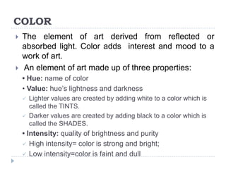


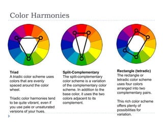


Color is an element of art derived from light that adds interest and mood. It has three properties: hue (name), value (lightness/darkness), and intensity (brightness/purity). The color wheel organizes colors, with primary colors of red, yellow and blue that can't be mixed, and secondary/tertiary colors made by mixing primaries. Color schemes use relationships of colors on the wheel, like complementary, analogous, triadic or split-complementary pairs and groups. Warm colors like red and yellow are associated with warmth, while cool colors like blue and green are associated with coolness. Neutral colors are also used in art.


