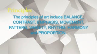
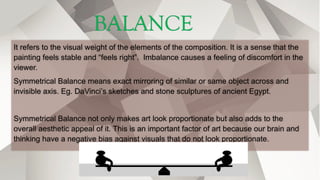
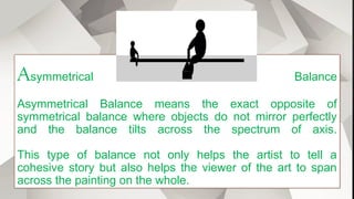
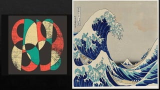
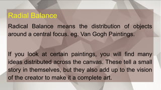
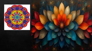
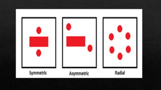
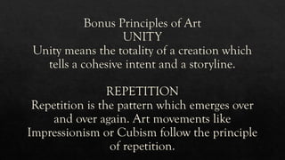
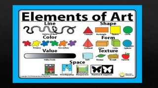
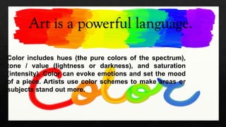
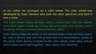
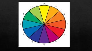
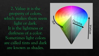
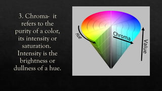
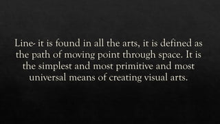
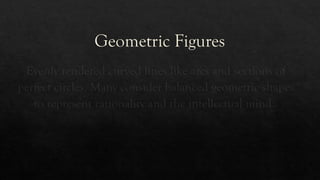
Visual
Arts
Sir Mark Cuarte
Objectives
 Analyze the different elements
and principles of art
 Explain the relevance of the
elements of art in the study of
art and its products
 Create a work of art applying
the proper use of the different
elements.
Principles
The principles of art include BALANCE,
CONTRAST, EMPHASIS, MOVEMENT,
PATTERN, VARIETY, RHYTHM, HARMONY
and PROPORTION.
The principles of art are like the commandments of the creative process.
So, art is all not only about the imagery and the intent, but also is the statement of
individuality of the creator who creates that art.
Composition of art is the coming together of the principles of art in perfect
harmony. These principles of art also help one to understand and appreciate art in
its completeness.
BALANCE
It refers to the visual weight of the elements of the composition. It is a sense that the
painting feels stable and “feels right”. Imbalance causes a feeling of discomfort in the
viewer.
Symmetrical Balance means exact mirroring of similar or same object across and
invisible axis. Eg. DaVinci’s sketches and stone sculptures of ancient Egypt.
Symmetrical Balance not only makes art look proportionate but also adds to the
overall aesthetic appeal of it. This is an important factor of art because our brain and
thinking have a negative bias against visuals that do not look proportionate.
Asymmetrical Balance
Asymmetrical Balance means the exact opposite of
symmetrical balance where objects do not mirror perfectly
and the balance tilts across the spectrum of axis.
This type of balance not only helps the artist to tell a
cohesive story but also helps the viewer of the art to span
across the painting on the whole.
“The Starry Night” Van Gogh
Radial Balance
Radical Balance means the distribution of objects
around a central focus. eg. Van Gogh Paintings.
If you look at certain paintings, you will find many
ideas distributed across the canvas. These tell a small
story in themselves, but they also add up to the vision
of the creator to make it a complete art.
PROPORTION
Proportion in any art is the relative size of objects in relation to
each other or corresponding to the other elements as a whole.
Eg. Pinocchio elongated nose.
This principle adds a definite contrast while also adding to the
complete story for the viewers to understand.
EMPHASIS
Emphasis means the placement of objects and elements in an
artwork which direct the gaze and attention to a single focus or
enhance the visual appeal.
Many artistic creations have many elements in their art, but the true
creativity of a creator is when they are able to steer the viewers gaze
automatically to the element on which the creator wants their
viewers to focus on.
Variety is the sense of difference in elements
and objects in an artwork that highlights a
particular intent or emotion.
This principle is the combination of all the
first three rules such that when different
elements come together to create a full story
and help the viewer to understand the
thinking process of the creator.
HARMONY
The sense of continuity or similarity across an
artwork that creates a connection and a flow of
intent is called harmony. It is the most
important and a very versatile principles of art.
Eg. Cubism Art Movement.
Without Harmony, art takes a disconnected
image.
MOVEMENT
The direction and focus of a viewer that
flows a painting across the focal elements of
an artwork is called movement. It essentially
tells a story crafted in the artwork.
RHYTHM
The total effect which tells about the
relation between objects and elements in a
creation and tell a story or emotion is called
rhythm. Rhythm is one of the most
important basic principles of art.
SCALE
Scale is the size of the objects and elements
in accordance with the intent of the
creation.
Bonus Principles of Art
UNITY
Unity means the totality of a creation which
tells a cohesive intent and a storyline.
REPETITION
Repetition is the pattern which emerges over
and over again. Art movements like
Impressionism or Cubism follow the principle
of repetition.
Art is a powerful language.
Color includes hues (the pure colors of the spectrum),
tone / value (lightness or darkness), and saturation
(intensity). Color can evoke emotions and set the mood
of a piece. Artists use color schemes to make areas or
subjects stand out more.
Color is created when light is reflected into the viewer’s eye.
In art, colors are arranged on a color wheel. The color wheel was
developed by Isaac Newton who took the color spectrum and bent it
into a circle.
The color wheel shows primary colors, (colors that can’t be mixed),
secondary colors (made by mixing two primaries) and tertiary colors
(made by mixing a primary and secondary color).
Color theory helps the artist to mix desired colors from primary colors.
It’s only a theory and can’t be proven but it is nevertheless useful to
the artist. Color theory is based on the color wheel, color value and on
which colors work well together - also called color schemes.
There are various color schemes which define
the primaries. The most common is the Red,
Yellow, Blue model. Another popular scheme
uses Cyan, Magenta and Yellow as the
primaries. There are several other and each
works well in different situations.
Color is described by its hue – red, green etc.
(Hue the name we give a color.)
A color has intensity called chroma, also
known as saturation, brightness or purity. The
more pure the color is (less of other colors
mixed in), the more intense or saturated it is.
In painting only small amounts of saturated
colors are usually used as accents. Too much
saturated color can give a garish result. The
chroma of a color is not the same as its value.
Attributes of Color
1. Hue- is that attribute by which one color is
distinguished from another.
Primary colors- red, blue, and yellow.
Secondary colors- violet, green and orange
Complementary colors- those that opposite in the scale
Intermediate colors are those adjacent in the wheel-red
and blue.
2. Value- it is the
property of colors,
which makes them seem
light or dark.
It is the lightness or
darkness of a color.
Sometimes light colors
are called tints and dark
are known as shades.
3. Chroma- it
refers to the
purity of a color,
its intensity or
saturation.
Intensity is the
brightness or
dullness of a hue.
Color Schemes:
1. Monochromatic- are all the colors of a single hue.
2. Analogous- any color that lacks strong chromatic
content is said to be unsaturated, achromatic, or
near neutral.
3. Warm and Cool Color- warm colors advance and
cool colors recede, affecting the perception of depth.
Ways of Using Colors
1. Representational
2. Impressionist
3. Decorative or Ornamental
4. Personal
5. Scientific
6. Symbolic
Line- it is found in all the arts, it is defined as
the path of moving point through space. It is
the simplest and most primitive and most
universal means of creating visual arts.
Kinds of Straight Line
1. Horizontal- it suggests a feeling of rest or repose.
2. Vertical- communicates a feeling of loftiness and
spirituality.
3. Diagonal- suggests a feeling of movement or direction.
4. Horizontal and Vertical- in combination communicates
stability and solidity
Deep, Acute Curves- it suggests confusion, turbulence, even
frenzy, as in the violence of waves in a storm, the chaos to a
tangled thread etc.
Curved- soft, shallow curves suggests comfort,
safety, familiarity and relaxation.
Outline
It refers to a type of line which separates shapes
and colors from other elements in a visual
composition. They are generally thick and do not
vary in width-thus, they have a flattening effect.
Contour Line
It follows the three dimensional
curves of a form: It gets darker where
there is less shadow.
Geometric Figures
Evenly rendered curved lines like arcs and sections of
perfect circles. Many consider balanced geometric shapes
to represent rationality and the intellectual mind.
Organic Curves in Abstract Painting
It is use to create ambiguous and
abstract shapes.
The Quality of the Line
It is in itself a fundamental visual language, to an
extent that cannot be claimed for any other single
element.
Form
Forms also have length and width.
They also have third dimension
depth.
Space
One of the classic elements of art that refers to distances or areas around,
between, and within components of a piece. It can be positive or negative,
open or closed, and shallow or deep. According to frank Lloyd Wright-
Space is the breath of Art.
It gives the viewer a reference for interpreting an artwork.
Positive- refers to the subject of the piece itself-. On the other hand the
empty spaces the artist has created refers to the negative
Texture
The tactile element or use of the sense of
touch. It has something to do with the
character of the surfaces.

Visual Arts Elements and principles discussion

  • 1.
  • 2.
    Objectives  Analyze thedifferent elements and principles of art  Explain the relevance of the elements of art in the study of art and its products  Create a work of art applying the proper use of the different elements.
  • 3.
    Principles The principles ofart include BALANCE, CONTRAST, EMPHASIS, MOVEMENT, PATTERN, VARIETY, RHYTHM, HARMONY and PROPORTION.
  • 4.
    The principles ofart are like the commandments of the creative process. So, art is all not only about the imagery and the intent, but also is the statement of individuality of the creator who creates that art. Composition of art is the coming together of the principles of art in perfect harmony. These principles of art also help one to understand and appreciate art in its completeness.
  • 6.
    BALANCE It refers tothe visual weight of the elements of the composition. It is a sense that the painting feels stable and “feels right”. Imbalance causes a feeling of discomfort in the viewer. Symmetrical Balance means exact mirroring of similar or same object across and invisible axis. Eg. DaVinci’s sketches and stone sculptures of ancient Egypt. Symmetrical Balance not only makes art look proportionate but also adds to the overall aesthetic appeal of it. This is an important factor of art because our brain and thinking have a negative bias against visuals that do not look proportionate.
  • 8.
    Asymmetrical Balance Asymmetrical Balancemeans the exact opposite of symmetrical balance where objects do not mirror perfectly and the balance tilts across the spectrum of axis. This type of balance not only helps the artist to tell a cohesive story but also helps the viewer of the art to span across the painting on the whole.
  • 10.
  • 11.
    Radial Balance Radical Balancemeans the distribution of objects around a central focus. eg. Van Gogh Paintings. If you look at certain paintings, you will find many ideas distributed across the canvas. These tell a small story in themselves, but they also add up to the vision of the creator to make it a complete art.
  • 14.
    PROPORTION Proportion in anyart is the relative size of objects in relation to each other or corresponding to the other elements as a whole. Eg. Pinocchio elongated nose. This principle adds a definite contrast while also adding to the complete story for the viewers to understand.
  • 16.
    EMPHASIS Emphasis means theplacement of objects and elements in an artwork which direct the gaze and attention to a single focus or enhance the visual appeal. Many artistic creations have many elements in their art, but the true creativity of a creator is when they are able to steer the viewers gaze automatically to the element on which the creator wants their viewers to focus on.
  • 18.
    Variety is thesense of difference in elements and objects in an artwork that highlights a particular intent or emotion. This principle is the combination of all the first three rules such that when different elements come together to create a full story and help the viewer to understand the thinking process of the creator.
  • 20.
    HARMONY The sense ofcontinuity or similarity across an artwork that creates a connection and a flow of intent is called harmony. It is the most important and a very versatile principles of art. Eg. Cubism Art Movement. Without Harmony, art takes a disconnected image.
  • 22.
    MOVEMENT The direction andfocus of a viewer that flows a painting across the focal elements of an artwork is called movement. It essentially tells a story crafted in the artwork.
  • 24.
    RHYTHM The total effectwhich tells about the relation between objects and elements in a creation and tell a story or emotion is called rhythm. Rhythm is one of the most important basic principles of art.
  • 26.
    SCALE Scale is thesize of the objects and elements in accordance with the intent of the creation.
  • 27.
    Bonus Principles ofArt UNITY Unity means the totality of a creation which tells a cohesive intent and a storyline. REPETITION Repetition is the pattern which emerges over and over again. Art movements like Impressionism or Cubism follow the principle of repetition.
  • 29.
    Art is apowerful language. Color includes hues (the pure colors of the spectrum), tone / value (lightness or darkness), and saturation (intensity). Color can evoke emotions and set the mood of a piece. Artists use color schemes to make areas or subjects stand out more.
  • 30.
    Color is createdwhen light is reflected into the viewer’s eye. In art, colors are arranged on a color wheel. The color wheel was developed by Isaac Newton who took the color spectrum and bent it into a circle. The color wheel shows primary colors, (colors that can’t be mixed), secondary colors (made by mixing two primaries) and tertiary colors (made by mixing a primary and secondary color). Color theory helps the artist to mix desired colors from primary colors. It’s only a theory and can’t be proven but it is nevertheless useful to the artist. Color theory is based on the color wheel, color value and on which colors work well together - also called color schemes.
  • 32.
    There are variouscolor schemes which define the primaries. The most common is the Red, Yellow, Blue model. Another popular scheme uses Cyan, Magenta and Yellow as the primaries. There are several other and each works well in different situations. Color is described by its hue – red, green etc. (Hue the name we give a color.)
  • 33.
    A color hasintensity called chroma, also known as saturation, brightness or purity. The more pure the color is (less of other colors mixed in), the more intense or saturated it is. In painting only small amounts of saturated colors are usually used as accents. Too much saturated color can give a garish result. The chroma of a color is not the same as its value.
  • 34.
    Attributes of Color 1.Hue- is that attribute by which one color is distinguished from another. Primary colors- red, blue, and yellow. Secondary colors- violet, green and orange Complementary colors- those that opposite in the scale Intermediate colors are those adjacent in the wheel-red and blue.
  • 35.
    2. Value- itis the property of colors, which makes them seem light or dark. It is the lightness or darkness of a color. Sometimes light colors are called tints and dark are known as shades.
  • 36.
    3. Chroma- it refersto the purity of a color, its intensity or saturation. Intensity is the brightness or dullness of a hue.
  • 37.
    Color Schemes: 1. Monochromatic-are all the colors of a single hue. 2. Analogous- any color that lacks strong chromatic content is said to be unsaturated, achromatic, or near neutral. 3. Warm and Cool Color- warm colors advance and cool colors recede, affecting the perception of depth.
  • 38.
    Ways of UsingColors 1. Representational 2. Impressionist 3. Decorative or Ornamental 4. Personal 5. Scientific 6. Symbolic
  • 39.
    Line- it isfound in all the arts, it is defined as the path of moving point through space. It is the simplest and most primitive and most universal means of creating visual arts.
  • 40.
    Kinds of StraightLine 1. Horizontal- it suggests a feeling of rest or repose. 2. Vertical- communicates a feeling of loftiness and spirituality. 3. Diagonal- suggests a feeling of movement or direction. 4. Horizontal and Vertical- in combination communicates stability and solidity
  • 41.
    Deep, Acute Curves-it suggests confusion, turbulence, even frenzy, as in the violence of waves in a storm, the chaos to a tangled thread etc. Curved- soft, shallow curves suggests comfort, safety, familiarity and relaxation.
  • 42.
    Outline It refers toa type of line which separates shapes and colors from other elements in a visual composition. They are generally thick and do not vary in width-thus, they have a flattening effect.
  • 43.
    Contour Line It followsthe three dimensional curves of a form: It gets darker where there is less shadow.
  • 44.
    Geometric Figures Evenly renderedcurved lines like arcs and sections of perfect circles. Many consider balanced geometric shapes to represent rationality and the intellectual mind.
  • 45.
    Organic Curves inAbstract Painting It is use to create ambiguous and abstract shapes.
  • 46.
    The Quality ofthe Line It is in itself a fundamental visual language, to an extent that cannot be claimed for any other single element.
  • 47.
    Form Forms also havelength and width. They also have third dimension depth.
  • 48.
    Space One of theclassic elements of art that refers to distances or areas around, between, and within components of a piece. It can be positive or negative, open or closed, and shallow or deep. According to frank Lloyd Wright- Space is the breath of Art. It gives the viewer a reference for interpreting an artwork. Positive- refers to the subject of the piece itself-. On the other hand the empty spaces the artist has created refers to the negative
  • 49.
    Texture The tactile elementor use of the sense of touch. It has something to do with the character of the surfaces.