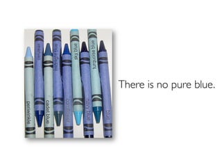
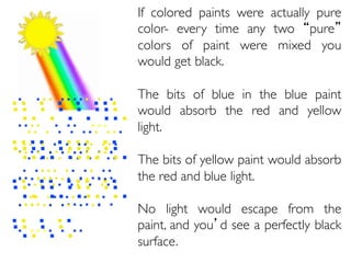
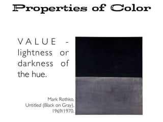
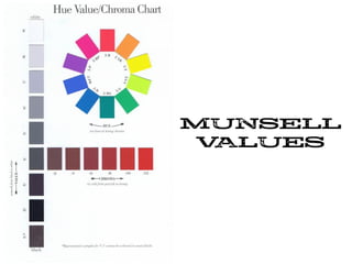
Download as PDF, PPTX


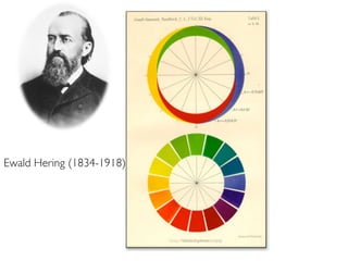
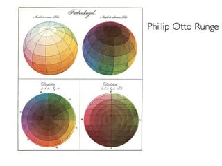

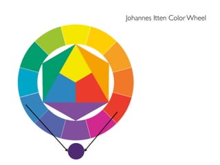
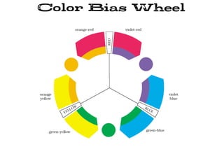
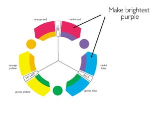
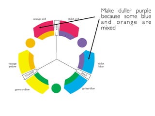
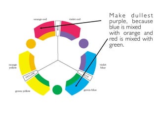
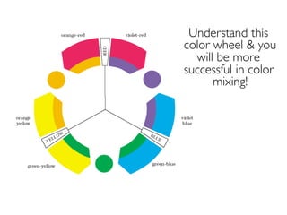
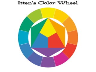
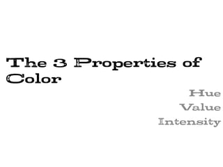
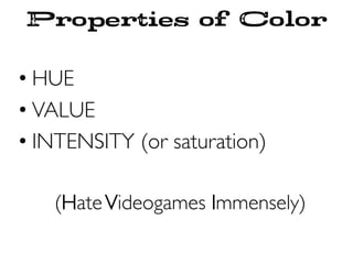
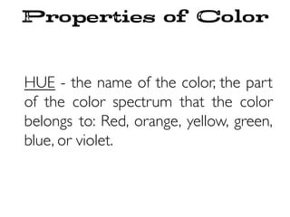
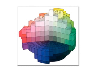
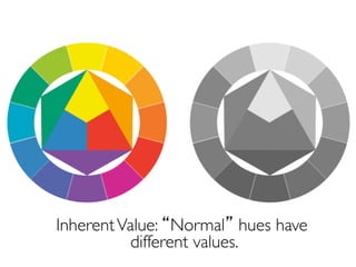
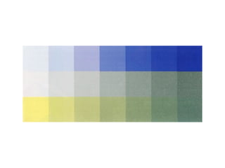
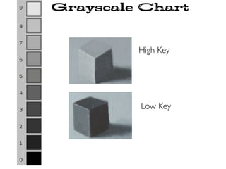
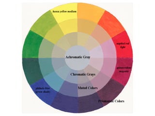
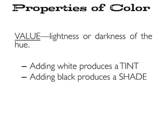
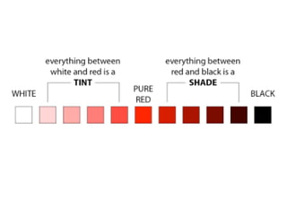
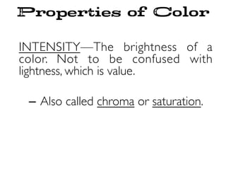
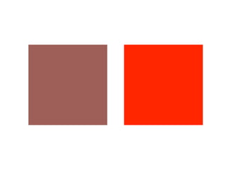
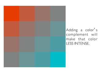
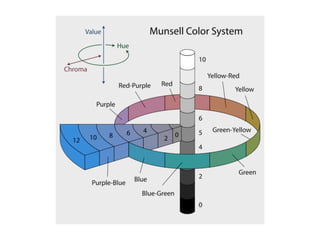
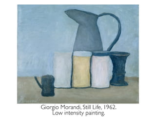
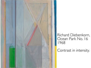
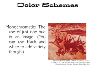
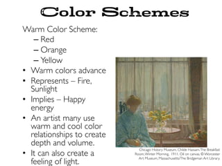
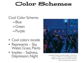
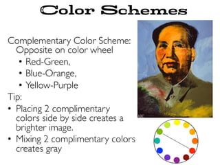
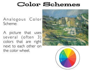
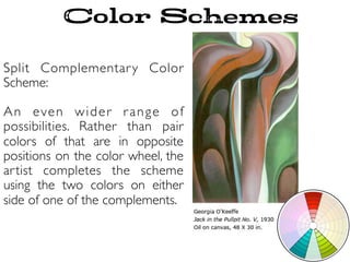
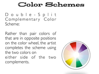
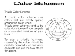
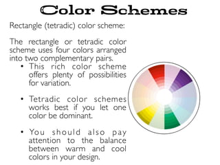
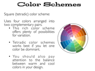
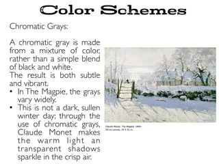
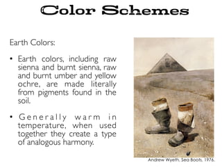
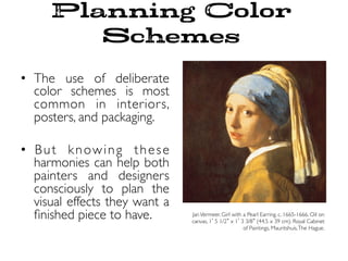
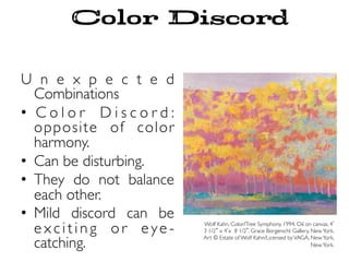
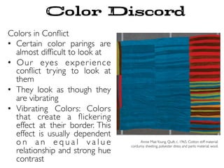
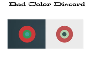
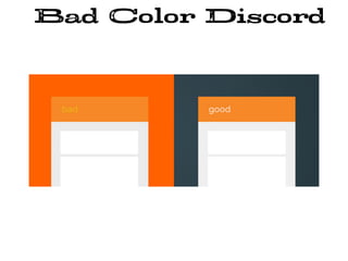

This document provides an overview of color theory and color schemes. It discusses Johannes Itten's color wheel and the three properties of color: hue, value, and intensity. It explains various color schemes including monochromatic, warm, cool, complementary, analogous, split-complementary, double split-complementary, triadic, rectangular, and square. It also covers chromatic grays, earth colors, planning color schemes, unexpected color combinations, colors in conflict, and different uses of color in painting like local color, optical color, subjective color, and heightened color.


