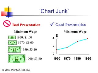
© 2003 Prentice-Hall, Inc.
Chapter 2
Presenting Data in Tables
and Charts
Business Statistics
(9th
Edition)
© 2003 Prentice-Hall, Inc.
Chapter Topics
 Guidelines to Analyze data
 Organizing Numerical Data
 The Ordered Array
 Tabulating and Graphing Univariate Numerical Data
 Frequency Distributions: Tables, Histograms, Polygons
 Describing Distribution:
Shape, Center and Spread
 Cumulative Distributions: Tables, the Ogive
 Graphing Bivariate Numerical Data
© 2003 Prentice-Hall, Inc.
Chapter Topics
 Displaying Categorical Data
 Tabulating and Graphing Univariate Categorical Data
 The Summary Table
 Bar and Pie Charts
 Tabulating and Graphing Bivariate Categorical Data
 Contingency Tables
 Side by Side Bar Charts
 Graphical Excellence and Common Errors in
Presenting Data
(continued)
© 2003 Prentice-Hall, Inc.
Guidelines to Analyze data
 First learn something about the context:
 What was measured?
 What are the units?
 How was the measurement carried out?
 Where the data measured for a particular purpose?
 Then make a picture.
It is sometimes said that there are three rules for starting a
data analysis:
 Plot the data, plot the data, and plot the data.
 Look for an overall pattern and for deviations from that
pattern. Such deviations are called outliers.
© 2003 Prentice-Hall, Inc.
Organizing Numerical Data
Numerical Data
Ordered Array
Frequency Distributions
Cumulative Distributions
Histograms Ogive
Tables
41, 24, 32, 26, 27, 27, 30, 24, 38, 21
21, 24, 24, 26, 27, 27, 30, 32, 38, 41
© 2003 Prentice-Hall, Inc.
 Data in RawRaw Form (as Collected):
24, 26, 24, 21, 27, 27, 30, 41, 32, 38
 Data in Ordered ArrayOrdered Array from Smallest to LargestSmallest to Largest:
21, 24, 24, 26, 27, 27, 30, 32, 38, 41
Organizing Numerical Data
(continued)
© 2003 Prentice-Hall, Inc.
Tabulating and Graphing
Numerical Data
Ogive
0
20
40
60
80
100
120
10 20 30 40 50 60
0
1
2
3
4
5
6
7
10 20 30 40 50 60
Numerical Data
Ordered Array
Histograms Ogive
Tables
41, 24, 32, 26, 27, 27, 30, 24, 38, 21
21, 24, 24, 26, 27, 27, 30, 32, 38, 41
Frequency Distributions
Cumulative Distributions
© 2003 Prentice-Hall, Inc.
Tabulating Numerical Data:
Frequency Distributions
 Sort Raw Data in Ascending Order
12, 13, 17, 21, 24, 24, 26, 27, 27, 30, 32, 35, 37, 38, 41, 43, 44, 46, 53, 58
 Find Range: 58 - 12 = 46
 Select Number of Classes: 5 (usually between 5 and 15)
 Compute Class Interval (Width): 10 (46/5 then round up)
(To make it simple we will always use 10 as Class Interval or
for this course)
 Determine Class Boundaries (Limits):10, 20, 30, 40, 50, 60
 Compute Class Midpoints: 15, 25, 35, 45, 55
 Count Observations & Assign to Classes
© 2003 Prentice-Hall, Inc.
Frequency Distributions, Relative Frequency
Distributions and Percentage Distributions
Class Frequency
10 but under 20 3 .15 15
20 but under 30 6 .30 30
30 but under 40 5 .25 25
40 but under 50 4 .20 20
50 but under 60 2 .10 10
Total 20 1 100
Relative
Frequency
Percentage
Data in Ordered Array:
12, 13, 17, 21, 24, 24, 26, 27, 27, 30, 32, 35, 37, 38, 41, 43, 44, 46, 53, 58
© 2003 Prentice-Hall, Inc.
Graphing Numerical Data:
The Histogram
Histogram
0
3
6
5
4
2
0
0
1
2
3
4
5
6
7
5 15 25 35 45 55 More
Frequency
Data in Ordered Array:
12, 13, 17, 21, 24, 24, 26, 27, 27, 30, 32, 35, 37, 38, 41, 43, 44, 46, 53, 58
No Gaps
Between
Bars
Class Midpoints
Class Boundaries
© 2003 Prentice-Hall, Inc.
Bar Chart
How tall are the tallest soldiers in this group?
1. How many in this group are between 65 and 67 inches tall?
2. If we selected a soldier at random from this group, would you
estimate that he or she is more likely to be taller than 65 inches or
shorter than 65 inches? (Hint: No calculation is needed. Judge from
the way the display looks.)
© 2003 Prentice-Hall, Inc.
Tabulating Numerical Data:
Cumulative Frequency
Lower Cumulative Cumulative
Limit Frequency % Frequency
10 0 0
20 3 15
30 9 45
40 14 70
50 18 90
60 20 100
Data in Ordered Array:
12, 13, 17, 21, 24, 24, 26, 27, 27, 30, 32, 35, 37, 38, 41, 43, 44, 46, 53, 58
Always
Starts
at Zero
Always
Ends at
at 100%
© 2003 Prentice-Hall, Inc.
Graphing Numerical Data:
The Ogive (Cumulative % Polygon)
Ogive
0
20
40
60
80
100
10 20 30 40 50 60
Class Boundaries (Not Midpoints)
Data in Ordered Array :
12, 13, 17, 21, 24, 24, 26, 27, 27, 30, 32, 35, 37, 38, 41, 43, 44, 46, 53, 58
© 2003 Prentice-Hall, Inc.
Graphing Bivariate Numerical
Data (Scatter Plot)
Mutual Funds Scatter Plot
0
10
20
30
40
0 10 20 30 40
Net Asset Values
TotalYearto
DateReturn(%)
© 2003 Prentice-Hall, Inc.
Tabulating and Graphing
Univariate Categorical Data
Categorical Data
Tabulating Data
The Summary Table
Graphing Data
Pie Charts
Pareto DiagramBar Charts
© 2003 Prentice-Hall, Inc.
Univariate and Bivariate Analysis by
Tables and Charts
of Car Data
Variables:
•Miles per Gallon
•Type of Drive
•Weight
© 2003 Prentice-Hall, Inc.
Variables
 We will be looking at 3 variables relating to
cars
 We Will use
 Histograms
 Ogives
 Scatter Plots (Bivariate Data)
© 2003 Prentice-Hall, Inc.
The following Data Relates to Front
and Rear Wheel Drive Cars
Drive Type and Miles per Gallon (Rear)
Cumulative Frequency
12 to under 14 13 2 8.0% 12 0 0.00%
14 to under 16 15 4 16.0% 14 0 0.00%
16 to under 18 17 3 12.0% 16 4 17.39%
18 to under 20 19 8 32.0% 18 7 30.43%
20 to under 22 21 4 16.0% 20 15 65.22%
22 to under 24 23 2 8.0% 22 19 82.61%
24 to under 26 25 2 8.0% 24 21 91.30%
26 to under 28 27 0 0.0% 26 23 100.00%
28 to under 30 29 0 0.0% 28 23 100.00%
30 to under 32 31 0 0.0% 30 23 100.00%
32 to under 34 33 0 0.0% 32 23 100.00%
Total 25 100.0%
Cumulative %
Frequency
Distribution
Percentage
Distribution
Lower
Limit
Cumulative
Frequency
Lo
wer Upper Limit Mid points
Drive Type and Miles per Gallon (Front)
Cumulative Frequency
12 to under 14 13 0 0.00% 12 0 0.00%
14 to under 16 15 3 3.70% 14 0 0.00%
16 to under 18 17 1 1.23% 16 3 3.70%
18 to under 20 19 12 14.81% 18 4 4.94%
20 to under 22 21 19 23.46% 20 16 19.75%
22 to under 24 23 22 27.16% 22 35 43.21%
24 to under 26 25 11 13.58% 24 57 70.37%
26 to under 28 27 6 7.41% 26 68 83.95%
28 to under 30 29 4 4.94% 28 74 91.36%
30 to under 32 31 3 3.70% 30 78 96.30%
32 to under 34 33 0 0.00% 32 81 100.00%
Cumulative
%
Frequency
Distribution
Percentage
Distribution Lower Limit
Cumulative
Frequency
Lower
limit
Upper
Limit
Mid
points
© 2003 Prentice-Hall, Inc.
0%
20%
40%
60%
80%
100%
120%
12 14 16 18 20 22 24 26 28 30 32
Lower Limits: Miles per Gallon
Percentage
Ogive: Front Wheel Drive
What percentage of the Front
wheel Drive Cars do: -
•More than 19 miles per gallon
•Less than 27 Miles per gallon
Estimate the miles per gallon
for: -
•50 Percentile of Front Wheel
Drive Cars:
•25 Percentile of Front Wheel
Drive Cars
© 2003 Prentice-Hall, Inc.
0%
20%
40%
60%
80%
100%
120%
12 14 16 18 20 22 24 26 28 30
Lower limit: Miles per Gallon
Percentage
Ogive: Rear Wheel Drive
What percentage of the Rear
wheel Drive Cars do: -
•More than 19 miles per gallon
•Less than 27 Miles per gallon
Estimate the miles per gallon
for: -
•50 Percentile of Rear Wheel
Drive Cars:
•Rear Percentile of Front Wheel
Drive Cars
© 2003 Prentice-Hall, Inc.
To Compare Distributions
 Compare Frequency and Percentage
Polygons for Front and Rear Drive Cars
 Compare Ogives for Front and Rear Drive
Cars
© 2003 Prentice-Hall, Inc.
0%
20%
40%
60%
80%
100%
120%
12 14 16 18 20 22 24 26 28 30 32
Lower Limit Miles per Gallon
Front Rear
Cumulative Percentage Polygon:
Drive Type and Miles per Gallon
Answer the following True or False. This
graph shows:
• Overall the miles per gallon for Front
Wheel is better than Rear Wheel Drive
Cars
• 80% of Front Wheel Drive Cars do
less than 21 Miles per gallon
© 2003 Prentice-Hall, Inc.
Car Weight (lbs) V’s Miles per
Gallon
0
1,000
2,000
3,000
4,000
5,000
6,000
7,000
0 5 10 15 20 25 30 35
Miles per Gallon
Weight (lbs)
Answer the Following True or False. This graph
shows:
• Overall the Weight of the car is associated with the
Miles per gallon
• The Heavier the car the greater the miles per
gallon
© 2003 Prentice-Hall, Inc.
Displaying Categorical Data
Three Rules of Data Analysis: -
 Make a picture – It will reveal things you can not
see on a table and will help you think clearly
 Make a picture – Well designed display will show
the important features and patterns in your data i.e.
missing wrong data or unexpected patterns
 Make Picture –It is the best way to tell others what
about your data.
© 2003 Prentice-Hall, Inc.
Frequency Tables
1. What is the most common hair color in this group of children?
2. What is the second most common color?
3. Are the categories given here well-defined?
4. If not, how would you improve them?
5. Does this distribution of hair colors resemble the distribution you see among
people in Cambodia?
6. If not, how does it differ?
Fair Red Medium Dark Black
27% 5.3% 39.7% 25.8
%
2.2%
© 2003 Prentice-Hall, Inc.
0%
5%
10%
15%
20%
25%
30%
35%
40%
45%
Red Medium Dark Black
Bar Chart
1. What is the most common hair color in this group of children?
2. What is the second most common color?
3. Is there a greater difference between the relative frequencies of Red and
Black, or between the relative frequencies of Medium and Dark?
© 2003 Prentice-Hall, Inc.
Graphing Univariate
Categorical Data
0 10 20 30 40 50
Stoc ks
B onds
S avings
CD
Categorical Data
Tabulating Data
The Summary Table
Graphing Data
Pie Charts
Bar Charts
© 2003 Prentice-Hall, Inc.
Tabulating and Graphing
Bivariate Categorical Data
 Contingency Tables:
Standard of Living A B C Total
Rich 8 5 0 13
Medium 15 10 1 26
Poor 39 39 25 103
Poorest 37 41 50 128
Total 99 95 76 270
Standard of Living A B C Total
Rich 8% 5% 0% 5%
Medium 15% 11% 1% 10%
Poor 39% 41% 33% 38%
Poorest 37% 43% 66% 47%
Total 100% 100% 100% 100%
Cummune
Cummune
© 2003 Prentice-Hall, Inc.
Pie Chart
(Analyzing Standard of Living in 4 Communes)
Rich
5%
Medium
10%
Poor
38%
Poorest
47%
Rich
Medium
Poor
Poorest
Standard of Living
© 2003 Prentice-Hall, Inc.
Bivariate Categorical Data
(for Standard of Living by Commune)
0 10 2 0 3 0 4 0 5 0 6 0
Rich
Medium
Poor
Poorest
C
B
A
Commun e
Frequency
© 2003 Prentice-Hall, Inc.
Stacked Bar Chart
Bivariate Categorical Data
0%
20%
40%
60%
80%
100%
A B C
Poorest
Poor
Medium
Rich
Which commune has the largest percentage of the Poorest?
© 2003 Prentice-Hall, Inc.
Principles of Graphical
Excellence
 Well-Designed Presentation of Data that Provides:
 Substance
 Statistics
 Design
 Communicate Complex Ideas with Clarity, Precision
and Efficiency
 Gives the Largest Number of Ideas in the Most
Efficient Manner
 Almost Always Involves Several Dimensions
 Telling the Truth about the Data
© 2003 Prentice-Hall, Inc.
Errors in Presenting Data
 Using ‘Chart Junk’
 No Relative Basis in Comparing Data
between Groups
 Compressing the Vertical Axis
 No Zero Point on the Vertical Axis
© 2003 Prentice-Hall, Inc.
‘Chart Junk’
Good Presentation
1960: $1.00
1970: $1.60
1980: $3.10
1990: $3.80
Minimum Wage Minimum Wage
0
2
4
1960 1970 1980 1990
$
Bad Presentation 
© 2003 Prentice-Hall, Inc.
No Relative Basis
Good Presentation
A’s received by
students
A’s received by
students
Bad Presentation
0
100
200
300
FR SO JR SR
Freq.
0
10
20
30
FR SO JR SR
%
FR = Freshmen, SO = Sophomore, JR = Junior, SR = Senior

© 2003 Prentice-Hall, Inc.
Compressing Vertical Axis
Good Presentation
Quarterly Sales Quarterly Sales
Bad Presentation
0
25
50
Q1 Q2 Q3 Q4
$
0
100
200
Q1 Q2 Q3 Q4
$

© 2003 Prentice-Hall, Inc.
No Zero Point on Vertical Axis
Good Presentation
Monthly Sales
Monthly Sales
Bad Presentation
0
39
42
45
J F M A M J
$
36
39
42
45
J F M A M J
$
Graphing the first six months of sales
36

© 2003 Prentice-Hall, Inc.
Chapter Summary
 Organized Numerical Data
 The Ordered Array and Stem-Leaf Display
 Tabulated and Graphed Univariate Numerical
Data
 Frequency Distributions: Tables, Histograms,
Polygons
 Cumulative Distributions: Tables, the Ogive
 Graphed Bivariate Numerical Data
© 2003 Prentice-Hall, Inc.
Chapter Summary
 Tabulated and Graphed Univariate Categorical Data
 The Summary Table
 Bar and Pie Charts, the Pareto Diagram
 Tabulated and Graphed Bivariate Categorical Data
 Contingency Tables
 Side by Side Charts
 Discussed Graphical Excellence and Common Errors
in Presenting Data
(continued)

Business Statistics Chapter 2

  • 1.
    © 2003 Prentice-Hall,Inc. Chapter 2 Presenting Data in Tables and Charts Business Statistics (9th Edition)
  • 2.
    © 2003 Prentice-Hall,Inc. Chapter Topics  Guidelines to Analyze data  Organizing Numerical Data  The Ordered Array  Tabulating and Graphing Univariate Numerical Data  Frequency Distributions: Tables, Histograms, Polygons  Describing Distribution: Shape, Center and Spread  Cumulative Distributions: Tables, the Ogive  Graphing Bivariate Numerical Data
  • 3.
    © 2003 Prentice-Hall,Inc. Chapter Topics  Displaying Categorical Data  Tabulating and Graphing Univariate Categorical Data  The Summary Table  Bar and Pie Charts  Tabulating and Graphing Bivariate Categorical Data  Contingency Tables  Side by Side Bar Charts  Graphical Excellence and Common Errors in Presenting Data (continued)
  • 4.
    © 2003 Prentice-Hall,Inc. Guidelines to Analyze data  First learn something about the context:  What was measured?  What are the units?  How was the measurement carried out?  Where the data measured for a particular purpose?  Then make a picture. It is sometimes said that there are three rules for starting a data analysis:  Plot the data, plot the data, and plot the data.  Look for an overall pattern and for deviations from that pattern. Such deviations are called outliers.
  • 5.
    © 2003 Prentice-Hall,Inc. Organizing Numerical Data Numerical Data Ordered Array Frequency Distributions Cumulative Distributions Histograms Ogive Tables 41, 24, 32, 26, 27, 27, 30, 24, 38, 21 21, 24, 24, 26, 27, 27, 30, 32, 38, 41
  • 6.
    © 2003 Prentice-Hall,Inc.  Data in RawRaw Form (as Collected): 24, 26, 24, 21, 27, 27, 30, 41, 32, 38  Data in Ordered ArrayOrdered Array from Smallest to LargestSmallest to Largest: 21, 24, 24, 26, 27, 27, 30, 32, 38, 41 Organizing Numerical Data (continued)
  • 7.
    © 2003 Prentice-Hall,Inc. Tabulating and Graphing Numerical Data Ogive 0 20 40 60 80 100 120 10 20 30 40 50 60 0 1 2 3 4 5 6 7 10 20 30 40 50 60 Numerical Data Ordered Array Histograms Ogive Tables 41, 24, 32, 26, 27, 27, 30, 24, 38, 21 21, 24, 24, 26, 27, 27, 30, 32, 38, 41 Frequency Distributions Cumulative Distributions
  • 8.
    © 2003 Prentice-Hall,Inc. Tabulating Numerical Data: Frequency Distributions  Sort Raw Data in Ascending Order 12, 13, 17, 21, 24, 24, 26, 27, 27, 30, 32, 35, 37, 38, 41, 43, 44, 46, 53, 58  Find Range: 58 - 12 = 46  Select Number of Classes: 5 (usually between 5 and 15)  Compute Class Interval (Width): 10 (46/5 then round up) (To make it simple we will always use 10 as Class Interval or for this course)  Determine Class Boundaries (Limits):10, 20, 30, 40, 50, 60  Compute Class Midpoints: 15, 25, 35, 45, 55  Count Observations & Assign to Classes
  • 9.
    © 2003 Prentice-Hall,Inc. Frequency Distributions, Relative Frequency Distributions and Percentage Distributions Class Frequency 10 but under 20 3 .15 15 20 but under 30 6 .30 30 30 but under 40 5 .25 25 40 but under 50 4 .20 20 50 but under 60 2 .10 10 Total 20 1 100 Relative Frequency Percentage Data in Ordered Array: 12, 13, 17, 21, 24, 24, 26, 27, 27, 30, 32, 35, 37, 38, 41, 43, 44, 46, 53, 58
  • 10.
    © 2003 Prentice-Hall,Inc. Graphing Numerical Data: The Histogram Histogram 0 3 6 5 4 2 0 0 1 2 3 4 5 6 7 5 15 25 35 45 55 More Frequency Data in Ordered Array: 12, 13, 17, 21, 24, 24, 26, 27, 27, 30, 32, 35, 37, 38, 41, 43, 44, 46, 53, 58 No Gaps Between Bars Class Midpoints Class Boundaries
  • 11.
    © 2003 Prentice-Hall,Inc. Bar Chart How tall are the tallest soldiers in this group? 1. How many in this group are between 65 and 67 inches tall? 2. If we selected a soldier at random from this group, would you estimate that he or she is more likely to be taller than 65 inches or shorter than 65 inches? (Hint: No calculation is needed. Judge from the way the display looks.)
  • 12.
    © 2003 Prentice-Hall,Inc. Tabulating Numerical Data: Cumulative Frequency Lower Cumulative Cumulative Limit Frequency % Frequency 10 0 0 20 3 15 30 9 45 40 14 70 50 18 90 60 20 100 Data in Ordered Array: 12, 13, 17, 21, 24, 24, 26, 27, 27, 30, 32, 35, 37, 38, 41, 43, 44, 46, 53, 58 Always Starts at Zero Always Ends at at 100%
  • 13.
    © 2003 Prentice-Hall,Inc. Graphing Numerical Data: The Ogive (Cumulative % Polygon) Ogive 0 20 40 60 80 100 10 20 30 40 50 60 Class Boundaries (Not Midpoints) Data in Ordered Array : 12, 13, 17, 21, 24, 24, 26, 27, 27, 30, 32, 35, 37, 38, 41, 43, 44, 46, 53, 58
  • 14.
    © 2003 Prentice-Hall,Inc. Graphing Bivariate Numerical Data (Scatter Plot) Mutual Funds Scatter Plot 0 10 20 30 40 0 10 20 30 40 Net Asset Values TotalYearto DateReturn(%)
  • 15.
    © 2003 Prentice-Hall,Inc. Tabulating and Graphing Univariate Categorical Data Categorical Data Tabulating Data The Summary Table Graphing Data Pie Charts Pareto DiagramBar Charts
  • 16.
    © 2003 Prentice-Hall,Inc. Univariate and Bivariate Analysis by Tables and Charts of Car Data Variables: •Miles per Gallon •Type of Drive •Weight
  • 17.
    © 2003 Prentice-Hall,Inc. Variables  We will be looking at 3 variables relating to cars  We Will use  Histograms  Ogives  Scatter Plots (Bivariate Data)
  • 18.
    © 2003 Prentice-Hall,Inc. The following Data Relates to Front and Rear Wheel Drive Cars Drive Type and Miles per Gallon (Rear) Cumulative Frequency 12 to under 14 13 2 8.0% 12 0 0.00% 14 to under 16 15 4 16.0% 14 0 0.00% 16 to under 18 17 3 12.0% 16 4 17.39% 18 to under 20 19 8 32.0% 18 7 30.43% 20 to under 22 21 4 16.0% 20 15 65.22% 22 to under 24 23 2 8.0% 22 19 82.61% 24 to under 26 25 2 8.0% 24 21 91.30% 26 to under 28 27 0 0.0% 26 23 100.00% 28 to under 30 29 0 0.0% 28 23 100.00% 30 to under 32 31 0 0.0% 30 23 100.00% 32 to under 34 33 0 0.0% 32 23 100.00% Total 25 100.0% Cumulative % Frequency Distribution Percentage Distribution Lower Limit Cumulative Frequency Lo wer Upper Limit Mid points Drive Type and Miles per Gallon (Front) Cumulative Frequency 12 to under 14 13 0 0.00% 12 0 0.00% 14 to under 16 15 3 3.70% 14 0 0.00% 16 to under 18 17 1 1.23% 16 3 3.70% 18 to under 20 19 12 14.81% 18 4 4.94% 20 to under 22 21 19 23.46% 20 16 19.75% 22 to under 24 23 22 27.16% 22 35 43.21% 24 to under 26 25 11 13.58% 24 57 70.37% 26 to under 28 27 6 7.41% 26 68 83.95% 28 to under 30 29 4 4.94% 28 74 91.36% 30 to under 32 31 3 3.70% 30 78 96.30% 32 to under 34 33 0 0.00% 32 81 100.00% Cumulative % Frequency Distribution Percentage Distribution Lower Limit Cumulative Frequency Lower limit Upper Limit Mid points
  • 19.
    © 2003 Prentice-Hall,Inc. 0% 20% 40% 60% 80% 100% 120% 12 14 16 18 20 22 24 26 28 30 32 Lower Limits: Miles per Gallon Percentage Ogive: Front Wheel Drive What percentage of the Front wheel Drive Cars do: - •More than 19 miles per gallon •Less than 27 Miles per gallon Estimate the miles per gallon for: - •50 Percentile of Front Wheel Drive Cars: •25 Percentile of Front Wheel Drive Cars
  • 20.
    © 2003 Prentice-Hall,Inc. 0% 20% 40% 60% 80% 100% 120% 12 14 16 18 20 22 24 26 28 30 Lower limit: Miles per Gallon Percentage Ogive: Rear Wheel Drive What percentage of the Rear wheel Drive Cars do: - •More than 19 miles per gallon •Less than 27 Miles per gallon Estimate the miles per gallon for: - •50 Percentile of Rear Wheel Drive Cars: •Rear Percentile of Front Wheel Drive Cars
  • 21.
    © 2003 Prentice-Hall,Inc. To Compare Distributions  Compare Frequency and Percentage Polygons for Front and Rear Drive Cars  Compare Ogives for Front and Rear Drive Cars
  • 22.
    © 2003 Prentice-Hall,Inc. 0% 20% 40% 60% 80% 100% 120% 12 14 16 18 20 22 24 26 28 30 32 Lower Limit Miles per Gallon Front Rear Cumulative Percentage Polygon: Drive Type and Miles per Gallon Answer the following True or False. This graph shows: • Overall the miles per gallon for Front Wheel is better than Rear Wheel Drive Cars • 80% of Front Wheel Drive Cars do less than 21 Miles per gallon
  • 23.
    © 2003 Prentice-Hall,Inc. Car Weight (lbs) V’s Miles per Gallon 0 1,000 2,000 3,000 4,000 5,000 6,000 7,000 0 5 10 15 20 25 30 35 Miles per Gallon Weight (lbs) Answer the Following True or False. This graph shows: • Overall the Weight of the car is associated with the Miles per gallon • The Heavier the car the greater the miles per gallon
  • 24.
    © 2003 Prentice-Hall,Inc. Displaying Categorical Data Three Rules of Data Analysis: -  Make a picture – It will reveal things you can not see on a table and will help you think clearly  Make a picture – Well designed display will show the important features and patterns in your data i.e. missing wrong data or unexpected patterns  Make Picture –It is the best way to tell others what about your data.
  • 25.
    © 2003 Prentice-Hall,Inc. Frequency Tables 1. What is the most common hair color in this group of children? 2. What is the second most common color? 3. Are the categories given here well-defined? 4. If not, how would you improve them? 5. Does this distribution of hair colors resemble the distribution you see among people in Cambodia? 6. If not, how does it differ? Fair Red Medium Dark Black 27% 5.3% 39.7% 25.8 % 2.2%
  • 26.
    © 2003 Prentice-Hall,Inc. 0% 5% 10% 15% 20% 25% 30% 35% 40% 45% Red Medium Dark Black Bar Chart 1. What is the most common hair color in this group of children? 2. What is the second most common color? 3. Is there a greater difference between the relative frequencies of Red and Black, or between the relative frequencies of Medium and Dark?
  • 27.
    © 2003 Prentice-Hall,Inc. Graphing Univariate Categorical Data 0 10 20 30 40 50 Stoc ks B onds S avings CD Categorical Data Tabulating Data The Summary Table Graphing Data Pie Charts Bar Charts
  • 28.
    © 2003 Prentice-Hall,Inc. Tabulating and Graphing Bivariate Categorical Data  Contingency Tables: Standard of Living A B C Total Rich 8 5 0 13 Medium 15 10 1 26 Poor 39 39 25 103 Poorest 37 41 50 128 Total 99 95 76 270 Standard of Living A B C Total Rich 8% 5% 0% 5% Medium 15% 11% 1% 10% Poor 39% 41% 33% 38% Poorest 37% 43% 66% 47% Total 100% 100% 100% 100% Cummune Cummune
  • 29.
    © 2003 Prentice-Hall,Inc. Pie Chart (Analyzing Standard of Living in 4 Communes) Rich 5% Medium 10% Poor 38% Poorest 47% Rich Medium Poor Poorest Standard of Living
  • 30.
    © 2003 Prentice-Hall,Inc. Bivariate Categorical Data (for Standard of Living by Commune) 0 10 2 0 3 0 4 0 5 0 6 0 Rich Medium Poor Poorest C B A Commun e Frequency
  • 31.
    © 2003 Prentice-Hall,Inc. Stacked Bar Chart Bivariate Categorical Data 0% 20% 40% 60% 80% 100% A B C Poorest Poor Medium Rich Which commune has the largest percentage of the Poorest?
  • 32.
    © 2003 Prentice-Hall,Inc. Principles of Graphical Excellence  Well-Designed Presentation of Data that Provides:  Substance  Statistics  Design  Communicate Complex Ideas with Clarity, Precision and Efficiency  Gives the Largest Number of Ideas in the Most Efficient Manner  Almost Always Involves Several Dimensions  Telling the Truth about the Data
  • 33.
    © 2003 Prentice-Hall,Inc. Errors in Presenting Data  Using ‘Chart Junk’  No Relative Basis in Comparing Data between Groups  Compressing the Vertical Axis  No Zero Point on the Vertical Axis
  • 34.
    © 2003 Prentice-Hall,Inc. ‘Chart Junk’ Good Presentation 1960: $1.00 1970: $1.60 1980: $3.10 1990: $3.80 Minimum Wage Minimum Wage 0 2 4 1960 1970 1980 1990 $ Bad Presentation 
  • 35.
    © 2003 Prentice-Hall,Inc. No Relative Basis Good Presentation A’s received by students A’s received by students Bad Presentation 0 100 200 300 FR SO JR SR Freq. 0 10 20 30 FR SO JR SR % FR = Freshmen, SO = Sophomore, JR = Junior, SR = Senior 
  • 36.
    © 2003 Prentice-Hall,Inc. Compressing Vertical Axis Good Presentation Quarterly Sales Quarterly Sales Bad Presentation 0 25 50 Q1 Q2 Q3 Q4 $ 0 100 200 Q1 Q2 Q3 Q4 $ 
  • 37.
    © 2003 Prentice-Hall,Inc. No Zero Point on Vertical Axis Good Presentation Monthly Sales Monthly Sales Bad Presentation 0 39 42 45 J F M A M J $ 36 39 42 45 J F M A M J $ Graphing the first six months of sales 36 
  • 38.
    © 2003 Prentice-Hall,Inc. Chapter Summary  Organized Numerical Data  The Ordered Array and Stem-Leaf Display  Tabulated and Graphed Univariate Numerical Data  Frequency Distributions: Tables, Histograms, Polygons  Cumulative Distributions: Tables, the Ogive  Graphed Bivariate Numerical Data
  • 39.
    © 2003 Prentice-Hall,Inc. Chapter Summary  Tabulated and Graphed Univariate Categorical Data  The Summary Table  Bar and Pie Charts, the Pareto Diagram  Tabulated and Graphed Bivariate Categorical Data  Contingency Tables  Side by Side Charts  Discussed Graphical Excellence and Common Errors in Presenting Data (continued)