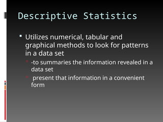
Descriptive Statistics
Utilizesnumerical, tabular and
graphical methods to look for patterns
in a data set
-to summaries the information revealed in a
data set
present that information in a convenient
form
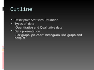
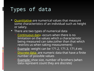
Types of data
Quantitative-are numerical values that measure
some characteristics of an individual such as height
or salary.
There are two types of numerical data
Continuous data -occurs when there is no
limitation on the values which a characteristic
being measured can take.(other than that which
restricts us when taking measurement)
Example: weight can be 171.2, 171.3, 171,4 etc
Discrete data- are numeric data that have a finite
number of possible values
Example: shoe size, number of brothers (when
data represent count they are discrete)
6.
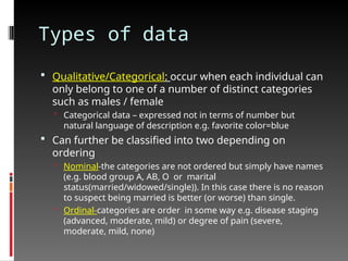
Types of data
Qualitative/Categorical: occur when each individual can
only belong to one of a number of distinct categories
such as males / female
Categorical data – expressed not in terms of number but
natural language of description e.g. favorite color=blue
Can further be classified into two depending on
ordering
Nominal-the categories are not ordered but simply have names
(e.g. blood group A, AB, O or marital
status(married/widowed/single)). In this case there is no reason
to suspect being married is better (or worse) than single.
Ordinal-categories are order in some way e.g. disease staging
(advanced, moderate, mild) or degree of pain (severe,
moderate, mild, none)
7.
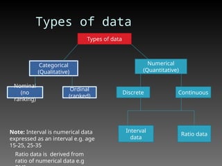
Types of data
Typesof data
Categorical
(Qualitative)
Numerical
(Quantitative)
Nominal
(no
ranking)
Ordinal
(ranked)
Discrete Continuous
Interval
data
Ratio data
Note: Interval is numerical data
expressed as an interval e.g. age
15-25, 25-35
Ratio data is derived from
ratio of numerical data e.g
8.
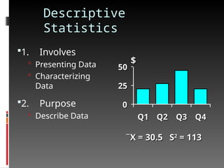
Univariate Analysis
involvesthe examination across cases of one
variable at a time. There are three major
characteristics of a single variable that we tend to
look at:
Frequency distribution
Central tendency
Dispersion
In most situations, we would describe all three of
these characteristics for each of the variables in
our study.
9.
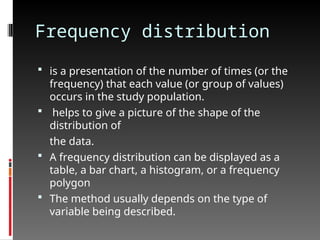
Frequency distribution
isa presentation of the number of times (or the
frequency) that each value (or group of values)
occurs in the study population.
helps to give a picture of the shape of the
distribution of
the data.
A frequency distribution can be displayed as a
table, a bar chart, a histogram, or a frequency
polygon
The method usually depends on the type of
variable being described.
10.
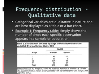
Frequency distribution -
Qualitativedata
Categorical variables are qualitative in nature and
are best displayed as a table or a bar chart.
Example 1: Frequency table; simply shows the
number of times each specific observation
appears in a sample or population.
11.
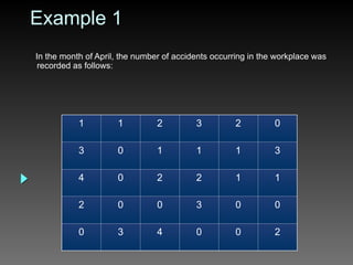
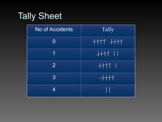
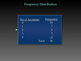
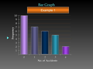
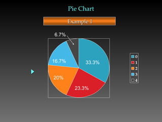
Example 1
In themonth of April, the number of accidents occurring in the workplace was
recorded as follows:
1 1 2 3 2 0
3 0 1 1 1 3
4 0 2 2 1 1
2 0 0 3 0 0
0 3 4 0 0 2
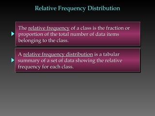
The
The relative frequency
relativefrequency of a class is the fraction or
of a class is the fraction or
proportion of the total number of data items
proportion of the total number of data items
belonging to the class.
belonging to the class.
A
A relative frequency distribution
relative frequency distribution is a tabular
is a tabular
summary of a set of data showing the relative
summary of a set of data showing the relative
frequency for each class.
frequency for each class.
Relative Frequency Distribution
Relative Frequency Distribution
15.
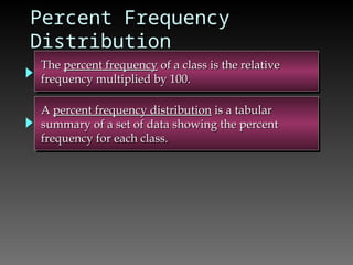
Percent Frequency
Distribution
The
The percentfrequency
percent frequency of a class is the relative
of a class is the relative
frequency multiplied by 100.
frequency multiplied by 100.
A
A percent frequency distribution
percent frequency distribution is a tabular
is a tabular
summary of a set of data showing the percent
summary of a set of data showing the percent
frequency for each class.
frequency for each class.
16.
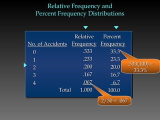
Relative Frequency and
RelativeFrequency and
Percent Frequency Distributions
Percent Frequency Distributions
0
0
1
1
2
2
3
3
4
4
.333
.333
.233
.233
.200
.200
.167
.167
.067
.067
Total
Total 1.000
1.000
33.3
33.3
23.3
23.3
20.0
20.0
16.7
16.7
6.7
6.7
100.0
100.0
Relative
Relative
Frequency
Frequency
Percent
Percent
Frequency
Frequency
No. of Accidents
No. of Accidents
.333(100) =
.333(100) =
33.3%
33.3%
2/30 = .067
2/30 = .067
17.
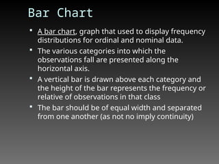
Bar Chart
Abar chart, graph that used to display frequency
distributions for ordinal and nominal data.
The various categories into which the
observations fall are presented along the
horizontal axis.
A vertical bar is drawn above each category and
the height of the bar represents the frequency or
relative of observations in that class
The bar should be of equal width and separated
from one another (as not no imply continuity)
18.
0 1 23 4
Frequency
No. of Accidents
Bar Graph
Bar Graph
1
2
3
4
5
6
7
8
9
10
Example 1
19.
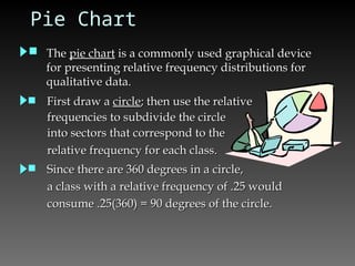
Pie Chart
The
Thepie chart
pie chart is a commonly used graphical device
is a commonly used graphical device
for presenting relative frequency distributions for
for presenting relative frequency distributions for
qualitative data.
qualitative data.
First draw a
First draw a circle
circle; then use the relative
; then use the relative
frequencies to subdivide the circle
frequencies to subdivide the circle
into sectors that correspond to the
into sectors that correspond to the
relative frequency for each class.
relative frequency for each class.
Since there are 360 degrees in a circle,
Since there are 360 degrees in a circle,
a class with a relative frequency of .25 would
a class with a relative frequency of .25 would
consume .25(360) = 90 degrees of the circle.
consume .25(360) = 90 degrees of the circle.
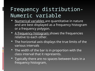
Frequency distribution-
Numeric variable
Numerical variables are quantitative in nature
and are best displayed as a frequency histogram
or a frequency polygon.
A frequency histogram shows the frequencies
relative to each other.
The horizontal axis displays the true limits of the
various intervals
The width of the bar is in proportion with the
class interval that it represents.
Typically there are no spaces between bars in a
frequency histogram,
Frequency Distribution-
Quantitative data
Guidelines for Selecting Number of
Classes
• Use between 5 and 20 classes.
Use between 5 and 20 classes.
• Data sets with a larger number of elements
Data sets with a larger number of elements
usually require a larger number of classes.
usually require a larger number of classes.
• Smaller data sets usually require fewer classes
Smaller data sets usually require fewer classes
25.
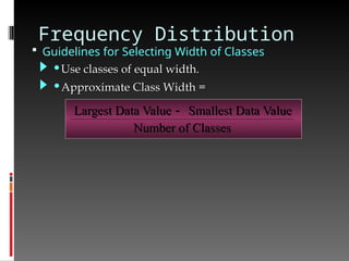
Frequency Distribution
Guidelinesfor Selecting Width of Classes
Largest Data Value Smallest Data Value
Number of Classes
•Use classes of equal width.
Use classes of equal width.
•Approximate Class Width =
Approximate Class Width =
26.
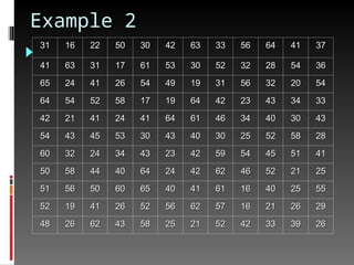
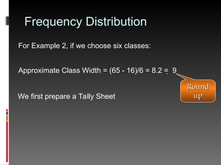
Frequency Distribution
For Example2, if we choose six classes:
Approximate Class Width = (65 - 16)/6 = 8.2 = 9
We first prepare a Tally Sheet
Round
Round
up
up
27.
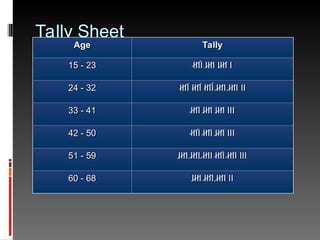
Tally Sheet
Age
Age Tally
Tally
15- 23
15 - 23 IIII IIII IIII I
IIII IIII IIII I
24 - 32
24 - 32 IIII IIII IIII IIII IIII II
IIII IIII IIII IIII IIII II
33 - 41
33 - 41 IIII IIII IIII III
IIII IIII IIII III
42 - 50
42 - 50 IIII IIII IIII III
IIII IIII IIII III
51 - 59
51 - 59 IIII IIII IIII IIII IIII III
IIII IIII IIII IIII IIII III
60 - 68
60 - 68 IIII IIII IIII II
IIII IIII IIII II
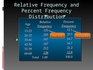
Relative Frequency and
PercentFrequency
Distribution
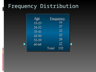
15-23
15-23
24-32
24-32
33-41
33-41
42-50
42-50
51-59
51-59
60-68
60-68
Age
Age
.121
.121
.205
.205
.167
.167
.167
.167
.212
.212
.128
.128
Total 1.00
Total 1.00
Relative
Relative
Frequency
Frequency
12.1
12.1
20.5
20.5
16.7
16.7
16.7
16.7
21.2
21.2
12.8
12.8
100.0
100.0
Percent
Percent
Frequency
Frequency
16/132
16/132 .121(100)
.121(100)
30.
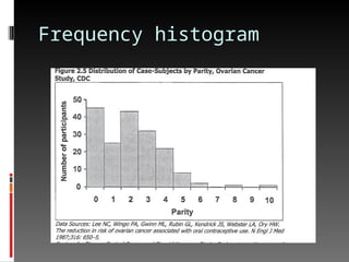
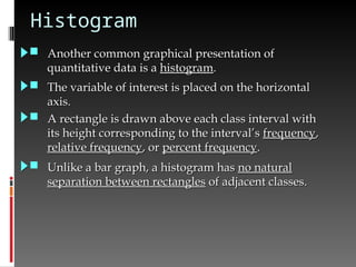
Histogram
Another commongraphical presentation of
Another common graphical presentation of
quantitative data is a
quantitative data is a histogram
histogram.
.
The variable of interest is placed on the horizontal
The variable of interest is placed on the horizontal
axis.
axis.
A rectangle is drawn above each class interval with
A rectangle is drawn above each class interval with
its height corresponding to the interval’s
its height corresponding to the interval’s frequency
frequency,
,
relative frequency
relative frequency, or
, or percent frequency
percent frequency.
.
Unlike a bar graph, a histogram has
Unlike a bar graph, a histogram has no natural
no natural
separation between rectangles
separation between rectangles of adjacent classes.
of adjacent classes.
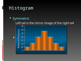
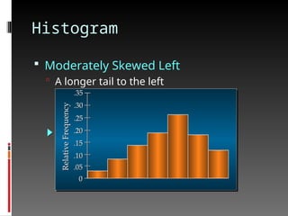
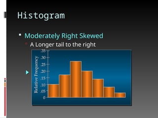
Histogram
Moderately RightSkewed
A Longer tail to the right
Relative
Frequency
.05
.10
.15
.20
.25
.30
.35
0
35.
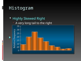
Histogram
Highly SkewedRight
A very long tail to the right
Relative
Frequency
.05
.10
.15
.20
.25
.30
.35
0
36.
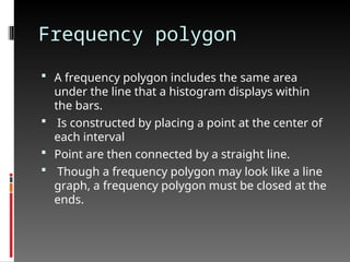
Frequency polygon
Afrequency polygon includes the same area
under the line that a histogram displays within
the bars.
Is constructed by placing a point at the center of
each interval
Point are then connected by a straight line.
Though a frequency polygon may look like a line
graph, a frequency polygon must be closed at the
ends.
37.
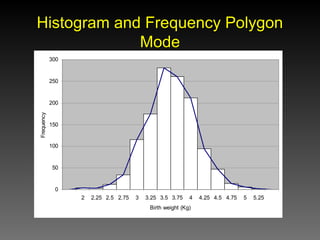
Histogram and FrequencyPolygon
Histogram and Frequency Polygon
Mode
Mode
0
50
100
150
200
250
300
2 2.25 2.5 2.75 3 3.25 3.5 3.75 4 4.25 4.5 4.75 5 5.25
Birth weight (Kg)
Frequency
38.
Other way ofpresenting
data
Quantitative data
Scatter plot
Box-plot
Line graph
Ogive
39.
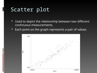
Scatter plot
Usedto depict the relationship between two different
continuous measurements.
Each point on the graph represents a pair of values.
FVC
FEV1
1.55333 4.00667
2.05
4.89
40.
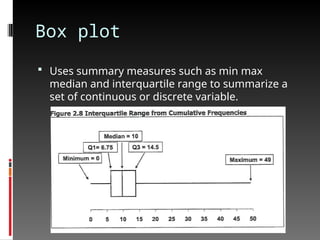
Box plot
Usessummary measures such as min max
median and interquartile range to summarize a
set of continuous or discrete variable.
41.
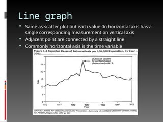
Line graph
Sameas scatter plot but each value 0n horizontal axis has a
single corresponding measurement on vertical axis
Adjacent point are connected by a straight line
Commonly horizontal axis is the time variable
42.
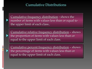
Cumulative frequency distribution
Cumulativefrequency distribution
shows the
shows the
number of items with values less than or equal to
number of items with values less than or equal to
the upper limit of each class..
the upper limit of each class..
Cumulative relative frequency distribution
Cumulative relative frequency distribution – shows
– shows
the proportion of items with values less than or
the proportion of items with values less than or
equal to the upper limit of each class.
equal to the upper limit of each class.
Cumulative Distributions
Cumulative Distributions
Cumulative percent frequency distribution
Cumulative percent frequency distribution – shows
– shows
the percentage of items with values less than or
the percentage of items with values less than or
equal to the upper limit of each class.
equal to the upper limit of each class.
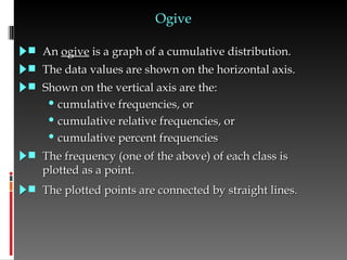
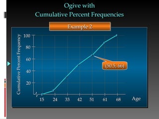
Ogive
Ogive
An
An ogive
ogiveis a graph of a cumulative distribution.
is a graph of a cumulative distribution.
The data values are shown on the horizontal axis.
The data values are shown on the horizontal axis.
Shown on the vertical axis are the:
Shown on the vertical axis are the:
• cumulative frequencies, or
cumulative frequencies, or
• cumulative relative frequencies, or
cumulative relative frequencies, or
• cumulative percent frequencies
cumulative percent frequencies
The frequency (one of the above) of each class is
The frequency (one of the above) of each class is
plotted as a point.
plotted as a point.
The plotted points are connected by straight lines.
The plotted points are connected by straight lines.
45.
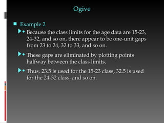
• Because theclass limits for the age data are 15-23,
Because the class limits for the age data are 15-23,
24-32, and so on, there appear to be one-unit gaps
24-32, and so on, there appear to be one-unit gaps
from 23 to 24, 32 to 33, and so on.
from 23 to 24, 32 to 33, and so on.
Ogive
Ogive
• These gaps are eliminated by plotting points
These gaps are eliminated by plotting points
halfway between the class limits.
halfway between the class limits.
• Thus, 23.5 is used for the 15-23 class, 32.5 is used
Thus, 23.5 is used for the 15-23 class, 32.5 is used
for the 24-32 class, and so on.
for the 24-32 class, and so on.
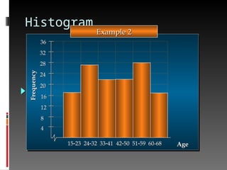
Example 2
Example 2
#37 To return to the birth weight data. We first plotted a histogram based on the frequency in each group. From this we constructed a frequency polygon. The mode is the group with the highest frequency. There is no formula to calculate it. It is found by inspection.
The ease with which the mode can be determined is one advantage of the mode. It gives a quick estimate of the centre of the group, and when the distribution is normal or nearly normal, this estimate is a fair description of the central tendency of the data. The mode is the only measure of central tendency that can be used with data on an ordinal scale.
The mode also has some disadvantages. It is unstable as it may change if the method of grouping changes. It is terminal statistic as it does not give information that can be used for further calculation. It completely disregards extreme scores – it does not reflect how many there are, their values or how far they are from the centre of the group.


![제 23회 보아즈(BOAZ) 빅데이터 컨퍼런스 - [MBOAX] : ABSA를 활용한 소비자 반응 분석 기반 운영 효율화 대시보드 설계](https://cdn.slidesharecdn.com/ss_thumbnails/3-1boaz23rdconferencemboax-260203102709-9d519923-thumbnail.jpg?width=640&height=640&fit=bounds)


![7.__Developing_a_Research_Proposal[1].pptx](https://cdn.slidesharecdn.com/ss_thumbnails/7-260131073037-df92dd7d-thumbnail.jpg?width=640&height=640&fit=bounds)


![Hacking-Uncovered-How-People-Get-Hacked-and-How-to-Stay-Safe[1].pptx](https://cdn.slidesharecdn.com/ss_thumbnails/hacking-uncovered-how-people-get-hacked-and-how-to-stay-safe1-260130170011-4883a9c7-thumbnail.jpg?width=640&height=640&fit=bounds)

