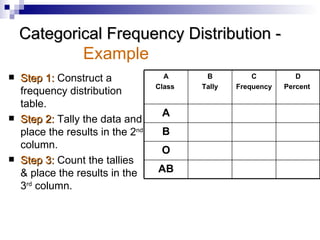
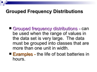
Chapter 2 Frequency Distributions and Graphs Reference:  Allan G. Bluman (2007)  Elementary Statistics: A Step-by Step Approach .  New York : McGraw Hill
Objectives Organize data using frequency distributions. Represent data in frequency distributions graphically using histograms, frequency polygons, and ogives. Represent data using Pareto charts, time series graphs, and pie graphs.
Organizing Data When data are collected in original form, they are called   raw data . When the raw data is organized into a   frequency distribution , the  frequency  will be the number of values in a specific class of the distribution.
Organizing Data A   frequency distribution   is the organizing of raw data in table form, using classes and frequencies 3 types: Categorical frequency distribution Grouped frequency distribution Ungrouped frequency distribution No. of data values  contained in a specific class
Types of Frequency Distributions Categorical frequency distributions   -  can be used for data that can be placed in specific categories, such as nominal- or ordinal-level data. Examples -  political affiliation, religious affiliation,   blood type   etc.
Categorical Frequency Distribution -  Example Step 1:   Construct a frequency distribution table. Step 2:   Tally the data and place the results in the 2 nd  column. Step 3:   Count the tallies & place the results in the 3 rd  column. AB O B A D Percent  C Frequency B Tally A Class
Categorical Frequency Distribution -  Example Step 4:   Find the percentage of values in each class by using the formula: % =  f / n  x 100% where f = frequency of the class AND   n = total number of values Step 5:   Find the totals for the 3 rd  and 4 th  column.
Blood Type Frequency Distribution -  Example
Grouped Frequency Distributions Grouped frequency distributions -   can be used when the range of values in the data set is very large.  The data must be grouped into classes that are more than one unit in width. Examples -  the life of boat batteries in hours.
Lifetimes of Boat Batteries  -  Example 25 25 1 | 58.5 – 65.5 59 – 65 24 6 ||||  | 51.5 – 58.5 52 – 58 18 9 ||||  |||| 44.5 – 51.5 45 – 51 9 5 |||| 37.5 – 44.5 38 – 44  4 1 | 30.5 – 37.5 31 – 37 3 3 ||| 23.5 – 30.5 24 – 30 Cumulative frequency Frequency Tally Class boundaries Class limits
Terms Associated with a Grouped Frequency Distribution Class limits represent the smallest and largest data values that can be included in a class. In the lifetimes of boat batteries example, the values 24 and 30 of the first class are the   class limits . The   lower class   limit is 24 and the   upper class   limit is 30.
The   class boundaries   are used to separate the classes so that there are no gaps in the frequency distribution. Class limits should have the same decimal place value as the data, but the class boundaries should have one additional place value and end in a 5. Terms Associated with a Grouped Frequency Distribution
The   class width   for a class in a frequency distribution is found by subtracting the lower (or upper) class limit of one class minus the lower (or upper) class limit of the previous class. Terms Associated with a    Grouped Frequency Distribution
Guidelines for Constructing  a Frequency Distribution There should be between 5 and 20 classes. The class width should be an odd number. To ensure the midpoint of each class has the same place value as the data The classes must be mutually exclusive. Non-overlapping class limits
Guidelines for Constructing  a Frequency Distribution The classes must be continuous. No gaps in a frequency distribution. A class must be included even though there’s no value in it. The classes must be exhaustive. Enough classes to accommodate all the data. The class must be equal in width . To avoid distorted view of the data Exception occurs when a distribution has a class that’s open- ended.
Open-Ended Distribution Example 1 Example 2 8 54 and above 10 43 – 53 4 32 – 42 6 21 – 31 3 10 – 20 Frequency Age 5 125 – 129 14 120 – 124 38 115 – 119 24 110 – 114 16 Below 100 Frequency Minutes
Procedure for Constructing  a Grouped Frequency Distribution Find the highest and lowest value. Find the range. Select the number of classes desired. Find the width by dividing the range by the number of classes and rounding up.
Select a starting point (usually the lowest value); add the width to get the lower limits. Find the upper class limits. Find the boundaries. Tally the data, find the frequencies, and find the cumulative frequency. Procedure for Constructing  a Grouped Frequency Distribution
In a survey of 20 patients who smoked, the following data were obtained.  Each value represents the number of cigarettes the patient smoked per day.  Construct a frequency distribution using six classes.  (The data is given on the next slide.) Grouped Frequency Distribution -  Example
Grouped Frequency Distribution -  Example
Step 1:   Find the highest and lowest  values:  H  = 22 and  L  = 5. Step 2:   Find the range:  R  =  H   –  L  =  22  –  5 = 17. Step 3:   Select the number of classes  desired.  In this case it is  equal to 6. Grouped Frequency Distribution -  Example
Step 4:   Find the class width by dividing the range by the number of classes.  Width = 17/6 = 2.83.  This value is rounded up to 3. Grouped Frequency Distribution -  Example
Step 5:   Select a starting point for the lowest class limit.  For convenience, this value is chosen to be 5, the smallest data value. The lower class limits will be 5, 8, 11, 14, 17, and 20. Grouped Frequency Distribution -  Example
Step 6:   The upper class limits will be  7, 10, 13, 16, 19, and 22.  For example, the upper limit for the first class is computed as 8 - 1, etc. Grouped Frequency Distribution -  Example
Step 7:   Find the class boundaries by subtracting 0.5 from each lower class limit and adding 0.5 to the upper class limit. Grouped Frequency Distribution -  Example
Step 8:   Tally the data, write the numerical values for the tallies in the frequency column, and find the cumulative frequencies. The grouped frequency distribution is shown on the next slide. Grouped Frequency Distribution -  Example
Note:   The dash “-” represents “to”.
Ungrouped Frequency Distributions Ungrouped frequency distributions -   can be used for data that can be enumerated and when the range of values in the data set is not large. Examples -   number of miles your instructors have to travel from home to campus, number of girls in a 4-child family etc.
Number of Miles Traveled  -  Example
To organize the data in a meaningful, intelligible way. To enable the reader to determine the nature or shape of distribution. To facilitate computational procedures for measures of average and spread. To enable the researcher to draw charts and graphs for the presentation of data. To enable the reader to make comparisons among different data sets. Reasons for constructing a frequency distribution
Histograms, Frequency Polygons, and Ogives The three most commonly used graphs in research are: The histogram. The frequency polygon. The cumulative frequency graph, or ogive (pronounced o-jive).
The  histogram  is a graph that displays the data by using vertical bars of various heights to represent the frequencies.   Histograms, Frequency Polygons, and Ogives
Example of a  Histogram 2 0 1 7 1 4 1 1 8 5 6 5 4 3 2 1 0 N u m b e r o f C i g a r e t t e s S m o k e d p e r D a y F r e q u e n c y
A  frequency polygon  is a graph that displays the data by using lines that connect points plotted for frequencies at the midpoint of classes.  The frequencies represent the heights of the midpoints.   Histograms, Frequency Polygons, and Ogives
Example of a  Frequency Polygon Frequency Polygon 2 6 2 3 2 0 1 7 1 4 1 1 8 5 2 6 5 4 3 2 1 0 N u m b e r o f C i g a r e t t e s S m o k e d p e r D a y F r e q u e n c y
A  cumulative frequency graph  or  ogive  is a graph that represents the cumulative frequencies for the classes in a frequency distribution.   Histograms, Frequency Polygons, and Ogives
Example of an Ogive Ogive
Other Types of Graphs Pareto charts -   a Pareto chart is used to represent a frequency distribution for a categorical variable.
Other Types of Graphs - Pareto Chart When constructing a Pareto chart -  Make the bars the same width.  Arrange the data from largest to smallest according to frequencies.  Make the units that are used for the frequency equal in size.
Example of a Pareto Chart P a r e t o C h a r t f o r t h e n u m b e r o f C r i m e s I n v e s t i g a t e d b y L a w H o m i c i d e R o b b e r y R a p e Assault 1 3 2 9 3 4 1 6 4 5 . 4 1 2 . 1 1 4 . 2 6 8 . 3 1 0 0 . 0 9 4 . 6 8 2 . 5 6 8 . 3 2 5 0 2 0 0 1 5 0 1 0 0 5 0 0 1 0 0 8 0 6 0 4 0 2 0 0 D e f e c t C o u n t P e r c e n t C u m % P e r c e n t C o u n t E n f o r c e ment Officers in U.S. National Parks During 1995.
Other Types of Graphs Time series graph -   A time series graph represents data that occur over a specific period of time.
Other Types of Graphs  - Time Series Graph 1 9 9 4 1 9 9 3 1 9 9 2 1 9 9 1 1 9 9 0 8 9 8 7 8 5 8 3 8 1 7 9 7 7 7 5 Y e a r R i d e r s h i p ( i n m i l l i o n s ) P O R T A U T H O R I T Y T R A N S I T R I D E R S H I P
Other Types of Graphs Pie graph -   A pie graph is a circle that is divided into sections or wedges according to the percentage of frequencies in each category of the distribution.
Other Types of Graphs  - Pie Graph Robbery (29, 12.1%) Rape (34, 14.2%) Assaults  (164, 68.3%) Homicide  (13, 5.4%) Pie Chart of the Number of Crimes Investigated by Law Enforcement Officers In U.S. National Parks During 1995

Chapter 2 250110 083240

  • 1.
    Chapter 2 FrequencyDistributions and Graphs Reference: Allan G. Bluman (2007) Elementary Statistics: A Step-by Step Approach . New York : McGraw Hill
  • 2.
    Objectives Organize datausing frequency distributions. Represent data in frequency distributions graphically using histograms, frequency polygons, and ogives. Represent data using Pareto charts, time series graphs, and pie graphs.
  • 3.
    Organizing Data Whendata are collected in original form, they are called raw data . When the raw data is organized into a frequency distribution , the frequency will be the number of values in a specific class of the distribution.
  • 4.
    Organizing Data A frequency distribution is the organizing of raw data in table form, using classes and frequencies 3 types: Categorical frequency distribution Grouped frequency distribution Ungrouped frequency distribution No. of data values contained in a specific class
  • 5.
    Types of FrequencyDistributions Categorical frequency distributions - can be used for data that can be placed in specific categories, such as nominal- or ordinal-level data. Examples - political affiliation, religious affiliation, blood type etc.
  • 6.
    Categorical Frequency Distribution- Example Step 1: Construct a frequency distribution table. Step 2: Tally the data and place the results in the 2 nd column. Step 3: Count the tallies & place the results in the 3 rd column. AB O B A D Percent C Frequency B Tally A Class
  • 7.
    Categorical Frequency Distribution- Example Step 4: Find the percentage of values in each class by using the formula: % = f / n x 100% where f = frequency of the class AND n = total number of values Step 5: Find the totals for the 3 rd and 4 th column.
  • 8.
    Blood Type FrequencyDistribution - Example
  • 9.
    Grouped Frequency DistributionsGrouped frequency distributions - can be used when the range of values in the data set is very large. The data must be grouped into classes that are more than one unit in width. Examples - the life of boat batteries in hours.
  • 10.
    Lifetimes of BoatBatteries - Example 25 25 1 | 58.5 – 65.5 59 – 65 24 6 |||| | 51.5 – 58.5 52 – 58 18 9 |||| |||| 44.5 – 51.5 45 – 51 9 5 |||| 37.5 – 44.5 38 – 44 4 1 | 30.5 – 37.5 31 – 37 3 3 ||| 23.5 – 30.5 24 – 30 Cumulative frequency Frequency Tally Class boundaries Class limits
  • 11.
    Terms Associated witha Grouped Frequency Distribution Class limits represent the smallest and largest data values that can be included in a class. In the lifetimes of boat batteries example, the values 24 and 30 of the first class are the class limits . The lower class limit is 24 and the upper class limit is 30.
  • 12.
    The class boundaries are used to separate the classes so that there are no gaps in the frequency distribution. Class limits should have the same decimal place value as the data, but the class boundaries should have one additional place value and end in a 5. Terms Associated with a Grouped Frequency Distribution
  • 13.
    The class width for a class in a frequency distribution is found by subtracting the lower (or upper) class limit of one class minus the lower (or upper) class limit of the previous class. Terms Associated with a Grouped Frequency Distribution
  • 14.
    Guidelines for Constructing a Frequency Distribution There should be between 5 and 20 classes. The class width should be an odd number. To ensure the midpoint of each class has the same place value as the data The classes must be mutually exclusive. Non-overlapping class limits
  • 15.
    Guidelines for Constructing a Frequency Distribution The classes must be continuous. No gaps in a frequency distribution. A class must be included even though there’s no value in it. The classes must be exhaustive. Enough classes to accommodate all the data. The class must be equal in width . To avoid distorted view of the data Exception occurs when a distribution has a class that’s open- ended.
  • 16.
    Open-Ended Distribution Example1 Example 2 8 54 and above 10 43 – 53 4 32 – 42 6 21 – 31 3 10 – 20 Frequency Age 5 125 – 129 14 120 – 124 38 115 – 119 24 110 – 114 16 Below 100 Frequency Minutes
  • 17.
    Procedure for Constructing a Grouped Frequency Distribution Find the highest and lowest value. Find the range. Select the number of classes desired. Find the width by dividing the range by the number of classes and rounding up.
  • 18.
    Select a startingpoint (usually the lowest value); add the width to get the lower limits. Find the upper class limits. Find the boundaries. Tally the data, find the frequencies, and find the cumulative frequency. Procedure for Constructing a Grouped Frequency Distribution
  • 19.
    In a surveyof 20 patients who smoked, the following data were obtained. Each value represents the number of cigarettes the patient smoked per day. Construct a frequency distribution using six classes. (The data is given on the next slide.) Grouped Frequency Distribution - Example
  • 20.
  • 21.
    Step 1: Find the highest and lowest values: H = 22 and L = 5. Step 2: Find the range: R = H – L = 22 – 5 = 17. Step 3: Select the number of classes desired. In this case it is equal to 6. Grouped Frequency Distribution - Example
  • 22.
    Step 4: Find the class width by dividing the range by the number of classes. Width = 17/6 = 2.83. This value is rounded up to 3. Grouped Frequency Distribution - Example
  • 23.
    Step 5: Select a starting point for the lowest class limit. For convenience, this value is chosen to be 5, the smallest data value. The lower class limits will be 5, 8, 11, 14, 17, and 20. Grouped Frequency Distribution - Example
  • 24.
    Step 6: The upper class limits will be 7, 10, 13, 16, 19, and 22. For example, the upper limit for the first class is computed as 8 - 1, etc. Grouped Frequency Distribution - Example
  • 25.
    Step 7: Find the class boundaries by subtracting 0.5 from each lower class limit and adding 0.5 to the upper class limit. Grouped Frequency Distribution - Example
  • 26.
    Step 8: Tally the data, write the numerical values for the tallies in the frequency column, and find the cumulative frequencies. The grouped frequency distribution is shown on the next slide. Grouped Frequency Distribution - Example
  • 27.
    Note: The dash “-” represents “to”.
  • 28.
    Ungrouped Frequency DistributionsUngrouped frequency distributions - can be used for data that can be enumerated and when the range of values in the data set is not large. Examples - number of miles your instructors have to travel from home to campus, number of girls in a 4-child family etc.
  • 29.
    Number of MilesTraveled - Example
  • 30.
    To organize thedata in a meaningful, intelligible way. To enable the reader to determine the nature or shape of distribution. To facilitate computational procedures for measures of average and spread. To enable the researcher to draw charts and graphs for the presentation of data. To enable the reader to make comparisons among different data sets. Reasons for constructing a frequency distribution
  • 31.
    Histograms, Frequency Polygons,and Ogives The three most commonly used graphs in research are: The histogram. The frequency polygon. The cumulative frequency graph, or ogive (pronounced o-jive).
  • 32.
    The histogram is a graph that displays the data by using vertical bars of various heights to represent the frequencies. Histograms, Frequency Polygons, and Ogives
  • 33.
    Example of a Histogram 2 0 1 7 1 4 1 1 8 5 6 5 4 3 2 1 0 N u m b e r o f C i g a r e t t e s S m o k e d p e r D a y F r e q u e n c y
  • 34.
    A frequencypolygon is a graph that displays the data by using lines that connect points plotted for frequencies at the midpoint of classes. The frequencies represent the heights of the midpoints. Histograms, Frequency Polygons, and Ogives
  • 35.
    Example of a Frequency Polygon Frequency Polygon 2 6 2 3 2 0 1 7 1 4 1 1 8 5 2 6 5 4 3 2 1 0 N u m b e r o f C i g a r e t t e s S m o k e d p e r D a y F r e q u e n c y
  • 36.
    A cumulativefrequency graph or ogive is a graph that represents the cumulative frequencies for the classes in a frequency distribution. Histograms, Frequency Polygons, and Ogives
  • 37.
    Example of anOgive Ogive
  • 38.
    Other Types ofGraphs Pareto charts - a Pareto chart is used to represent a frequency distribution for a categorical variable.
  • 39.
    Other Types ofGraphs - Pareto Chart When constructing a Pareto chart - Make the bars the same width. Arrange the data from largest to smallest according to frequencies. Make the units that are used for the frequency equal in size.
  • 40.
    Example of aPareto Chart P a r e t o C h a r t f o r t h e n u m b e r o f C r i m e s I n v e s t i g a t e d b y L a w H o m i c i d e R o b b e r y R a p e Assault 1 3 2 9 3 4 1 6 4 5 . 4 1 2 . 1 1 4 . 2 6 8 . 3 1 0 0 . 0 9 4 . 6 8 2 . 5 6 8 . 3 2 5 0 2 0 0 1 5 0 1 0 0 5 0 0 1 0 0 8 0 6 0 4 0 2 0 0 D e f e c t C o u n t P e r c e n t C u m % P e r c e n t C o u n t E n f o r c e ment Officers in U.S. National Parks During 1995.
  • 41.
    Other Types ofGraphs Time series graph - A time series graph represents data that occur over a specific period of time.
  • 42.
    Other Types ofGraphs - Time Series Graph 1 9 9 4 1 9 9 3 1 9 9 2 1 9 9 1 1 9 9 0 8 9 8 7 8 5 8 3 8 1 7 9 7 7 7 5 Y e a r R i d e r s h i p ( i n m i l l i o n s ) P O R T A U T H O R I T Y T R A N S I T R I D E R S H I P
  • 43.
    Other Types ofGraphs Pie graph - A pie graph is a circle that is divided into sections or wedges according to the percentage of frequencies in each category of the distribution.
  • 44.
    Other Types ofGraphs - Pie Graph Robbery (29, 12.1%) Rape (34, 14.2%) Assaults (164, 68.3%) Homicide (13, 5.4%) Pie Chart of the Number of Crimes Investigated by Law Enforcement Officers In U.S. National Parks During 1995