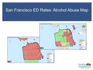
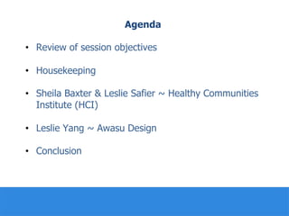
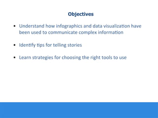
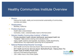
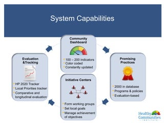
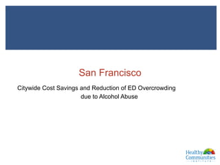
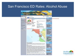
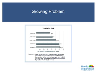
Welcome to the Webinar!
New Media Best Practices:
Using Infographics and Data Visualization
We will begin shortly…
Today you’ll be hearing from…
Leslie	
  Yang	
  
Associate	
  Experience	
  Designer	
  
Awasu	
  Design	
  
Lisa	
  Peterson	
  
New	
  Media	
  Educa:on	
  Specialist	
  
CHL/CALPACT	
  
Leslie	
  Safier	
  
Director	
  of	
  Research	
  
Healthy	
  Communi:es	
  Ins:tute	
  
Sheila	
  Baxter	
  
Director	
  of	
  Business	
  Development	
  
Healthy	
  Communi:es	
  Ins:tute	
  
Agenda
•  Review of session objectives
•  Housekeeping
•  Sheila Baxter & Leslie Safier ~ Healthy Communities
Institute (HCI)
•  Leslie Yang ~ Awasu Design
•  Conclusion
Objectives
•  Understand	
  how	
  infographics	
  and	
  data	
  visualiza:on	
  have	
  
been	
  used	
  to	
  communicate	
  complex	
  informa:on	


•  Iden:fy	
  :ps	
  for	
  telling	
  stories	


•  Learn	
  strategies	
  for	
  choosing	
  the	
  right	
  tools	
  to	
  use	


Tweet the event!
Use	
  #calpactNM14	


Healthy Communities Institute
Leslie	
  Safier	
  
Director	
  of	
  Research	
  
Healthy	
  Communi:es	
  Ins:tute	
  
Sheila	
  Baxter	
  
Director	
  of	
  Business	
  Development	
  
Healthy	
  Communi:es	
  Ins:tute	
  
CALPACT New Media
Best Practices:
Using Infographics and
Data Visualization
Webinar
May 22, 2014
Sheila Baxter, MPH ‘10
Director of Business Development
West/Central Region
Healthy Communities Institute
Leslie Safier, MPH ‘10
Director of Research
Healthy Communities Institute
Data Visualization Basics
8
Word cloud developed by WordleTM : http://www.wordle.com
9
Credit: John Snow, On the Mode of Communication of Cholera.
Early Data Visualizations
•  Develop the Story
•  Gather and Organize Your Information
•  Create and Iterate
10
Process Overview
Always Maintain the Integrity of Your Data
11
Source: “America’s Newsroom”. Fox
News Channel. 31 Mar. 2014.
Television.
Source: Gibson, K. (2013 September 24). Black leaders
at Purdue find support, recruitment to be community
based. Retrieved from http://purdueexponent.org
Healthy Communities Institute Overview
•  Mission
‒  Improve the health, vitality and environmental sustainability of communities,
counties and states
•  Headquarters
‒  Berkeley, California
•  Problem/Approach
‒  Health data is decentralized
‒  Centralize, make understandable, lead to informed action
•  Solution Healthy Communities Institute’s Platform
‒  Provide population health indicator dashboards, geomapped health risk
“hotspots,” best practice sharing and evaluation tools
‒  Users: health systems and hospitals, foundations, health departments,
collaboratives, any organization assuming risk of populations
•  National Relationships/Awards/ Coverage
‒  2012 Health and Human Services Award: Best Community Health App
‒  2011 Health and Human Services Award: MyHealthyPeople - Helping Attain The
Health Goals Of Healthy People 2020
‒  VHA and CHA National Agreements
‒  100+ million lives in the United States XXX
• 100 – 200 indicators
• Color coded
• Constantly updated
Community
Dashboard
• 2000 in database
• Programs & policies
• Evaluation-based
Promising
Practices
• Form working groups
• Set local goals
• Manage achievement
of objectives
Initiative Centers
• HP 2020 Tracker
• Local Priorities tracker
• Comparative and
longitudinal evaluation
Evaluation
&Tracking
System Capabilities
XXX
San Francisco
Citywide Cost Savings and Reduction of ED Overcrowding
due to Alcohol Abuse
14
XXXmm
San Francisco ED Rates: Alcohol Abuse
and
XXXm
Growing Problem
and
XXXm
San Francisco ED Rates: Alcohol Abuse Map
and
XXXm
The Citywide Solution
and
1. 50 San Francisco Stakeholders came together
2. Sober and Respite Center created
3. Van service provides transport from police
or with ambulance crew hand-off
4. 10-14 inebriates diverted from EDs everyday
XXXm
Financial Benefits
and
Operates 24/7
•  Daily operating cost: less than $2,700/day
(ambulance ride and ED visit)
•  Annual operating cost: $1 million/year
•  Approximate value cost avoidance: $9 million/year
XXXm
A Creative Solution
and
Success
•  Reduced citywide costs for chronic public inebriates
Ingredients that Solved the Problem
•  Statewide Hospital data tell the story
•  Multi-sector collaborative and citywide solution
XXXm
The HCN System
Thank You!
For more information
Sheila Baxter
Sheila.Baxter@healthycities.org
Leslie Safier
leslie@healthycities.org
Healthy Communities Institute
http://www.healthycommunitiesinstitute.com/
Sample Client Sites
Douglas County: http://www.douglascohealth.org/
St. Mary Medical Center : http://www.stmaryhealthcare.org/CommunityHealthDataandResources
Alameda County: http://www.healthyalamedacounty.org/
HCI Platform System
XXX
•  Develop the Story
‒  What story are you trying to tell? Consider what data is necessary to support
your story.
‒  What questions will your visualization allow you to explore or answer?
‒  Why will users be viewing or interacting with the visualization?
•  Gather and Organize Your Information
‒  Think about the best ways to summarize your spreadsheets.
‒  Consider your primary audience and their data literacy.
‒  Determine what information is critical for understanding.
‒  Use tools such as color, iconography and typography to display critical
information.
•  Create and Iterate
‒  Sketch out early ideas.
‒  Get feedback early and often.
‒  Keep your purpose and user in mind.
‒  Maintain the integrity of the data through scales, legends, and display.
‒  Simplify!
Process Summary
22
23
Data Visualization Tools and Resources*
Books
•  Few, Stephen. (2009) Now You See It. Oakland, CA: Analytics Press.
•  Tufte, Edward. (1983). The Visual Display of Quantitative Information.
Cheshire, CT: Graphics Press.
Background Information
•  Duke University Libraries. Introduction to Data Visualization.
http://guides.library.duke.edu/vis_types
•  Anne K. Emery. The Dataviz Design Process: 7 Steps for Beginners.
http://annkemery.com/dataviz-design-process/
Tools
•  Fast Company Magazine. 30 Simple Tools for Data Visualization.
http://www.fastcodesign.com/3029239/infographic-of-the-day/30-simple-
tools-for-data-visualization
•  Google Fusion Tables.
https://support.google.com/fusiontables/answer/2571232
•  Tableu Public. http://www.tableausoftware.com/public/
•  Many Eyes. http://www.manyeyes.com
*This is by no means an exhaustive list. It contains information we came across while developing this
presentation that may be useful to you.
24
Data Visualization Tools and Resources (pg 2)*
*This is by no means an exhaustive list. It contains information we came across while developing this
presentation that may be useful to you.
Inspiration
•  The Guardian. http://www.theguardian.com/data
•  Information is Beautiful. http://www.informationisbeautiful.net/
•  Flowing Data. http://flowingdata.com/
•  GE Data Visualization. http://visualization.geblogs.com/
•  NEWSVIS. http://newsvis.org/
•  Visual Complexity. http://www.visualcomplexity.com/vc/
•  Reddit Data is Beautiful. http://www.reddit.com/r/dataisbeautiful
Q & A for Sheila and Leslie
• Send	
  a	
  ques:on	
  or	
  comment	
  using	
  the	
  chat	
  
box	
  func:on	
  
• Click	
  “raise	
  hand”	
  buQon	
  to	
  be	
  taken	
  off	
  
mute	
  and	
  ask	
  a	
  ques:on	
  verbally	


Leslie	
  Safier	
  
Director	
  of	
  Research	
  
Healthy	
  Communi:es	
  Ins:tute	
  
Sheila	
  Baxter	
  
Director	
  of	
  Business	
  Development	
  
Healthy	
  Communi:es	
  Ins:tute	
  
Awasu Design
Leslie	
  Yang	
  
Associate	
  Experience	
  Designer	
  
Awasu	
  Design	
  
Q & A for Leslie
• Send	
  a	
  ques:on	
  or	
  comment	
  using	
  the	
  chat	
  
box	
  func:on	
  
• Click	
  “raise	
  hand”	
  buQon	
  to	
  be	
  taken	
  off	
  
mute	
  and	
  ask	
  a	
  ques:on	
  verbally	


Leslie	
  Yang	
  
Associate	
  Experience	
  Designer	
  
Awasu	
  Design	
  
Speaker Contact Information
Sheila	
  Baxter	
  
Sheila.Baxter@healthyci:es.org	


Leslie	
  Safier	
  	
  
leslie@healthyci:es.org	


Leslie	
  Yang	
  
Leslie.yang@gmail.com	


What action step will you take after the webinar?
•  What do you think you can do in the next month to
further your goals with infographics & data visualization?
•  Let us know ~ we’d love to check back with you and hear how
it’s going!
•  We appreciate your feedback!


Thank you!
Questions? Contact us at sphcalpact@berkeley.edu
Learn more about other trainings:
http://chl.berkeley.edu/events/newmedia/2014-new-media-trainings/sessions.html

CALPACT Webinar: Using Infographics and Data Visualization

  • 1.
    Welcome to theWebinar! New Media Best Practices: Using Infographics and Data Visualization We will begin shortly…
  • 2.
    Today you’ll behearing from… Leslie  Yang   Associate  Experience  Designer   Awasu  Design   Lisa  Peterson   New  Media  Educa:on  Specialist   CHL/CALPACT   Leslie  Safier   Director  of  Research   Healthy  Communi:es  Ins:tute   Sheila  Baxter   Director  of  Business  Development   Healthy  Communi:es  Ins:tute  
  • 3.
    Agenda •  Review ofsession objectives •  Housekeeping •  Sheila Baxter & Leslie Safier ~ Healthy Communities Institute (HCI) •  Leslie Yang ~ Awasu Design •  Conclusion
  • 4.
    Objectives •  Understand  how  infographics  and  data  visualiza:on  have   been  used  to  communicate  complex  informa:on     •  Iden:fy  :ps  for  telling  stories       •  Learn  strategies  for  choosing  the  right  tools  to  use        
  • 5.
    Tweet the event! Use  #calpactNM14    
  • 6.
    Healthy Communities Institute Leslie  Safier   Director  of  Research   Healthy  Communi:es  Ins:tute   Sheila  Baxter   Director  of  Business  Development   Healthy  Communi:es  Ins:tute  
  • 7.
    CALPACT New Media BestPractices: Using Infographics and Data Visualization Webinar May 22, 2014 Sheila Baxter, MPH ‘10 Director of Business Development West/Central Region Healthy Communities Institute Leslie Safier, MPH ‘10 Director of Research Healthy Communities Institute
  • 8.
    Data Visualization Basics 8 Wordcloud developed by WordleTM : http://www.wordle.com
  • 9.
    9 Credit: John Snow,On the Mode of Communication of Cholera. Early Data Visualizations
  • 10.
    •  Develop theStory •  Gather and Organize Your Information •  Create and Iterate 10 Process Overview
  • 11.
    Always Maintain theIntegrity of Your Data 11 Source: “America’s Newsroom”. Fox News Channel. 31 Mar. 2014. Television. Source: Gibson, K. (2013 September 24). Black leaders at Purdue find support, recruitment to be community based. Retrieved from http://purdueexponent.org
  • 12.
    Healthy Communities InstituteOverview •  Mission ‒  Improve the health, vitality and environmental sustainability of communities, counties and states •  Headquarters ‒  Berkeley, California •  Problem/Approach ‒  Health data is decentralized ‒  Centralize, make understandable, lead to informed action •  Solution Healthy Communities Institute’s Platform ‒  Provide population health indicator dashboards, geomapped health risk “hotspots,” best practice sharing and evaluation tools ‒  Users: health systems and hospitals, foundations, health departments, collaboratives, any organization assuming risk of populations •  National Relationships/Awards/ Coverage ‒  2012 Health and Human Services Award: Best Community Health App ‒  2011 Health and Human Services Award: MyHealthyPeople - Helping Attain The Health Goals Of Healthy People 2020 ‒  VHA and CHA National Agreements ‒  100+ million lives in the United States XXX
  • 13.
    • 100 – 200indicators • Color coded • Constantly updated Community Dashboard • 2000 in database • Programs & policies • Evaluation-based Promising Practices • Form working groups • Set local goals • Manage achievement of objectives Initiative Centers • HP 2020 Tracker • Local Priorities tracker • Comparative and longitudinal evaluation Evaluation &Tracking System Capabilities XXX
  • 14.
    San Francisco Citywide CostSavings and Reduction of ED Overcrowding due to Alcohol Abuse 14 XXXmm
  • 15.
    San Francisco EDRates: Alcohol Abuse and XXXm
  • 16.
  • 17.
    San Francisco EDRates: Alcohol Abuse Map and XXXm
  • 18.
    The Citywide Solution and 1. 50San Francisco Stakeholders came together 2. Sober and Respite Center created 3. Van service provides transport from police or with ambulance crew hand-off 4. 10-14 inebriates diverted from EDs everyday XXXm
  • 19.
    Financial Benefits and Operates 24/7 • Daily operating cost: less than $2,700/day (ambulance ride and ED visit) •  Annual operating cost: $1 million/year •  Approximate value cost avoidance: $9 million/year XXXm
  • 20.
    A Creative Solution and Success • Reduced citywide costs for chronic public inebriates Ingredients that Solved the Problem •  Statewide Hospital data tell the story •  Multi-sector collaborative and citywide solution XXXm
  • 21.
    The HCN System ThankYou! For more information Sheila Baxter Sheila.Baxter@healthycities.org Leslie Safier leslie@healthycities.org Healthy Communities Institute http://www.healthycommunitiesinstitute.com/ Sample Client Sites Douglas County: http://www.douglascohealth.org/ St. Mary Medical Center : http://www.stmaryhealthcare.org/CommunityHealthDataandResources Alameda County: http://www.healthyalamedacounty.org/ HCI Platform System XXX
  • 22.
    •  Develop theStory ‒  What story are you trying to tell? Consider what data is necessary to support your story. ‒  What questions will your visualization allow you to explore or answer? ‒  Why will users be viewing or interacting with the visualization? •  Gather and Organize Your Information ‒  Think about the best ways to summarize your spreadsheets. ‒  Consider your primary audience and their data literacy. ‒  Determine what information is critical for understanding. ‒  Use tools such as color, iconography and typography to display critical information. •  Create and Iterate ‒  Sketch out early ideas. ‒  Get feedback early and often. ‒  Keep your purpose and user in mind. ‒  Maintain the integrity of the data through scales, legends, and display. ‒  Simplify! Process Summary 22
  • 23.
    23 Data Visualization Toolsand Resources* Books •  Few, Stephen. (2009) Now You See It. Oakland, CA: Analytics Press. •  Tufte, Edward. (1983). The Visual Display of Quantitative Information. Cheshire, CT: Graphics Press. Background Information •  Duke University Libraries. Introduction to Data Visualization. http://guides.library.duke.edu/vis_types •  Anne K. Emery. The Dataviz Design Process: 7 Steps for Beginners. http://annkemery.com/dataviz-design-process/ Tools •  Fast Company Magazine. 30 Simple Tools for Data Visualization. http://www.fastcodesign.com/3029239/infographic-of-the-day/30-simple- tools-for-data-visualization •  Google Fusion Tables. https://support.google.com/fusiontables/answer/2571232 •  Tableu Public. http://www.tableausoftware.com/public/ •  Many Eyes. http://www.manyeyes.com *This is by no means an exhaustive list. It contains information we came across while developing this presentation that may be useful to you.
  • 24.
    24 Data Visualization Toolsand Resources (pg 2)* *This is by no means an exhaustive list. It contains information we came across while developing this presentation that may be useful to you. Inspiration •  The Guardian. http://www.theguardian.com/data •  Information is Beautiful. http://www.informationisbeautiful.net/ •  Flowing Data. http://flowingdata.com/ •  GE Data Visualization. http://visualization.geblogs.com/ •  NEWSVIS. http://newsvis.org/ •  Visual Complexity. http://www.visualcomplexity.com/vc/ •  Reddit Data is Beautiful. http://www.reddit.com/r/dataisbeautiful
  • 25.
    Q & Afor Sheila and Leslie • Send  a  ques:on  or  comment  using  the  chat   box  func:on   • Click  “raise  hand”  buQon  to  be  taken  off   mute  and  ask  a  ques:on  verbally         Leslie  Safier   Director  of  Research   Healthy  Communi:es  Ins:tute   Sheila  Baxter   Director  of  Business  Development   Healthy  Communi:es  Ins:tute  
  • 26.
    Awasu Design Leslie  Yang   Associate  Experience  Designer   Awasu  Design  
  • 49.
    Q & Afor Leslie • Send  a  ques:on  or  comment  using  the  chat   box  func:on   • Click  “raise  hand”  buQon  to  be  taken  off   mute  and  ask  a  ques:on  verbally       Leslie  Yang   Associate  Experience  Designer   Awasu  Design  
  • 50.
    Speaker Contact Information Sheila  Baxter   Sheila.Baxter@healthyci:es.org     Leslie  Safier     leslie@healthyci:es.org     Leslie  Yang   Leslie.yang@gmail.com        
  • 51.
    What action stepwill you take after the webinar? •  What do you think you can do in the next month to further your goals with infographics & data visualization? •  Let us know ~ we’d love to check back with you and hear how it’s going! •  We appreciate your feedback!          
  • 52.
    Thank you! Questions? Contactus at sphcalpact@berkeley.edu Learn more about other trainings: http://chl.berkeley.edu/events/newmedia/2014-new-media-trainings/sessions.html