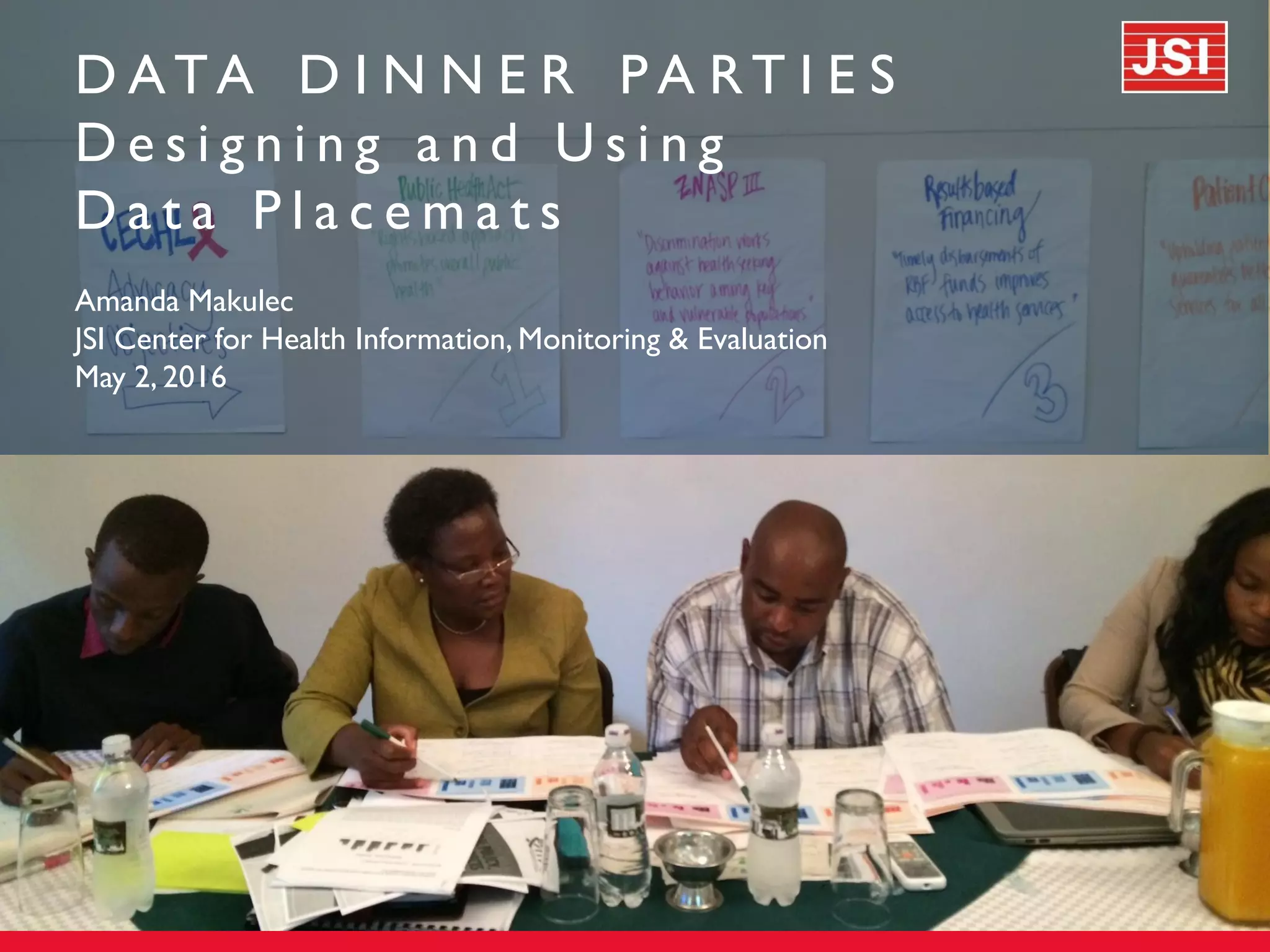
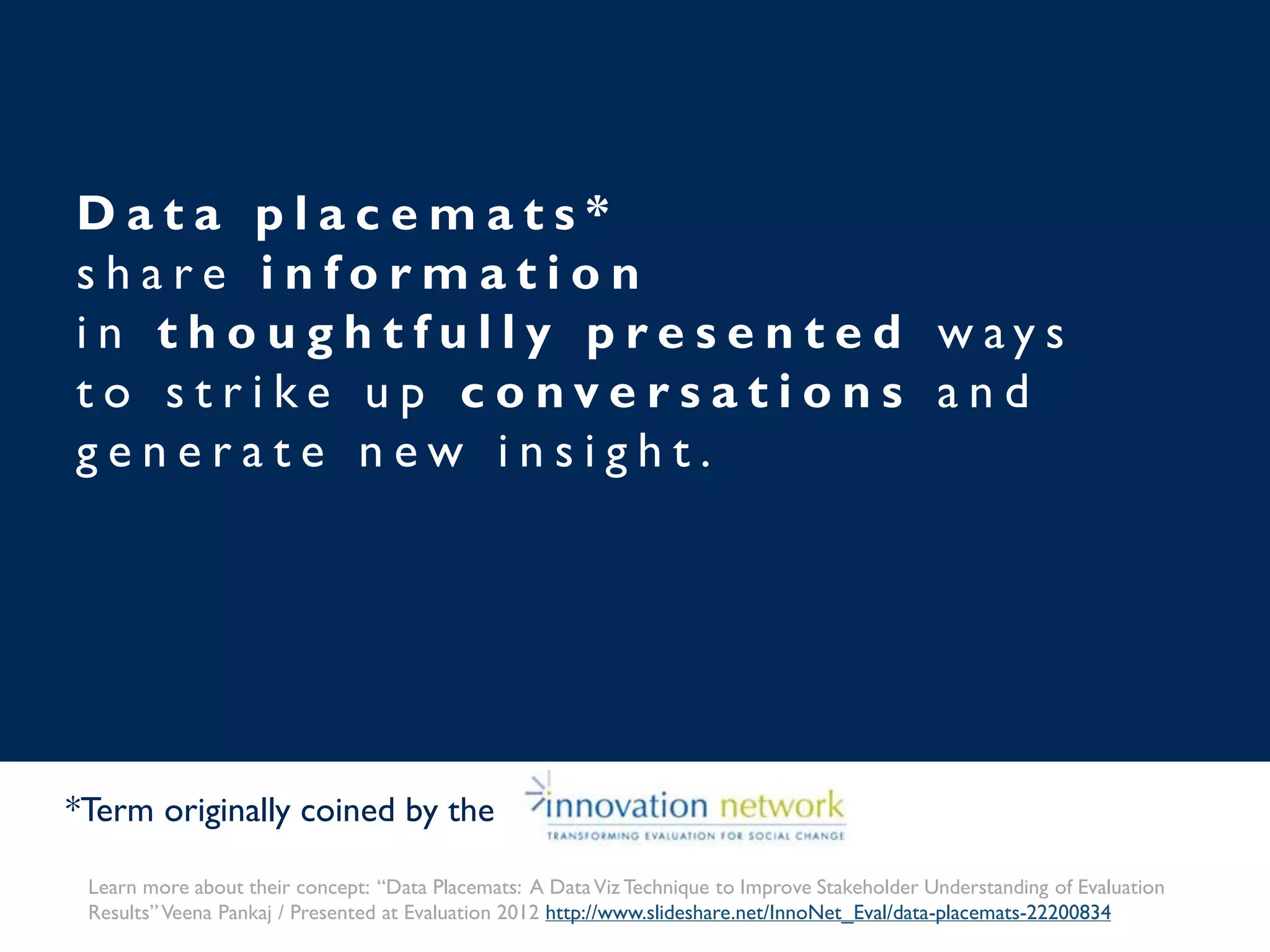
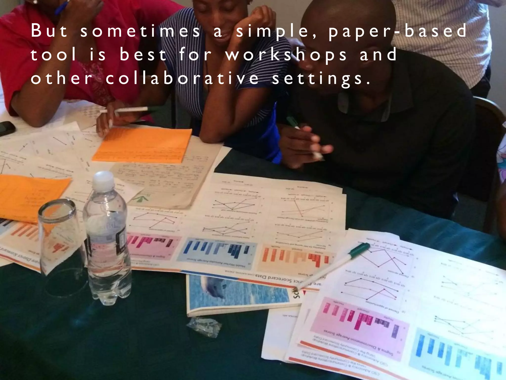
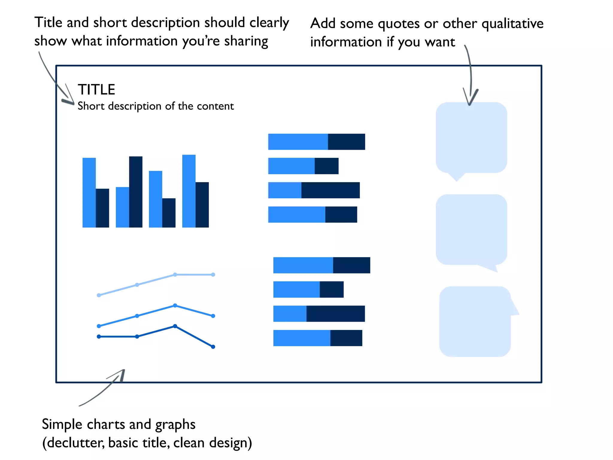
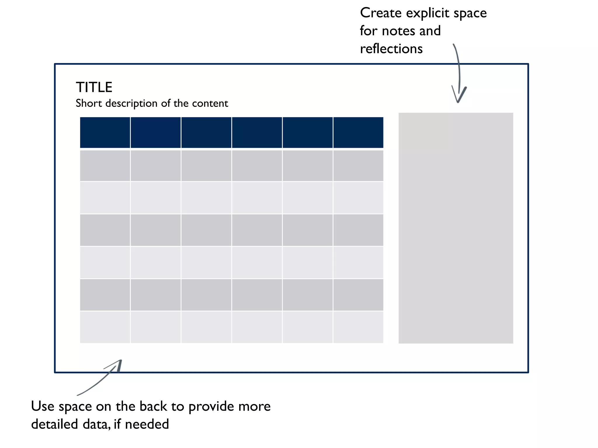
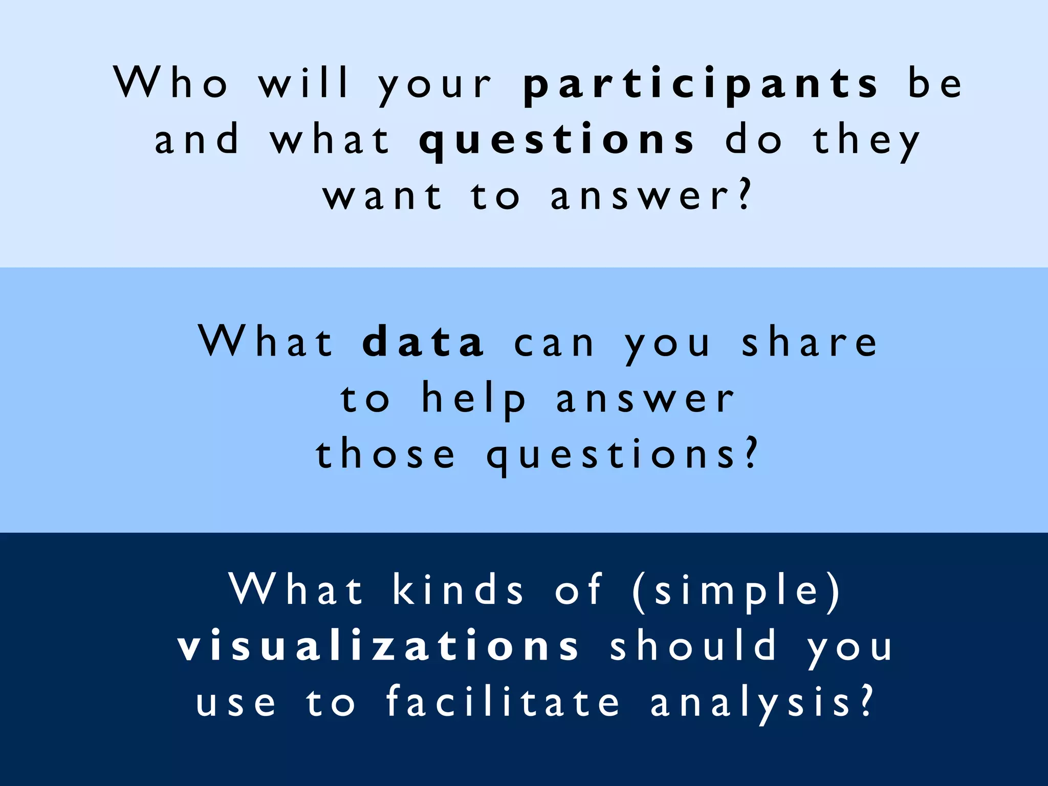
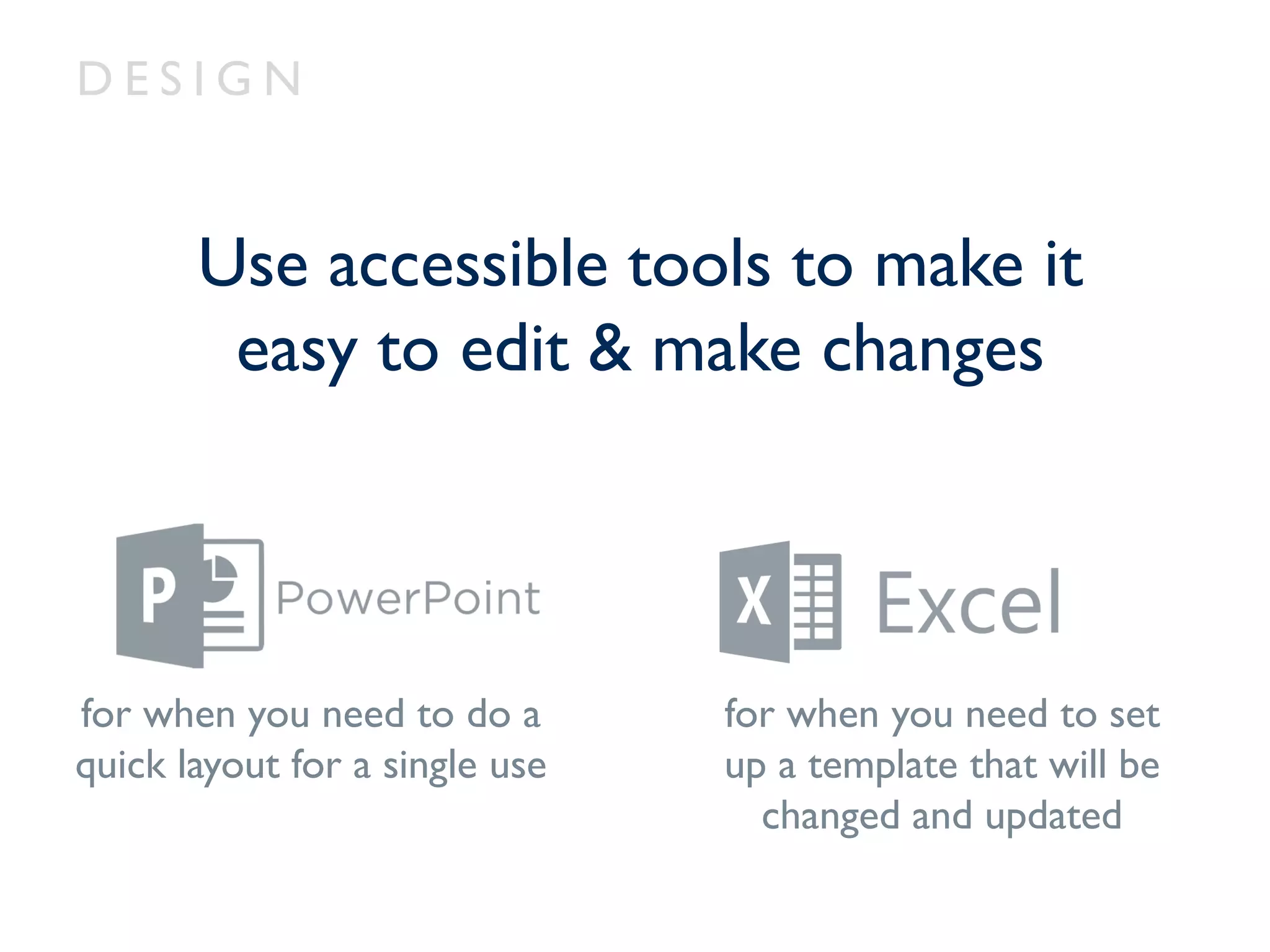
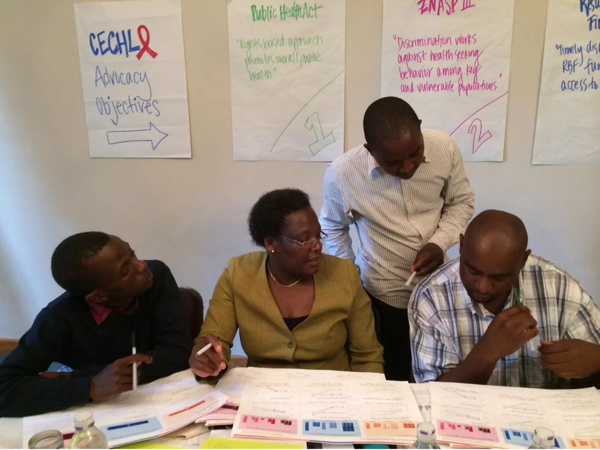
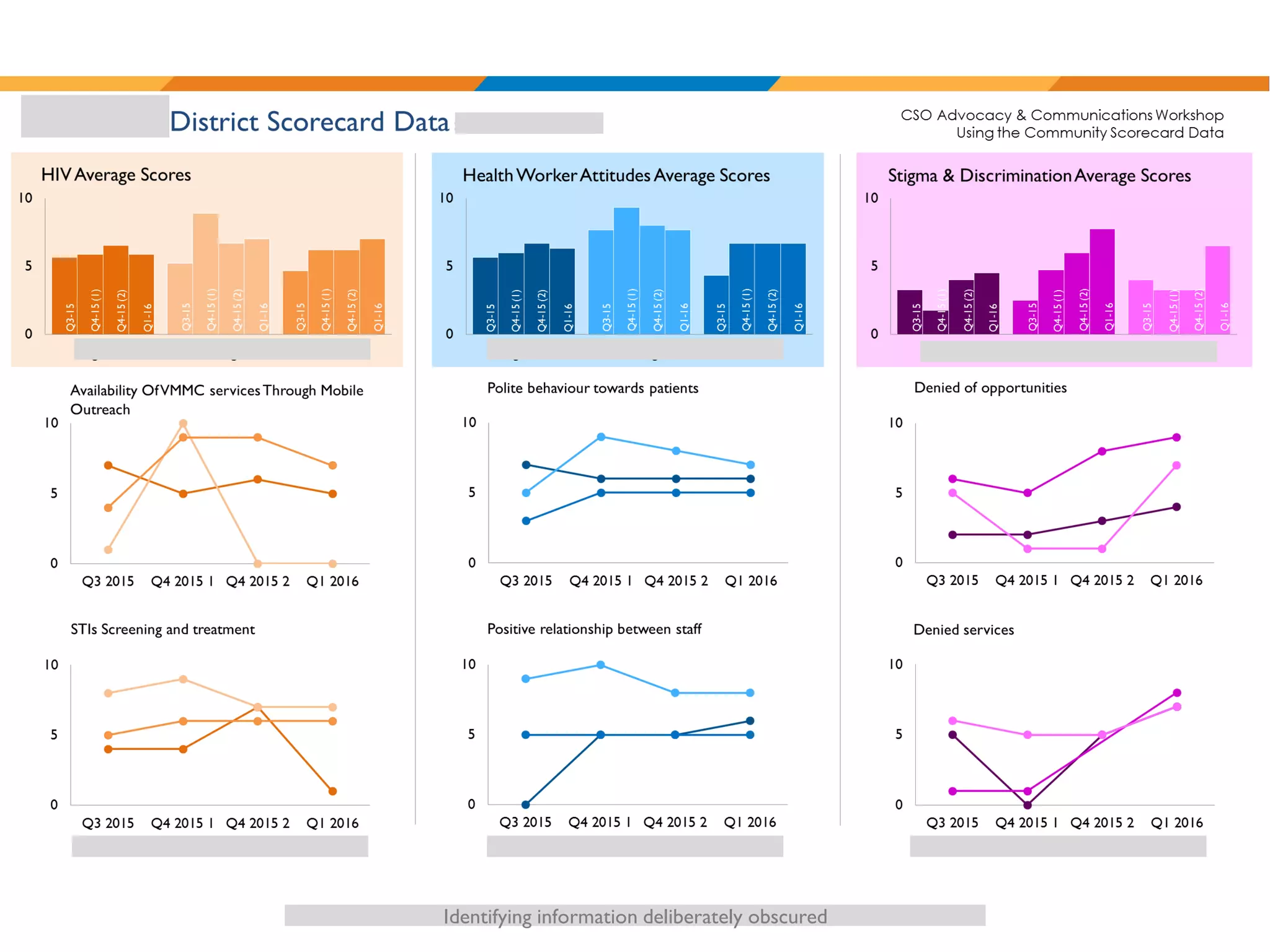
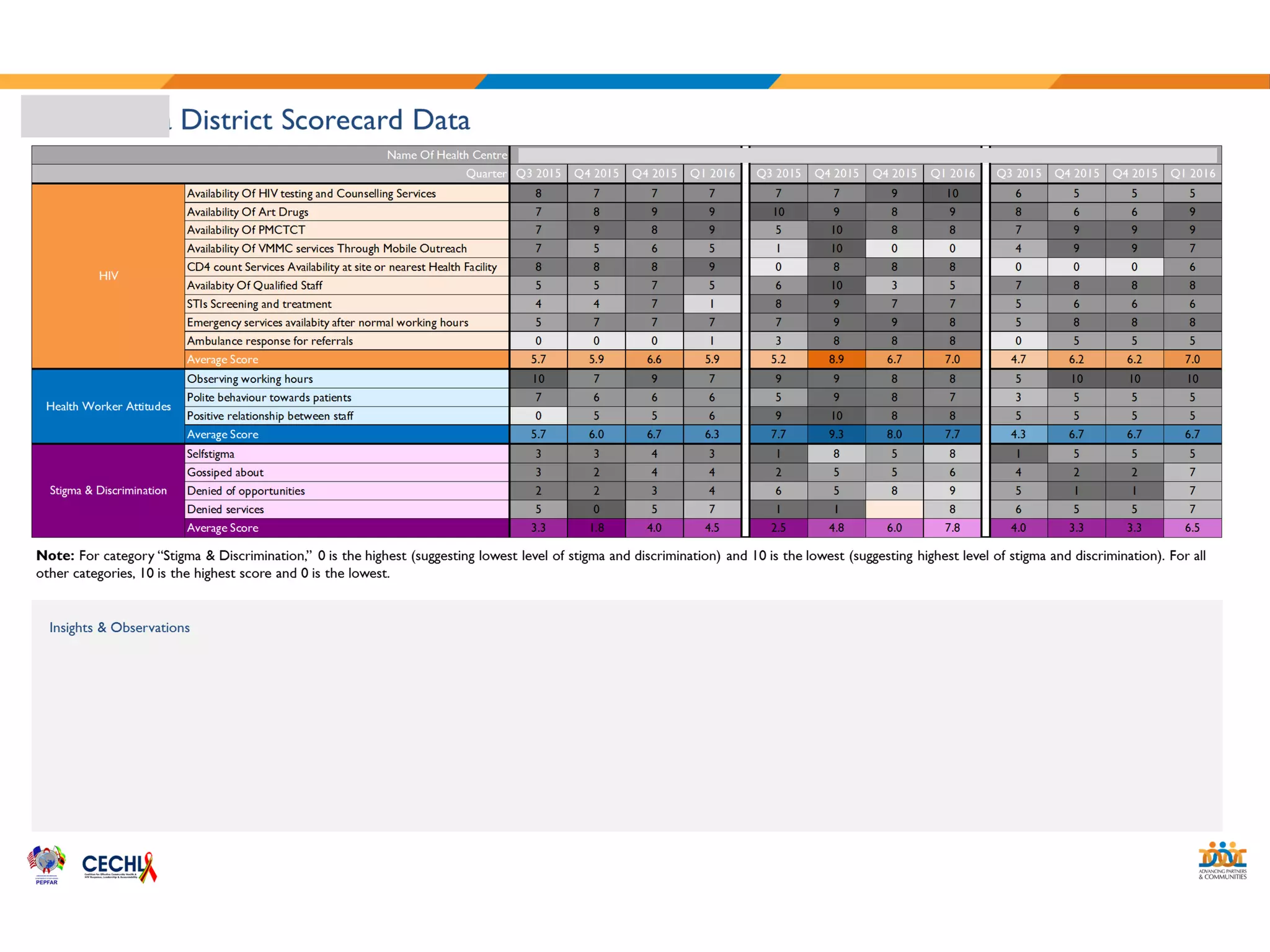
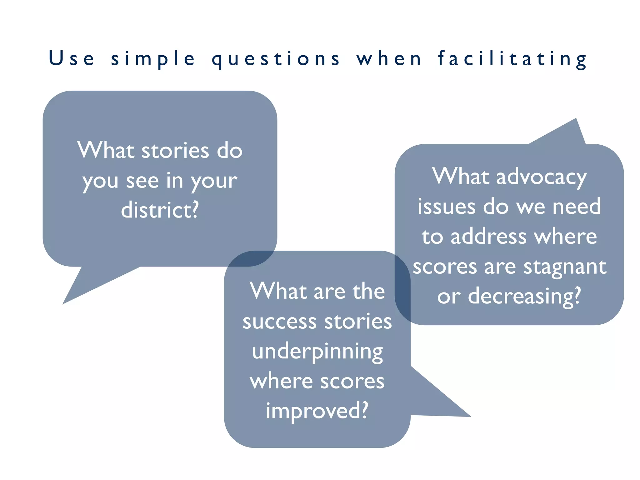
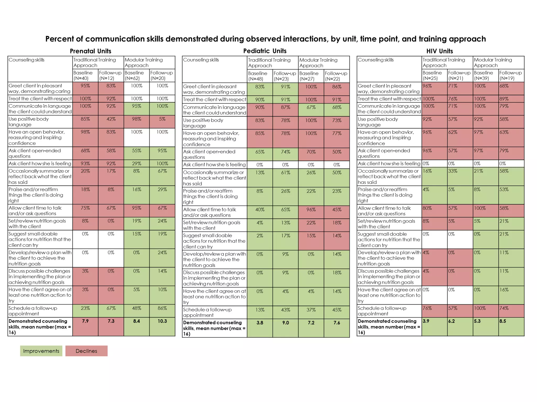
A short workshop from MERL Tech 2016 on how we can think more purposefully about telling stories with our data and designing visualizations to bring those stories to life in global health and development.
Understanding your audience and considering them in your design is essential for building great visualizations. This deck will walk you through the critical steps for identifying and understanding your audience, and developing a complex visualization storyboard to share your message.
Designing Data Visualizations to Strengthen Health SystemsAmanda Makulec
Slide deck from our hands-on workshop hosted at the 4th Global Symposium on Health Systems Research, focused on basic design tips, tricks, and best practices to improve your charts and graphs.
Borrowing from the communications and media experts, storyboarding is one of my favorite approaches to work through a data visualization design with a team. First identify your audience & what your data story is, then map it out visually to come to a common understanding of what your team is designing.
A quick reference on designing data visualizations that delight and leverage best practices from the design world to ensure your data is presented in meaningful, usable, fun ways.
Why People are the Heart of Health Innovation. Keynote presentation at the Boston College Public Health Innovation Symposium (19 March 2016). Highlighting how starting with what people want is key to successful health innovation, and how human centered design can help us do just that.
Presented on May 7, 2015 to the TechChange Technology for M&E course. The aim of the presentation was to highlight key considerations in designing visualizations as part of international development programs, and includes both challenges of visualization in development programs and six things to consider when designing visualizations.
Building your own skills is one step in strengthening how you use visualization in your work, but fostering organizational change can be hard. Here are a few quick considerations on how to nurture data visualization as a personal skill and as an organizational value, and tips for successful collaborations on data visualization activities.
Originally presented as part of the HC3 Innovation Webinar Series on March 8, 2017.
Developing Dashboards with User-Centered DesignAmanda Makulec
Design sprint session hosted at the TechLady Hackathon, focused on the basic principles and techniques for starting a design process with who will use the data, rather than the tables and tools.
Thinking about how to communicate results from global health and development programs can be a challenge. By looking beyond long form, narrative, text reports, we can make our learning more accessible to wider audiences and promote the use of data for decision making by formatting our results in interesting, inviting ways. This deck includes a ideas, resources, and inspiration for great alternative reporting formats, including videos and SlideDocs.
A quick overview of two techniques from design thinking that can help us better tailor data visualizations to the needs of our audiences. Personas can be used to identify illustrative audience members who represent large groups within our target audience, and journey maps help us understand how an audience receives, interprets, and acts on information.
The illustrative example presented here is rooted in a real world experience, but is not an actual persona and journey used in that work.
August Designstorm: Alternative Reporting FormatsAmanda Makulec
Monthly brainstorm and idea sharing session at JSI around data visualization. The August deck focuses on alternative reporting formats and questions to think through to reach various audiences, including tools like interactive timelines, interactive graphics and dashboards (Tableau & others), scrolling/parallax webpages, and key design principles.
Data visualization trends in Business Intelligence: Allison Sapka at Analytic...Fitzgerald Analytics, Inc.
Allison Sapka's presentation at the Analytics and Data in Financial Services Meetup in Dec 2012. Alison discusses trends in Data Visualization, including why visualization is so powerful when implemented well, and confusing or misleading when done badly
Data visualization is a complex set of processes which is like an umbrella that covers both information and scientific visualization simultaneously. We can’t ignore the benefits of data visualization for its accurate quantities, as it is easily comparable. It also lends valuable suggestion pertaining to the usage of its technique and tools. Scientifically its effectiveness lies in our brain's ability to maintain a proper balance between perception and cognition through visualization.
Data visualization is about transforming numbers into knowledge, making information meaningful. I was one of 50 contributors to this free, Creative Commons licensed eBook, which provides a comprehensive overview of how to approach, develop, design, and publish great data visualizations.
Learn more about the project, interact with the eBook online, and get involved in future iterations at https://infoactive.co/data-design
The Future of Business Intelligence: Data VisualizationKristen Sosulski
Kristen Sosulski
The future of business intelligence: Data Visualization
How can data visualization be used as a platform to reveal intelligent insights and help business analysts make timely decisions? In this talk, Kristen Sosulski will discuss the opportunities for personalized, location aware, context relevant, and platform independent information visualizations as a toolkit for business analysts.
Slides from an interactive workshop focused on exposing M&E practitioners to design thinking approaches to understand the needs and experiences of data users at MERL Tech 2017
Data Visualization Design Best Practices WorkshopJSI
This introduction was presented as part of a workshop at the Measurement and Accountability for Results in Health Summit at the World Bank (June 2015). The workshop focused on simple ways anyone working with data can improve their presentations, and included visualization redesign activity to put these principles in practice.
Lightning talk presented at MERL Tech 2018.
Often we think of dashboards as interactive reports instead of being digital products.
By rethinking our criteria of success for launching a new dashboard and borrowing from UX design, we can think more meaningfully about how we build dashboards stakeholders actually want to use.
Beyond Data Visualization: What's next in communicating with data?Zach Gemignani
We've made great progress in learning how to visualize data, yet a gap still remains between the data experts and the data consumers who might take action on the data. This presentation, shared at the Nashville Analytics Summit, explains how we can bring people into the process of communicating data and guide them to informed actions.
Data Modelling is an important tool in the toolbox of a developer. By building and communicating a shared understanding of the domain they're working with, their applications and APIs are more useable and maintainable. However, as you scale up your technical teams, how do you keep these benefits whilst avoiding time-consuming meetings every time something new comes along? This talk reminds ourselves of key data modelling technique and how our use of Kafka changes and informs them. It then examines how these patterns change as more teams join your organisation and how Kafka comes into its own in this world.
A short overview of the simplest style of data mart schema that can be used to construct data warehouses. It helps reduce the complexities in joining tables when presenting your data through reports and data visualizations.
Openbar 4 - Leuven - AI for Public Services - Stewie - ArintiOpenbar
In deze sessie zal Wouter meer vertellen over de mogelijkheden van conversational interfaces in de publieke sector en enkele business cases toelichten. Hij vertelt wat de uitdagingen zijn en laat zien wat er vandaag al kan en bestaat. Tot slot geeft hij je ook een blik op de toekomst van Chat- en Voicebots.
Navigating the Employee Lifecycle: Create Your Own Remote CultureAggregage
We are living in uncertain times - the COVID-19 pandemic has led to confusion and isolation for our global workforce as companies have had to turn completely to remote working. As most organizations were unprepared for this change, they are waiting for things to "get back to normal" when they can have in-person meetings and higher productivity. However, we are never going to return to normal. We may return to office working, but our approach to remote working will have changed. We need to understand now how we can maintain a strong culture when all our employees are working remotely and how we can shape our post-pandemic remote working policies. Join Change Instigator and LIberationist CEO Gustavo Razzetti to learn how to remote-proof your culture!
Broad point of view on User/Consumer Experience as a differentiator across product/services.
Thx to VentureHive ( http://venturehive.co/) for the speaking engagement today. Here is the deck I presented on thinking of UX in terms of influencing better ways to own consumers habits.
Elevated.com's 2018 General Capabilities Deck-We are growing!!Chris Snook
We have grown in capabilities for 2018. Elevated.com is a full service digital and customer experience marketing agency. Our current capabilities and several relevant case studies are a good starting point to understand the focus and depth of our service offerings and current capabilities. We work with B2C and B2B brands operating in an omni-channel world and seeking to put the customer in the center of their strategy.
The idea of innovation is not new, though it is seldom talked about in the context of platform and API development. Traditional product owners talk about innovating on new products and features, A/B testing them and figuring out what works with the consumer and what doesn’t. The rapid development and fail-fast strategies don’t apply in platform API design and development. Externally published APIs, that have been integrated with, are difficult to change. Nevertheless, innovation happens in the platform world too. This presentation talks about what kinds of innovation these are, which areas, how is agile development applicable in the platform context, some innovative examples in our PayPal platform and how we go about getting them available and adopted.
Artificial Assistants: How can I help you? by Christopher CurrinChristopher Currin
Chatbots are not equal; with different forms permeating our lives more and more. Virtual assistants are increasingly relevant for businesses and our day-to-day lives. Chatbots have become ubiquitous for interactions, yet ‘reasonable’ intelligence remains elusive.
In this talk, we explore and explain their underlying architectures and capabilities to understand what makes them work, their weaknesses, and future improvements.
Design principles from a technology and human perspective will be disseminated with examples of current production systems and their impact. Furthermore, the audience will have the opportunity to advance these best practices.
Resources will be made available, so the technology is relevant, practical, and accessible.
Breakout session at MERL Tech 2018.
Agile - commonly used in the tech community - offers a number of sticky ideas and principles we can adapt in international development and MERL to improve how we work and support adaptive management.
In this breakout, we focus on three sticky ideas: creating and being guided by user stories, prioritization, and limiting WIP.
Visualizations with Empathy: Developing Audience PersonasAmanda Makulec
Presentation from Evaluation 2016 featuring ideas for how evaluators (and other data viz designers) can use the develop of personas to segment and understand their audiences. Instead of thinking just of stakeholder groups and job titles, we approach understanding audiences by developing empathy, borrowing from human centered design.
Highlights from three different speakers on the actual use of dashboards for decisionmaking.
MEASURE Evaluation shares the results of a landscape analysis looking for specific examples of dashboards prompting action. BroadReach shares an example of how their Vantage platform is making HIV data accessible in South Africa. JSI shares an example of low-tech but high-impact dashboard development and coaching that has transformed districts in Zimbabwe.
Designing Usage Dashboards for mHealth Program MonitoringAmanda Makulec
Presentation from the MERL Tech Panel on "Dashboards: Force for Good, Great, or Greater Confusion?" focused on the unique challenges of developing a dashboard of usage data from a mobile application.
Data Visualization Design Best Practices WorkshopAmanda Makulec
Presentation shared at the #MA4Health Data Visualization workshop cofacilitated with my colleague Tahmid Chowdhury. Our aim was to empower participants with simple principles they can apply to any graph or chart to improve its effectiveness in communicating information, and to share resources on viz design relevant to global health practitioners.
Chart Makeover: A Women's Nutrition Bar ChartAmanda Makulec
One of the most common requests I receive is to review charts and graphs and provide insight around how to improve them by using the formatting tools available in Excel.
This example shows the process of redesigning the chart to better facilitate comparison within regions of the trend towards a greater percent of women falling into the overweight and obese categories (from 1980 to 2008).
A Data Viz Makeover: Approaches for Improving your VisualizationsAmanda Makulec
A joint presentation made at the 2015 USAID Global Health Mini University, introducing key data visualization concepts and setting the stage for two interactive activities on storyboarding for data visualizations and visual best practices for graph and chart design.
An introduction to infographic design written for global health and development professionals, including ideas for storyboarding, design tools, and tips and tricks to create fun, meaningful infographics. Lots of links to free web-based tools and great resources.
Data Visualization Resource Guide (September 2014)Amanda Makulec
A summary guide to data visualization design, including key design principles, great resources, and tools (listed by category with short explanations) that you can use to help design elegant, effective data visualizations that help share your message & promote the use of your information.
Note that the tools & resources highlighted are suggested, and inclusion should not be considered as an endorsement from JSI.
Summary deck from our monthly JSI design-storm (design + brainstorm), highlighting the key features of Piktochart for designing visualizations to make information accessible.
Interactive, clickable session highlighting how to apply design principles to Excel graphs to make a data story sing. Originally hosted as a brown-bag lunch presentation at JSI. For more detailed resources on designing various chart types in Excel, check out Ann Emery's Excel series and slide decks http://www.slideshare.net/annkemery/presentations.
Summary deck from our monthly JSI design-storm (design + brainstorm), highlighting the amazing templates and design features from Nancy Duarte's Slidedocs. The highlights features here only hit on a small section of her overall approach - check out the complete package at http://www.duarte.com/slidedocs
The Building Blocks of QuestDB, a Time Series Databasejavier ramirez
Talk Delivered at Valencia Codes Meetup 2024-06.
Traditionally, databases have treated timestamps just as another data type. However, when performing real-time analytics, timestamps should be first class citizens and we need rich time semantics to get the most out of our data. We also need to deal with ever growing datasets while keeping performant, which is as fun as it sounds.
It is no wonder time-series databases are now more popular than ever before. Join me in this session to learn about the internal architecture and building blocks of QuestDB, an open source time-series database designed for speed. We will also review a history of some of the changes we have gone over the past two years to deal with late and unordered data, non-blocking writes, read-replicas, or faster batch ingestion.
06-04-2024 - NYC Tech Week - Discussion on Vector Databases, Unstructured Data and AI
Discussion on Vector Databases, Unstructured Data and AI
https://www.meetup.com/unstructured-data-meetup-new-york/
This meetup is for people working in unstructured data. Speakers will come present about related topics such as vector databases, LLMs, and managing data at scale. The intended audience of this group includes roles like machine learning engineers, data scientists, data engineers, software engineers, and PMs.This meetup was formerly Milvus Meetup, and is sponsored by Zilliz maintainers of Milvus.
Quantitative Data AnalysisReliability Analysis (Cronbach Alpha) Common Method...2023240532
Quantitative data Analysis
Overview
Reliability Analysis (Cronbach Alpha)
Common Method Bias (Harman Single Factor Test)
Frequency Analysis (Demographic)
Descriptive Analysis
Machine learning and optimization techniques for electrical drives.pptx
Data Dinner Parties
1. D A TA D I N N E R P A R T I E S
D e s i g n i n g a n d U s i n g
D a t a P l a c e m a t s
Amanda Makulec
JSI Center for Health Information, Monitoring & Evaluation
May 2, 2016
8. D a t a p l a c e m a t s *
s h a r e i n f o r m a t i o n
i n t h o u g h t f u l l y p r e s e n t e d w a y s
t o s t r i k e u p c o n v e r s a t i o n s a n d
g e n e r a t e n e w i n s i g h t .
*Term originally coined by the
Learn more about their concept: “Data Placemats: A DataViz Technique to Improve Stakeholder Understanding of Evaluation
Results”Veena Pankaj / Presented at Evaluation 2012 http://www.slideshare.net/InnoNet_Eval/data-placemats-22200834
9. E l e c t r o n i c d a s h b o a r d s
c a n m e e t t h i s n e e d t o o .
10. B u t s o m e t i m e s a s i m p l e , p a p e r - b a s e d
t o o l i s b e s t f o r w o r k s h o p s a n d
o t h e r c o l l a b o r a t i v e s e t t i n g s .
11. TITLE
Short description of the content
Simple charts and graphs
(declutter, basic title, clean design)
Add some quotes or other qualitative
information if you want
Title and short description should clearly
show what information you’re sharing
12. TITLE
Short description of the content
Use space on the back to provide more
detailed data, if needed
Create explicit space
for notes and
reflections
13. Think of it as an analog
dashboard being used as a
facilitation tool.
(Many of the best practices for
dashboard design also apply here.)
14. W h o w i l l y o u r p a r t i c i p a n t s b e
a n d w h a t q u e s t i o n s d o t h e y
w a n t t o a n s w e r ?
W h a t d a t a c a n y o u s h a r e
t o h e l p a n s w e r
t h o s e q u e s t i o n s ?
W h a t k i n d s o f ( s i m p l e )
v i s u a l i z a t i o n s s h o u l d y o u
u s e t o f a c i l i t a t e a n a l y s i s ?
15. D E S I G N
Use accessible tools to make it
easy to edit & make changes
for when you need to do a
quick layout for a single use
for when you need to set
up a template that will be
changed and updated
21. U s e s i m p l e q u e s t i o n s w h e n f a c i l i t a t i n g
What stories do
you see in your
district?
What are the
success stories
underpinning
where scores
improved?
What advocacy
issues do we need
to address where
scores are stagnant
or decreasing?
22. G l ob al Heal t h Mi n i U
SPRING Nutrition Capacity Building
Evaluation Data from Haiti
23.
24.
25. Considering using data
placemats for…
Participatory analysis in a
workshop
Engaging your audience in
an activity during a
presentation
Helping to surface success
stories with stakeholders
But probably not for…
A presentation handout or
leave behind on its own
Engaging teams or
stakeholders with very
limited analytical capabilities
(who may be overwhelmed)
26. A few key lessons
learned from ou r
ex p eri en ces t o dat e .