Download to read offline

![10/24/2015
10
• NIH Library Data Visualization Survey
• Gathered feedback to help us develop training and services to
support data visualization at NIH and HHS
• 10 questions on potential services, types of tools being used and
types of tools for which training is desired, types of data to be
visualized and its purpose of use, and demographics
• 160 responses
• Data Visualization Training Survey
• 14 demographic questions, specific questions about the webinar
experience [webinars only], and specific questions about course
content
• Ongoing survey that evaluates data visualization classes and
webinars
• Number and type of consultations
Three Methods of Evaluation](https://image.slidesharecdn.com/macmla2015-160222182600/85/Developing-a-library-based-data-visualization-service-10-320.jpg)

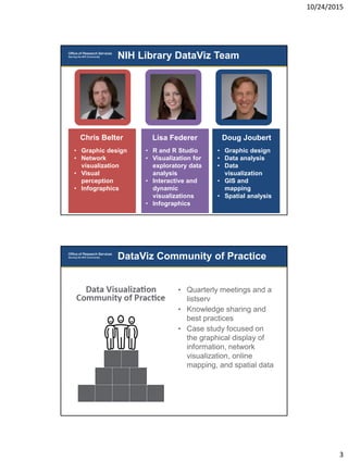
The NIH Library is developing a data visualization service including tools, training, and support. Their DataViz Team consists of experts in graphic design, network visualization, R, GIS mapping, and data analysis. They offer various training classes on tools like R, ggplot2, Excel, and Gephi. They also evaluate their services through surveys of users and tracking consultations to help develop additional trainings and support data visualization needs at NIH and HHS.