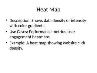
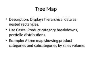
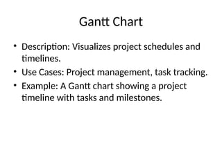
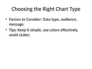
Exploring Basic Chart Types in
Tableau
A Guide for Data Analysts
[Your Name]
[Date]
Introduction
• Overview of Tableau as a data visualization
tool.
• Importance of choosing the right chart type
for effective data analysis.
• Purpose of the presentation.
Bar Chart
• Description: Compares quantities across
different categories.
• Use Cases: Sales by region, number of
products sold, performance metrics.
• Example: A bar chart showing sales figures for
different product categories.
Pie Chart
• Description: Displays proportions and
percentages of a whole.
• Use Cases: Market share distribution, budget
allocation.
• Example: A pie chart showing market share by
company.
Scatter Plot
• Description: Identifies relationships and
correlations between two variables.
• Use Cases: Sales vs. advertising spend, age vs.
income.
• Example: A scatter plot showing the
correlation between marketing spend and
sales revenue.
Line Chart
• Description: Visualizes trends and changes
over time.
• Use Cases: Stock prices over time, website
traffic trends.
• Example: A line chart showing website traffic
trends over a year.
Histogram
• Description: Displays the distribution of a
single variable.
• Use Cases: Examining frequency distributions,
age distributions.
• Example: A histogram showing the distribution
of customer ages.
Area Chart
• Description: Similar to a line chart but with the
area below the line filled in.
• Use Cases: Cumulative data trends, resource
usage over time.
• Example: An area chart showing cumulative
sales over the months.
Bubble Chart
• Description: Extends a scatter plot by adding a
third dimension via bubble size.
• Use Cases: Sales volume by region and
product category.
• Example: A bubble chart showing sales
volume by region, with bubble size
representing sales.
Heat Map
• Description: Shows data density or intensity
with color gradients.
• Use Cases: Performance metrics, user
engagement heatmaps.
• Example: A heat map showing website click
density.
Tree Map
• Description: Displays hierarchical data as
nested rectangles.
• Use Cases: Product category breakdowns,
portfolio distributions.
• Example: A tree map showing product
categories and subcategories by sales volume.
Gantt Chart
• Description: Visualizes project schedules and
timelines.
• Use Cases: Project management, task tracking.
• Example: A Gantt chart showing a project
timeline with tasks and milestones.
Choosing the Right Chart Type
• Factors to Consider: Data type, audience,
message.
• Tips: Keep it simple, use colors effectively,
avoid clutter.
Real-World Scenarios
• Scenario 1: Sales analysis using bar charts and
line charts.
• Scenario 2: Market share analysis using pie
charts and bubble charts.
• Scenario 3: Project tracking using Gantt charts.
Challenges and Limitations
• Common Issues: Misleading visuals,
overcomplicated charts.
• Solutions: Proper training, using best
practices, continuous learning.
Conclusion
• Summary: Recap of different chart types and
their uses.
• Final Thoughts: Importance of effective data
visualization in data analysis.
• Q&A: Open the floor for questions and
discussions.
Q&A
• Invite questions from the audience.
• Encourage sharing of experiences and insights.
Thank You
• Contact Information: [Your Contact Info]
• Call to Action: Invite audience to connect or
follow up.

Tablue and it's chart type presentation.

  • 1.
    Exploring Basic ChartTypes in Tableau A Guide for Data Analysts [Your Name] [Date]
  • 2.
    Introduction • Overview ofTableau as a data visualization tool. • Importance of choosing the right chart type for effective data analysis. • Purpose of the presentation.
  • 3.
    Bar Chart • Description:Compares quantities across different categories. • Use Cases: Sales by region, number of products sold, performance metrics. • Example: A bar chart showing sales figures for different product categories.
  • 4.
    Pie Chart • Description:Displays proportions and percentages of a whole. • Use Cases: Market share distribution, budget allocation. • Example: A pie chart showing market share by company.
  • 5.
    Scatter Plot • Description:Identifies relationships and correlations between two variables. • Use Cases: Sales vs. advertising spend, age vs. income. • Example: A scatter plot showing the correlation between marketing spend and sales revenue.
  • 6.
    Line Chart • Description:Visualizes trends and changes over time. • Use Cases: Stock prices over time, website traffic trends. • Example: A line chart showing website traffic trends over a year.
  • 7.
    Histogram • Description: Displaysthe distribution of a single variable. • Use Cases: Examining frequency distributions, age distributions. • Example: A histogram showing the distribution of customer ages.
  • 8.
    Area Chart • Description:Similar to a line chart but with the area below the line filled in. • Use Cases: Cumulative data trends, resource usage over time. • Example: An area chart showing cumulative sales over the months.
  • 9.
    Bubble Chart • Description:Extends a scatter plot by adding a third dimension via bubble size. • Use Cases: Sales volume by region and product category. • Example: A bubble chart showing sales volume by region, with bubble size representing sales.
  • 10.
    Heat Map • Description:Shows data density or intensity with color gradients. • Use Cases: Performance metrics, user engagement heatmaps. • Example: A heat map showing website click density.
  • 11.
    Tree Map • Description:Displays hierarchical data as nested rectangles. • Use Cases: Product category breakdowns, portfolio distributions. • Example: A tree map showing product categories and subcategories by sales volume.
  • 12.
    Gantt Chart • Description:Visualizes project schedules and timelines. • Use Cases: Project management, task tracking. • Example: A Gantt chart showing a project timeline with tasks and milestones.
  • 13.
    Choosing the RightChart Type • Factors to Consider: Data type, audience, message. • Tips: Keep it simple, use colors effectively, avoid clutter.
  • 14.
    Real-World Scenarios • Scenario1: Sales analysis using bar charts and line charts. • Scenario 2: Market share analysis using pie charts and bubble charts. • Scenario 3: Project tracking using Gantt charts.
  • 15.
    Challenges and Limitations •Common Issues: Misleading visuals, overcomplicated charts. • Solutions: Proper training, using best practices, continuous learning.
  • 16.
    Conclusion • Summary: Recapof different chart types and their uses. • Final Thoughts: Importance of effective data visualization in data analysis. • Q&A: Open the floor for questions and discussions.
  • 17.
    Q&A • Invite questionsfrom the audience. • Encourage sharing of experiences and insights.
  • 18.
    Thank You • ContactInformation: [Your Contact Info] • Call to Action: Invite audience to connect or follow up.