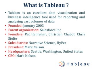
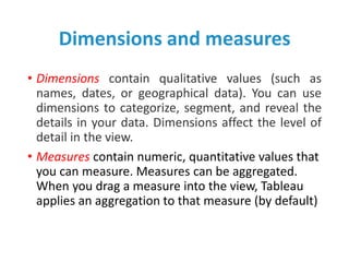
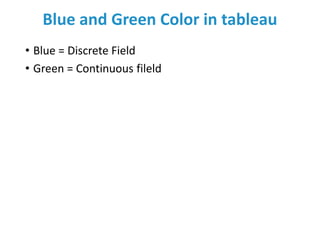
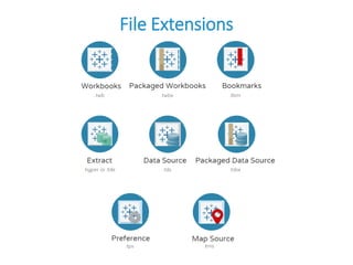
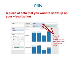
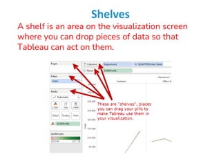
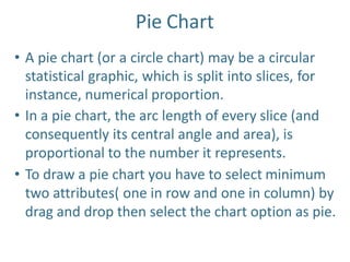
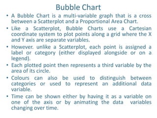
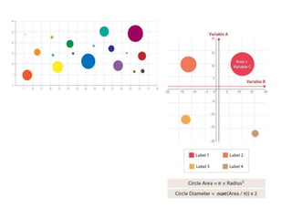
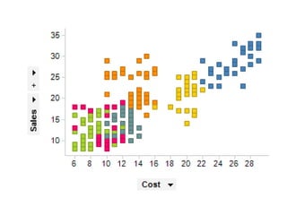
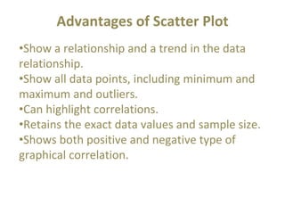
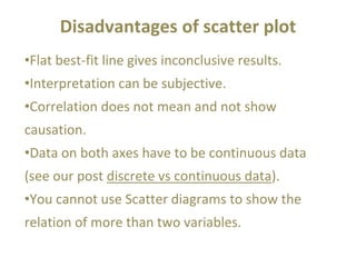
What is Tableau
What is Tableau ?
• Tableau is an excellent data visualization and
business intelligence tool used for reporting and
analyzing vast volumes of data.
• Founded: January 2003
• Parent organization: Salesforce Inc
• Founders: Pat Hanrahan, Christian Chabot, Chris
Stolte
• Subsidiaries: Narrative Science, HyPer
• President: Mark Nelson
• Headquarters: Seattle, Washington, United States
• CEO: Mark Nelson
Tableau Architecture
Tableau Products
Tableau Desktop Workspace
Tableau workspace after importing data
Tableau Desktop Workspace Menu
Tableau Navigation
Data Window in Tableau
Dimensions and measures
• Dimensions contain qualitative values (such as
names, dates, or geographical data). You can use
dimensions to categorize, segment, and reveal the
details in your data. Dimensions affect the level of
detail in the view.
• Measures contain numeric, quantitative values that
you can measure. Measures can be aggregated.
When you drag a measure into the view, Tableau
applies an aggregation to that measure (by default)
Blue and Green Color in tableau
• Blue = Discrete Field
• Green = Continuous fileld
File Extensions
Pills
A piece of data that you want to show up on
your visualization.
Shelves
A shelf is an area on the visualization screen
where you can drop pieces of data so that
Tableau can act on them.
Data Types in Tableau
Advantages of Tableau
Disadvantages of tableau
What is a Bar chart ?
• A bar chart is a way of summarizing a set of categorical
data (continuous data can be made categorical by auto-
binning).
• The bar chart displays data using a number of bars, each
representing a particular category.
• The height of each bar is proportional to a specific
aggregation (for example the sum of the values in the
category it represents).
• The categories could be something like an age group or a
geographical location.
• It is also possible to color or split each bar into another
categorical column in the data, which enables you to see
the contribution from different categories to each bar or
group of bars in the bar chart.
Stacked Bar Chart
• Stacked column charts work well when the focus
of the chart is to compare the totals and one part
of the totals.
• Stacked column chart can work well for dates,
but should only be considered if the total of your
parts is crucial.
• If you want to use stacked column charts for time
data, make sure your dates have the same
intervals.
• Stacked column charts work well for only a few
totals.
Grouped Bar Chart
• A grouped bar chart, also known as clustered bar
graph, multi-set bar chart, or grouped column
chart, is a type of bar graph that is used to
represent and compare different categories of
two or more groups.
• Because the categories are grouped and
arranged side-by-side, the bar clusters make easy
to interpret the differences inside a group, and
even between the same category across groups.
Best uses for the grouped bar chart
• Showing the changes in set categories over time,
location or sector
• Comparing financial data–for example sales,
costs and revenue–across different groups
• Evaluating the performance of a series of
marketing projects in contrast to one another
Advantages
• show each data category in a frequency distribution
• display relative numbers or proportions of multiple
categories
• summarize a large data set in visual form
• clarify trends better than do tables
• estimate key values at a glance
• permit a visual check of the accuracy and
reasonableness of calculations
• be easily understood due to widespread use in
business and the media
Disadvantages
• require additional explanation
• be easily manipulated to yield false impressions
• fail to reveal key assumptions, causes, effects, or
patterns
Pie Chart
• A pie chart (or a circle chart) may be a circular
statistical graphic, which is split into slices, for
instance, numerical proportion.
• In a pie chart, the arc length of every slice (and
consequently its central angle and area), is
proportional to the number it represents.
• To draw a pie chart you have to select minimum
two attributes( one in row and one in column) by
drag and drop then select the chart option as pie.
Advantages
• The picture is simple and easy-to-understand
• Data can be represented visually as a fractional part of a
whole
• It helps in providing an effective communication tool for
the even uninformed audience
• Provides a data comparison for the audience at a glance
to give an immediate analysis or to quickly understand
information
• No need for readers to examine or measure underlying
numbers themselves, which can be removed by using this
chart
• To emphasize a few points you want to make, you can
manipulate pieces of data in the pie chart
Disadvantages
• It becomes less effective, if there are too many
pieces of data to use
• If there are too many pieces of data. Even if you add
data labels and numbers may not help here, they
themselves may become crowded and hard to read
• As this chart only represents one data set, you need
a series to compare multiple sets
• This may make it more difficult for readers when it
comes to analyze and assimilate information quickly
Bubble Chart
• A Bubble Chart is a multi-variable graph that is a cross
between a Scatterplot and a Proportional Area Chart.
• Like a Scatterplot, Bubble Charts use a Cartesian
coordinate system to plot points along a grid where the X
and Y axis are separate variables.
• However. unlike a Scatterplot, each point is assigned a
label or category (either displayed alongside or on a
legend).
• Each plotted point then represents a third variable by the
area of its circle.
• Colours can also be used to distinguish between
categories or used to represent an additional data
variable.
• Time can be shown either by having it as a variable on
one of the axis or by animating the data variables
changing over time.
• Bubble Charts are typically used to compare and
show the relationships between categorised circles,
by the use of positioning and proportions. The
overall picture of Bubble Charts can be used to
analyse for patterns/correlations.
• Like with Proportional Area Charts, the sizes of the
circles need to be drawn based on the circle’s area,
not its radius or diameter. Not only will the size of
the circles change exponentially, but this will lead to
misinterpretations by the human visual system.
Advantages
• display three variables without using 3D graphs
• visual size makes it very easy to make relative
comparisons
• Conveys same information as a line graph
Disadvantages
• due to circle sizes, can be difficult to ascertain
actual values
• difficult to read and understand
• cannot be used to display a lot of data.
Uses
• Bubble charts are often used in business to
visualize the relationships between alternatives
investment in dimensions such as cost, value,
and risk.
Highlighted table
• The highlight table allows us to use conditional formatting
to a view of a normal table.
• Tableau will automatically apply a color scheme in either
endless or stepped array of colors from highest to lowest.
• It’s great for comparing a field’s values within a row or
column.
• Use highlight tables to match categorical data using color.
• Highlight tables are often outstanding as they help users
quickly spot the foremost interesting values during a table
of numbers.
• In cases where multiple variables are displayed, Measure
Values are often used to apply one color scheme to all or
any of the values in a table.
• Unless the variables are very similar, highlighting multiple
variables is typically not helpful and can mislead.
Scatter Plot
The scatter plot is used to visualize the
relationship between the two measures.
It is designed by adding measures in both x-axis
and y-axis.
This can show the trend or relationship between
the measures selected.
To create a scatter plot, you should have at least
one measure in the rows shelf and one measure in
the columns shelf.
However, you can add the dimensions field to the
scatter plot that plays a role of different color
making for already existing points in the scatter
graph.
Advantages of Scatter Plot
•Show a relationship and a trend in the data
relationship.
•Show all data points, including minimum and
maximum and outliers.
•Can highlight correlations.
•Retains the exact data values and sample size.
•Shows both positive and negative type of
graphical correlation.
Disadvantages of scatter plot
•Flat best-fit line gives inconclusive results.
•Interpretation can be subjective.
•Correlation does not mean and not show
causation.
•Data on both axes have to be continuous data
(see our post discrete vs continuous data).
•You cannot use Scatter diagrams to show the
relation of more than two variables.

Data visualization_Creating basics charts

  • 1.
  • 2.
    What is Tableau? • Tableau is an excellent data visualization and business intelligence tool used for reporting and analyzing vast volumes of data. • Founded: January 2003 • Parent organization: Salesforce Inc • Founders: Pat Hanrahan, Christian Chabot, Chris Stolte • Subsidiaries: Narrative Science, HyPer • President: Mark Nelson • Headquarters: Seattle, Washington, United States • CEO: Mark Nelson
  • 3.
  • 4.
  • 5.
  • 6.
  • 7.
  • 8.
  • 9.
  • 10.
  • 11.
  • 12.
    Dimensions and measures •Dimensions contain qualitative values (such as names, dates, or geographical data). You can use dimensions to categorize, segment, and reveal the details in your data. Dimensions affect the level of detail in the view. • Measures contain numeric, quantitative values that you can measure. Measures can be aggregated. When you drag a measure into the view, Tableau applies an aggregation to that measure (by default)
  • 13.
    Blue and GreenColor in tableau • Blue = Discrete Field • Green = Continuous fileld
  • 14.
  • 15.
    Pills A piece ofdata that you want to show up on your visualization.
  • 16.
    Shelves A shelf isan area on the visualization screen where you can drop pieces of data so that Tableau can act on them.
  • 17.
  • 18.
  • 19.
  • 20.
  • 22.
    What is aBar chart ? • A bar chart is a way of summarizing a set of categorical data (continuous data can be made categorical by auto- binning). • The bar chart displays data using a number of bars, each representing a particular category. • The height of each bar is proportional to a specific aggregation (for example the sum of the values in the category it represents). • The categories could be something like an age group or a geographical location. • It is also possible to color or split each bar into another categorical column in the data, which enables you to see the contribution from different categories to each bar or group of bars in the bar chart.
  • 24.
    Stacked Bar Chart •Stacked column charts work well when the focus of the chart is to compare the totals and one part of the totals. • Stacked column chart can work well for dates, but should only be considered if the total of your parts is crucial. • If you want to use stacked column charts for time data, make sure your dates have the same intervals. • Stacked column charts work well for only a few totals.
  • 25.
    Grouped Bar Chart •A grouped bar chart, also known as clustered bar graph, multi-set bar chart, or grouped column chart, is a type of bar graph that is used to represent and compare different categories of two or more groups. • Because the categories are grouped and arranged side-by-side, the bar clusters make easy to interpret the differences inside a group, and even between the same category across groups.
  • 26.
    Best uses forthe grouped bar chart • Showing the changes in set categories over time, location or sector • Comparing financial data–for example sales, costs and revenue–across different groups • Evaluating the performance of a series of marketing projects in contrast to one another
  • 28.
    Advantages • show eachdata category in a frequency distribution • display relative numbers or proportions of multiple categories • summarize a large data set in visual form • clarify trends better than do tables • estimate key values at a glance • permit a visual check of the accuracy and reasonableness of calculations • be easily understood due to widespread use in business and the media
  • 29.
    Disadvantages • require additionalexplanation • be easily manipulated to yield false impressions • fail to reveal key assumptions, causes, effects, or patterns
  • 30.
    Pie Chart • Apie chart (or a circle chart) may be a circular statistical graphic, which is split into slices, for instance, numerical proportion. • In a pie chart, the arc length of every slice (and consequently its central angle and area), is proportional to the number it represents. • To draw a pie chart you have to select minimum two attributes( one in row and one in column) by drag and drop then select the chart option as pie.
  • 31.
    Advantages • The pictureis simple and easy-to-understand • Data can be represented visually as a fractional part of a whole • It helps in providing an effective communication tool for the even uninformed audience • Provides a data comparison for the audience at a glance to give an immediate analysis or to quickly understand information • No need for readers to examine or measure underlying numbers themselves, which can be removed by using this chart • To emphasize a few points you want to make, you can manipulate pieces of data in the pie chart
  • 32.
    Disadvantages • It becomesless effective, if there are too many pieces of data to use • If there are too many pieces of data. Even if you add data labels and numbers may not help here, they themselves may become crowded and hard to read • As this chart only represents one data set, you need a series to compare multiple sets • This may make it more difficult for readers when it comes to analyze and assimilate information quickly
  • 33.
    Bubble Chart • ABubble Chart is a multi-variable graph that is a cross between a Scatterplot and a Proportional Area Chart. • Like a Scatterplot, Bubble Charts use a Cartesian coordinate system to plot points along a grid where the X and Y axis are separate variables. • However. unlike a Scatterplot, each point is assigned a label or category (either displayed alongside or on a legend). • Each plotted point then represents a third variable by the area of its circle. • Colours can also be used to distinguish between categories or used to represent an additional data variable. • Time can be shown either by having it as a variable on one of the axis or by animating the data variables changing over time.
  • 35.
    • Bubble Chartsare typically used to compare and show the relationships between categorised circles, by the use of positioning and proportions. The overall picture of Bubble Charts can be used to analyse for patterns/correlations. • Like with Proportional Area Charts, the sizes of the circles need to be drawn based on the circle’s area, not its radius or diameter. Not only will the size of the circles change exponentially, but this will lead to misinterpretations by the human visual system.
  • 36.
    Advantages • display threevariables without using 3D graphs • visual size makes it very easy to make relative comparisons • Conveys same information as a line graph
  • 37.
    Disadvantages • due tocircle sizes, can be difficult to ascertain actual values • difficult to read and understand • cannot be used to display a lot of data.
  • 38.
    Uses • Bubble chartsare often used in business to visualize the relationships between alternatives investment in dimensions such as cost, value, and risk.
  • 39.
    Highlighted table • Thehighlight table allows us to use conditional formatting to a view of a normal table. • Tableau will automatically apply a color scheme in either endless or stepped array of colors from highest to lowest. • It’s great for comparing a field’s values within a row or column. • Use highlight tables to match categorical data using color. • Highlight tables are often outstanding as they help users quickly spot the foremost interesting values during a table of numbers. • In cases where multiple variables are displayed, Measure Values are often used to apply one color scheme to all or any of the values in a table. • Unless the variables are very similar, highlighting multiple variables is typically not helpful and can mislead.
  • 41.
    Scatter Plot The scatterplot is used to visualize the relationship between the two measures. It is designed by adding measures in both x-axis and y-axis. This can show the trend or relationship between the measures selected. To create a scatter plot, you should have at least one measure in the rows shelf and one measure in the columns shelf. However, you can add the dimensions field to the scatter plot that plays a role of different color making for already existing points in the scatter graph.
  • 43.
    Advantages of ScatterPlot •Show a relationship and a trend in the data relationship. •Show all data points, including minimum and maximum and outliers. •Can highlight correlations. •Retains the exact data values and sample size. •Shows both positive and negative type of graphical correlation.
  • 44.
    Disadvantages of scatterplot •Flat best-fit line gives inconclusive results. •Interpretation can be subjective. •Correlation does not mean and not show causation. •Data on both axes have to be continuous data (see our post discrete vs continuous data). •You cannot use Scatter diagrams to show the relation of more than two variables.