Microsoft charts can be used to visualize data and maximize impact on an audience. There are various types of charts including column, line, pie, doughnut, bar, area, scatter, bubble, map, stock, surface, radar, treemap, sunburst, histogram, box and whisker, waterfall, and funnel charts. Combo charts combine two or more chart types to make widely varied data easier to understand.
Let's understand 7QC tool and basic of Graph / Presentation what to use and when to use. It will enable you to apply graph and present your data in more graphical format.
Contains different types of Data Visualizations, best practices to follow for each case and what type of visualization should be made for different kinds of datasets.
This presentation educates you about Tableau - Box Plot and its uses, Uses of Bullet Graph, Creating a Box Plot and Box Plot with Two Dimensions.
For more topics stay tuned with Learnbay.
done by : ( ABCD'S &G )
alaa ba-jafar
abrar alshahranii
sahab filfilan
nada alharbi
shahd rajab
Ghadeer suwaimil
I hope that you enjoy and you benefit❤
The use of data visualization to tell effectivegentlemoro
Data usually represents unprocessed numbers, pictures or statements; information is typically the result of analyzing or processing the data. Data are usually collected in a raw format and thus the inherent information is difficult to understand. Therefore, raw data need to be summarized, processed and analyzed. These days, data are often summarized, organized, and analyzed with statistical packages or graphics software. Data must be prepared in such a way they are properly recognized by the program being used.No matter how well manipulated, the information derived from the raw data should be presented in an effective format, otherwise, it would be a great loss for both authors and readers.
Curious about the different types of chart? This presentation demonstrates the variety of charts and their purpose. All these charts have been created using Chartblocks online chart building tool.
Data Compilation and Tabulation
• Data coding is preferred before going on site for survey. This enables uniformity of data collection among all surveyors and helps in speedy data compilation.
• Survey data is then compiled/ tabulated under various required study parameters/ categories like income category, age groups, hourly water supply, O/D survey, traffic volume, etc.
• These tables are then ready for further graphical representation and analysis.
Graphical presentation of data: pie chart, line chart, bar chart, pyramid graphs, histograms, Lorenz curve, scalogram, sociogram
Data analysis- Quantitative and Qualitative
Land suitability Analysis
Population- Economic Analysis
• Relationship between human capital and city’s economy
• Relationship between humans and resource consumption
Population pattern and its analysis
Density : Density is an objective and quantitative measure referring to a spatial fact that is typically calculated from the ratio of persons or housing units per surface unit.
Residential and non-residential population
How to Split Bills in the Odoo 17 POS ModuleCeline George
Bills have a main role in point of sale procedure. It will help to track sales, handling payments and giving receipts to customers. Bill splitting also has an important role in POS. For example, If some friends come together for dinner and if they want to divide the bill then it is possible by POS bill splitting. This slide will show how to split bills in odoo 17 POS.
How to Create Map Views in the Odoo 17 ERPCeline George
The map views are useful for providing a geographical representation of data. They allow users to visualize and analyze the data in a more intuitive manner.
Read| The latest issue of The Challenger is here! We are thrilled to announce that our school paper has qualified for the NATIONAL SCHOOLS PRESS CONFERENCE (NSPC) 2024. Thank you for your unwavering support and trust. Dive into the stories that made us stand out!
This is a presentation by Dada Robert in a Your Skill Boost masterclass organised by the Excellence Foundation for South Sudan (EFSS) on Saturday, the 25th and Sunday, the 26th of May 2024.
He discussed the concept of quality improvement, emphasizing its applicability to various aspects of life, including personal, project, and program improvements. He defined quality as doing the right thing at the right time in the right way to achieve the best possible results and discussed the concept of the "gap" between what we know and what we do, and how this gap represents the areas we need to improve. He explained the scientific approach to quality improvement, which involves systematic performance analysis, testing and learning, and implementing change ideas. He also highlighted the importance of client focus and a team approach to quality improvement.
The Roman Empire A Historical Colossus.pdfkaushalkr1407
The Roman Empire, a vast and enduring power, stands as one of history's most remarkable civilizations, leaving an indelible imprint on the world. It emerged from the Roman Republic, transitioning into an imperial powerhouse under the leadership of Augustus Caesar in 27 BCE. This transformation marked the beginning of an era defined by unprecedented territorial expansion, architectural marvels, and profound cultural influence.
The empire's roots lie in the city of Rome, founded, according to legend, by Romulus in 753 BCE. Over centuries, Rome evolved from a small settlement to a formidable republic, characterized by a complex political system with elected officials and checks on power. However, internal strife, class conflicts, and military ambitions paved the way for the end of the Republic. Julius Caesar’s dictatorship and subsequent assassination in 44 BCE created a power vacuum, leading to a civil war. Octavian, later Augustus, emerged victorious, heralding the Roman Empire’s birth.
Under Augustus, the empire experienced the Pax Romana, a 200-year period of relative peace and stability. Augustus reformed the military, established efficient administrative systems, and initiated grand construction projects. The empire's borders expanded, encompassing territories from Britain to Egypt and from Spain to the Euphrates. Roman legions, renowned for their discipline and engineering prowess, secured and maintained these vast territories, building roads, fortifications, and cities that facilitated control and integration.
The Roman Empire’s society was hierarchical, with a rigid class system. At the top were the patricians, wealthy elites who held significant political power. Below them were the plebeians, free citizens with limited political influence, and the vast numbers of slaves who formed the backbone of the economy. The family unit was central, governed by the paterfamilias, the male head who held absolute authority.
Culturally, the Romans were eclectic, absorbing and adapting elements from the civilizations they encountered, particularly the Greeks. Roman art, literature, and philosophy reflected this synthesis, creating a rich cultural tapestry. Latin, the Roman language, became the lingua franca of the Western world, influencing numerous modern languages.
Roman architecture and engineering achievements were monumental. They perfected the arch, vault, and dome, constructing enduring structures like the Colosseum, Pantheon, and aqueducts. These engineering marvels not only showcased Roman ingenuity but also served practical purposes, from public entertainment to water supply.
Model Attribute Check Company Auto PropertyCeline George
In Odoo, the multi-company feature allows you to manage multiple companies within a single Odoo database instance. Each company can have its own configurations while still sharing common resources such as products, customers, and suppliers.
Synthetic Fiber Construction in lab .pptxPavel ( NSTU)
Synthetic fiber production is a fascinating and complex field that blends chemistry, engineering, and environmental science. By understanding these aspects, students can gain a comprehensive view of synthetic fiber production, its impact on society and the environment, and the potential for future innovations. Synthetic fibers play a crucial role in modern society, impacting various aspects of daily life, industry, and the environment. ynthetic fibers are integral to modern life, offering a range of benefits from cost-effectiveness and versatility to innovative applications and performance characteristics. While they pose environmental challenges, ongoing research and development aim to create more sustainable and eco-friendly alternatives. Understanding the importance of synthetic fibers helps in appreciating their role in the economy, industry, and daily life, while also emphasizing the need for sustainable practices and innovation.
Instructions for Submissions thorugh G- Classroom.pptxJheel Barad
This presentation provides a briefing on how to upload submissions and documents in Google Classroom. It was prepared as part of an orientation for new Sainik School in-service teacher trainees. As a training officer, my goal is to ensure that you are comfortable and proficient with this essential tool for managing assignments and fostering student engagement.
Unit 8 - Information and Communication Technology (Paper I).pdfThiyagu K
This slides describes the basic concepts of ICT, basics of Email, Emerging Technology and Digital Initiatives in Education. This presentations aligns with the UGC Paper I syllabus.
Ethnobotany and Ethnopharmacology:
Ethnobotany in herbal drug evaluation,
Impact of Ethnobotany in traditional medicine,
New development in herbals,
Bio-prospecting tools for drug discovery,
Role of Ethnopharmacology in drug evaluation,
Reverse Pharmacology.
ESC Beyond Borders _From EU to You_ InfoPack general.pdf
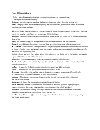
Types of Microsoft Chart.docx
1. Types of Microsoft Charts
• A chart is used to visualize data to create maximum impact on your audience.
• Chart types include the following:
Column – It displays categories along the horizontal axis and values along the vertical axis.
Line – Category data is distributed evenly along the horizontal axis, and all value data is distributed
evenly along the vertical axis.
Pie – This shows the size of items in a single data series proportional to the sum of the items. The data
points in a pie chart are shown as a percentage of the whole pie.
Doughnut – This also shows the relationships of parts to a whole, but it can contain more than a single
data series.
Bar – This displays categories along the vertical axis and values along the horizontal axis.
Area – It is used to plot change over time and draw attention to the total value across a trend.
X Y (Scatter) – This combines x and y values into single data points and shows them in irregular intervals
or clusters. Scatter charts are typically used for showing and comparing numerical values, like scientific,
statistical, and engineering data.
Bubble – This is a scatter chart added with a third column to specify the size of the bubbles it shows to
represent the data points in the data series.
Map – This compares values and shows categories across geographical regions
Stock – It shows fluctuations in stock prices. It can also be used for other data, such as daily rainfall or
annual temperatures.
Surface – It is used to find optimum combinations between two (2) sets of data.
Radar – This compares the aggregate values of several data series.
Treemap – It provides a hierarchical view of data and an easy way to compare different levels
of categorization. It displays categories by color and proximity.
Sunburst – This displays hierarchical data and can be plotted when empty cells exist within
the hierarchal structure.
Histogram – It shows the frequencies of data within a distribution.
Box & Whisker – Whisker chart shows the distribution of data into quartiles, highlighting the
mean and outliers. The boxes may have lines extending vertically called “whiskers”.
Waterfall – This shows a running total of your financial data as values are added or subtracted.
Funnel – It shows values across multiple stages in a process.
Combo – It combines two (2) or more chart types to make the data easy to understand, especially when
the data is widely varied