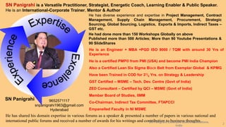
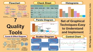
1
2
SN Panigrahi is a Versatile Practitioner, Strategist, Energetic Coach, Learning Enabler & Public Speaker.
He is an International-Corporate Trainer, Mentor & Author
He has diverse experience and expertise in Project Management, Contract
Management, Supply Chain Management, Procurement, Strategic
Sourcing, Global Sourcing, Logistics, Exports & Imports, Indirect Taxes –
GST etc.
He had done more than 150 Workshops Globally on above
Published more than 500 Articles; More than 90 Youtube Presentations &
90 SlideShares
He is an Engineer + MBA +PGD ISO 9000 / TQM with around 30 Yrs of
Experience
He is a certified PMP® from PMI (USA) and become PMI India Champion
Also a Certified Lean Six Sigma Black Belt from Exemplar Global & KPMG
Have been Trained in COD for 31/2 Yrs. on Strategy & Leadership
GST Certified – MSME – Tech. Dev. Centre (Govt of India)
ZED Consultant – Certified by QCI – MSME (Govt of India)
Member Board of Studies, IIMM
Co-Chairman, Indirect Tax Committee, FTAPCCI
Empanelled Faculty in NI MSME
He has shared his domain expertise in various forums as a speaker & presented a number of papers in various national and
international public forums and received a number of awards for his writings and contribution to business thoughts.
SN Panigrahi 9652571117
snpanigrahi1963@gmail.com
Hyderabad
SN Panigrahi, Essenpee Business Solutions,
India
3
SN Panigrahi, Essenpee Business Solutions, India 4
Quality is a very important feature for successful businesses to
uphold.
The 7 QC tools are set of graphical techniques, relatively simple
data analysis tools, fundamental instruments to improve the
process and product quality. They are used to examine the
production process, identify the key issues, control fluctuations of
product quality, and give solutions to avoid future defects.
This grouping of 7 quality control tools is often credited to Dr.
Kaoru Ishikawa. While it is clear that he used them, it is not
certain that he specifically packaged them together in this
grouping.
These 7 QC tools are easy to understand and implement and
does not need complex analytical / statistical competence.
Flowchart Check Sheet Histograms
Cause & Effect Diagram Scatter Diagram Control Chart
Pareto Diagram
6
Flowchart A Flowchart is a type of diagram that represents a workflow or process.
Check Sheet
A Check Sheet is a structured, prepared form for collecting and analyzing
data in real time and at the location where the data is generated.
Histograms
Histograms - A graphical representation, similar to a bar chart in
structure, that organizes a group of data points into user-specified ranges.
Pareto Diagram
It’s a Prioritization Diagram also Called 80:20 Rule used to identify the 20% of
the causes that create 80% of the effect to focus on those vital 20% for
Maximum Benefit
Cause & Effect
Diagram
A Cause-and-Effect Diagram is a tool that helps identify, sort, and display
possible causes of a specific problem or quality characteristic
Scatter Diagram
A Scatter Diagram is a tool for analyzing relationships between two
variables. One variable is plotted on the horizontal axis and the other is
plotted on the vertical axis.
Control Chart
The Control Chart is a graph used to study how a process changes over
time. Data are plotted in time order.
7
8
Start / End
Process Step
Decision Preparation
Document
Input /
OutputProcess
Flow Line
Pre-Defined
Process
Off-Page
Connector
A Flowchart is a type of diagram that represents a workflow or
process. A flowchart can also be defined as a diagrammatic
representation of an algorithm, a step-by-step approach to solving a
task.
The flowchart shows the steps as boxes of various kinds, and their
order by connecting the boxes with arrows.
9
Start
Patient Arrives
Patient
Registered
?
Nurse
Available?
Get Register
Wait for Nurse
Availability
Record Health
Condition
Doctor
Available?
Assign Doctor
Diagnosis Test Results
Need
Medication
?
Give Patient
PrescriptionPatient Leaves
End
Wait for Doctor
Availability
10
11
A check sheet is a structured, prepared form for collecting and analyzing data in real time and at the
location where the data is generated. This is a generic data collection and analysis tool that can be
adapted for a wide variety of purposes and is considered one of the seven basic quality tools.
Water Bottle Defects
Capacity Scratches Loose Cap Label Volume Leakage Frequency
300 ml
500 ml
1000 ml
Total
Water Bottle Defects
Capacity Scratches Loose Cap Label Volume Leakage Frequency
300 ml II II IIII I I
500 ml III IIII II I I
1000 ml IIII IIII I I I
Total
Water Bottle Defects
Capacity Scratches Loose Cap Label Volume Leakage Frequency
300 ml II II IIII I I 11
500 ml III IIII II I I 12
1000 ml IIII IIII I I I 13
Total 5 18 8 2 3 36
Telephone Interruptions
Reasons Monday Tuesday Wednesday Thursday Friday Total
Wrong
Number
Info.
Request
Boss
Total
Telephone Interruptions
Reasons Monday Tuesday Wednesday Thursday Friday Total
Wrong
Number
IIII II I IIII IIII II
Info.
Request
II II II II II
Boss IIII II IIII II I IIII
Total
Telephone Interruptions
Reasons Monday Tuesday Wednesday Thursday Friday Total
Wrong
Number
IIII II I IIII IIII II 20
Info.
Request
II II II II II 10
Complaints IIII II IIII II I IIII 19
Total 12 6 10 8 13 49
12
Histograms - A graphical representation, similar to a bar chart in
structure, that organizes a group of data points into user-specified
ranges. The histogram condenses a data series into an easily
interpreted visual by taking many data points and grouping them
into logical ranges or bins.
A histogram is a bar graph-like representation of data that buckets
a range of outcomes into columns along the x-axis.
The y-axis represents the number count or percentage of
occurrences in the data for each column and can be used to
visualize data distributions.
36
25
14
46
55
68
72
8
36
38
5
45
22
76
91
46
56
61
58
55
10
16
26
35
42
Example : Patients Arrived in a Hospital
Age Data
More Examples
Hight or Weight of Students in Class
Sales, Production, Defects
Population Age, Income etc
15
16
Pareto Diagram – Invented by an Italian Economist Alfredo Pareto. Also Called
80:20 Rule.
It is Combination of Bar Diagram & Line Graph.
Actual Frequencies are taken on Primary Vertical Axis, showing as Vertical Bars
in Descending Order.
Percentage Cumulative Frequency are taken on Secondary Vertical Axis shown
by Line Graph in Ascending Order.
Useful tools for Prioritization & to drive continuous process improvement.
The 80:20 Rule can help you identify the 20% of the causes that create 80% of
the effect allowing you to focus on those vital 20% for maximum benefit rather
than wasting your resources tackling the other 80% of the causes for minimal
benefit.
17
Example
A Survey was Conducted in
Garments Shop & Customer
Complaints are Recorded as
Follows:
Parking Difficulty 97
Sales Representative
was Rude 74
Poor Lighting 46
Layout Confusing 27
Limited Sizes 21
Limited Designs 15
Stiching Deffects 13
Price Tags Tampered 9
Fadded Cloths 2
Significant
Few
Insignificant
Many
80% Line
18
19
Ishikawa Diagrams (also called Cause-and-Effect Diagrams or Fishbone Diagrams)
are causal diagrams created by Kaoru Ishikawa that show the potential causes of a specific
event.
It helps in brainstorming to identify possible causes of a problem and in sorting ideas into useful
categories in a visual way to look at cause and effect.
"Causes in the diagram are often categorized, such as to the 7 M's ...
The 7 Ms (used in manufacturing industry):
(1) Machine (technology);
(2) Method (process);
(3) Material (Includes Raw Material, Consumables and Information.);
(4) Man Power (physical work)/ Mind Power (brain work): Kaizens, Suggestions;
(5) Measurement (Inspection);
(6) Milieu / Mother Nature (Environment).
(7) Management/ Money Power;
20
21
Poor Handling of Orders
Poor Dispatch
Process
Poor Layout
Lack of Standard
Procedures
High Staff
Turnover
Low Morale
High Turnover
High Absenteeism
No Capacity /
Low Capacity
Poor Use of
Equipment
Poor
Maintenance
Poor
Training on M/C
Inaccurate
Ordering
Inventory
Stockout
Obsolete
Inventory
Tight Tolerance
Poor Warehouse
Systems
Inadequate
Training
New Machine
Operators
Incorrect
M/C Setup
Inventory
Buffer Reduced
Employer
Breaks Policy
Assembly
Difficulty
Broken Packages
Winter Driving
Conditions
Employer Breaks Policy
22
The Wrong Item was Pulled
from Inventory
The Item we Pulled from
Inventory was Mislabelled
Our Supplier Mislabelled the
Item Prior to Shipping it to
Our Warehouse
The Individual Applying Labels
to Our Product at the Suppliers
Placed the Wrong Label on the
Product
Labels for Different Orders are
Pre-Printed & Mixed & It is Easy
to Apply the Wrong Label
23
Why was My Tea Cold? The Kettle Didn’t Heat the Water
Why Didn’t the Kettle Heat the
Water?
No Power – the Fuse in the Plug
was Blown
Why was the Fuse in the Plug
Blown?
The incorrect Rated Fuse was
Fitted
Why was an Incorrect Rated Fuse
Fitted?
The Required Fuse was Not
Specified
Why was the Correct Fuse Not
Specified?
There was No Specification for
Fuses
24
25
Scatter Diagram - A scatter diagram is a tool for analyzing relationships between two variables.
One variable is plotted on the horizontal axis and the other is plotted on the vertical axis. The pattern of
their intersecting points can graphically show relationship patterns. Most often a scatter diagram is
used to prove or disprove cause-and-effect relationships.
•All correlations have two properties:
Strength (Strong or Week Co-Relation)
and Direction (Positive Co-Relation &
Negative Co-Relation).
•Positive Correlation: Both variables
move in the same direction. In other
words, as one variable increases, the
other variable also increases and Vis-
Versa.
•Negative Correlation: The variables
move in opposite directions. As one
variable increases, the other variable
decreases.
26
27
The control chart is a graph used to study how a process changes over time. Data are plotted in
time order. A control chart always has a central line for the average, an upper line for the upper
control limit, and a lower line for the lower control limit. These lines are determined from historical
data. By comparing current data to these lines, you can draw conclusions about whether the
process variation is consistent (in control) or is unpredictable (out of control, affected by special
causes of variation).
Lower Control Limit = Mean - 3*ϭ
Central Line = Mean
Upper Control Limit = Mean + 3*ϭ
Ϭ = Standard Deviation (SD)
Samples
QualityCharacteristics
UCL
LCL
Mean
28
Rule of Seven is used to filter out the random
variation in a production process. shows the ‘trends’
that are caused by the ‘assignable causes’ or non-
random causes that required investigation and
possible corrective action to be taken.
Samples
QualityCharacteristics Common causes are part and
parcel of the process of
production. Variations due
to common causes are well
Expected, Inherent & Natural and
Within Control Limits & Accepted.
Special Cause variations are issues developed
in a process. There may be some kind of defects
in the system – System Out of Control.
Therefore special cause variations must be
Identified, Investigated and Resolved
Rule of Seven pattern:
➢ seven points above mean value;
➢ seven points below mean value;
➢ seven points or all increasing ; or
➢ seven points all decreasing
the patterns are indicators of non-
random problems which can be
symptom of process out of control.
Rule of Seven Also Special Cause
Variance
29
30
Stratification is a technique used in combination with other
data analysis tools. When data from a variety of sources or
categories have been lumped together, the meaning of the
data can be impossible to see. This technique separates the
data so that patterns can be seen..
Stratification Procedure
When plotting or graphing the collected data on a scatter
diagram, control chart, histogram or other analysis tool,
use different marks or colors to distinguish data from
various sources. Data that are distinguished in this way
are said to be “stratified.”
Analyze the subsets of stratified data separately. For
example, on a scatter diagram where data are stratified into
data from source 1 and data from source 2, draw quadrants,
count points and determine the critical value only for the
data from source 1, then only for the data from source 2.
By using unique symbols for each source,
you can view data sets independently or in
correlation to other data sets.
31
SN Panigrahi, Essenpee Business Solutions, India
32
SN Panigrahi, Essenpee Business Solutions, India
33
Contact Details:
SN Panigrahi
9652571117
snpanigrahi1963@gmail.com
34

#The 7 Basic Quality Tools For Process Improvement - By SN Panigrahi

  • 1.
  • 2.
    2 SN Panigrahi isa Versatile Practitioner, Strategist, Energetic Coach, Learning Enabler & Public Speaker. He is an International-Corporate Trainer, Mentor & Author He has diverse experience and expertise in Project Management, Contract Management, Supply Chain Management, Procurement, Strategic Sourcing, Global Sourcing, Logistics, Exports & Imports, Indirect Taxes – GST etc. He had done more than 150 Workshops Globally on above Published more than 500 Articles; More than 90 Youtube Presentations & 90 SlideShares He is an Engineer + MBA +PGD ISO 9000 / TQM with around 30 Yrs of Experience He is a certified PMP® from PMI (USA) and become PMI India Champion Also a Certified Lean Six Sigma Black Belt from Exemplar Global & KPMG Have been Trained in COD for 31/2 Yrs. on Strategy & Leadership GST Certified – MSME – Tech. Dev. Centre (Govt of India) ZED Consultant – Certified by QCI – MSME (Govt of India) Member Board of Studies, IIMM Co-Chairman, Indirect Tax Committee, FTAPCCI Empanelled Faculty in NI MSME He has shared his domain expertise in various forums as a speaker & presented a number of papers in various national and international public forums and received a number of awards for his writings and contribution to business thoughts. SN Panigrahi 9652571117 snpanigrahi1963@gmail.com Hyderabad SN Panigrahi, Essenpee Business Solutions, India
  • 3.
  • 4.
    SN Panigrahi, EssenpeeBusiness Solutions, India 4 Quality is a very important feature for successful businesses to uphold. The 7 QC tools are set of graphical techniques, relatively simple data analysis tools, fundamental instruments to improve the process and product quality. They are used to examine the production process, identify the key issues, control fluctuations of product quality, and give solutions to avoid future defects. This grouping of 7 quality control tools is often credited to Dr. Kaoru Ishikawa. While it is clear that he used them, it is not certain that he specifically packaged them together in this grouping. These 7 QC tools are easy to understand and implement and does not need complex analytical / statistical competence.
  • 5.
    Flowchart Check SheetHistograms Cause & Effect Diagram Scatter Diagram Control Chart Pareto Diagram
  • 6.
    6 Flowchart A Flowchartis a type of diagram that represents a workflow or process. Check Sheet A Check Sheet is a structured, prepared form for collecting and analyzing data in real time and at the location where the data is generated. Histograms Histograms - A graphical representation, similar to a bar chart in structure, that organizes a group of data points into user-specified ranges. Pareto Diagram It’s a Prioritization Diagram also Called 80:20 Rule used to identify the 20% of the causes that create 80% of the effect to focus on those vital 20% for Maximum Benefit Cause & Effect Diagram A Cause-and-Effect Diagram is a tool that helps identify, sort, and display possible causes of a specific problem or quality characteristic Scatter Diagram A Scatter Diagram is a tool for analyzing relationships between two variables. One variable is plotted on the horizontal axis and the other is plotted on the vertical axis. Control Chart The Control Chart is a graph used to study how a process changes over time. Data are plotted in time order.
  • 7.
  • 8.
    8 Start / End ProcessStep Decision Preparation Document Input / OutputProcess Flow Line Pre-Defined Process Off-Page Connector A Flowchart is a type of diagram that represents a workflow or process. A flowchart can also be defined as a diagrammatic representation of an algorithm, a step-by-step approach to solving a task. The flowchart shows the steps as boxes of various kinds, and their order by connecting the boxes with arrows.
  • 9.
    9 Start Patient Arrives Patient Registered ? Nurse Available? Get Register Waitfor Nurse Availability Record Health Condition Doctor Available? Assign Doctor Diagnosis Test Results Need Medication ? Give Patient PrescriptionPatient Leaves End Wait for Doctor Availability
  • 10.
  • 11.
    11 A check sheetis a structured, prepared form for collecting and analyzing data in real time and at the location where the data is generated. This is a generic data collection and analysis tool that can be adapted for a wide variety of purposes and is considered one of the seven basic quality tools. Water Bottle Defects Capacity Scratches Loose Cap Label Volume Leakage Frequency 300 ml 500 ml 1000 ml Total Water Bottle Defects Capacity Scratches Loose Cap Label Volume Leakage Frequency 300 ml II II IIII I I 500 ml III IIII II I I 1000 ml IIII IIII I I I Total Water Bottle Defects Capacity Scratches Loose Cap Label Volume Leakage Frequency 300 ml II II IIII I I 11 500 ml III IIII II I I 12 1000 ml IIII IIII I I I 13 Total 5 18 8 2 3 36 Telephone Interruptions Reasons Monday Tuesday Wednesday Thursday Friday Total Wrong Number Info. Request Boss Total Telephone Interruptions Reasons Monday Tuesday Wednesday Thursday Friday Total Wrong Number IIII II I IIII IIII II Info. Request II II II II II Boss IIII II IIII II I IIII Total Telephone Interruptions Reasons Monday Tuesday Wednesday Thursday Friday Total Wrong Number IIII II I IIII IIII II 20 Info. Request II II II II II 10 Complaints IIII II IIII II I IIII 19 Total 12 6 10 8 13 49
  • 12.
  • 13.
    Histograms - Agraphical representation, similar to a bar chart in structure, that organizes a group of data points into user-specified ranges. The histogram condenses a data series into an easily interpreted visual by taking many data points and grouping them into logical ranges or bins. A histogram is a bar graph-like representation of data that buckets a range of outcomes into columns along the x-axis. The y-axis represents the number count or percentage of occurrences in the data for each column and can be used to visualize data distributions.
  • 14.
    36 25 14 46 55 68 72 8 36 38 5 45 22 76 91 46 56 61 58 55 10 16 26 35 42 Example : PatientsArrived in a Hospital Age Data More Examples Hight or Weight of Students in Class Sales, Production, Defects Population Age, Income etc
  • 15.
  • 16.
    16 Pareto Diagram –Invented by an Italian Economist Alfredo Pareto. Also Called 80:20 Rule. It is Combination of Bar Diagram & Line Graph. Actual Frequencies are taken on Primary Vertical Axis, showing as Vertical Bars in Descending Order. Percentage Cumulative Frequency are taken on Secondary Vertical Axis shown by Line Graph in Ascending Order. Useful tools for Prioritization & to drive continuous process improvement. The 80:20 Rule can help you identify the 20% of the causes that create 80% of the effect allowing you to focus on those vital 20% for maximum benefit rather than wasting your resources tackling the other 80% of the causes for minimal benefit.
  • 17.
    17 Example A Survey wasConducted in Garments Shop & Customer Complaints are Recorded as Follows: Parking Difficulty 97 Sales Representative was Rude 74 Poor Lighting 46 Layout Confusing 27 Limited Sizes 21 Limited Designs 15 Stiching Deffects 13 Price Tags Tampered 9 Fadded Cloths 2 Significant Few Insignificant Many 80% Line
  • 18.
  • 19.
    19 Ishikawa Diagrams (alsocalled Cause-and-Effect Diagrams or Fishbone Diagrams) are causal diagrams created by Kaoru Ishikawa that show the potential causes of a specific event. It helps in brainstorming to identify possible causes of a problem and in sorting ideas into useful categories in a visual way to look at cause and effect. "Causes in the diagram are often categorized, such as to the 7 M's ... The 7 Ms (used in manufacturing industry): (1) Machine (technology); (2) Method (process); (3) Material (Includes Raw Material, Consumables and Information.); (4) Man Power (physical work)/ Mind Power (brain work): Kaizens, Suggestions; (5) Measurement (Inspection); (6) Milieu / Mother Nature (Environment). (7) Management/ Money Power;
  • 20.
  • 21.
    21 Poor Handling ofOrders Poor Dispatch Process Poor Layout Lack of Standard Procedures High Staff Turnover Low Morale High Turnover High Absenteeism No Capacity / Low Capacity Poor Use of Equipment Poor Maintenance Poor Training on M/C Inaccurate Ordering Inventory Stockout Obsolete Inventory Tight Tolerance Poor Warehouse Systems Inadequate Training New Machine Operators Incorrect M/C Setup Inventory Buffer Reduced Employer Breaks Policy Assembly Difficulty Broken Packages Winter Driving Conditions Employer Breaks Policy
  • 22.
    22 The Wrong Itemwas Pulled from Inventory The Item we Pulled from Inventory was Mislabelled Our Supplier Mislabelled the Item Prior to Shipping it to Our Warehouse The Individual Applying Labels to Our Product at the Suppliers Placed the Wrong Label on the Product Labels for Different Orders are Pre-Printed & Mixed & It is Easy to Apply the Wrong Label
  • 23.
    23 Why was MyTea Cold? The Kettle Didn’t Heat the Water Why Didn’t the Kettle Heat the Water? No Power – the Fuse in the Plug was Blown Why was the Fuse in the Plug Blown? The incorrect Rated Fuse was Fitted Why was an Incorrect Rated Fuse Fitted? The Required Fuse was Not Specified Why was the Correct Fuse Not Specified? There was No Specification for Fuses
  • 24.
  • 25.
    25 Scatter Diagram -A scatter diagram is a tool for analyzing relationships between two variables. One variable is plotted on the horizontal axis and the other is plotted on the vertical axis. The pattern of their intersecting points can graphically show relationship patterns. Most often a scatter diagram is used to prove or disprove cause-and-effect relationships. •All correlations have two properties: Strength (Strong or Week Co-Relation) and Direction (Positive Co-Relation & Negative Co-Relation). •Positive Correlation: Both variables move in the same direction. In other words, as one variable increases, the other variable also increases and Vis- Versa. •Negative Correlation: The variables move in opposite directions. As one variable increases, the other variable decreases.
  • 26.
  • 27.
    27 The control chartis a graph used to study how a process changes over time. Data are plotted in time order. A control chart always has a central line for the average, an upper line for the upper control limit, and a lower line for the lower control limit. These lines are determined from historical data. By comparing current data to these lines, you can draw conclusions about whether the process variation is consistent (in control) or is unpredictable (out of control, affected by special causes of variation). Lower Control Limit = Mean - 3*ϭ Central Line = Mean Upper Control Limit = Mean + 3*ϭ Ϭ = Standard Deviation (SD) Samples QualityCharacteristics UCL LCL Mean
  • 28.
    28 Rule of Sevenis used to filter out the random variation in a production process. shows the ‘trends’ that are caused by the ‘assignable causes’ or non- random causes that required investigation and possible corrective action to be taken. Samples QualityCharacteristics Common causes are part and parcel of the process of production. Variations due to common causes are well Expected, Inherent & Natural and Within Control Limits & Accepted. Special Cause variations are issues developed in a process. There may be some kind of defects in the system – System Out of Control. Therefore special cause variations must be Identified, Investigated and Resolved Rule of Seven pattern: ➢ seven points above mean value; ➢ seven points below mean value; ➢ seven points or all increasing ; or ➢ seven points all decreasing the patterns are indicators of non- random problems which can be symptom of process out of control. Rule of Seven Also Special Cause Variance
  • 29.
  • 30.
    30 Stratification is atechnique used in combination with other data analysis tools. When data from a variety of sources or categories have been lumped together, the meaning of the data can be impossible to see. This technique separates the data so that patterns can be seen.. Stratification Procedure When plotting or graphing the collected data on a scatter diagram, control chart, histogram or other analysis tool, use different marks or colors to distinguish data from various sources. Data that are distinguished in this way are said to be “stratified.” Analyze the subsets of stratified data separately. For example, on a scatter diagram where data are stratified into data from source 1 and data from source 2, draw quadrants, count points and determine the critical value only for the data from source 1, then only for the data from source 2. By using unique symbols for each source, you can view data sets independently or in correlation to other data sets.
  • 31.
    31 SN Panigrahi, EssenpeeBusiness Solutions, India
  • 32.
    32 SN Panigrahi, EssenpeeBusiness Solutions, India
  • 33.
  • 34.