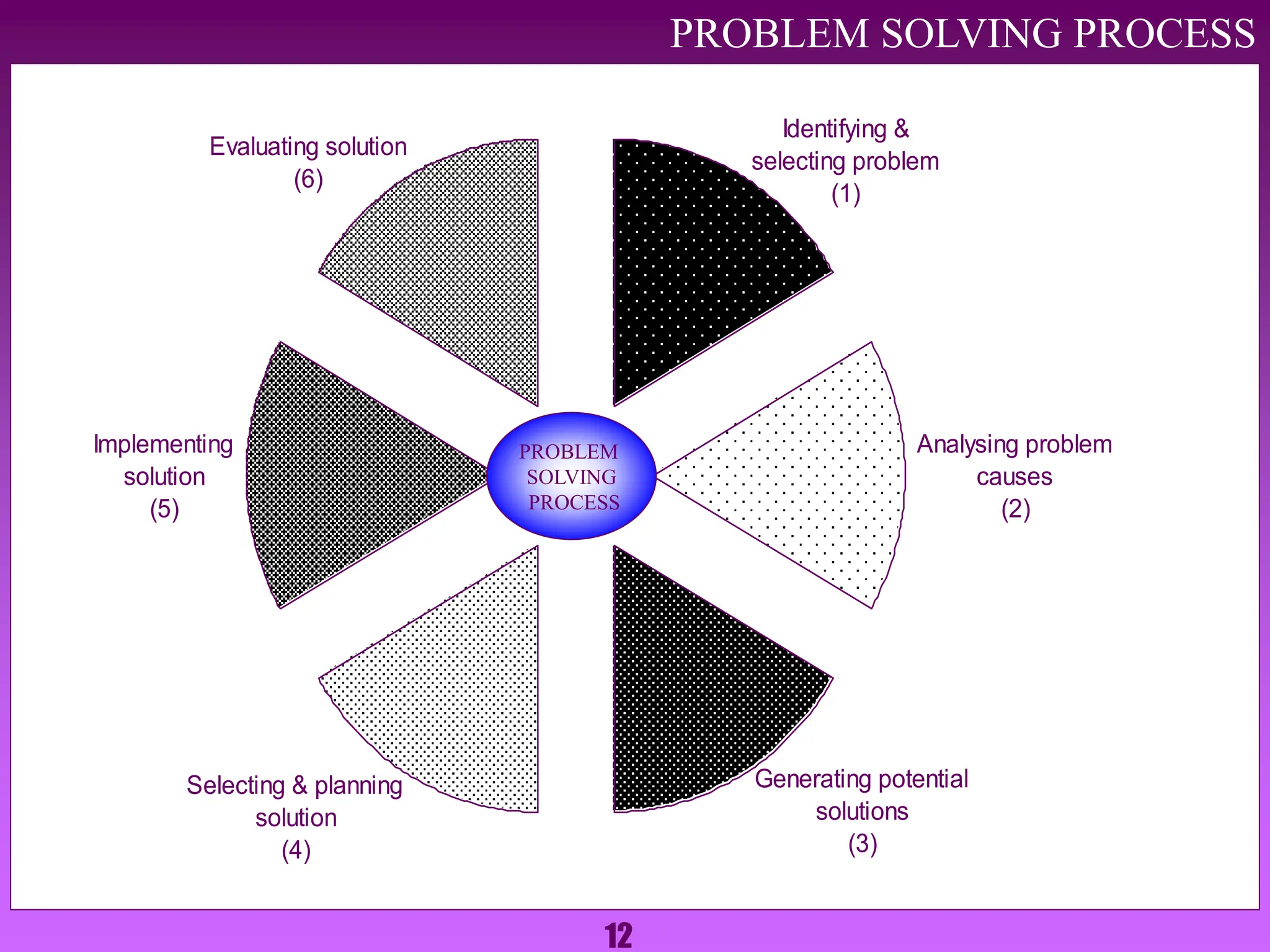
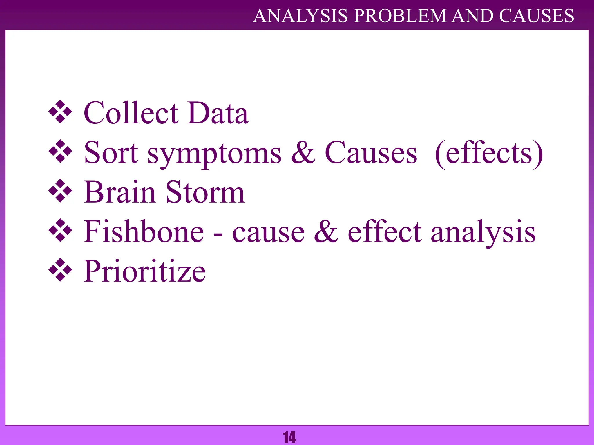
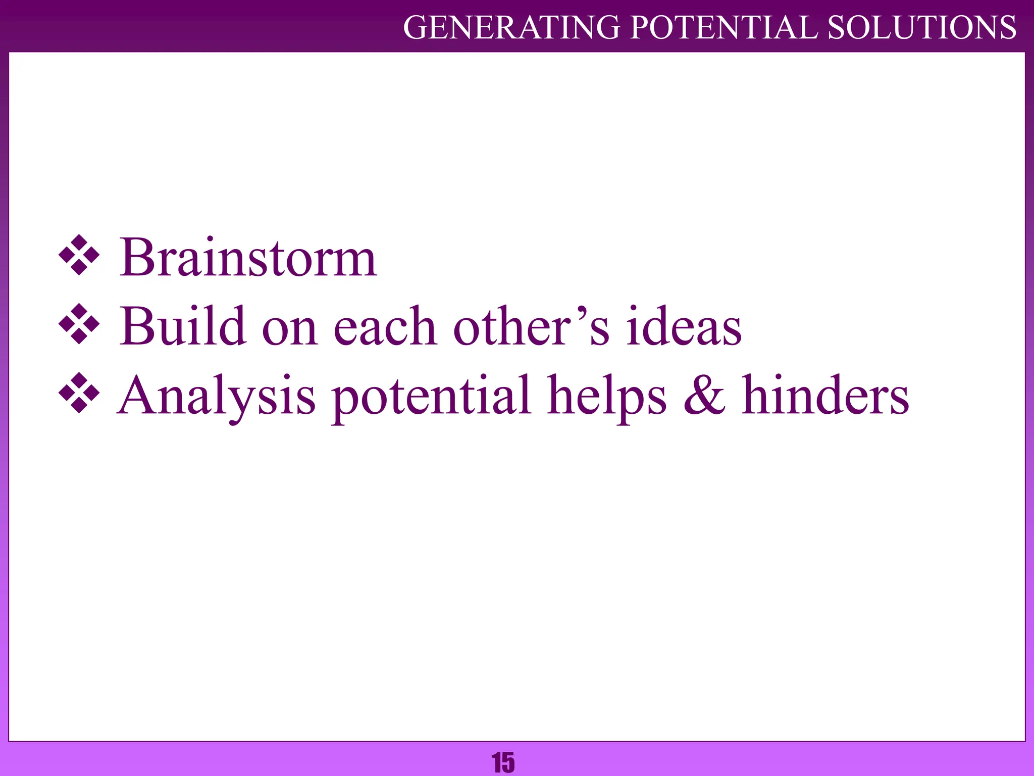
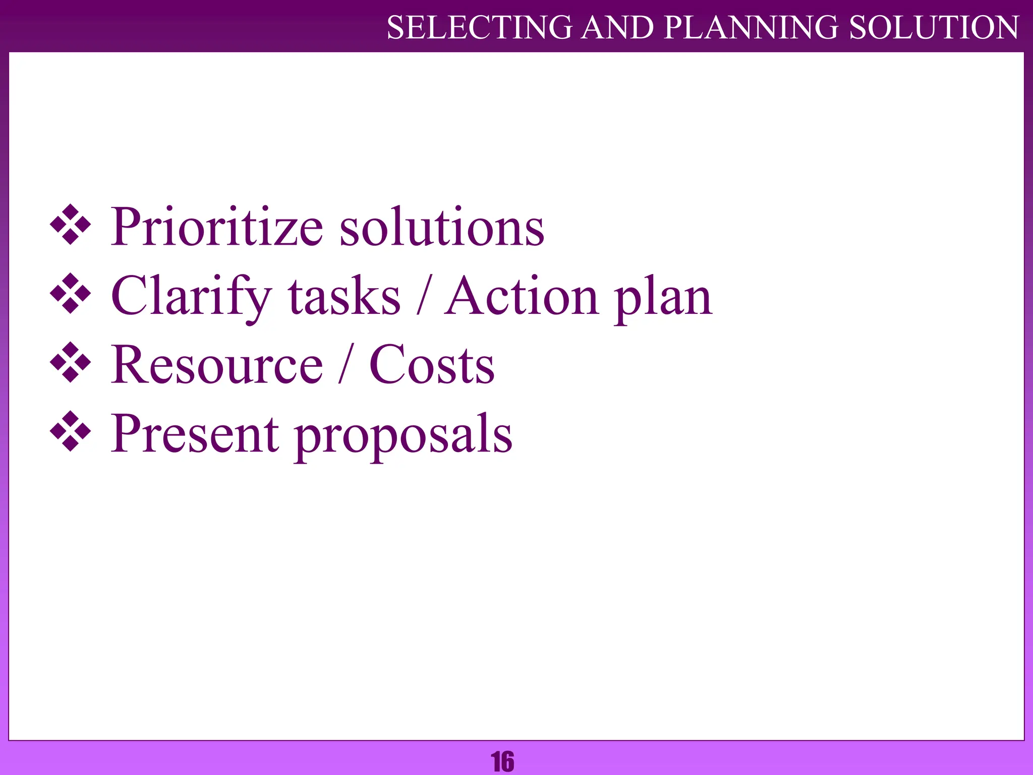
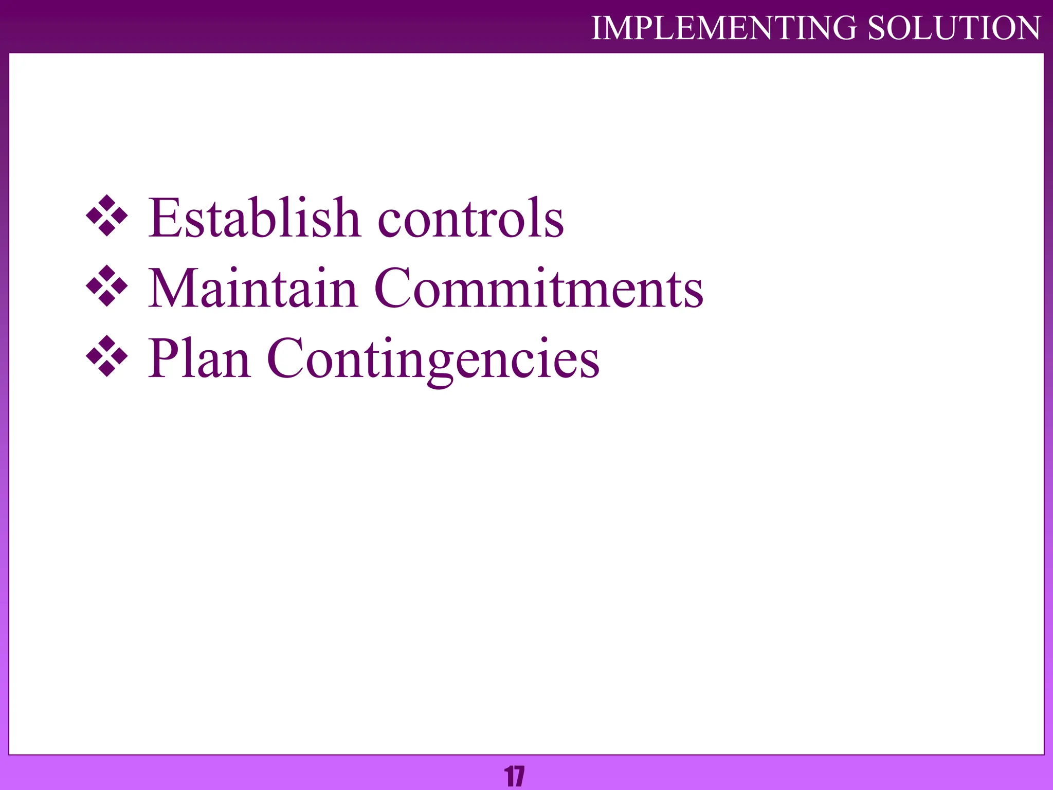
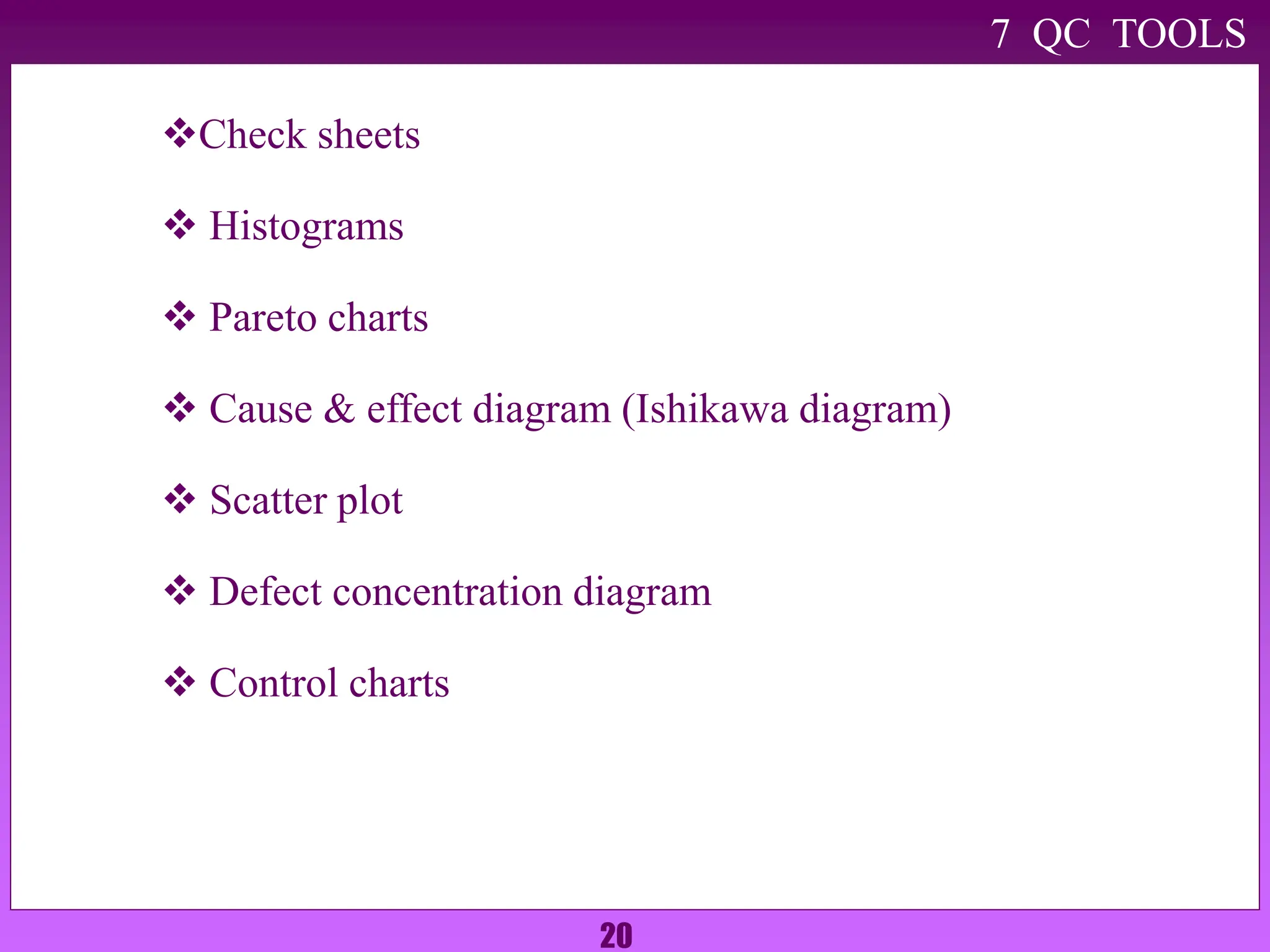
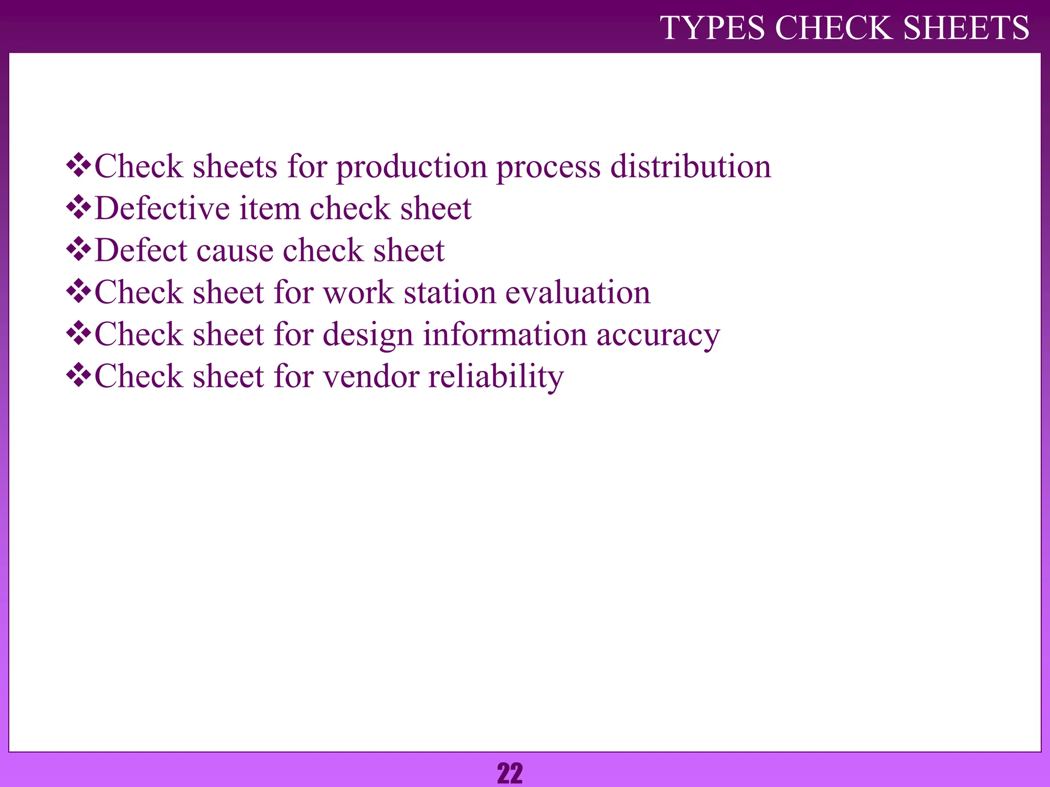
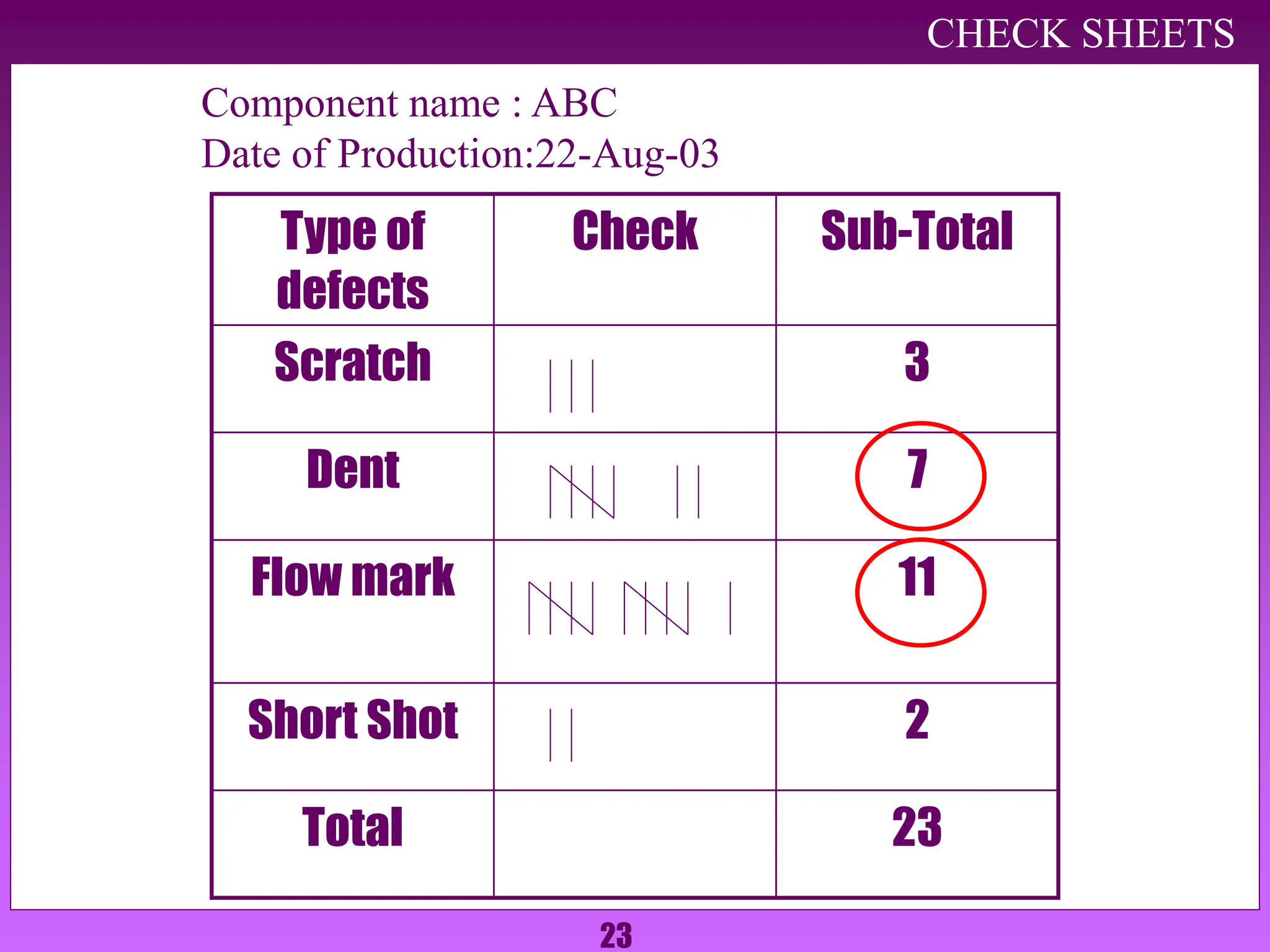
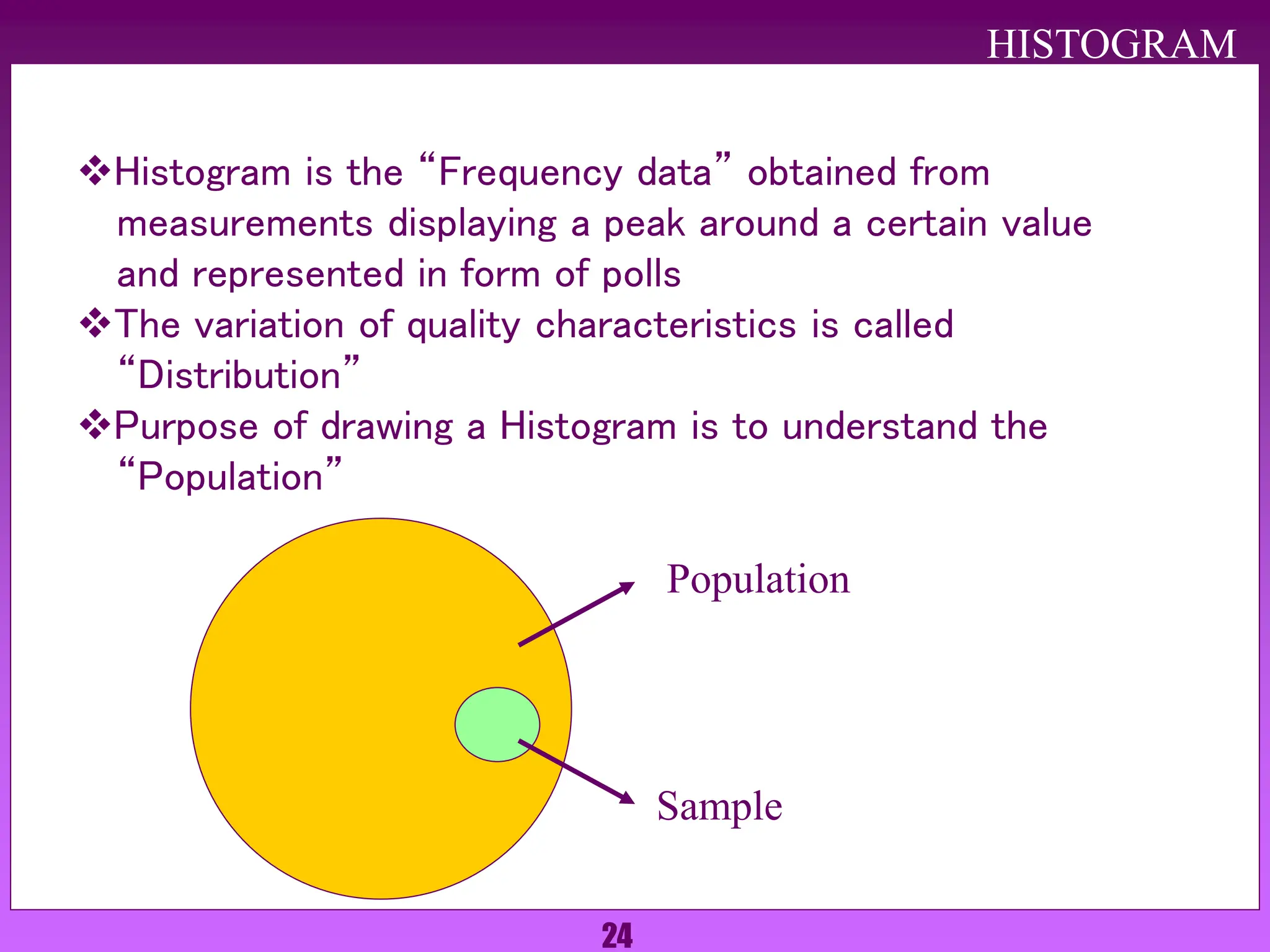
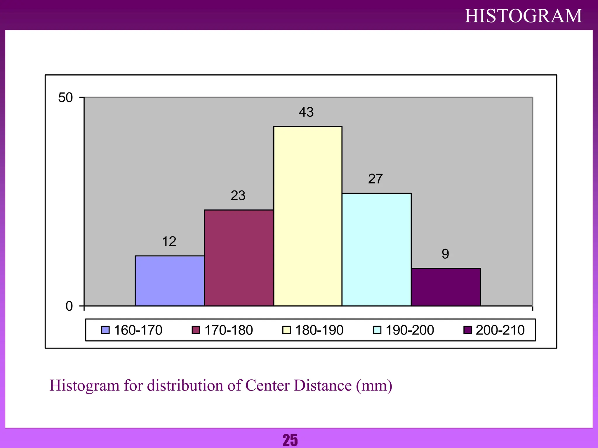
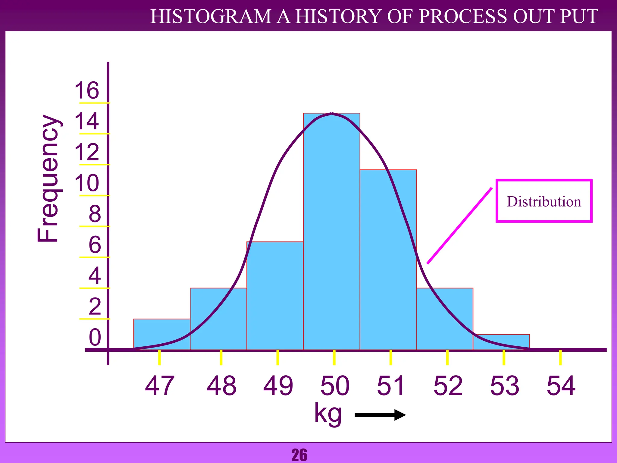
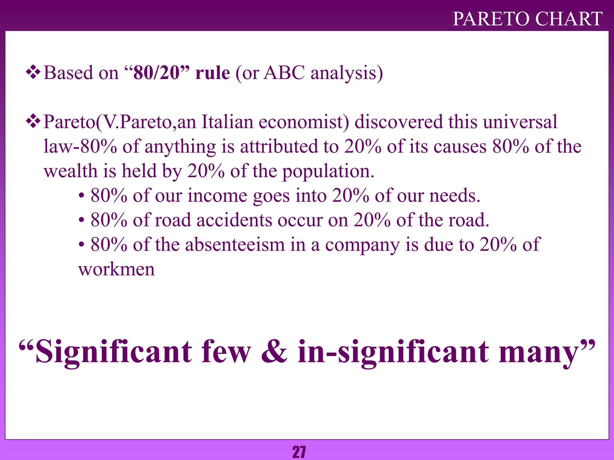
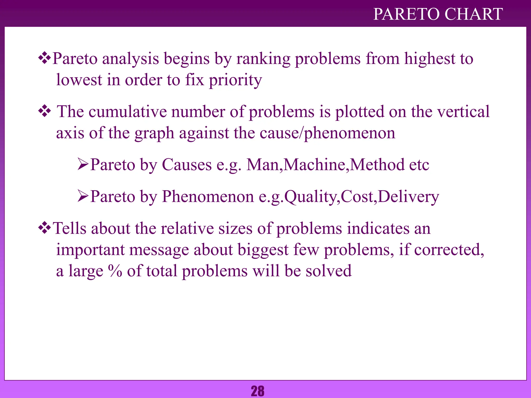
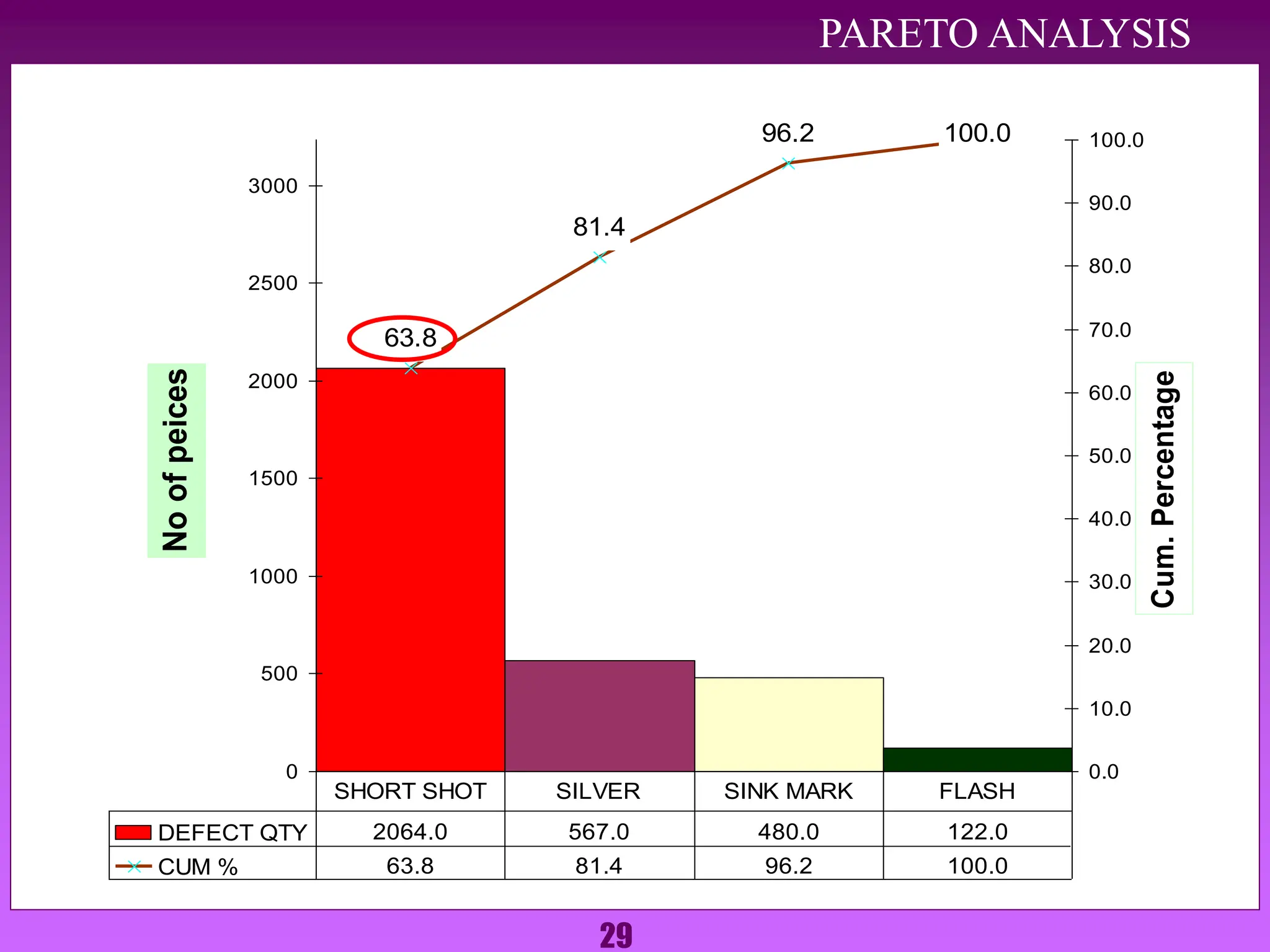
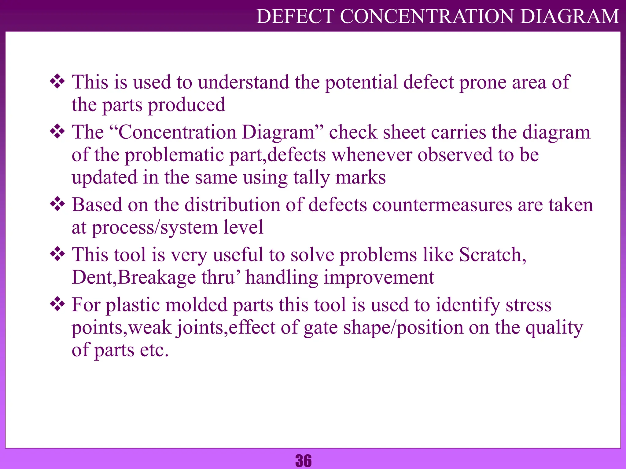
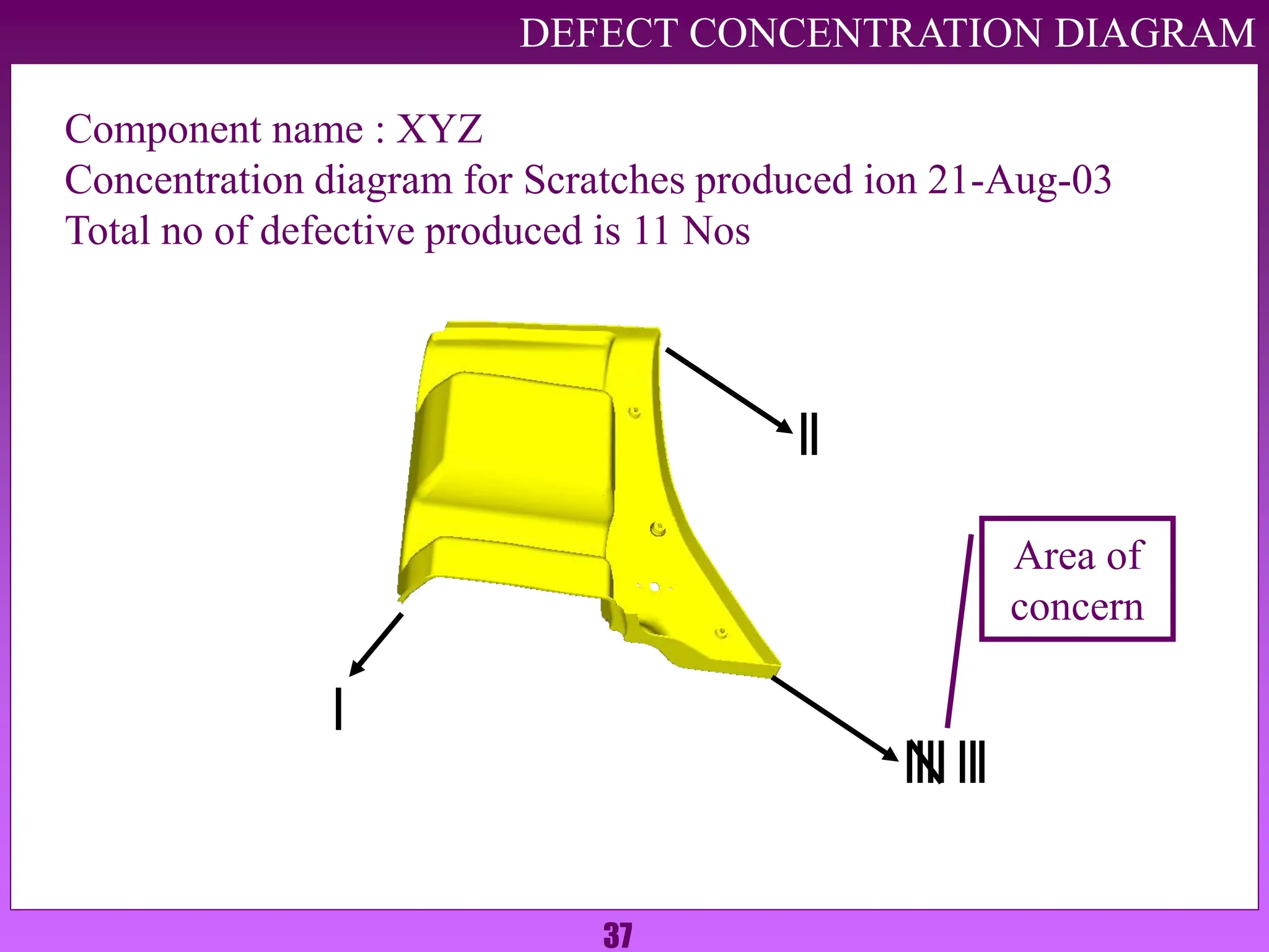
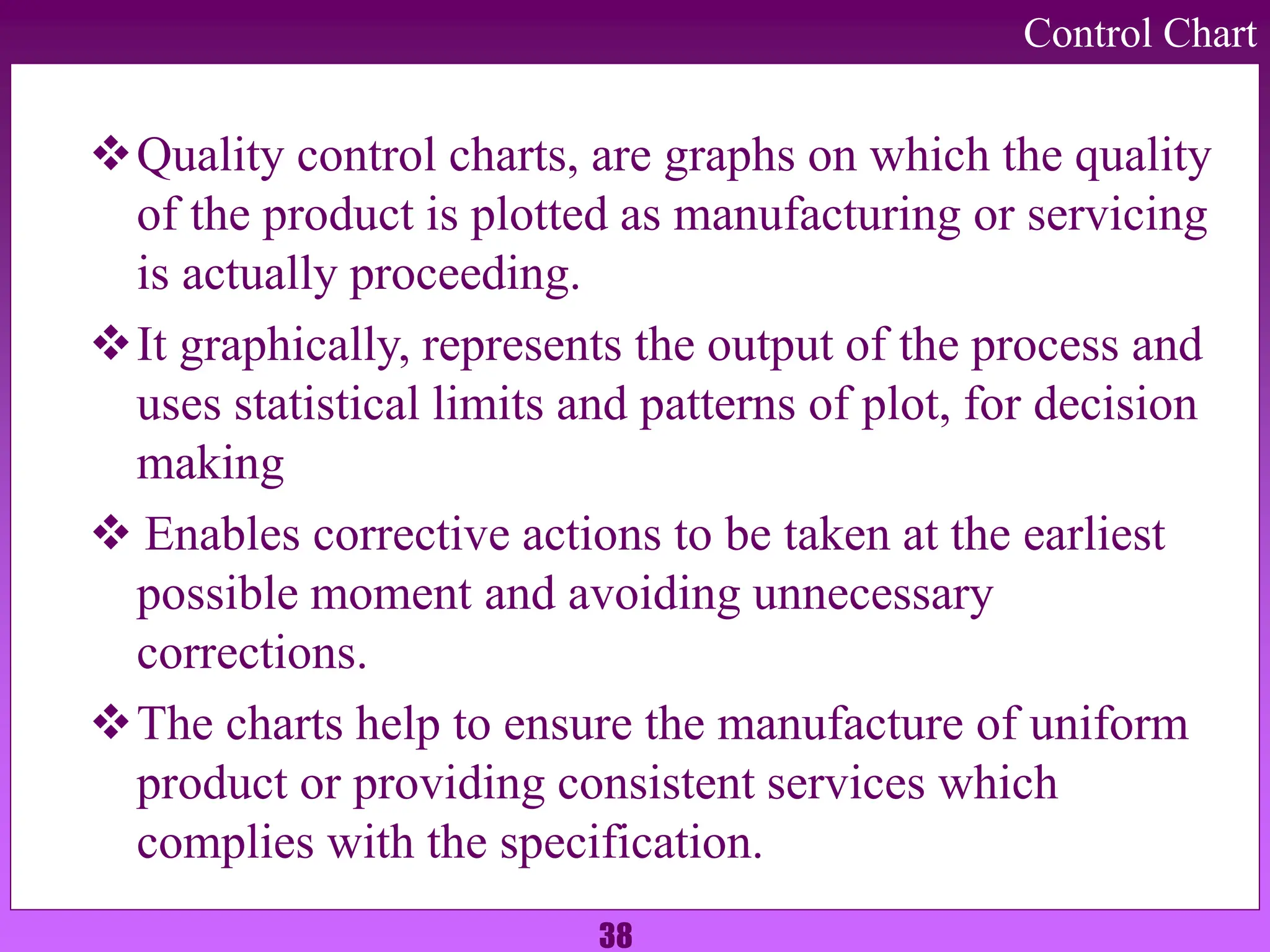
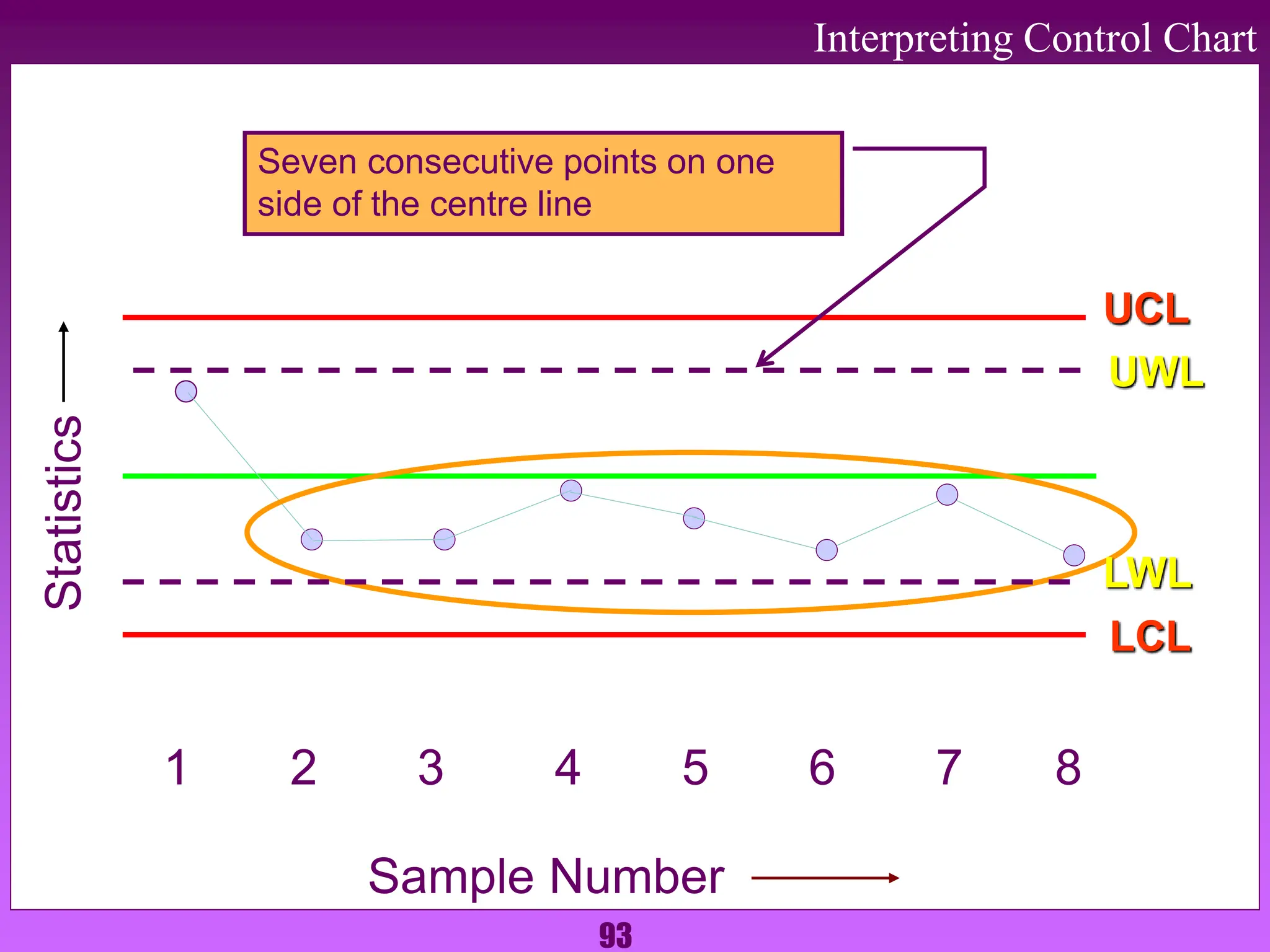
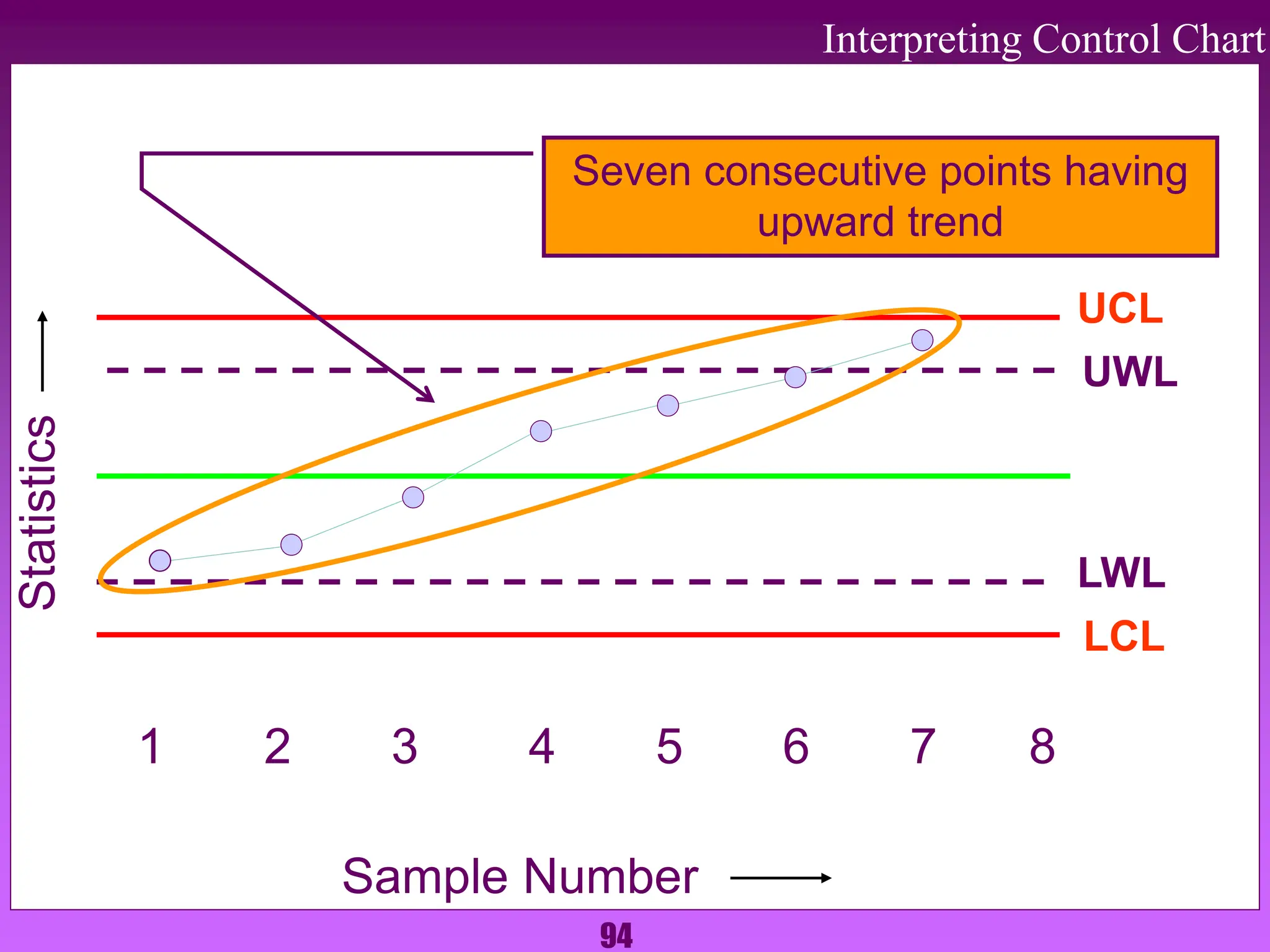
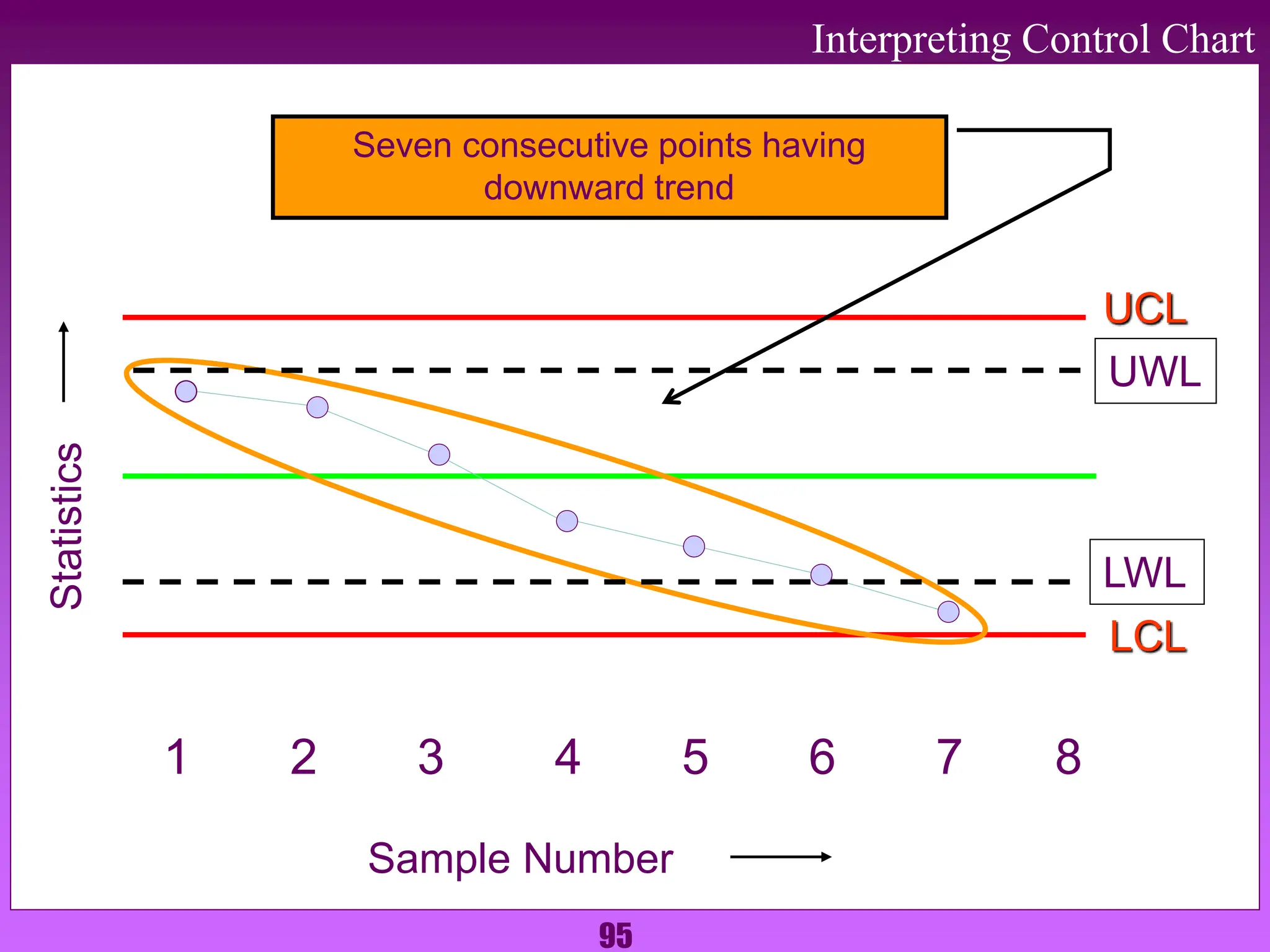
1. The document discusses various quality control tools used to identify, analyze, and resolve problems in a systematic manner. It describes tools like check sheets, histograms, Pareto charts, cause-and-effect diagrams, scatter plots, defect concentration diagrams, and control charts.
2. These 7 QC tools are simple but powerful for solving day-to-day work problems by finding solutions systematically. They are widely used by quality circle members.
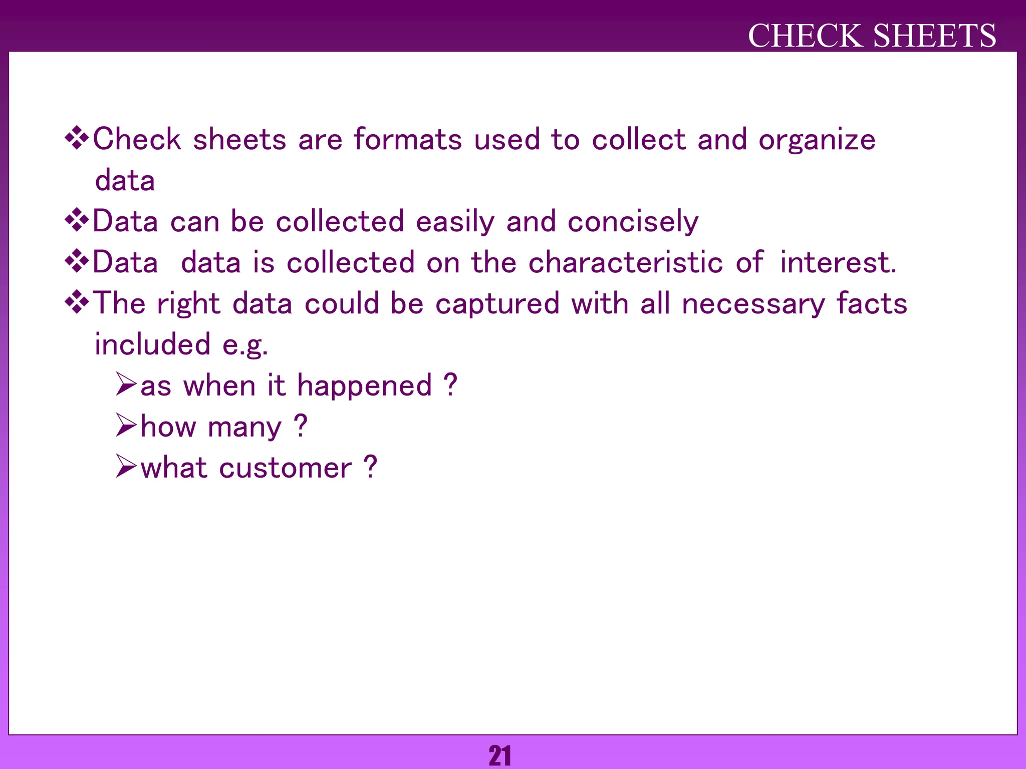
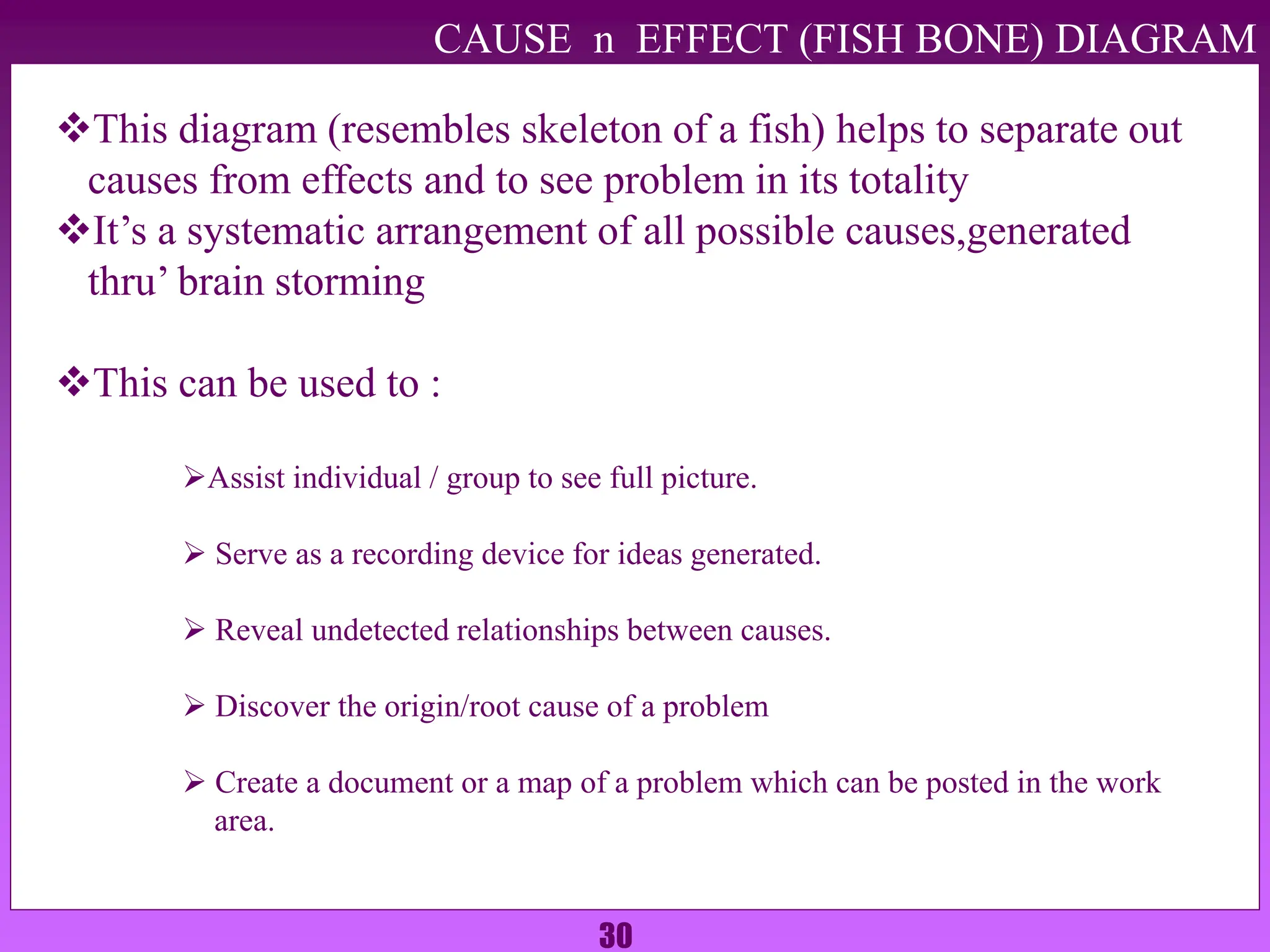
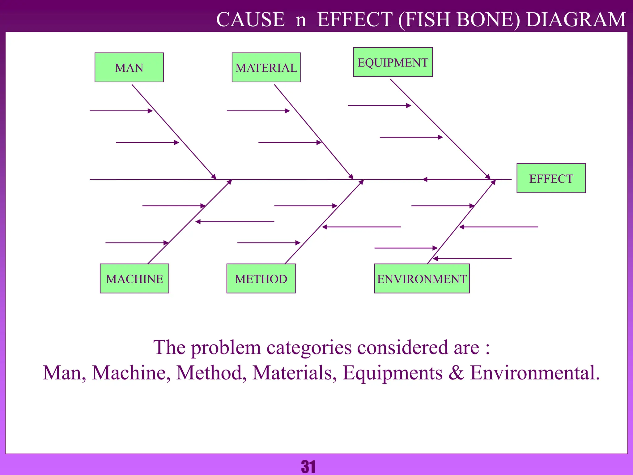
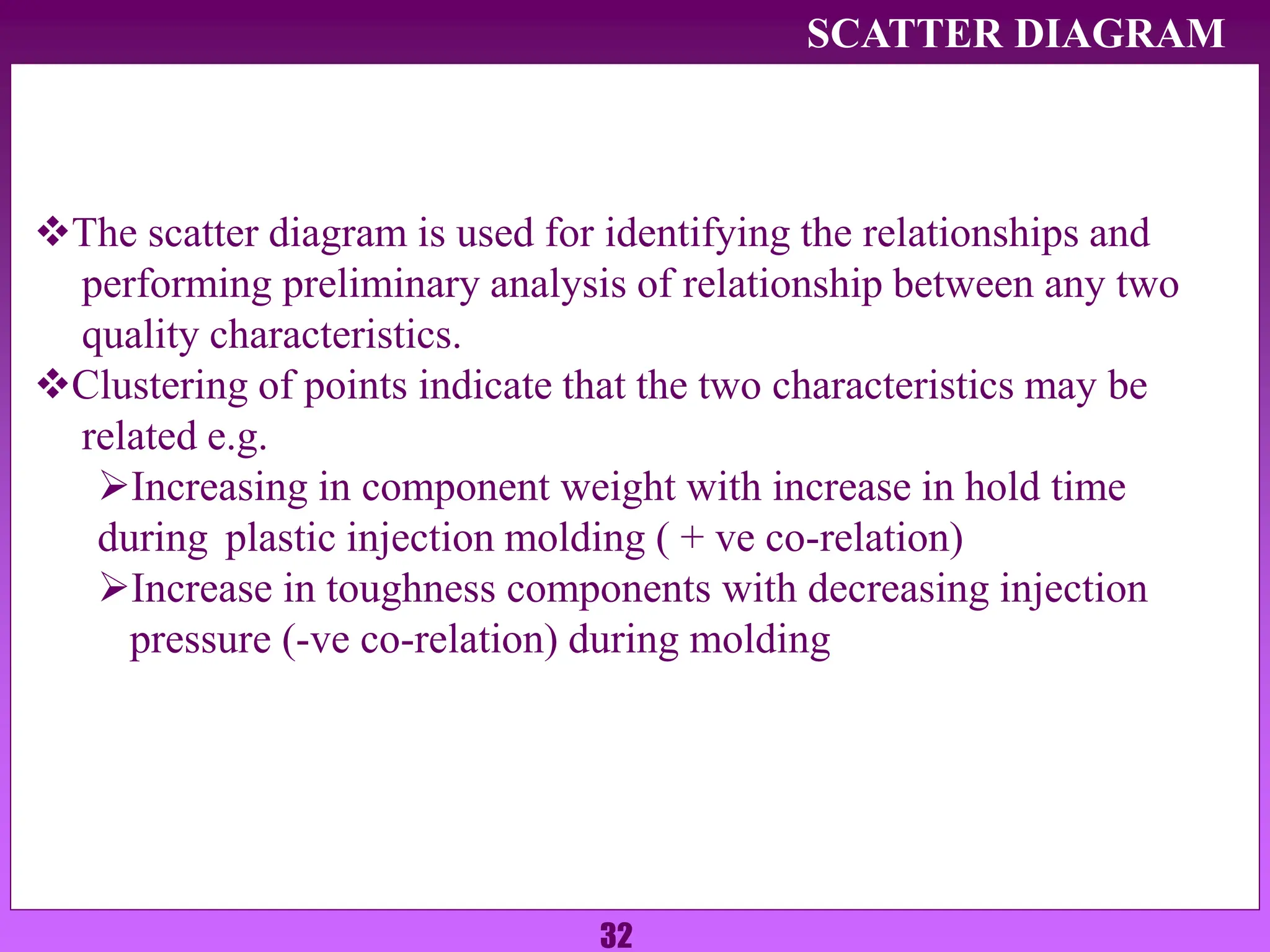
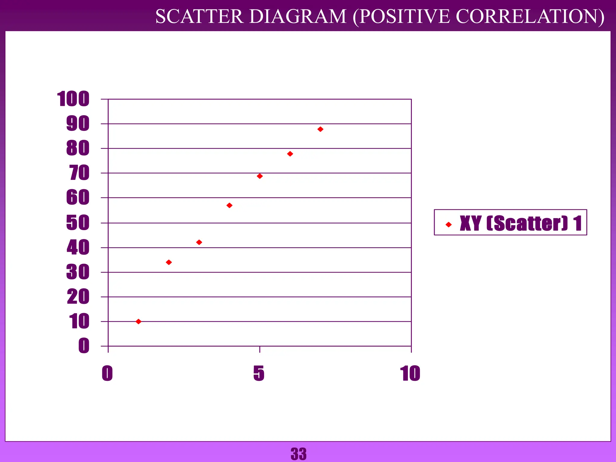
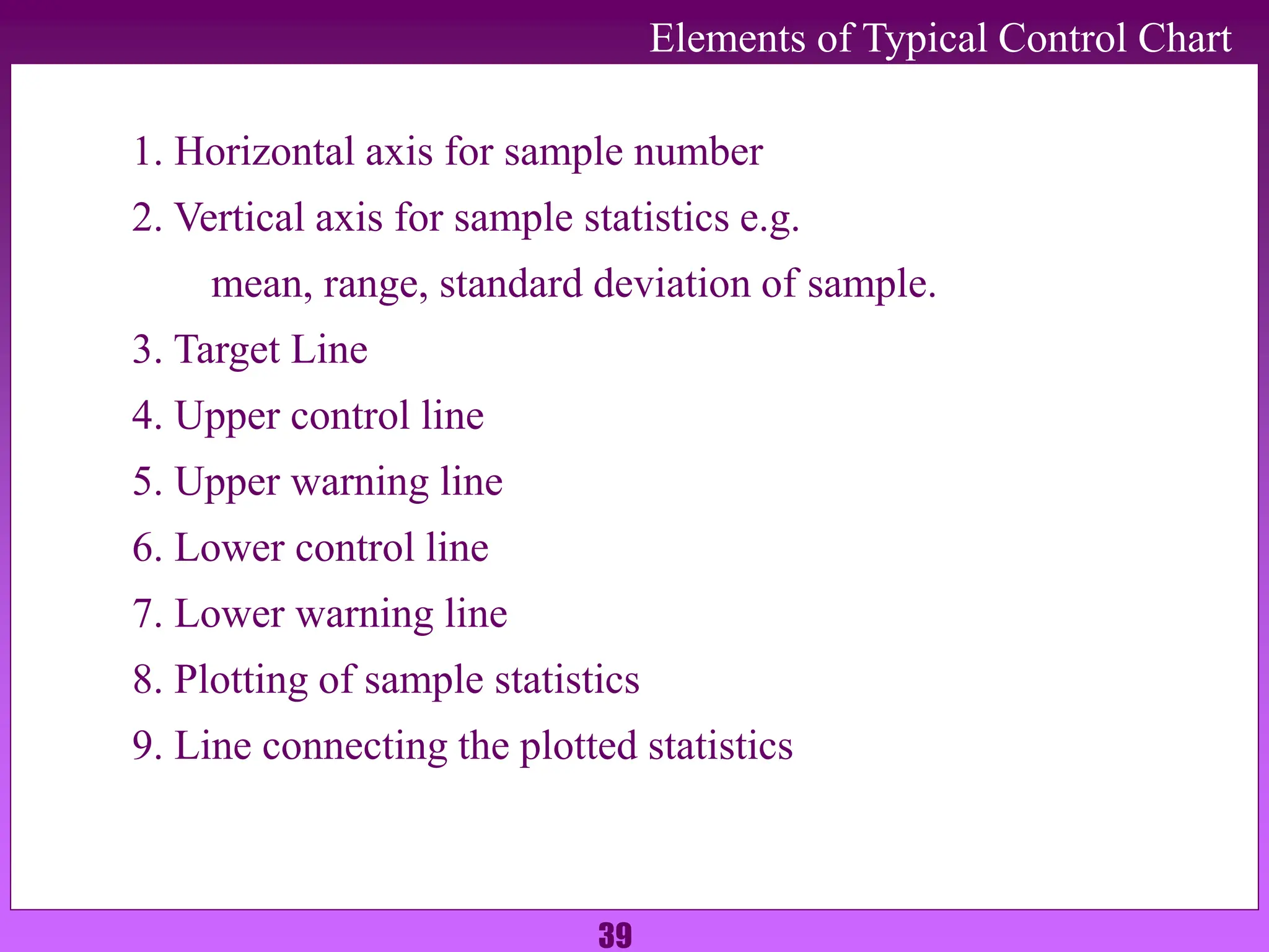
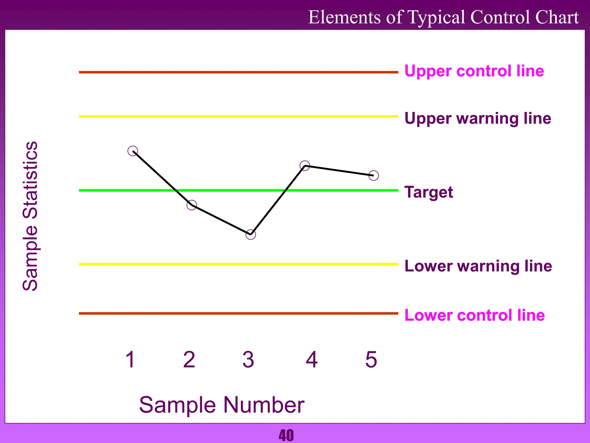
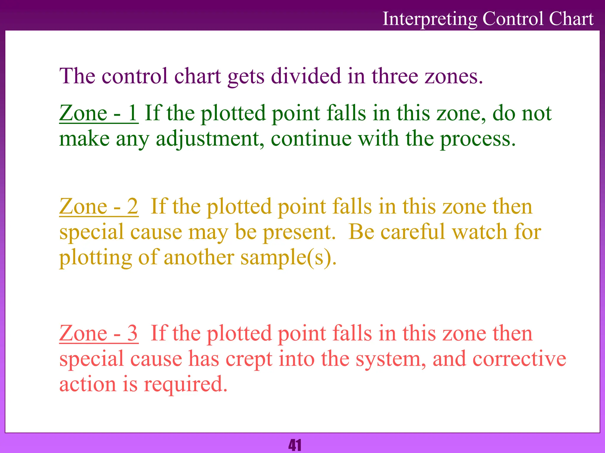
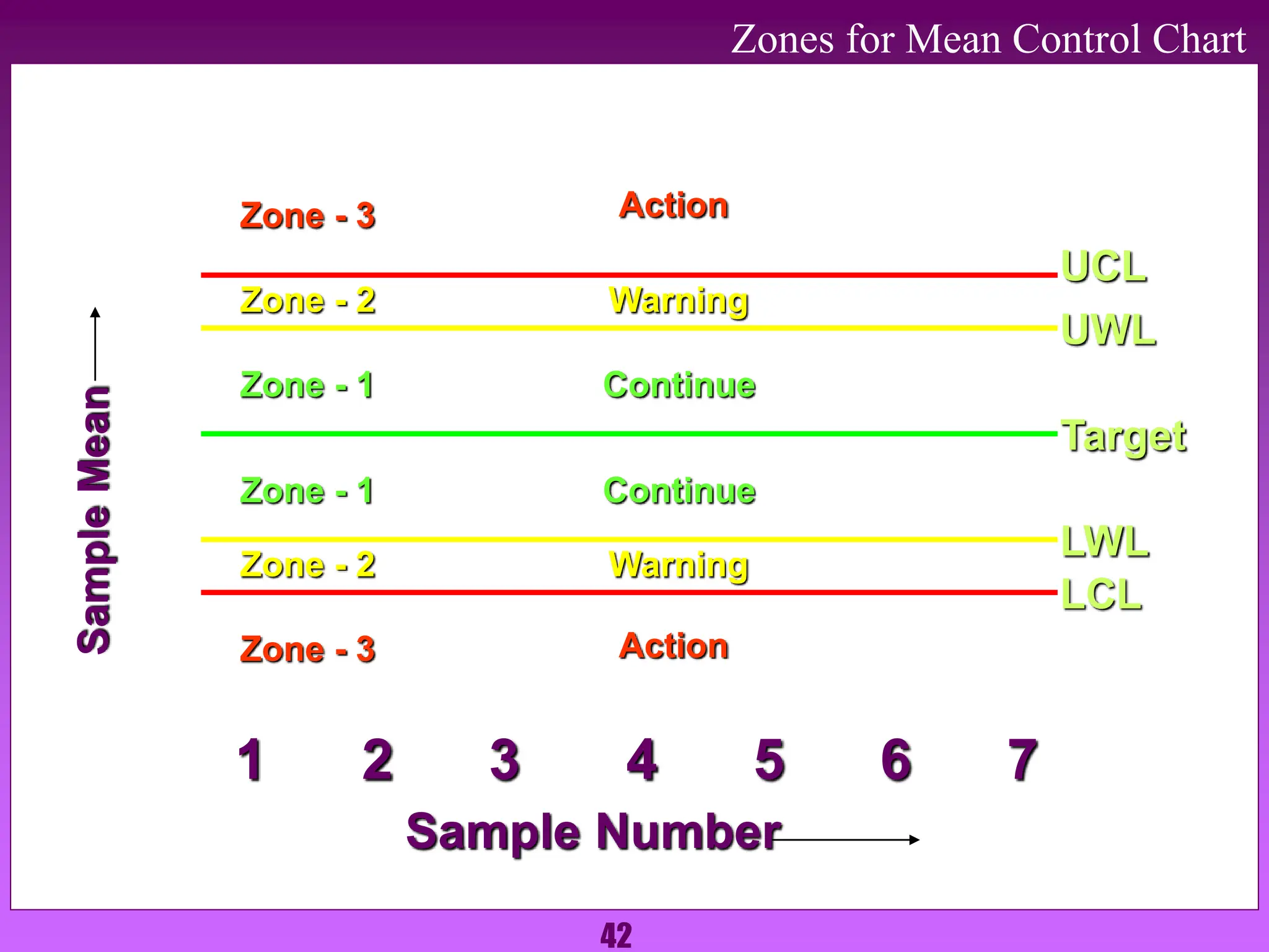
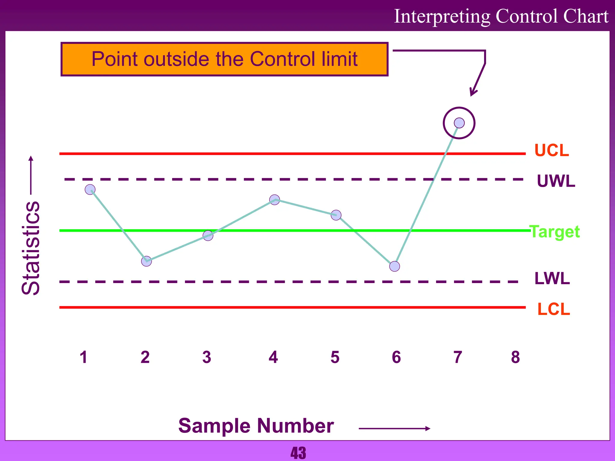
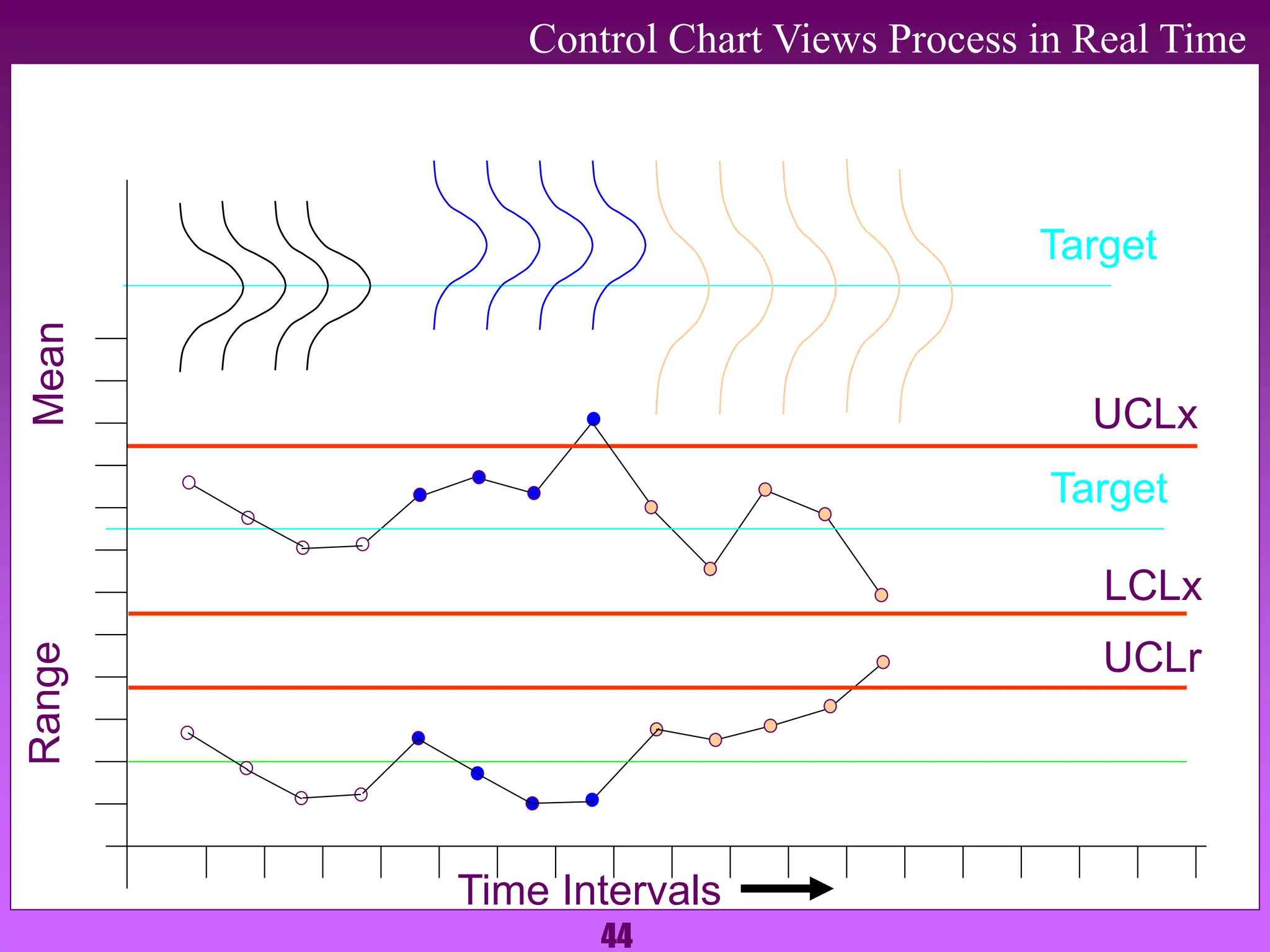
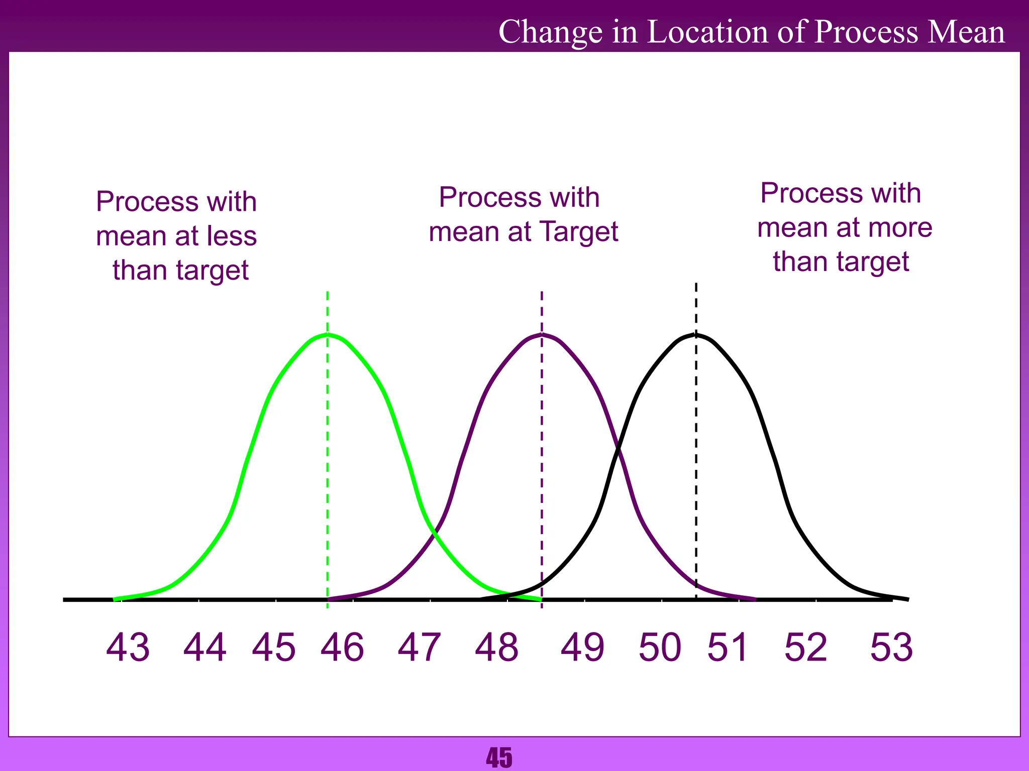
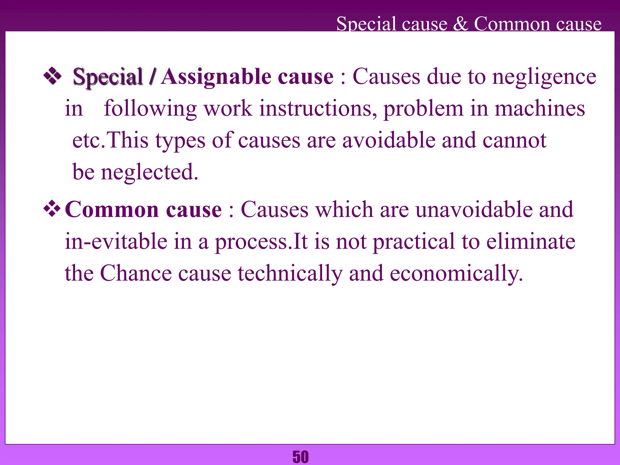
3. The document explains each tool in detail - their purpose, how they are constructed and interpreted, and how each can help identify issues, root causes, and ensure process control.