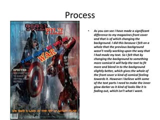
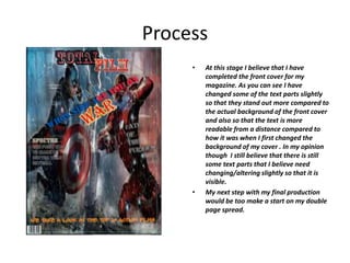
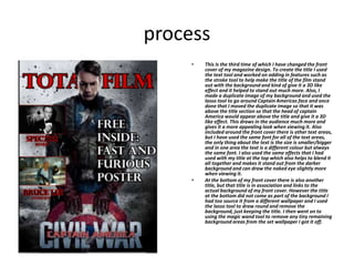
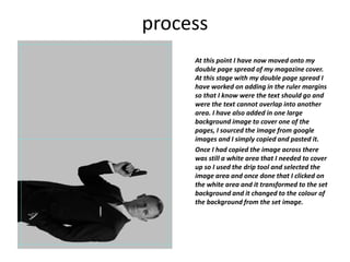
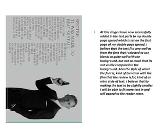
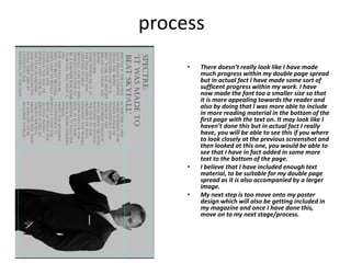
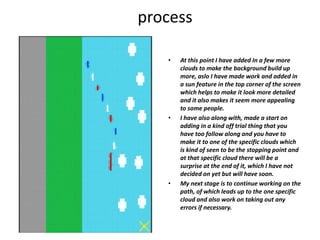
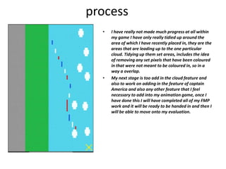
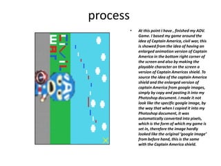
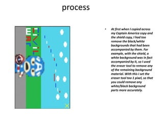
Production Reflection
CALEB WILCOX
Process
• At this point within the production of my
magazine I have made progress on the
work within my front cover. At this point
I have successfully added in a suitable
background image for my magazine
cover, I have also added in the magazine
title and a few other aspects of the
cover, including other text parts.
However with the text parts I made it so
that it appeared to be slightly different, I
did this by adding inner and outer glows
to the text also I added in shadow parts
to the text as it helped to give it more
effect. At this point I have done with
nearly all the text I just have to do it
with the title of the magazine
• So my next step is to alter the text title
and be adding in the other features of
the front cover of my magazine.
Process
• As you can now see I have added In the
features of altering the magazine which
lies at the top of the magazine cover. I
have added in a outer and inner glow to
the words from lie on the top of my front
cover of my magazine. By doing this with
the title of my magazine, it helps to
make it stand out much more from the
slightly more darker background. From
looking at the bottom corner of the front
cover you can also see that I have added
in the barcode feature in the bottom left
hand corner which helps to give it more
of a magazine appeal towards it. To get
the barcode feature I simply copied and
pasted an image of a barcode across to
my magazine cover.
Process
• At this stage I have added in ruler margins
to give the border sense of where the text
needs to in and also represents were the
text cannot overlap and go beyond the
margins. I have also added in more text
features to the front cover. To do this I
simply used the text tool, but when it came
to the effects that are on the text I added
in features such as outer glow/inner glow/
drop shadow , such affects as these helps to
make the text stand out from the
background. To be able to access the
features of this magazine I simply right
clicked on the selected text section and a
drop down menu appeared and became
able to select these effects.
• Due to the fact that I added in the ruler
margins around the edges of my front cover
I had to over around the text in some places
so that it didn’t overlap into the set text
margins.
Process
• As you can see I have made a significant
difference to my magazines front cover
and that is of which changing the
background. I did this because I felt on a
whole that the previous background
wasn’t really working upon the way that
I had made my text. So I felt that by
changing the background to something
more comical it will help the text to fit
more and blend in to the background
slightly better, which gives the whole of
the front cover a kind of comical feeling
towards it. However I believe with some
of the text parts I need to make the inner
glow darker as it kind of looks like it Is
fading out, which isn’t what I want.
Process
• At this stage I believe that I have
completed the front cover for my
magazine. As you can see I have
changed some of the text parts slightly
so that they stand out more compared to
the actual background of the front cover
and also so that the text is more
readable from a distance compared to
how it was when I first changed the
background of my cover . In my opinion
though I still believe that there is still
some text parts that I believe need
changing/altering slightly so that it is
visible.
• My next step with my final production
would be too make a start on my double
page spread.
process
• This is the third time of which I have changed the front
cover of my magazine design. To create the title I used
the text tool and worked on adding in features such as
the stroke tool to help make the title of the film stand
out with the background and kind of give it a 3D like
effect and it helped to stand out much more. Also, I
made a duplicate image of my background and used the
lasso tool to go around Captain Americas face and once
done that I moved the duplicate image so that it was
above the title section so that the head of captain
America would appear above the title and give it a 3D
like effect. This draws in the audience much more and
gives it a more appealing look when viewing it. Also
included around the front cover there is other text areas,
but I have used the same font for all of the text areas,
the only thing about the text is the size is smaller/bigger
and in one area the text is a different colour but always
the same font. I also used the same effects that I had
used with my title at the top which also helps to blend it
all together and makes it stand out from the darker
background and can draw the naked eye slightly more
when viewing it.
• At the bottom of my front cover there is also another
title, but that title is in association and links to the
actual background of my front cover. However the title
at the bottom did not come as part of the background I
had too source it from a different wallpaper and I used
the lasso tool to draw round and remove the
background, just keeping the title. I then went on to
using the magic wand tool to remove any tiny remaining
background areas from the set wallpaper I got it off.
process
At this point I have now moved onto my
double page spread of my magazine cover.
At this stage with my double page spread I
have worked on adding in the ruler margins
so that I know were the text should go and
were the text cannot overlap into another
area. I have also added in one large
background image to cover one of the
pages, I sourced the image from google
images and I simply copied and pasted it.
Once I had copied the image across there
was still a white area that I needed to cover
up so I used the drip tool and selected the
image area and once done that I clicked on
the white area and it transformed to the set
background and it changed to the colour of
the background from the set image.
• At this stage I have now successfully
added in the text parts to my double
page spread which is set on the first
page of my double page spread. I
believe that the text fits very well as
from the font that I selected to use
blends in quite well with the
background, but not so much that its
not visible compared to the
background. Also the style of which
the font is, kind of blends in with the
film that the review is for, kind of an
retro style of text. I believe that by
making the text to be slightly smaller
I will be able to fit more text in and
will appeal to the reader more.
process
• There doesn’t really look like I have made
much progress within my double page spread
but in actual fact I have made some sort of
sufficent progress within my work. I have
now made the font too a smaller size so that
it is more appealing towards the reader and
also by doing that I was more able to include
in more reading material in the bottom of the
first page with the text on. It may look like I
haven’t done this but in actual fact I really
have, you will be able to see this if you where
to look closely at the previous screenshot and
then looked at this one, you would be able to
see that I have in fact added in some more
text to the bottom of the page.
• I believe that I have included enough text
material, to be suitable for my double page
spread as it is also accompanied by a larger
image.
• My next step is too move onto my poster
design which will also be getting included in
my magazine and once I have done this,
move on to my next stage/process.
process
• At this stage I have successfully started work on
my animation game which is the final stage of
my FMP production, once I have completed this I
will be moving onto my evaluation. At this stage
with my game I haven’t really made that much
progress within it, in fact I have only actually put
in some of the background features to my game
and they are they ground i.e. path and grass and
also the sky and some of the clouds. The next
stage for me will be to work on adding in more
of the features such as the hero characters i.e.
captain America, any other features that need to
be included into the background.
process
• At this point I have added In a few more
clouds to make the background build up
more, aslo I have made work and added in
a sun feature in the top corner of the screen
which helps to make it look more detailed
and it also makes it seem more appealing
to some people.
• I have also along with, made a start on
adding in a kind off trial thing that you
have too follow along and you have to
make it to one of the specific clouds which
is kind of seen to be the stopping point and
at that specific cloud there will be a
surprise at the end of it, which I have not
decided on yet but will have soon.
• My next stage is to continue working on the
path, of which leads up to the one specific
cloud and also work on taking out any
errors if necessary.
process
• I have really not made much progress at all within
my game I have only really tidied up around the
area of which I have recently placed in, they are the
areas that are leading up to the one particular
cloud. Tidying up them set areas, includes the idea
of removing any set pixels that have been coloured
in that were not meant to be coloured in, so in a
way a overlap.
• My next stage is too add in the cloud feature and
also to work on adding in the feature of captain
America and also any other feature that I feel
necessary to add into my animation game, once I
have done this I will have completed all of my FMP
work and it will be ready to be handed in and then I
will be able to move onto my evaluation.
process
• At this point I have , finished my ADV.
Game. I based my game around the
idea of Captain America, civil war, this
is showed from the idea of having an
enlarged animation version of Captain
America in the bottom right corner of
the screen and also by making the
playable character on the screen a
version of Captain Americas shield. To
source the idea of the captain America
shield and the enlarged version of
captain America from google images,
simply by copy and pasting it into my
Photoshop document. I made it not
look like the specific google image, by
the way that when I copied it into my
Photoshop document, it was
automatically converted into pixels,
which is the form of which my game is
set in, therefore the image hardly
looked like the original ‘google image’
from before hand, this is the same
with the Captain America shield.
process
• At first when I copied across
my Captain America copy and
the shield copy, I had too
remove the black/white
backgrounds that had been
accompanied by them. For
example, with the shield, a
white background was in fact
accompanied by it, so I used
the eraser tool to remove any
of the remaining background
material. With this I set the
eraser tool too 1 pixel, so that
you could remove any
white/black background
parts more accurately.
process
• This here is my advertisement poster
based around the film of ‘fast and
furious 8’. To create this particular style
of advertisement poster, I took the idea
of taking two already existing, but
different posters and kind of like
mashed them together to create one
advertisement poster. To cut the two in
half and create one, I took one of the
posters and placed in onto the other,
once done that I took the polygon lasso
tool and cut around the top half of the
poster and then simply pressed ‘delete’
too remove it, exposing the top half of
the other poster, yet still keeping the
bottom half of the other poster, so that
the top half of the poster shows the
title of the film ‘F8’ and the bottom half
of the other poster represents an image
from the film, gives hints about the
film. On a whole, it also kind of creates
a 3D effect towards it, especially by the
way that the two backgrounds overlap.

6. fmp production reflection (1)

  • 1.
  • 2.
    Process • At thispoint within the production of my magazine I have made progress on the work within my front cover. At this point I have successfully added in a suitable background image for my magazine cover, I have also added in the magazine title and a few other aspects of the cover, including other text parts. However with the text parts I made it so that it appeared to be slightly different, I did this by adding inner and outer glows to the text also I added in shadow parts to the text as it helped to give it more effect. At this point I have done with nearly all the text I just have to do it with the title of the magazine • So my next step is to alter the text title and be adding in the other features of the front cover of my magazine.
  • 3.
    Process • As youcan now see I have added In the features of altering the magazine which lies at the top of the magazine cover. I have added in a outer and inner glow to the words from lie on the top of my front cover of my magazine. By doing this with the title of my magazine, it helps to make it stand out much more from the slightly more darker background. From looking at the bottom corner of the front cover you can also see that I have added in the barcode feature in the bottom left hand corner which helps to give it more of a magazine appeal towards it. To get the barcode feature I simply copied and pasted an image of a barcode across to my magazine cover.
  • 4.
    Process • At thisstage I have added in ruler margins to give the border sense of where the text needs to in and also represents were the text cannot overlap and go beyond the margins. I have also added in more text features to the front cover. To do this I simply used the text tool, but when it came to the effects that are on the text I added in features such as outer glow/inner glow/ drop shadow , such affects as these helps to make the text stand out from the background. To be able to access the features of this magazine I simply right clicked on the selected text section and a drop down menu appeared and became able to select these effects. • Due to the fact that I added in the ruler margins around the edges of my front cover I had to over around the text in some places so that it didn’t overlap into the set text margins.
  • 5.
    Process • As youcan see I have made a significant difference to my magazines front cover and that is of which changing the background. I did this because I felt on a whole that the previous background wasn’t really working upon the way that I had made my text. So I felt that by changing the background to something more comical it will help the text to fit more and blend in to the background slightly better, which gives the whole of the front cover a kind of comical feeling towards it. However I believe with some of the text parts I need to make the inner glow darker as it kind of looks like it Is fading out, which isn’t what I want.
  • 6.
    Process • At thisstage I believe that I have completed the front cover for my magazine. As you can see I have changed some of the text parts slightly so that they stand out more compared to the actual background of the front cover and also so that the text is more readable from a distance compared to how it was when I first changed the background of my cover . In my opinion though I still believe that there is still some text parts that I believe need changing/altering slightly so that it is visible. • My next step with my final production would be too make a start on my double page spread.
  • 7.
    process • This isthe third time of which I have changed the front cover of my magazine design. To create the title I used the text tool and worked on adding in features such as the stroke tool to help make the title of the film stand out with the background and kind of give it a 3D like effect and it helped to stand out much more. Also, I made a duplicate image of my background and used the lasso tool to go around Captain Americas face and once done that I moved the duplicate image so that it was above the title section so that the head of captain America would appear above the title and give it a 3D like effect. This draws in the audience much more and gives it a more appealing look when viewing it. Also included around the front cover there is other text areas, but I have used the same font for all of the text areas, the only thing about the text is the size is smaller/bigger and in one area the text is a different colour but always the same font. I also used the same effects that I had used with my title at the top which also helps to blend it all together and makes it stand out from the darker background and can draw the naked eye slightly more when viewing it. • At the bottom of my front cover there is also another title, but that title is in association and links to the actual background of my front cover. However the title at the bottom did not come as part of the background I had too source it from a different wallpaper and I used the lasso tool to draw round and remove the background, just keeping the title. I then went on to using the magic wand tool to remove any tiny remaining background areas from the set wallpaper I got it off.
  • 8.
    process At this pointI have now moved onto my double page spread of my magazine cover. At this stage with my double page spread I have worked on adding in the ruler margins so that I know were the text should go and were the text cannot overlap into another area. I have also added in one large background image to cover one of the pages, I sourced the image from google images and I simply copied and pasted it. Once I had copied the image across there was still a white area that I needed to cover up so I used the drip tool and selected the image area and once done that I clicked on the white area and it transformed to the set background and it changed to the colour of the background from the set image.
  • 9.
    • At thisstage I have now successfully added in the text parts to my double page spread which is set on the first page of my double page spread. I believe that the text fits very well as from the font that I selected to use blends in quite well with the background, but not so much that its not visible compared to the background. Also the style of which the font is, kind of blends in with the film that the review is for, kind of an retro style of text. I believe that by making the text to be slightly smaller I will be able to fit more text in and will appeal to the reader more.
  • 10.
    process • There doesn’treally look like I have made much progress within my double page spread but in actual fact I have made some sort of sufficent progress within my work. I have now made the font too a smaller size so that it is more appealing towards the reader and also by doing that I was more able to include in more reading material in the bottom of the first page with the text on. It may look like I haven’t done this but in actual fact I really have, you will be able to see this if you where to look closely at the previous screenshot and then looked at this one, you would be able to see that I have in fact added in some more text to the bottom of the page. • I believe that I have included enough text material, to be suitable for my double page spread as it is also accompanied by a larger image. • My next step is too move onto my poster design which will also be getting included in my magazine and once I have done this, move on to my next stage/process.
  • 11.
    process • At thisstage I have successfully started work on my animation game which is the final stage of my FMP production, once I have completed this I will be moving onto my evaluation. At this stage with my game I haven’t really made that much progress within it, in fact I have only actually put in some of the background features to my game and they are they ground i.e. path and grass and also the sky and some of the clouds. The next stage for me will be to work on adding in more of the features such as the hero characters i.e. captain America, any other features that need to be included into the background.
  • 12.
    process • At thispoint I have added In a few more clouds to make the background build up more, aslo I have made work and added in a sun feature in the top corner of the screen which helps to make it look more detailed and it also makes it seem more appealing to some people. • I have also along with, made a start on adding in a kind off trial thing that you have too follow along and you have to make it to one of the specific clouds which is kind of seen to be the stopping point and at that specific cloud there will be a surprise at the end of it, which I have not decided on yet but will have soon. • My next stage is to continue working on the path, of which leads up to the one specific cloud and also work on taking out any errors if necessary.
  • 13.
    process • I havereally not made much progress at all within my game I have only really tidied up around the area of which I have recently placed in, they are the areas that are leading up to the one particular cloud. Tidying up them set areas, includes the idea of removing any set pixels that have been coloured in that were not meant to be coloured in, so in a way a overlap. • My next stage is too add in the cloud feature and also to work on adding in the feature of captain America and also any other feature that I feel necessary to add into my animation game, once I have done this I will have completed all of my FMP work and it will be ready to be handed in and then I will be able to move onto my evaluation.
  • 14.
    process • At thispoint I have , finished my ADV. Game. I based my game around the idea of Captain America, civil war, this is showed from the idea of having an enlarged animation version of Captain America in the bottom right corner of the screen and also by making the playable character on the screen a version of Captain Americas shield. To source the idea of the captain America shield and the enlarged version of captain America from google images, simply by copy and pasting it into my Photoshop document. I made it not look like the specific google image, by the way that when I copied it into my Photoshop document, it was automatically converted into pixels, which is the form of which my game is set in, therefore the image hardly looked like the original ‘google image’ from before hand, this is the same with the Captain America shield.
  • 15.
    process • At firstwhen I copied across my Captain America copy and the shield copy, I had too remove the black/white backgrounds that had been accompanied by them. For example, with the shield, a white background was in fact accompanied by it, so I used the eraser tool to remove any of the remaining background material. With this I set the eraser tool too 1 pixel, so that you could remove any white/black background parts more accurately.
  • 16.
    process • This hereis my advertisement poster based around the film of ‘fast and furious 8’. To create this particular style of advertisement poster, I took the idea of taking two already existing, but different posters and kind of like mashed them together to create one advertisement poster. To cut the two in half and create one, I took one of the posters and placed in onto the other, once done that I took the polygon lasso tool and cut around the top half of the poster and then simply pressed ‘delete’ too remove it, exposing the top half of the other poster, yet still keeping the bottom half of the other poster, so that the top half of the poster shows the title of the film ‘F8’ and the bottom half of the other poster represents an image from the film, gives hints about the film. On a whole, it also kind of creates a 3D effect towards it, especially by the way that the two backgrounds overlap.

Editor's Notes

  • #3 Discuss the tools and processes used in your production. Log your thoughts and feelings about your work.
  • #4 Discuss the tools and processes used in your production. Log your thoughts and feelings about your work.
  • #5 Discuss the tools and processes used in your production. Log your thoughts and feelings about your work.
  • #6 Discuss the tools and processes used in your production. Log your thoughts and feelings about your work.
  • #7 Discuss the tools and processes used in your production. Log your thoughts and feelings about your work.