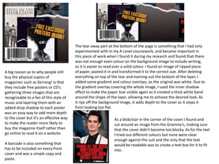
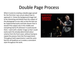
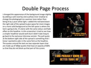
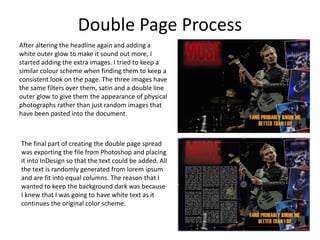
Experiments
Your Name
Front Cover Process
For the masthead I wanted it to stand out
with a bright colour in a thicker font, from
my research I found that a dark
yellow/orange isn’t unusual on alternative
rock magazine covers and it was included
in my style sheet. I wanted to give the
cover some depth so on the masthead I
used the inner shadow, gradient overlay
and drop shadow effects.
Another thing I found during my research and style
sheet that I wanted to use in my own work was that
when artists are used as the main subject on a cover
and a part of their body reaches the top of the page
where the mast head is, typically the part of their
body that would be covered by the masthead is
brought forward to lie on top of it. I was unsure of
how to do this at first but finally settled on selecting
around the artists head and separating it from the
background image onto another layer that would be
put above the masthead, again adding more depth
to the image and making sure that the subject of the
background is still the main focus of the cover.
The image I picked as the background of the cover worked well as it had the
subject in the centre of the page, allowed space around the sides for text and
the resolution allowed me to edit it in any way I felt necessary, however I
found one issue and that was the background was too light and had too made
contrasting colours that made reading the text around the images subject
quite difficult. It was suggested that I went around the artist and find a
different stage background to put on a separate layer, but after looking for
something that would work I realised that I wasn’t going to be able to find an
image that fit the lighting of the original as it was a very bright, naturally lit
stage. What I ended up doing was separating the artist from the background
onto a separate layer, and using the stroke, inner shadow and satin effects in
order to dull down the stage and make the text more legible. the same effects
were also used on the artist but to a lesser degree so that he still stood out
against the darker background. The black text was changed to white as it
meant the contrast was easier to read and still fit the colour scheme I was
wanting to use.
A big reason as to why people still
buy the physical copies of
magazines such as Kerrang! Is that
they include free posters or CD’s.
gathering three images that are
recognizable to a fan of this style of
music and layering them with an
added drop shadow to each poster
was an easy way to add more depth
to the cover but it’s an effective way
to make the reader more likely to
buy the magazine itself rather than
go online to read it on a website.
A barcode is also something that
has to be included on every front
cover and was a simple copy and
paste.
The tear away part at the bottom of the page is something that I had only
experimented with in my A-Level coursework, and became important in
this piece of work when I found it during my research and found that there
was not enough even colour on the background image to include writing,
as it is easier to read over a solid colour. I found an image of ripped piece
of paper, pasted it in and transformed it to the correct size. After deleting
everything on top of the tear and evening out the bottom of the layer, I
added some gradient and colour overlays, as the original was white. Due to
the gradient overlay covering the whole image, I used the inner shadow
effect to make the paper tear visible again as it created a thick white band
around the shape of the layer, allowing me to achieve the desired look. As
it rips off the background image, it adds depth to the cover as it stops it
from looking too flat.
As a blob/star in the corner of the cover I found and
cut around an image from the Grammy’s, making sure
that the cover didn’t become too blocky. As for the text
I tried out different colours but none were clear
enough against the suit and the only that the text
would be readable was to create a text box for it to fit
into.
Reflection
I feel like a lot of the aspects from my experiment are going to be used in the final product, such
as the artist coming out in front of the masthead, and the depth I tried to give to the cover by
using shadows and visual layers to the page.
Although it might not be in the same way of using a paper rip like I did at the bottom of the
page, I do want to include the depth that the layers give to the cover and will definitely think
about what other kinds of visuals I can use to satisfy that ideal.
I want to include the idea of free promotional products inside as it is a personal reason for why I
bought those magazines as well as it making the cover look more realistic to the reader. Due to
the brief for this project making it clear that the majority of the image and text has to be
original, I've realised that if I want to include something such as a free promotional poster, it is
something that I will most likely create on it's own as well, meaning that I will create original
posters for non-existing bands to add to my project.
From this experiment I've found that the warmer palette consisting of reds, oranges and yellows
suits the theme quite well and is likely to be what I use during production, however as I am yet
to produce my main images I do not yet know if the colour scheme will compliment the
background.
Something that I haven't managed to include in this cover but I know is an essential part of this
kind of work is the use of splash graphics and blobs that allow more text and images to fill the
page without the background interrupting and make them harder to see.
Double Page Process
When it came to creating a double page spread
for the first time I was unsure about how to
approach it. I knew the background image had
to be interesting and ideally have the subject of
the photograph to one side so that the text can
be implemented easily and look cleaner than it
would if the subject was in the middle and
everything had to fit wherever it could around
them. I went with a darker image so that I could
easily work the already determined colour
scheme from the front cover, without having to
repeat the process from the first experiment.
Throughout both experiments I used the same
font for all headlines as it creates a consistent
style throughout the work.
Double Page Process
I changed the appearance of the background image slightly
by adding a satin overlay and a yellow inner shadow to
change the photograph to a warmer tone rather than
being lit by a pure white light. I added the red band down
the right side of the spread to give space for more images
on a more solid background as the left space is where the
text is going to be. It’s done with the same colour and fade
effect as the headline. In this screenshot I tried to see how
a simpler headliner would work but it didn’t take long to
go back to the exclusive interview version. The pull quote
at the bottom right side of the spread is something that I
knew I wanted to add, in the same font as the headline.
The quotes around the text are two separate layers that
are made up of 500pt quotes that have an opacity of 80%
so that they do not block up that part of the screen.
Double Page Process
After altering the headline again and adding a
white outer glow to make it sound out more, I
started adding the extra images. I tried to keep a
similar colour scheme when finding them to keep a
consistent look on the page. The three images have
the same filters over them, satin and a double line
outer glow to give them the appearance of physical
photographs rather than just random images that
have been pasted into the document.
The final part of creating the double page spread
was exporting the file from Photoshop and placing
it into InDesign so that the text could be added. All
the text is randomly generated from lorem ipsum
and are fit into equal columns. The reason that I
wanted to keep the background dark was because
I knew that I was going to have white text as it
continues the original color scheme.
Reflection
What elements of your experiments will you include in your final product?
Unlike the front cover, this was my first time making something like this and although I want my
product to be a better quality than what I’ve made here, it’s been a good learning experience.
I’ll know that keeping the colour scheme in mind through the whole production is going to be
important to the text, as its going to be added last and needs to be easy to read for the audience.
During the production I'm going to try and pay more attention to the images that are being added
to ensure that they work with the colour scheme and are placed in a way that is interesting and
appealing to the reader.
As this is the first time I’ve worked with a double page spread, I know I'm going to need to pay
more attention to the proportions of text and images, making sure that everything is an
appropriate size in relation to what it is and the space that’s been left around it.

3. production experiments

  • 1.
  • 2.
    Front Cover Process Forthe masthead I wanted it to stand out with a bright colour in a thicker font, from my research I found that a dark yellow/orange isn’t unusual on alternative rock magazine covers and it was included in my style sheet. I wanted to give the cover some depth so on the masthead I used the inner shadow, gradient overlay and drop shadow effects. Another thing I found during my research and style sheet that I wanted to use in my own work was that when artists are used as the main subject on a cover and a part of their body reaches the top of the page where the mast head is, typically the part of their body that would be covered by the masthead is brought forward to lie on top of it. I was unsure of how to do this at first but finally settled on selecting around the artists head and separating it from the background image onto another layer that would be put above the masthead, again adding more depth to the image and making sure that the subject of the background is still the main focus of the cover.
  • 3.
    The image Ipicked as the background of the cover worked well as it had the subject in the centre of the page, allowed space around the sides for text and the resolution allowed me to edit it in any way I felt necessary, however I found one issue and that was the background was too light and had too made contrasting colours that made reading the text around the images subject quite difficult. It was suggested that I went around the artist and find a different stage background to put on a separate layer, but after looking for something that would work I realised that I wasn’t going to be able to find an image that fit the lighting of the original as it was a very bright, naturally lit stage. What I ended up doing was separating the artist from the background onto a separate layer, and using the stroke, inner shadow and satin effects in order to dull down the stage and make the text more legible. the same effects were also used on the artist but to a lesser degree so that he still stood out against the darker background. The black text was changed to white as it meant the contrast was easier to read and still fit the colour scheme I was wanting to use.
  • 4.
    A big reasonas to why people still buy the physical copies of magazines such as Kerrang! Is that they include free posters or CD’s. gathering three images that are recognizable to a fan of this style of music and layering them with an added drop shadow to each poster was an easy way to add more depth to the cover but it’s an effective way to make the reader more likely to buy the magazine itself rather than go online to read it on a website. A barcode is also something that has to be included on every front cover and was a simple copy and paste. The tear away part at the bottom of the page is something that I had only experimented with in my A-Level coursework, and became important in this piece of work when I found it during my research and found that there was not enough even colour on the background image to include writing, as it is easier to read over a solid colour. I found an image of ripped piece of paper, pasted it in and transformed it to the correct size. After deleting everything on top of the tear and evening out the bottom of the layer, I added some gradient and colour overlays, as the original was white. Due to the gradient overlay covering the whole image, I used the inner shadow effect to make the paper tear visible again as it created a thick white band around the shape of the layer, allowing me to achieve the desired look. As it rips off the background image, it adds depth to the cover as it stops it from looking too flat. As a blob/star in the corner of the cover I found and cut around an image from the Grammy’s, making sure that the cover didn’t become too blocky. As for the text I tried out different colours but none were clear enough against the suit and the only that the text would be readable was to create a text box for it to fit into.
  • 5.
    Reflection I feel likea lot of the aspects from my experiment are going to be used in the final product, such as the artist coming out in front of the masthead, and the depth I tried to give to the cover by using shadows and visual layers to the page. Although it might not be in the same way of using a paper rip like I did at the bottom of the page, I do want to include the depth that the layers give to the cover and will definitely think about what other kinds of visuals I can use to satisfy that ideal. I want to include the idea of free promotional products inside as it is a personal reason for why I bought those magazines as well as it making the cover look more realistic to the reader. Due to the brief for this project making it clear that the majority of the image and text has to be original, I've realised that if I want to include something such as a free promotional poster, it is something that I will most likely create on it's own as well, meaning that I will create original posters for non-existing bands to add to my project. From this experiment I've found that the warmer palette consisting of reds, oranges and yellows suits the theme quite well and is likely to be what I use during production, however as I am yet to produce my main images I do not yet know if the colour scheme will compliment the background. Something that I haven't managed to include in this cover but I know is an essential part of this kind of work is the use of splash graphics and blobs that allow more text and images to fill the page without the background interrupting and make them harder to see.
  • 6.
    Double Page Process Whenit came to creating a double page spread for the first time I was unsure about how to approach it. I knew the background image had to be interesting and ideally have the subject of the photograph to one side so that the text can be implemented easily and look cleaner than it would if the subject was in the middle and everything had to fit wherever it could around them. I went with a darker image so that I could easily work the already determined colour scheme from the front cover, without having to repeat the process from the first experiment. Throughout both experiments I used the same font for all headlines as it creates a consistent style throughout the work.
  • 7.
    Double Page Process Ichanged the appearance of the background image slightly by adding a satin overlay and a yellow inner shadow to change the photograph to a warmer tone rather than being lit by a pure white light. I added the red band down the right side of the spread to give space for more images on a more solid background as the left space is where the text is going to be. It’s done with the same colour and fade effect as the headline. In this screenshot I tried to see how a simpler headliner would work but it didn’t take long to go back to the exclusive interview version. The pull quote at the bottom right side of the spread is something that I knew I wanted to add, in the same font as the headline. The quotes around the text are two separate layers that are made up of 500pt quotes that have an opacity of 80% so that they do not block up that part of the screen.
  • 8.
    Double Page Process Afteraltering the headline again and adding a white outer glow to make it sound out more, I started adding the extra images. I tried to keep a similar colour scheme when finding them to keep a consistent look on the page. The three images have the same filters over them, satin and a double line outer glow to give them the appearance of physical photographs rather than just random images that have been pasted into the document. The final part of creating the double page spread was exporting the file from Photoshop and placing it into InDesign so that the text could be added. All the text is randomly generated from lorem ipsum and are fit into equal columns. The reason that I wanted to keep the background dark was because I knew that I was going to have white text as it continues the original color scheme.
  • 9.
    Reflection What elements ofyour experiments will you include in your final product? Unlike the front cover, this was my first time making something like this and although I want my product to be a better quality than what I’ve made here, it’s been a good learning experience. I’ll know that keeping the colour scheme in mind through the whole production is going to be important to the text, as its going to be added last and needs to be easy to read for the audience. During the production I'm going to try and pay more attention to the images that are being added to ensure that they work with the colour scheme and are placed in a way that is interesting and appealing to the reader. As this is the first time I’ve worked with a double page spread, I know I'm going to need to pay more attention to the proportions of text and images, making sure that everything is an appropriate size in relation to what it is and the space that’s been left around it.

Editor's Notes

  • #3 Discuss the tools and processes used in your experiments
  • #4 Discuss the tools and processes used in your experiments
  • #5 Discuss the tools and processes used in your experiments
  • #7 Discuss the tools and processes used in your experiments
  • #8 Discuss the tools and processes used in your experiments
  • #9 Discuss the tools and processes used in your experiments