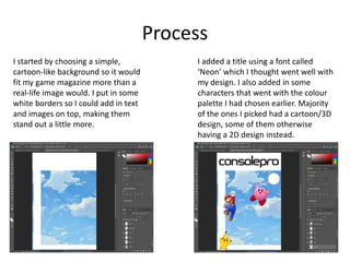
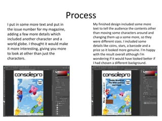
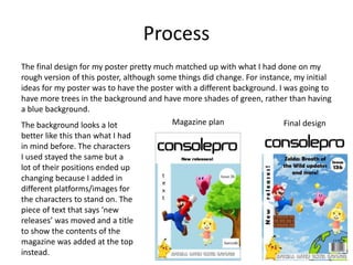
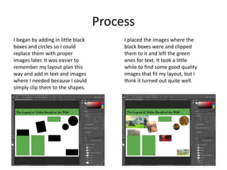
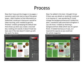
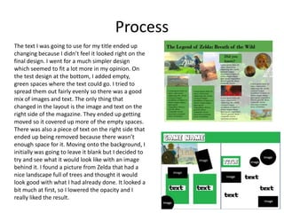
Production Reflection
Ellie Warmingham
Process
I started by choosing a simple,
cartoon-like background so it would
fit my game magazine more than a
real-life image would. I put in some
white borders so I could add in text
and images on top, making them
stand out a little more.
I added a title using a font called
‘Neon’ which I thought went well with
my design. I also added in some
characters that went with the colour
palette I had chosen earlier. Majority
of the ones I picked had a cartoon/3D
design, some of them otherwise
having a 2D design instead.
Process
I put in some more text and put in
the issue number for my magazine,
adding a few more details which
included another character and a
world globe. I thought it would make
it more interesting, giving you more
to look at other than just the
characters.
My finished design included some more
text to tell the audience the contents other
than moving some characters around and
changing them up a some more, so they
were different sizes. I included some
details like coins, stars, a barcode and a
price so it looked more genuine. I'm happy
with the result overall although I'm
wondering if it would have looked better if
I had chosen a different background.
Process
The final design for my poster pretty much matched up with what I had done on my
rough version of this poster, although some things did change. For instance, my initial
ideas for my poster was to have the poster with a different background. I was going to
have more trees in the background and have more shades of green, rather than having
a blue background.
The background looks a lot
better like this than what I had
in mind before. The characters
I used stayed the same but a
lot of their positions ended up
changing because I added in
different platforms/images for
the characters to stand on. The
piece of text that says ‘new
releases’ was moved and a title
to show the contents of the
magazine was added at the top
instead.
Magazine plan Final design
Process
I began by adding in little black
boxes and circles so I could
replace them with proper
images later. It was easier to
remember my layout plan this
way and add in text and images
where I needed because I could
simply clip them to the shapes.
I placed the images where the
black boxes were and clipped
them to it and left the green
ones for text. It took a little
while to find some good quality
images that fit my layout, but I
think it turned out quite well.
Process
Now that I have put the images in my pages, I
started to add in the text on top of the green
boxes. I didn’t bother to find information on
Zelda that I could put in because it would’ve
taken too long, and I needed to get this
finished. I ended up keeping the default text
that shows up when you create a new text
box. Looking at it overall, it doesn’t look too
bad, even if the text doesn’t match up with
the work I’ve done.
Now I've added in the text, I thought I'd see
if there was any details or anything I could put
in to improve it. I was wondering if I could
change the background because it looked too
plain. I wanted to add some text to brighten it
up a bit more. I ended up choosing a
background from Zelda which was of a green
forest. It looked too busy as it was, so I
lowered the opacity so you could see
the whole magazine.
Process
The text I was going to use for my title ended up
changing because I didn’t feel it looked right on the
final design. I went for a much simpler design
which seemed to fit a lot more in my opinion. On
the test design at the bottom, I added empty,
green spaces where the text could go. I tried to
spread them out fairly evenly so there was a good
mix of images and text. The only thing that
changed in the layout is the image and text on the
right side of the magazine. They ended up getting
moved so it covered up more of the empty spaces.
There was also a piece of text on the right side that
ended up being removed because there wasn’t
enough space for it. Moving onto the background, I
initially was going to leave it blank but I decided to
try and see what it would look like with an image
behind it. I found a picture from Zelda that had a
nice landscape full of trees and thought it would
look good with what I had already done. It looked a
bit much at first, so I lowered the opacity and I
really liked the result.

Production reflection - Visual

  • 1.
  • 2.
    Process I started bychoosing a simple, cartoon-like background so it would fit my game magazine more than a real-life image would. I put in some white borders so I could add in text and images on top, making them stand out a little more. I added a title using a font called ‘Neon’ which I thought went well with my design. I also added in some characters that went with the colour palette I had chosen earlier. Majority of the ones I picked had a cartoon/3D design, some of them otherwise having a 2D design instead.
  • 3.
    Process I put insome more text and put in the issue number for my magazine, adding a few more details which included another character and a world globe. I thought it would make it more interesting, giving you more to look at other than just the characters. My finished design included some more text to tell the audience the contents other than moving some characters around and changing them up a some more, so they were different sizes. I included some details like coins, stars, a barcode and a price so it looked more genuine. I'm happy with the result overall although I'm wondering if it would have looked better if I had chosen a different background.
  • 4.
    Process The final designfor my poster pretty much matched up with what I had done on my rough version of this poster, although some things did change. For instance, my initial ideas for my poster was to have the poster with a different background. I was going to have more trees in the background and have more shades of green, rather than having a blue background. The background looks a lot better like this than what I had in mind before. The characters I used stayed the same but a lot of their positions ended up changing because I added in different platforms/images for the characters to stand on. The piece of text that says ‘new releases’ was moved and a title to show the contents of the magazine was added at the top instead. Magazine plan Final design
  • 5.
    Process I began byadding in little black boxes and circles so I could replace them with proper images later. It was easier to remember my layout plan this way and add in text and images where I needed because I could simply clip them to the shapes. I placed the images where the black boxes were and clipped them to it and left the green ones for text. It took a little while to find some good quality images that fit my layout, but I think it turned out quite well.
  • 6.
    Process Now that Ihave put the images in my pages, I started to add in the text on top of the green boxes. I didn’t bother to find information on Zelda that I could put in because it would’ve taken too long, and I needed to get this finished. I ended up keeping the default text that shows up when you create a new text box. Looking at it overall, it doesn’t look too bad, even if the text doesn’t match up with the work I’ve done. Now I've added in the text, I thought I'd see if there was any details or anything I could put in to improve it. I was wondering if I could change the background because it looked too plain. I wanted to add some text to brighten it up a bit more. I ended up choosing a background from Zelda which was of a green forest. It looked too busy as it was, so I lowered the opacity so you could see the whole magazine.
  • 7.
    Process The text Iwas going to use for my title ended up changing because I didn’t feel it looked right on the final design. I went for a much simpler design which seemed to fit a lot more in my opinion. On the test design at the bottom, I added empty, green spaces where the text could go. I tried to spread them out fairly evenly so there was a good mix of images and text. The only thing that changed in the layout is the image and text on the right side of the magazine. They ended up getting moved so it covered up more of the empty spaces. There was also a piece of text on the right side that ended up being removed because there wasn’t enough space for it. Moving onto the background, I initially was going to leave it blank but I decided to try and see what it would look like with an image behind it. I found a picture from Zelda that had a nice landscape full of trees and thought it would look good with what I had already done. It looked a bit much at first, so I lowered the opacity and I really liked the result.

Editor's Notes

  • #3 Discuss the tools and processes used in your production. Log your thoughts and feelings about your work.
  • #4 Discuss the tools and processes used in your production. Log your thoughts and feelings about your work.
  • #5 Discuss the tools and processes used in your production. Log your thoughts and feelings about your work.
  • #6 Discuss the tools and processes used in your production. Log your thoughts and feelings about your work.
  • #7 Discuss the tools and processes used in your production. Log your thoughts and feelings about your work.
  • #8 Discuss the tools and processes used in your production. Log your thoughts and feelings about your work.