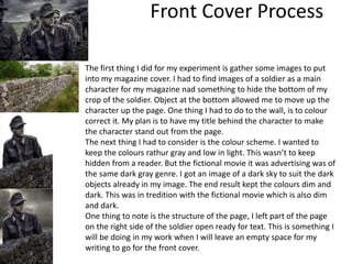
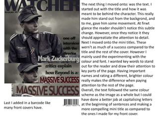
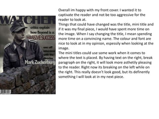
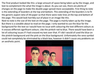
SlideShare a Scribd company logo
Experiments
Daniel Morland
Front Cover Process
The first thing I did for my experiment is gather some images to put
into my magazine cover. I had to find images of a soldier as a main
character for my magazine nad something to hide the bottom of my
crop of the soldier. Object at the bottom allowed me to move up the
character up the page. One thing I had to do to the wall, is to colour
correct it. My plan is to have my title behind the character to make
the character stand out from the page.
The next thing I had to consider is the colour scheme. I wanted to
keep the colours rathur gray and low in light. This wasn’t to keep
hidden from a reader. But the fictional movie it was advertising was of
the same dark gray genre. I got an image of a dark sky to suit the dark
objects already in my image. The end result kept the colours dim and
dark. This was in tredition with the fictional movie which is also dim
and dark.
One thing to note is the structure of the page, I left part of the page
on the right side of the soldier open ready for text. This is something I
will be doing in my work when I will leave an empty space for my
writing to go for the front cover.
The next thing I moved onto: was the text. I
started out with the title and how it was
meant to be behind the character. This really
made him stand out from the backgrond, and
to me, gave him some movement. At firwt
glance the reader shouldn’t notice this subtle
change. However, once they notice it they
should appreatiate the attention to detail.
Next I moved onto the mini titles. These
wern't as much of a success compared to the
title and the rest of the cover. However I
mainly used the experimenting with the
colour and font. I wanted key words to stand
out for the reader and draw their attention to
key parts of the page. Having important
names and rating a different, brighter colour
really makes the difference when paying
attention to the rest of the page.
Overall, the text followed the same colour
scheme as the image as a whole but I could
have done a better job at capitalising letters
at the beginning of sentences and making a
more compelling mini title as compared to
the ones I made for my front cover.
Last I added in a barcode like
many front covers have.
Overall im happy with my front cover. I wanted it to
captivate the reader and not be too aggressive for the
reader to look at.
Things that could have changed was the title, mini title and
if it was my final piece, I would have spent more time on
the image. When I say changing the title, I mean spending
more time on a convincing name. The colour and font are
nice to look at in my opinion, espessily when looking at the
image.
The mini titles could use some work when it comes to
where the text is placed. By having text on the right, break
paragraph on the right, it will look more asthetily pleasing
to the reader. Right now its breaking on the left while on
the right. This really doesn’t look good, but its definently
something I will look at in my next piece.
Reflection
• Text isnt lined up
• Make sure there is an invisable line to line up text
• Astheticly pleasing text
• Colour correcting
• What elements of your experiments will you
include in your final product?
• Large title
• Bold and bright colour
• Colours should contrast each other
Double Page Process
The first thing to do for my experimental work is
gather some imaginary text to fill in for actual
writing. This is only a test after all. So I used the
website Loren ipsum to generate some text so
could fill the space where the text would go. I
wanted to keep the amount of paragraphs to an
even number so that they would easily fit into 2
coloums on my double page spread.
after generating the text, I would have to
insert it into an area of the double page
spread that would fit the text. It would have
to remain bold to the reader as well as being
astheticly pleasing.
Next, I would have to import an image which would fit the criteria
of being 'double paged.' This image would easily be able to fit
within the double page aspect ratio after I add some black boxes
to the top and bottom. The red and blue colour scheme would be
easy to play around with it. one thing I had to cover up on the
image was the "vevo" symbol which is found on the bottom left
of the image. This was a large symbol to remove on the image
however it was located near the black part of the image so it
could easily be covered.
i would stick to the colours of redish pink and blue with my text, colouring
more important text with red and less important filler with a blue. This is
the colour I got from the image itself. By taking colour directly from the
image, the text would fit a lot easier as opposed to just guessing the
colour. My origional plan for the text was to just be a blue which was
similar to the blue on the page seen in the image. However this didn’t
really stand out to me and I don’t think that it would look to impressive to
the reader. So I experiemnted with using a pinkish red which I took
directly from the image. I did this colour change to significant parts of the
page: the title, underline, capital letter and a quote seen later in the in the
text. By having other colours on the page, the reader should be attracted
to these smaller parts which are more interesting. Drawing them in.
Things like the title, first letter and a quote are all parts I would want the
reader to see on the extract. Other more 'filler' parts on the text remained
a blue which fitted the background it was sat on. The colour I chose didn’t
make the text invisable, however it really did make it less significant
compared to the highlighted text. Again moving their attention to the
highlighted text.
The final product looked like this: a large amount of space being taken up by the image, and
text to complement the what the image is about. As you can see, there are plenty of
changes on the page to make the double page spread more accseptable. First thing to note
is the extending of boarders at the top and bottom. This extending of the boarders is to fit
the generic aspect ratio of A4 paper so that there were note lines at the top and bottom of
the page. This would look horribly out of place in an image like this.
Next to note is the size of the text on the page. The page is mainly taken up by the image.
But there is a sizeable about to read on the page. I only wanted to use the blue for the
background for the text so I would have no issue with colouring the text different colours as
it crosses differnet significant colours. Like the pinkish red to blue. There would have been a
lot of colouring issues if I had crossed my text over that. If I did I would of used the blue on
the pinkish background and the pink on the blue background. Unfortnately the vevo symbol
could not completely be eliminated by a black box, however it didn’t cause any problems on
an aesthetic point.
Reflection
• Different colours depending on backgrounds
• Sticking to 2 colours. One primary and one
secondary
• Text in specific parts of the page
• Title in different font
• Bold title depending on font

More Related Content

What's hot

Task 10 pp
Task 10 pp Task 10 pp
Task 10 pp
olibrandon
 
Pr(1)
Pr(1)Pr(1)
Pr(1)
AdamLepard
 
Feedback
FeedbackFeedback
Feedback
Simran Jabbal
 
Digital graphics evaluation pro forma
Digital graphics evaluation pro formaDigital graphics evaluation pro forma
Digital graphics evaluation pro forma
Lewis-Powell
 
Evaluation
EvaluationEvaluation
Evaluation
Sophie Husteden
 
Construction douple page article
Construction douple page articleConstruction douple page article
Construction douple page article
mediafan
 
Construction Douple Page Article
Construction Douple Page ArticleConstruction Douple Page Article
Construction Douple Page Article
mediafan
 
Production process for double page spread music
Production process for double page spread musicProduction process for double page spread music
Production process for double page spread music
kategalvin97
 
Producing a music magazine
Producing a music magazineProducing a music magazine
Producing a music magazine
_emmaparker
 
Making- Front Cover
Making- Front CoverMaking- Front Cover
Making- Front Cover
ct04929306
 
Print pro forma
Print pro formaPrint pro forma
Print pro forma
AllanGodin
 
Final development
Final developmentFinal development
Final development
Adam
 
Print Screens
Print ScreensPrint Screens
Print Screens
Maresx
 
Digital graphics evaluation pro forma
Digital graphics evaluation pro formaDigital graphics evaluation pro forma
Digital graphics evaluation pro forma
Emma Wells
 
Pre production FMP y2
Pre production FMP y2Pre production FMP y2
Pre production FMP y2
aliceleeman
 
Producing a film review
Producing a film reviewProducing a film review
Producing a film review
Kayyah_Robun
 
Evaluation
EvaluationEvaluation
Production log1
Production log1Production log1
Production log1
thomasm2612
 

What's hot (18)

Task 10 pp
Task 10 pp Task 10 pp
Task 10 pp
 
Pr(1)
Pr(1)Pr(1)
Pr(1)
 
Feedback
FeedbackFeedback
Feedback
 
Digital graphics evaluation pro forma
Digital graphics evaluation pro formaDigital graphics evaluation pro forma
Digital graphics evaluation pro forma
 
Evaluation
EvaluationEvaluation
Evaluation
 
Construction douple page article
Construction douple page articleConstruction douple page article
Construction douple page article
 
Construction Douple Page Article
Construction Douple Page ArticleConstruction Douple Page Article
Construction Douple Page Article
 
Production process for double page spread music
Production process for double page spread musicProduction process for double page spread music
Production process for double page spread music
 
Producing a music magazine
Producing a music magazineProducing a music magazine
Producing a music magazine
 
Making- Front Cover
Making- Front CoverMaking- Front Cover
Making- Front Cover
 
Print pro forma
Print pro formaPrint pro forma
Print pro forma
 
Final development
Final developmentFinal development
Final development
 
Print Screens
Print ScreensPrint Screens
Print Screens
 
Digital graphics evaluation pro forma
Digital graphics evaluation pro formaDigital graphics evaluation pro forma
Digital graphics evaluation pro forma
 
Pre production FMP y2
Pre production FMP y2Pre production FMP y2
Pre production FMP y2
 
Producing a film review
Producing a film reviewProducing a film review
Producing a film review
 
Evaluation
EvaluationEvaluation
Evaluation
 
Production log1
Production log1Production log1
Production log1
 

Similar to production experiments for magazine

production reflection magazine
production reflection magazine production reflection magazine
production reflection magazine
DanMorland
 
Making The Double Page Spread
Making The Double Page SpreadMaking The Double Page Spread
Making The Double Page Spread
stevenpwells
 
Making The Contents
Making The ContentsMaking The Contents
Making The Contents
stevenpwells
 
Magazine Creation
Magazine CreationMagazine Creation
Magazine Creation
sophcanning
 
Construction of contents page
Construction of contents pageConstruction of contents page
Construction of contents page
sophcanning
 
Making my First Draft of My Double Page Spread
Making my First Draft of My Double Page SpreadMaking my First Draft of My Double Page Spread
Making my First Draft of My Double Page Spread
shannoncammish
 
How I Made My Magazine (Presentation)
How I Made My Magazine (Presentation)How I Made My Magazine (Presentation)
How I Made My Magazine (Presentation)
Andrew Johnson
 
Digital graphics evaluation pro forma
Digital graphics evaluation pro formaDigital graphics evaluation pro forma
Digital graphics evaluation pro forma
alisrose1
 
Presentation slides
Presentation slidesPresentation slides
Presentation slides
Rayrayy
 
Digital graphics evaluation
Digital graphics evaluationDigital graphics evaluation
Digital graphics evaluation
charles-stick
 
Construction of magazine
Construction of magazine Construction of magazine
Construction of magazine
Lyndan Trenholm
 
Construction of magazine
Construction of magazine Construction of magazine
Construction of magazine
Lyndan Trenholm
 
Digital graphics evaluation pro forma
Digital graphics evaluation pro formaDigital graphics evaluation pro forma
Digital graphics evaluation pro forma
Jack Head
 
Photoshop process
Photoshop processPhotoshop process
Photoshop process
asmediae15
 
Construction Process
Construction ProcessConstruction Process
Construction Process
Natalie
 
Construction Process
Construction ProcessConstruction Process
Construction Process
Natalie
 
Construction process
Construction processConstruction process
Construction process
Natalie
 
Evaluation
EvaluationEvaluation
Evaluation
Josh Brownsword
 
Designing my dps
Designing my dpsDesigning my dps
Designing my dps
AS Media Column D
 
Evaluation Question 7
Evaluation Question 7Evaluation Question 7
Evaluation Question 7
emilybritcliffe
 

Similar to production experiments for magazine (20)

production reflection magazine
production reflection magazine production reflection magazine
production reflection magazine
 
Making The Double Page Spread
Making The Double Page SpreadMaking The Double Page Spread
Making The Double Page Spread
 
Making The Contents
Making The ContentsMaking The Contents
Making The Contents
 
Magazine Creation
Magazine CreationMagazine Creation
Magazine Creation
 
Construction of contents page
Construction of contents pageConstruction of contents page
Construction of contents page
 
Making my First Draft of My Double Page Spread
Making my First Draft of My Double Page SpreadMaking my First Draft of My Double Page Spread
Making my First Draft of My Double Page Spread
 
How I Made My Magazine (Presentation)
How I Made My Magazine (Presentation)How I Made My Magazine (Presentation)
How I Made My Magazine (Presentation)
 
Digital graphics evaluation pro forma
Digital graphics evaluation pro formaDigital graphics evaluation pro forma
Digital graphics evaluation pro forma
 
Presentation slides
Presentation slidesPresentation slides
Presentation slides
 
Digital graphics evaluation
Digital graphics evaluationDigital graphics evaluation
Digital graphics evaluation
 
Construction of magazine
Construction of magazine Construction of magazine
Construction of magazine
 
Construction of magazine
Construction of magazine Construction of magazine
Construction of magazine
 
Digital graphics evaluation pro forma
Digital graphics evaluation pro formaDigital graphics evaluation pro forma
Digital graphics evaluation pro forma
 
Photoshop process
Photoshop processPhotoshop process
Photoshop process
 
Construction Process
Construction ProcessConstruction Process
Construction Process
 
Construction Process
Construction ProcessConstruction Process
Construction Process
 
Construction process
Construction processConstruction process
Construction process
 
Evaluation
EvaluationEvaluation
Evaluation
 
Designing my dps
Designing my dpsDesigning my dps
Designing my dps
 
Evaluation Question 7
Evaluation Question 7Evaluation Question 7
Evaluation Question 7
 

More from DanMorland

FMP - Evaluation
FMP - Evaluation FMP - Evaluation
FMP - Evaluation
DanMorland
 
FMP - Contextual Research
FMP - Contextual Research FMP - Contextual Research
FMP - Contextual Research
DanMorland
 
FMP - Contextual Research
FMP - Contextual Research FMP - Contextual Research
FMP - Contextual Research
DanMorland
 
FMP - Contextual Research
FMP - Contextual ResearchFMP - Contextual Research
FMP - Contextual Research
DanMorland
 
FMP - Evaluation WIP
FMP - Evaluation WIPFMP - Evaluation WIP
FMP - Evaluation WIP
DanMorland
 
FMP - Production Reflection
FMP - Production Reflection FMP - Production Reflection
FMP - Production Reflection
DanMorland
 
FMP pre-production and planning
FMP pre-production and planningFMP pre-production and planning
FMP pre-production and planning
DanMorland
 
Experiment Ideas
Experiment Ideas Experiment Ideas
Experiment Ideas
DanMorland
 
FMP production reflection
FMP   production reflectionFMP   production reflection
FMP production reflection
DanMorland
 
Theory essay, potential sources
Theory essay, potential sources Theory essay, potential sources
Theory essay, potential sources
DanMorland
 
Final Media Project - Research
Final Media Project - Research Final Media Project - Research
Final Media Project - Research
DanMorland
 
FMP - Proposal
FMP - ProposalFMP - Proposal
FMP - Proposal
DanMorland
 
FMP - pre-proposal
FMP - pre-proposalFMP - pre-proposal
FMP - pre-proposal
DanMorland
 
Fmp problem solving and solutions
Fmp   problem solving and solutionsFmp   problem solving and solutions
Fmp problem solving and solutions
DanMorland
 
Final media project research
Final media project research Final media project research
Final media project research
DanMorland
 
Grade reflection
Grade reflectionGrade reflection
Grade reflection
DanMorland
 
Grade reflection
Grade reflection Grade reflection
Grade reflection
DanMorland
 
Grade reflection
Grade reflectionGrade reflection
Grade reflection
DanMorland
 
Fmp Pre-Production and Planning
Fmp Pre-Production and PlanningFmp Pre-Production and Planning
Fmp Pre-Production and Planning
DanMorland
 
FMP - problem solving and solutions
FMP - problem solving and solutions FMP - problem solving and solutions
FMP - problem solving and solutions
DanMorland
 

More from DanMorland (20)

FMP - Evaluation
FMP - Evaluation FMP - Evaluation
FMP - Evaluation
 
FMP - Contextual Research
FMP - Contextual Research FMP - Contextual Research
FMP - Contextual Research
 
FMP - Contextual Research
FMP - Contextual Research FMP - Contextual Research
FMP - Contextual Research
 
FMP - Contextual Research
FMP - Contextual ResearchFMP - Contextual Research
FMP - Contextual Research
 
FMP - Evaluation WIP
FMP - Evaluation WIPFMP - Evaluation WIP
FMP - Evaluation WIP
 
FMP - Production Reflection
FMP - Production Reflection FMP - Production Reflection
FMP - Production Reflection
 
FMP pre-production and planning
FMP pre-production and planningFMP pre-production and planning
FMP pre-production and planning
 
Experiment Ideas
Experiment Ideas Experiment Ideas
Experiment Ideas
 
FMP production reflection
FMP   production reflectionFMP   production reflection
FMP production reflection
 
Theory essay, potential sources
Theory essay, potential sources Theory essay, potential sources
Theory essay, potential sources
 
Final Media Project - Research
Final Media Project - Research Final Media Project - Research
Final Media Project - Research
 
FMP - Proposal
FMP - ProposalFMP - Proposal
FMP - Proposal
 
FMP - pre-proposal
FMP - pre-proposalFMP - pre-proposal
FMP - pre-proposal
 
Fmp problem solving and solutions
Fmp   problem solving and solutionsFmp   problem solving and solutions
Fmp problem solving and solutions
 
Final media project research
Final media project research Final media project research
Final media project research
 
Grade reflection
Grade reflectionGrade reflection
Grade reflection
 
Grade reflection
Grade reflection Grade reflection
Grade reflection
 
Grade reflection
Grade reflectionGrade reflection
Grade reflection
 
Fmp Pre-Production and Planning
Fmp Pre-Production and PlanningFmp Pre-Production and Planning
Fmp Pre-Production and Planning
 
FMP - problem solving and solutions
FMP - problem solving and solutions FMP - problem solving and solutions
FMP - problem solving and solutions
 

Recently uploaded

按照学校原版(ArtEZ文凭证书)ArtEZ艺术学院毕业证快速办理
按照学校原版(ArtEZ文凭证书)ArtEZ艺术学院毕业证快速办理按照学校原版(ArtEZ文凭证书)ArtEZ艺术学院毕业证快速办理
按照学校原版(ArtEZ文凭证书)ArtEZ艺术学院毕业证快速办理
evnum
 
Learnings from Successful Jobs Searchers
Learnings from Successful Jobs SearchersLearnings from Successful Jobs Searchers
Learnings from Successful Jobs Searchers
Bruce Bennett
 
一比一原版(EUR毕业证)鹿特丹伊拉斯姆斯大学毕业证如何办理
一比一原版(EUR毕业证)鹿特丹伊拉斯姆斯大学毕业证如何办理一比一原版(EUR毕业证)鹿特丹伊拉斯姆斯大学毕业证如何办理
一比一原版(EUR毕业证)鹿特丹伊拉斯姆斯大学毕业证如何办理
nguqayx
 
美洲杯投注-美洲杯投注比分-美洲杯投注比分投注|【​网址​🎉ac44.net🎉​】
美洲杯投注-美洲杯投注比分-美洲杯投注比分投注|【​网址​🎉ac44.net🎉​】美洲杯投注-美洲杯投注比分-美洲杯投注比分投注|【​网址​🎉ac44.net🎉​】
美洲杯投注-美洲杯投注比分-美洲杯投注比分投注|【​网址​🎉ac44.net🎉​】
balliuvilla512
 
Khushi Saini, An Intern from The Sparks Foundation
Khushi Saini, An Intern from The Sparks FoundationKhushi Saini, An Intern from The Sparks Foundation
Khushi Saini, An Intern from The Sparks Foundation
khushisaini0924
 
在线办理(UOIT毕业证书)安大略省理工大学毕业证在读证明一模一样
在线办理(UOIT毕业证书)安大略省理工大学毕业证在读证明一模一样在线办理(UOIT毕业证书)安大略省理工大学毕业证在读证明一模一样
在线办理(UOIT毕业证书)安大略省理工大学毕业证在读证明一模一样
yhkox
 
Connect to Grow: The power of building networks
Connect to Grow: The power of building networksConnect to Grow: The power of building networks
Connect to Grow: The power of building networks
Eirini SYKA-LERIOTI
 
Switching Careers Slides - JoyceMSullivan SocMediaFin - 2024Jun11.pdf
Switching Careers Slides - JoyceMSullivan SocMediaFin -  2024Jun11.pdfSwitching Careers Slides - JoyceMSullivan SocMediaFin -  2024Jun11.pdf
Switching Careers Slides - JoyceMSullivan SocMediaFin - 2024Jun11.pdf
SocMediaFin - Joyce Sullivan
 
LinkedIn for Your Job Search June 17, 2024
LinkedIn for Your Job Search June  17, 2024LinkedIn for Your Job Search June  17, 2024
LinkedIn for Your Job Search June 17, 2024
Bruce Bennett
 
办理阿卡迪亚大学毕业证(uvic毕业证)本科文凭证书原版一模一样
办理阿卡迪亚大学毕业证(uvic毕业证)本科文凭证书原版一模一样办理阿卡迪亚大学毕业证(uvic毕业证)本科文凭证书原版一模一样
办理阿卡迪亚大学毕业证(uvic毕业证)本科文凭证书原版一模一样
kkkkr4pg
 
体育博彩论坛-十大体育博彩论坛-体育博彩论坛|【​网址​🎉ac55.net🎉​】
体育博彩论坛-十大体育博彩论坛-体育博彩论坛|【​网址​🎉ac55.net🎉​】体育博彩论坛-十大体育博彩论坛-体育博彩论坛|【​网址​🎉ac55.net🎉​】
体育博彩论坛-十大体育博彩论坛-体育博彩论坛|【​网址​🎉ac55.net🎉​】
waldorfnorma258
 
欧洲杯外围-欧洲杯外围赛程-欧洲杯外围压注|【​网址​🎉ac99.net🎉​】
欧洲杯外围-欧洲杯外围赛程-欧洲杯外围压注|【​网址​🎉ac99.net🎉​】欧洲杯外围-欧洲杯外围赛程-欧洲杯外围压注|【​网址​🎉ac99.net🎉​】
欧洲杯外围-欧洲杯外围赛程-欧洲杯外围压注|【​网址​🎉ac99.net🎉​】
karimimorine448
 
一比一原版坎特伯雷大学毕业证(UC毕业证书)学历如何办理
一比一原版坎特伯雷大学毕业证(UC毕业证书)学历如何办理一比一原版坎特伯雷大学毕业证(UC毕业证书)学历如何办理
一比一原版坎特伯雷大学毕业证(UC毕业证书)学历如何办理
cenaws
 
A Guide to a Winning Interview June 2024
A Guide to a Winning Interview June 2024A Guide to a Winning Interview June 2024
A Guide to a Winning Interview June 2024
Bruce Bennett
 
欧洲杯投注-欧洲杯投注投注官方网站-欧洲杯投注买球投注官网|【​网址​🎉ac99.net🎉​】
欧洲杯投注-欧洲杯投注投注官方网站-欧洲杯投注买球投注官网|【​网址​🎉ac99.net🎉​】欧洲杯投注-欧洲杯投注投注官方网站-欧洲杯投注买球投注官网|【​网址​🎉ac99.net🎉​】
欧洲杯投注-欧洲杯投注投注官方网站-欧洲杯投注买球投注官网|【​网址​🎉ac99.net🎉​】
mukeshomran942
 
一比一原版布拉德福德大学毕业证(bradford毕业证)如何办理
一比一原版布拉德福德大学毕业证(bradford毕业证)如何办理一比一原版布拉德福德大学毕业证(bradford毕业证)如何办理
一比一原版布拉德福德大学毕业证(bradford毕业证)如何办理
taqyea
 
按照学校原版(UofT文凭证书)多伦多大学毕业证快速办理
按照学校原版(UofT文凭证书)多伦多大学毕业证快速办理按照学校原版(UofT文凭证书)多伦多大学毕业证快速办理
按照学校原版(UofT文凭证书)多伦多大学毕业证快速办理
evnum
 
Gabrielle M. A. Sinaga Portfolio, Film Student (2024)
Gabrielle M. A. Sinaga Portfolio, Film Student (2024)Gabrielle M. A. Sinaga Portfolio, Film Student (2024)
Gabrielle M. A. Sinaga Portfolio, Film Student (2024)
GabrielleSinaga
 
一比一原版(surrey毕业证书)英国萨里大学毕业证成绩单修改如何办理
一比一原版(surrey毕业证书)英国萨里大学毕业证成绩单修改如何办理一比一原版(surrey毕业证书)英国萨里大学毕业证成绩单修改如何办理
一比一原版(surrey毕业证书)英国萨里大学毕业证成绩单修改如何办理
gnokue
 
欧洲杯足彩-欧洲杯足彩体育投注-欧洲杯足彩投注网站|【​网址​🎉ac99.net🎉​】
欧洲杯足彩-欧洲杯足彩体育投注-欧洲杯足彩投注网站|【​网址​🎉ac99.net🎉​】欧洲杯足彩-欧洲杯足彩体育投注-欧洲杯足彩投注网站|【​网址​🎉ac99.net🎉​】
欧洲杯足彩-欧洲杯足彩体育投注-欧洲杯足彩投注网站|【​网址​🎉ac99.net🎉​】
lemike859
 

Recently uploaded (20)

按照学校原版(ArtEZ文凭证书)ArtEZ艺术学院毕业证快速办理
按照学校原版(ArtEZ文凭证书)ArtEZ艺术学院毕业证快速办理按照学校原版(ArtEZ文凭证书)ArtEZ艺术学院毕业证快速办理
按照学校原版(ArtEZ文凭证书)ArtEZ艺术学院毕业证快速办理
 
Learnings from Successful Jobs Searchers
Learnings from Successful Jobs SearchersLearnings from Successful Jobs Searchers
Learnings from Successful Jobs Searchers
 
一比一原版(EUR毕业证)鹿特丹伊拉斯姆斯大学毕业证如何办理
一比一原版(EUR毕业证)鹿特丹伊拉斯姆斯大学毕业证如何办理一比一原版(EUR毕业证)鹿特丹伊拉斯姆斯大学毕业证如何办理
一比一原版(EUR毕业证)鹿特丹伊拉斯姆斯大学毕业证如何办理
 
美洲杯投注-美洲杯投注比分-美洲杯投注比分投注|【​网址​🎉ac44.net🎉​】
美洲杯投注-美洲杯投注比分-美洲杯投注比分投注|【​网址​🎉ac44.net🎉​】美洲杯投注-美洲杯投注比分-美洲杯投注比分投注|【​网址​🎉ac44.net🎉​】
美洲杯投注-美洲杯投注比分-美洲杯投注比分投注|【​网址​🎉ac44.net🎉​】
 
Khushi Saini, An Intern from The Sparks Foundation
Khushi Saini, An Intern from The Sparks FoundationKhushi Saini, An Intern from The Sparks Foundation
Khushi Saini, An Intern from The Sparks Foundation
 
在线办理(UOIT毕业证书)安大略省理工大学毕业证在读证明一模一样
在线办理(UOIT毕业证书)安大略省理工大学毕业证在读证明一模一样在线办理(UOIT毕业证书)安大略省理工大学毕业证在读证明一模一样
在线办理(UOIT毕业证书)安大略省理工大学毕业证在读证明一模一样
 
Connect to Grow: The power of building networks
Connect to Grow: The power of building networksConnect to Grow: The power of building networks
Connect to Grow: The power of building networks
 
Switching Careers Slides - JoyceMSullivan SocMediaFin - 2024Jun11.pdf
Switching Careers Slides - JoyceMSullivan SocMediaFin -  2024Jun11.pdfSwitching Careers Slides - JoyceMSullivan SocMediaFin -  2024Jun11.pdf
Switching Careers Slides - JoyceMSullivan SocMediaFin - 2024Jun11.pdf
 
LinkedIn for Your Job Search June 17, 2024
LinkedIn for Your Job Search June  17, 2024LinkedIn for Your Job Search June  17, 2024
LinkedIn for Your Job Search June 17, 2024
 
办理阿卡迪亚大学毕业证(uvic毕业证)本科文凭证书原版一模一样
办理阿卡迪亚大学毕业证(uvic毕业证)本科文凭证书原版一模一样办理阿卡迪亚大学毕业证(uvic毕业证)本科文凭证书原版一模一样
办理阿卡迪亚大学毕业证(uvic毕业证)本科文凭证书原版一模一样
 
体育博彩论坛-十大体育博彩论坛-体育博彩论坛|【​网址​🎉ac55.net🎉​】
体育博彩论坛-十大体育博彩论坛-体育博彩论坛|【​网址​🎉ac55.net🎉​】体育博彩论坛-十大体育博彩论坛-体育博彩论坛|【​网址​🎉ac55.net🎉​】
体育博彩论坛-十大体育博彩论坛-体育博彩论坛|【​网址​🎉ac55.net🎉​】
 
欧洲杯外围-欧洲杯外围赛程-欧洲杯外围压注|【​网址​🎉ac99.net🎉​】
欧洲杯外围-欧洲杯外围赛程-欧洲杯外围压注|【​网址​🎉ac99.net🎉​】欧洲杯外围-欧洲杯外围赛程-欧洲杯外围压注|【​网址​🎉ac99.net🎉​】
欧洲杯外围-欧洲杯外围赛程-欧洲杯外围压注|【​网址​🎉ac99.net🎉​】
 
一比一原版坎特伯雷大学毕业证(UC毕业证书)学历如何办理
一比一原版坎特伯雷大学毕业证(UC毕业证书)学历如何办理一比一原版坎特伯雷大学毕业证(UC毕业证书)学历如何办理
一比一原版坎特伯雷大学毕业证(UC毕业证书)学历如何办理
 
A Guide to a Winning Interview June 2024
A Guide to a Winning Interview June 2024A Guide to a Winning Interview June 2024
A Guide to a Winning Interview June 2024
 
欧洲杯投注-欧洲杯投注投注官方网站-欧洲杯投注买球投注官网|【​网址​🎉ac99.net🎉​】
欧洲杯投注-欧洲杯投注投注官方网站-欧洲杯投注买球投注官网|【​网址​🎉ac99.net🎉​】欧洲杯投注-欧洲杯投注投注官方网站-欧洲杯投注买球投注官网|【​网址​🎉ac99.net🎉​】
欧洲杯投注-欧洲杯投注投注官方网站-欧洲杯投注买球投注官网|【​网址​🎉ac99.net🎉​】
 
一比一原版布拉德福德大学毕业证(bradford毕业证)如何办理
一比一原版布拉德福德大学毕业证(bradford毕业证)如何办理一比一原版布拉德福德大学毕业证(bradford毕业证)如何办理
一比一原版布拉德福德大学毕业证(bradford毕业证)如何办理
 
按照学校原版(UofT文凭证书)多伦多大学毕业证快速办理
按照学校原版(UofT文凭证书)多伦多大学毕业证快速办理按照学校原版(UofT文凭证书)多伦多大学毕业证快速办理
按照学校原版(UofT文凭证书)多伦多大学毕业证快速办理
 
Gabrielle M. A. Sinaga Portfolio, Film Student (2024)
Gabrielle M. A. Sinaga Portfolio, Film Student (2024)Gabrielle M. A. Sinaga Portfolio, Film Student (2024)
Gabrielle M. A. Sinaga Portfolio, Film Student (2024)
 
一比一原版(surrey毕业证书)英国萨里大学毕业证成绩单修改如何办理
一比一原版(surrey毕业证书)英国萨里大学毕业证成绩单修改如何办理一比一原版(surrey毕业证书)英国萨里大学毕业证成绩单修改如何办理
一比一原版(surrey毕业证书)英国萨里大学毕业证成绩单修改如何办理
 
欧洲杯足彩-欧洲杯足彩体育投注-欧洲杯足彩投注网站|【​网址​🎉ac99.net🎉​】
欧洲杯足彩-欧洲杯足彩体育投注-欧洲杯足彩投注网站|【​网址​🎉ac99.net🎉​】欧洲杯足彩-欧洲杯足彩体育投注-欧洲杯足彩投注网站|【​网址​🎉ac99.net🎉​】
欧洲杯足彩-欧洲杯足彩体育投注-欧洲杯足彩投注网站|【​网址​🎉ac99.net🎉​】
 

production experiments for magazine

  • 2. Front Cover Process The first thing I did for my experiment is gather some images to put into my magazine cover. I had to find images of a soldier as a main character for my magazine nad something to hide the bottom of my crop of the soldier. Object at the bottom allowed me to move up the character up the page. One thing I had to do to the wall, is to colour correct it. My plan is to have my title behind the character to make the character stand out from the page. The next thing I had to consider is the colour scheme. I wanted to keep the colours rathur gray and low in light. This wasn’t to keep hidden from a reader. But the fictional movie it was advertising was of the same dark gray genre. I got an image of a dark sky to suit the dark objects already in my image. The end result kept the colours dim and dark. This was in tredition with the fictional movie which is also dim and dark. One thing to note is the structure of the page, I left part of the page on the right side of the soldier open ready for text. This is something I will be doing in my work when I will leave an empty space for my writing to go for the front cover.
  • 3. The next thing I moved onto: was the text. I started out with the title and how it was meant to be behind the character. This really made him stand out from the backgrond, and to me, gave him some movement. At firwt glance the reader shouldn’t notice this subtle change. However, once they notice it they should appreatiate the attention to detail. Next I moved onto the mini titles. These wern't as much of a success compared to the title and the rest of the cover. However I mainly used the experimenting with the colour and font. I wanted key words to stand out for the reader and draw their attention to key parts of the page. Having important names and rating a different, brighter colour really makes the difference when paying attention to the rest of the page. Overall, the text followed the same colour scheme as the image as a whole but I could have done a better job at capitalising letters at the beginning of sentences and making a more compelling mini title as compared to the ones I made for my front cover. Last I added in a barcode like many front covers have.
  • 4. Overall im happy with my front cover. I wanted it to captivate the reader and not be too aggressive for the reader to look at. Things that could have changed was the title, mini title and if it was my final piece, I would have spent more time on the image. When I say changing the title, I mean spending more time on a convincing name. The colour and font are nice to look at in my opinion, espessily when looking at the image. The mini titles could use some work when it comes to where the text is placed. By having text on the right, break paragraph on the right, it will look more asthetily pleasing to the reader. Right now its breaking on the left while on the right. This really doesn’t look good, but its definently something I will look at in my next piece.
  • 5. Reflection • Text isnt lined up • Make sure there is an invisable line to line up text • Astheticly pleasing text • Colour correcting • What elements of your experiments will you include in your final product? • Large title • Bold and bright colour • Colours should contrast each other
  • 6. Double Page Process The first thing to do for my experimental work is gather some imaginary text to fill in for actual writing. This is only a test after all. So I used the website Loren ipsum to generate some text so could fill the space where the text would go. I wanted to keep the amount of paragraphs to an even number so that they would easily fit into 2 coloums on my double page spread. after generating the text, I would have to insert it into an area of the double page spread that would fit the text. It would have to remain bold to the reader as well as being astheticly pleasing. Next, I would have to import an image which would fit the criteria of being 'double paged.' This image would easily be able to fit within the double page aspect ratio after I add some black boxes to the top and bottom. The red and blue colour scheme would be easy to play around with it. one thing I had to cover up on the image was the "vevo" symbol which is found on the bottom left of the image. This was a large symbol to remove on the image however it was located near the black part of the image so it could easily be covered.
  • 7. i would stick to the colours of redish pink and blue with my text, colouring more important text with red and less important filler with a blue. This is the colour I got from the image itself. By taking colour directly from the image, the text would fit a lot easier as opposed to just guessing the colour. My origional plan for the text was to just be a blue which was similar to the blue on the page seen in the image. However this didn’t really stand out to me and I don’t think that it would look to impressive to the reader. So I experiemnted with using a pinkish red which I took directly from the image. I did this colour change to significant parts of the page: the title, underline, capital letter and a quote seen later in the in the text. By having other colours on the page, the reader should be attracted to these smaller parts which are more interesting. Drawing them in. Things like the title, first letter and a quote are all parts I would want the reader to see on the extract. Other more 'filler' parts on the text remained a blue which fitted the background it was sat on. The colour I chose didn’t make the text invisable, however it really did make it less significant compared to the highlighted text. Again moving their attention to the highlighted text.
  • 8. The final product looked like this: a large amount of space being taken up by the image, and text to complement the what the image is about. As you can see, there are plenty of changes on the page to make the double page spread more accseptable. First thing to note is the extending of boarders at the top and bottom. This extending of the boarders is to fit the generic aspect ratio of A4 paper so that there were note lines at the top and bottom of the page. This would look horribly out of place in an image like this. Next to note is the size of the text on the page. The page is mainly taken up by the image. But there is a sizeable about to read on the page. I only wanted to use the blue for the background for the text so I would have no issue with colouring the text different colours as it crosses differnet significant colours. Like the pinkish red to blue. There would have been a lot of colouring issues if I had crossed my text over that. If I did I would of used the blue on the pinkish background and the pink on the blue background. Unfortnately the vevo symbol could not completely be eliminated by a black box, however it didn’t cause any problems on an aesthetic point.
  • 9. Reflection • Different colours depending on backgrounds • Sticking to 2 colours. One primary and one secondary • Text in specific parts of the page • Title in different font • Bold title depending on font

Editor's Notes

  1. Discuss the tools and processes used in your experiments
  2. Discuss the tools and processes used in your experiments