Evaluation
Caleb Wilcox
Fanzine evaluation
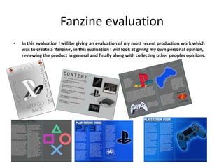
• In this evaluation I will be giving an evaluation of my most recent production work which
was to create a ‘fanzine’, in this evaluation I will look at giving my own personal opinion,
reviewing the product in general and finally along with collecting other peoples opinions.
Colour schemes
• On a whole I feel that I worked well with my production work when it came to deciding on the
colour schemes of which I wanted to use, as I wanted to create that feeling were your looking at
past technology, but when you turn over the page it has changed to present/future/upcoming
technology to be released. To do this I took some time with my planning in exploring the different
colors that I could use, this included experimenting with different gradient style patterns to
decide on a suitable color of which would give a good representation of the previous generation
consoles. In the end I made the decision to go with a light grey color to give representation of the
previous generation consoles, I made this decision because I thought that it looked appealing
when I applied it into a gradient and personally I thought that it looked like those scenes you get
in a program when you go back in time, with the bright silver/grey color in the center of the
pages which I caused by using the gradient tool. I made the decision to use this grey gradient
color on my front cover as I thought that it would be much more appealing for the front cover to
give a representation of the fanzine starting of by going into the past. When it came to looking at
the future/current consoles I already had a rough idea of the color scheme that I wanted to use
the blue that is famously related with the ‘PlayStation’ console , which is in fact that all famous
light blue which has always been seen with the console. But I thought that it would be best to
create a gradient out of it also, instead of it being basic so that it will look more like the blue
home screen of the console. I thought this to be appropriate to represent with the current
consoles and future consoles as I felt that it would give the reader/viewer a more appealing
feature towards the fanzine with there being a familiar sight of that color.
Techniques/tools used
• Throughout the course of this production I feel that I have worked well with the production aspects
and have worked on using some new tools and effects of which I have not used before. One of these
main techniques of which I used that was new to me was the idea of adding glow to images, I
imparticually used this to around the various different console joy pads of which that feature in
different places throughout my fanzine, although this might seem to be boring but don’t worry they
are all different gaming pads. I decided this would be a good tool to use because I feel that it helps
to make my production look more appealing towards the viewer/reader as I feel that it gives a sort
of 3D effect as it looks as if the whole of the controller is lighting up. I also made the decision to use
the 3D tool effect with some of the text throughout my fanzine evaluation, this was especially the
case with some of the titles for the articles in my production work, in some cases I managed to
make some of the titles look like the logo name of the typical game ‘Fortnite’, which I found to be a
good thing as the viewer might find it to be appealing as it gives a slight link/representation to
‘Fortnite’. The most basic tool of which I feel that I used the most, was in fact the ‘ruler’ tool and
this was used to mark out the areas of which I had to work in, this I found to be especially useful
when It came to marking out areas for where I wanted my titles to go at the top of the page.
However despite this being a useful tool it is a tool that I removed once I had finished creating a
page because I wouldn't’t have wanted ruler margins to be left, as it would just look pointless.,
apart from that I found it to be a useful tool that helped me multiple times throughout my
production. I have decided to leave the newest tool to me and that was the idea of adding 3D
effects to images, I am unsure on what its called but I found it to be a very useful tool as I was able
to look at altering the shape of the image and able to add curves to the edges of images. This is
something of which I made good use of with the PlayStation logo as I thought it helped to make it
look just that bit more personalized and different, which I thought would help to make it more
appealing rather then it just being basic and simple which isn't what I wanted, as it is something of
which you normally see everyday.
Audience
• On a whole I feel that I worked well with finding myself a audience of which I wanted to base my
production work around, when it first came to deciding on what I wanted to base my audience
around, I took some time to look into researching into the different audiences that I could base my
production around, some of this research that I went into was taking out surveys and interview in
my own time so that I was able to find out what people like and what they would expect to see in a
fanzine, on a whole this didn't’t take me long to carry out this research as I already has a small idea
of what I wanted my audience to be based around which wasn’t hard as I am the kind to play video
games so in my head I already had an idea of what I wanted it to look like. In the end the main
audience I went with was aimed around the kind of people who play games consoles but in
particular the typical games console ‘PlayStation’ as that is what I based my whole fanzine around,
but not only that also more based around the history of the games console, going right back to the
very first console, so the audience who view my fanzine will much more have to be the
‘Geeky/nerdy’ audience as these are the people who would be more interested in a consoles
history/or heavy gamers, but even they are seen to be the more nerdy type of people, so this is
why on a whole I decided to aim my main audience around heavy PlayStation gamers /nerds. Every
piece of work will have a secondary target audience and in this case with mine I believe that mine is
based around the kind of people who go to music concerts/festivals and want something to look
at/read, I believe that this is the case because my fanzine is most likely to be given out at a music
festival as it it more seen to be something that you don’t have to pay for, so where else would you
be more likely to pick it up if its for free.
Time Management
• On a whole I believe that I worked well and managed to get everything handed in on time
when it came to my time management apart from one thing but I will get to that in a
minute. When it came to completing my research and filling out the first research
documents I feel that I worked well with my time management and managed to work well
with getting them completed and handed in on time, there is in fact only really one of these
documents of which I felt that I struggled with my time management on and that is the final
PowerPoint document ‘Evaluation’ and this is down to a simple reason, but I was quick to
get it resolved. The reason for me not getting my evaluation completed on time was mainly
down to a reason to do with my production as It took me a few days after the deadline to
get my production completed, which was down to me being ill, leaving me unable to attend
for the last few days before half-term. So as a result I had to return after half-term and finish
of my production, which I did so without difficulty. However apart from the last few pages
of my production I feel that I worked well with my time management up to the point until of
which I fell ill and had to take time of college. When It came to filling out my evaluation I
tried to get It done as quickly as I could so that I can move onto my next production brief, in
total it only took me a few days to get my evaluation completed which I thought was
excellent, as I didn’t waste to much time and didn’t fall behind compared to others who had
moved onto the next production brief. In a final conclusion I feel that I worked well with my
time management throughout my production, even with the few small areas that I fell
behind I still think I kept to the task and worked well against my schedule.
Production schedule
• In my opinion I believe that I managed to stick to my production schedule apart from a few
areas, but they are ones of which I felt that I didn’t need to worry about to much that they
didn’t really make that much of a difference towards my schedule, or if it did then it was
only a few days at most, I believe this as my production schedule is pretty much seen to be
the same as my time management. When I first started my production I felt that I managed
to stick to my schedule, I found this so because I thought that the first few pages of my
fanzine production were the easiest to create as I had a strong idea of how I wanted them
to look like. However when I was coming towards the last few pages of my production I felt
that I struggled to stick to my production schedule but that was more down to the fact of
me falling ill, resulting In my being unable to attend college for a few days, but apart from
that I had no problems with getting on with the last few pages of my production when I
returned from college and managed to continue working to my production schedule and
got it finished. In terms of faults when creating my production according to my schedule, I
don’t think that I really had any as I took some time to get my production schedule to my
creating and to something that I knew I’d be able to work by. In conclusion to this, I feel
that I didn’t have any problems with sticking to my production schedule and the only small
problem I had relates to the same as the problem with my time management, which was
due to falling ill, but again I would like to emphasize how it didn’t really effect my
production schedule.
Peer Evaluation
• What looks good in my fanzine?Why?
• The backgrounds of all your pages in your fanzine look good, especially by the way that you
have worked to create a gradient out of the colours you chose to go that extra mile, not
only that but it helps to bring out the text and images ext. that are sat on it.
• What is the thing that you like the look of most in my fanzine?Why?
• Personally, the main thing for me of which I think looks exceptionally good in your fanzine
in the glow effects that you have added to some images, most commonly seen on images
of joy pads.
• Anything that you think I could work on/improve?Why?
• In my opinion I believe that your fanzine production looks good, but if there had to be one
area of which you where to go back and improve, I would like to suggest that you look at
your final page, as too me it seems to look a bit basic/boring with just images.
Peer Evaluation
• What looks good in my fanzine?Why?
• From looking at your final fanzine production I feel that lots of things look good in your
production but inparticually the idea on the final page of your production and that was more on
the 10th page of your fanzine which has what appears to be a ‘PS4’ joy pad. I felt that this looked
good in your production because it looks like some sort of 3D effect, looking almost as if its about
to jump out of your fanzine which is something that is very appealing to me.
• What is the thing that you like the look of most in my fanzine?Why?
• From looking at your fanzine production, the thing of which I like the most is on the final page of
your fanzine and it is the idea of the image of the ‘PS4’ joy pad, I feel this because to me it looks
like you have put some time into it to make it look the way it does, well done.
• Anything that you think I could work on/improve? Why?
• I think to improve your fanzine production you could work on going back if you have the spare
time, to evaluate and look at creating a back cover to show to end of your fanzine because to me
it looks like there is still more to be added to it.
Personal evaluation
.In my own personal opinion I believe that my production looks good and to be honest I
thought that some of the pages looked better then what I thought they would once I had
finished my production, these pages were mainly based towards the final few pages of my
production work were I embedded the idea of the blue gradient trying to give a representation
of that typical PlayStation ‘blue’ home screen. The blue gradient background in the last few
pages was more the parts of which I was most impressed with at the end of my production, as
when I was coming to the end of my production I started to have doubts about the different
colour schemes in my background, but it was just my doubt as by the time I had finished my
production, I was right all along it ended up looking good enough. When It came to creating the
front cover for for my production, I was particularly proud of the gradient that I created for my
front cover , as I decided to go with a grey gradient to try and give a representation of the
‘PlayStation’ consoles of which were first released many years ago and that is what I thought I
did as it has that very light silver shine in the centre of the front cover, which I think made it
look like as if its slowly going into the centre of the front cover ’turning over into the first page’.
To conclude I personally think that I have worked well with my production, especially with
missing the last few days of production, but I still managed to get my production done to a
good standard in my opinion and I am happy with myself for getting it finished.
Evaluation
. What would I go back and improve in my production, if given the time to go back and
improve?
If I was given the time to go back and make improvements/change my production I think that I would
take some time to go back and review the final page of my production work because I was rushed
towards the end to get the last bits and pieces of my production finished so I rushed to get something
down for my final page, which explains why it looks to be quite limited. Some might say that this will
limit me, but I feel that I have put a good amount of detail in the rest of my production work so I feel
that I will be alright. There is one more thing that I feel I might need to change if given the chance to
go back and change my work and that is more based around pages 9-10 as I feel that I could add in
some more text underneath the dualshock pad on page 10, as some might see it to be a bit basic and I
don’t want that to happen.
Anything you would make different?
In my opinion I don’t think that there is much else that I would make different to my production work
as I feel that I am happy enough with my production, there is only the few improvements/changes
that I would make to my production and I have already mentioned them above.

Fanzine evaluation

  • 1.
  • 2.
    Fanzine evaluation • Inthis evaluation I will be giving an evaluation of my most recent production work which was to create a ‘fanzine’, in this evaluation I will look at giving my own personal opinion, reviewing the product in general and finally along with collecting other peoples opinions.
  • 3.
    Colour schemes • Ona whole I feel that I worked well with my production work when it came to deciding on the colour schemes of which I wanted to use, as I wanted to create that feeling were your looking at past technology, but when you turn over the page it has changed to present/future/upcoming technology to be released. To do this I took some time with my planning in exploring the different colors that I could use, this included experimenting with different gradient style patterns to decide on a suitable color of which would give a good representation of the previous generation consoles. In the end I made the decision to go with a light grey color to give representation of the previous generation consoles, I made this decision because I thought that it looked appealing when I applied it into a gradient and personally I thought that it looked like those scenes you get in a program when you go back in time, with the bright silver/grey color in the center of the pages which I caused by using the gradient tool. I made the decision to use this grey gradient color on my front cover as I thought that it would be much more appealing for the front cover to give a representation of the fanzine starting of by going into the past. When it came to looking at the future/current consoles I already had a rough idea of the color scheme that I wanted to use the blue that is famously related with the ‘PlayStation’ console , which is in fact that all famous light blue which has always been seen with the console. But I thought that it would be best to create a gradient out of it also, instead of it being basic so that it will look more like the blue home screen of the console. I thought this to be appropriate to represent with the current consoles and future consoles as I felt that it would give the reader/viewer a more appealing feature towards the fanzine with there being a familiar sight of that color.
  • 4.
    Techniques/tools used • Throughoutthe course of this production I feel that I have worked well with the production aspects and have worked on using some new tools and effects of which I have not used before. One of these main techniques of which I used that was new to me was the idea of adding glow to images, I imparticually used this to around the various different console joy pads of which that feature in different places throughout my fanzine, although this might seem to be boring but don’t worry they are all different gaming pads. I decided this would be a good tool to use because I feel that it helps to make my production look more appealing towards the viewer/reader as I feel that it gives a sort of 3D effect as it looks as if the whole of the controller is lighting up. I also made the decision to use the 3D tool effect with some of the text throughout my fanzine evaluation, this was especially the case with some of the titles for the articles in my production work, in some cases I managed to make some of the titles look like the logo name of the typical game ‘Fortnite’, which I found to be a good thing as the viewer might find it to be appealing as it gives a slight link/representation to ‘Fortnite’. The most basic tool of which I feel that I used the most, was in fact the ‘ruler’ tool and this was used to mark out the areas of which I had to work in, this I found to be especially useful when It came to marking out areas for where I wanted my titles to go at the top of the page. However despite this being a useful tool it is a tool that I removed once I had finished creating a page because I wouldn't’t have wanted ruler margins to be left, as it would just look pointless., apart from that I found it to be a useful tool that helped me multiple times throughout my production. I have decided to leave the newest tool to me and that was the idea of adding 3D effects to images, I am unsure on what its called but I found it to be a very useful tool as I was able to look at altering the shape of the image and able to add curves to the edges of images. This is something of which I made good use of with the PlayStation logo as I thought it helped to make it look just that bit more personalized and different, which I thought would help to make it more appealing rather then it just being basic and simple which isn't what I wanted, as it is something of which you normally see everyday.
  • 5.
    Audience • On awhole I feel that I worked well with finding myself a audience of which I wanted to base my production work around, when it first came to deciding on what I wanted to base my audience around, I took some time to look into researching into the different audiences that I could base my production around, some of this research that I went into was taking out surveys and interview in my own time so that I was able to find out what people like and what they would expect to see in a fanzine, on a whole this didn't’t take me long to carry out this research as I already has a small idea of what I wanted my audience to be based around which wasn’t hard as I am the kind to play video games so in my head I already had an idea of what I wanted it to look like. In the end the main audience I went with was aimed around the kind of people who play games consoles but in particular the typical games console ‘PlayStation’ as that is what I based my whole fanzine around, but not only that also more based around the history of the games console, going right back to the very first console, so the audience who view my fanzine will much more have to be the ‘Geeky/nerdy’ audience as these are the people who would be more interested in a consoles history/or heavy gamers, but even they are seen to be the more nerdy type of people, so this is why on a whole I decided to aim my main audience around heavy PlayStation gamers /nerds. Every piece of work will have a secondary target audience and in this case with mine I believe that mine is based around the kind of people who go to music concerts/festivals and want something to look at/read, I believe that this is the case because my fanzine is most likely to be given out at a music festival as it it more seen to be something that you don’t have to pay for, so where else would you be more likely to pick it up if its for free.
  • 6.
    Time Management • Ona whole I believe that I worked well and managed to get everything handed in on time when it came to my time management apart from one thing but I will get to that in a minute. When it came to completing my research and filling out the first research documents I feel that I worked well with my time management and managed to work well with getting them completed and handed in on time, there is in fact only really one of these documents of which I felt that I struggled with my time management on and that is the final PowerPoint document ‘Evaluation’ and this is down to a simple reason, but I was quick to get it resolved. The reason for me not getting my evaluation completed on time was mainly down to a reason to do with my production as It took me a few days after the deadline to get my production completed, which was down to me being ill, leaving me unable to attend for the last few days before half-term. So as a result I had to return after half-term and finish of my production, which I did so without difficulty. However apart from the last few pages of my production I feel that I worked well with my time management up to the point until of which I fell ill and had to take time of college. When It came to filling out my evaluation I tried to get It done as quickly as I could so that I can move onto my next production brief, in total it only took me a few days to get my evaluation completed which I thought was excellent, as I didn’t waste to much time and didn’t fall behind compared to others who had moved onto the next production brief. In a final conclusion I feel that I worked well with my time management throughout my production, even with the few small areas that I fell behind I still think I kept to the task and worked well against my schedule.
  • 7.
    Production schedule • Inmy opinion I believe that I managed to stick to my production schedule apart from a few areas, but they are ones of which I felt that I didn’t need to worry about to much that they didn’t really make that much of a difference towards my schedule, or if it did then it was only a few days at most, I believe this as my production schedule is pretty much seen to be the same as my time management. When I first started my production I felt that I managed to stick to my schedule, I found this so because I thought that the first few pages of my fanzine production were the easiest to create as I had a strong idea of how I wanted them to look like. However when I was coming towards the last few pages of my production I felt that I struggled to stick to my production schedule but that was more down to the fact of me falling ill, resulting In my being unable to attend college for a few days, but apart from that I had no problems with getting on with the last few pages of my production when I returned from college and managed to continue working to my production schedule and got it finished. In terms of faults when creating my production according to my schedule, I don’t think that I really had any as I took some time to get my production schedule to my creating and to something that I knew I’d be able to work by. In conclusion to this, I feel that I didn’t have any problems with sticking to my production schedule and the only small problem I had relates to the same as the problem with my time management, which was due to falling ill, but again I would like to emphasize how it didn’t really effect my production schedule.
  • 8.
    Peer Evaluation • Whatlooks good in my fanzine?Why? • The backgrounds of all your pages in your fanzine look good, especially by the way that you have worked to create a gradient out of the colours you chose to go that extra mile, not only that but it helps to bring out the text and images ext. that are sat on it. • What is the thing that you like the look of most in my fanzine?Why? • Personally, the main thing for me of which I think looks exceptionally good in your fanzine in the glow effects that you have added to some images, most commonly seen on images of joy pads. • Anything that you think I could work on/improve?Why? • In my opinion I believe that your fanzine production looks good, but if there had to be one area of which you where to go back and improve, I would like to suggest that you look at your final page, as too me it seems to look a bit basic/boring with just images.
  • 9.
    Peer Evaluation • Whatlooks good in my fanzine?Why? • From looking at your final fanzine production I feel that lots of things look good in your production but inparticually the idea on the final page of your production and that was more on the 10th page of your fanzine which has what appears to be a ‘PS4’ joy pad. I felt that this looked good in your production because it looks like some sort of 3D effect, looking almost as if its about to jump out of your fanzine which is something that is very appealing to me. • What is the thing that you like the look of most in my fanzine?Why? • From looking at your fanzine production, the thing of which I like the most is on the final page of your fanzine and it is the idea of the image of the ‘PS4’ joy pad, I feel this because to me it looks like you have put some time into it to make it look the way it does, well done. • Anything that you think I could work on/improve? Why? • I think to improve your fanzine production you could work on going back if you have the spare time, to evaluate and look at creating a back cover to show to end of your fanzine because to me it looks like there is still more to be added to it.
  • 10.
    Personal evaluation .In myown personal opinion I believe that my production looks good and to be honest I thought that some of the pages looked better then what I thought they would once I had finished my production, these pages were mainly based towards the final few pages of my production work were I embedded the idea of the blue gradient trying to give a representation of that typical PlayStation ‘blue’ home screen. The blue gradient background in the last few pages was more the parts of which I was most impressed with at the end of my production, as when I was coming to the end of my production I started to have doubts about the different colour schemes in my background, but it was just my doubt as by the time I had finished my production, I was right all along it ended up looking good enough. When It came to creating the front cover for for my production, I was particularly proud of the gradient that I created for my front cover , as I decided to go with a grey gradient to try and give a representation of the ‘PlayStation’ consoles of which were first released many years ago and that is what I thought I did as it has that very light silver shine in the centre of the front cover, which I think made it look like as if its slowly going into the centre of the front cover ’turning over into the first page’. To conclude I personally think that I have worked well with my production, especially with missing the last few days of production, but I still managed to get my production done to a good standard in my opinion and I am happy with myself for getting it finished.
  • 11.
    Evaluation . What wouldI go back and improve in my production, if given the time to go back and improve? If I was given the time to go back and make improvements/change my production I think that I would take some time to go back and review the final page of my production work because I was rushed towards the end to get the last bits and pieces of my production finished so I rushed to get something down for my final page, which explains why it looks to be quite limited. Some might say that this will limit me, but I feel that I have put a good amount of detail in the rest of my production work so I feel that I will be alright. There is one more thing that I feel I might need to change if given the chance to go back and change my work and that is more based around pages 9-10 as I feel that I could add in some more text underneath the dualshock pad on page 10, as some might see it to be a bit basic and I don’t want that to happen. Anything you would make different? In my opinion I don’t think that there is much else that I would make different to my production work as I feel that I am happy enough with my production, there is only the few improvements/changes that I would make to my production and I have already mentioned them above.