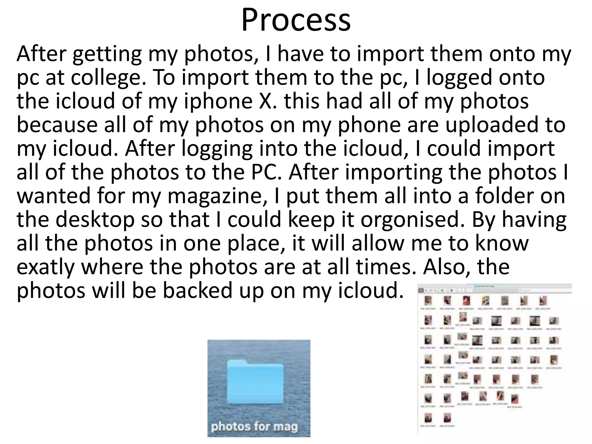
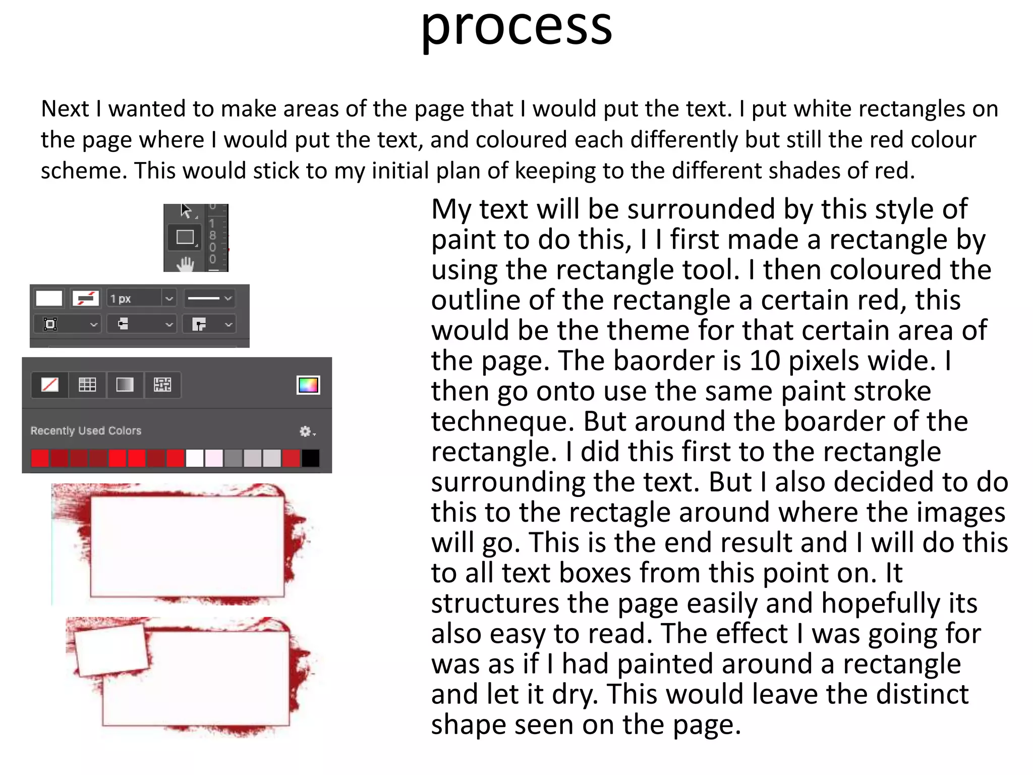
Production Reflection
By Daniel Morland
Process
For the first part of my production, I am going to email the
place where I would want to take photos for my magazine. By
knowing earlier, I will have a more flexible time when it
comes to understanding what subject I should do. If I get the
chance to take photos in the facility, I can continue my main
idea of rock climbing. If I don’t get access, I will have to alter
my idea.
Process
After a few days, the support team at Red Goat didn’t
respond to my email I sent to them. Requesting access to
take photos within the facility. What I didn’t was. go into
Red Goat and ask the front desk if I can take photos
while being inside the building. They said that I can take
photos of any location within the facility. This included
anyone inside and any logos within the facility. The only
thing I would not be able to take photos of were children
or people who couldn’t consent without a carer. This was
easy to do because I went during hours where there
were not many people. As you can see, I got plenty.
Process
I only used one actor in my magazine. My friend.
He was happy to have photos taken of him
straight away, but he did want access to the
photos taken during the photoshoot. For the
photoshoot I asked him to climb and hold
position at certain parts of a climb. This
photoshoot allowed me to gather many different
photos and angles for my magazine. After which
I can import to my pc at college to use on my
front cover and double page spread.
Process
After getting my photos, I have to import them onto my
pc at college. To import them to the pc, I logged onto
the icloud of my iphone X. this had all of my photos
because all of my photos on my phone are uploaded to
my icloud. After logging into the icloud, I could import
all of the photos to the PC. After importing the photos I
wanted for my magazine, I put them all into a folder on
the desktop so that I could keep it orgonised. By having
all the photos in one place, it will allow me to know
exatly where the photos are at all times. Also, the
photos will be backed up on my icloud.
Process
Next I got the font for my magazine. I first found
the title text. I got the "army buster" font from
DaFonts website. I downloaded the font as a zip
file on my mac. I opened the zip file and it saved
as a folder on my pc and installed the font to the
mac. This allows me to use this font on the pc.
process
Editing my front cover, I have to first position the
image so it is parallel with the top and bottom of
the magazine. The original image is slightly off. I
used many grid lines to rotate the image to be
perfectly parallel.
process
Next I have to magic wand the background so I
can remove it later. One issue that I have is the
moving foot on the bottom left. However the
colours behind are different so I should have no
issue with selecting them as opposed to the
foot. Here is the end result. Now I just need to
go around him with an eraser to clean things
up.
process Next I want to add a background. First I will
find a Red Goat Logo to stick on the bottom,
in a position the reader will see clearly. I want
this background to be abstract and unique. I
found an image of a paint brush streak which I
wanted to use for an 'earthy' effect of
movement for the guy climbing. After
importing it to photoshop I wanted to change
the colour of it so it would match my colour
scheme. I did this by selecting the image with
the magic wand tool. After selecting it, I went
to: Edit, Fill. After selecting fill, I got a box for
the colour and opasity. I selected what I
wanted and hit OK.
Heres the result:
With this coloured stroke I can change the hue
and opasity to match my colour scheme of
black red and white.
process After messing around with the paintbrush stroke, I
found 3 positions of it where I was comfotable for them
to stay and look astheticly pleasing. Having each colour
different allows for the perspective of paint being on
different levels, as if they are layerd to the persective of
the reader.
I then started on the font and text. I used the "army buster'
as planned before. To give it more of a unique look to the
front cover, I added an outline to the title and liked how it
stood out as bold and aggressive to appeal to the male
audience, but the audience as a whole. But then I had
another look at magazines for insparation of my secondary
titles. I saw how the secondary text was more redgid and
clear to read. So I took note and used "arial" font. I then
added an outline like the title, but to make it more
structured, I changed the colour of the secondary text. It
kept the same look as the title, however it still had its own
style as text. But the positioning of the text was fading due
to the background. So I moved the text down to a darker
area of the image, and it produced a much more readable
text. Im going to add an image about to relate to the text.
This should be a great structure for my front cover.
process
i added some images to relate to the text however the
image on the left didn’t really relate to the text below, if it
continues to be an issue for me Ill change it to an image of
some climbing shoes and equipment.
next I wanted to take away the 'tacky' feel of the
magazine and decided to experiment with using more
of the bottom of the page. The contrast of red and
black was an easy choice to mess with. With clear lines
and defined colours.
one more change I made to the front cover, was the
text on the front. I made sure that the text was more
inline with other magazines. So I chose to use a
different font and I didn’t add the slight outline, like I
did the first time. I used Corbel for my next font and
this did a better job of being clear to read, and isn't as
hard to look at. I also added a shadow in the direction
of the images lighting.
process
After that I just added the barcode and issue
number and called it a day. I saved the project in
my front cover folder on my desktop.
process
Next, I have to start on my double page spread.
The plan I have for it is to: first complete the
graphical side of the double page spread in
photoshop and then move to Indesign for the
text. This would allow me to fully experiment
around the page in photoshop and then allow
me to put the tet in the correct place in
Indesign.
process
i first had to create a new canvas in photoshop. I
went on to choose A3 in print orientation because it
is a doublepage spread. And 2 A4 pages make up 1
A3 page.
The A3 page will be split into 2 pages. One on the
left and one on the right. To make sure I don’t cross
over with images and text, I make a new guide
layout so that I would know the exact edge of the
page, along with the middle of the page. This would
allow me to structure the page knowing where to
not cross the page. I have it around the edges so
that I know where the edge of the page is clearly.
The blue used is very easy to see.
process
Next I wanted to save it in a
location which would be easy
to locate. This would be in
the work folder for this
project on my desktop. I
saved the project under a
name which would also be
easy to find under a simple
search.
process
For my double page spread, I want to
immitate what I have done for the front
cover, using the paint streaks as a background
in areas, but not to overdo it as to not make it
look too busy but I do like the look of the
paint streaks. I was thinking of just doing the
corners, but that might change over time. I
came up with this design: and it really
continues the effect I was going for on the
front cover. I am however happy to edit this
background as the page develops with more
images and writing. One thing I have tried to
keep consistent on this page, is to be
inconsistent with the colour red. My colour
scheme had 3 different shades of red. So that
inspired me to experiment with the different
colours of red.
After this I add a title, along with a white box
around it, this is to all the title to stand out
for now, and this is not the final design I want
for my title.
process
The next process is to add in the different subjects I
will be talking about. On my pre-production, I
showed how I would split the different subjects into
boxes with small images on the side. This would
allow my to break up the page effectively allowing
for an easy read. I chose to use the "Bookman old
style" font for my extract front. This is because its
easy to read while on the page and also similar
enough to other new agents in the aspect of style.
However I wont tamper with the text until I'm in
InDesign.
process
My text will be surrounded by this style of
paint to do this, I I first made a rectangle by
using the rectangle tool. I then coloured the
outline of the rectangle a certain red, this
would be the theme for that certain area of
the page. The baorder is 10 pixels wide. I
then go onto use the same paint stroke
techneque. But around the boarder of the
rectangle. I did this first to the rectangle
surrounding the text. But I also decided to do
this to the rectagle around where the images
will go. This is the end result and I will do this
to all text boxes from this point on. It
structures the page easily and hopefully its
also easy to read. The effect I was going for
was as if I had painted around a rectangle
and let it dry. This would leave the distinct
shape seen on the page.
Next I wanted to make areas of the page that I would put the text. I put white rectangles on
the page where I would put the text, and coloured each differently but still the red colour
scheme. This would stick to my initial plan of keeping to the different shades of red.
process
This by the end, I came up with this: it continued
to use that paint strak style. Creating areas on
the page which easily split up the page for
images and text. The paint style is aggressive
and busy on the page. I didn’t want it to be
distracting, but I did want the reader to
understand that the clear areas are for text and
images.
process
This is the end result of my
photoshop effort. After this is
wanted to port it to adobe
Indesign. However, I realized that I
wouldn’t be able to put images into
certain locations on the page, due
to the paint. I put some examples
of this on the side. So I will go back
to photoshop to put some of the
images in. After this I will go to
indesign to put text and the last
images in.
Process
After putting all of the
images in, the page came
alive. With other colours
and not just red and
black. Now I will port it to
indesign and add text in
the areas I want it to
appear.
One more change to the
page was the title. I
added a white paint
stroke behind it to it
would stand out from the
other black and red
around it. Otherwise it
would be unreadable.
process
What I had to do next was to add text to the areas that I
designated to text. I wanted a verity of subjects in
my magazine, this would create an interesting read. The
text must be somewhat interesting so that the reader
would continue reading my magazine. So the 4 subjects I
produced were: "Red goat as a whole", "Dans experience of
climbing as a new starter", the "health risks with
climbing" and the "new area in Red Goat". This created a
large range of subjects on climbing which should keep the
reader engaged with my double page spread.
To begin my writing, I wanted to use all of the space
possible to write in. So I began my writing in Indesign. Once
I had filled the space; I copied the text into a word
document to check for spelling and word count. By doing
the writing first in Adobe Indesign and then going to
Microsoft word after, allowed me to see the space I was
using instead of guessing what space I had left to use on
InDesign. The total word count came to 1200 which was
500 more then the 700 required, so I didn’t have to worry
about that criteria.
process
I wanted the text to be in the text boxes, however
the text would go onto the images. To get around
this, I created some boxes, areas which I wouldn’t
want the text to go once I had made the text wrap
around it. To do this I used the rectangle tool along
with some other shapes which I want the text to
wrap around. These shapes are placed in the areas I
don’t want the text to use, and therefore not go on
the images. This made the text only use the text
box without going over the image.
After I had finished my double page spread, I
have to export it from the PC to an online
source. First, I exported the image as a .PNG so I
could easily upload it to places like slide share.
And store it on my pc.

production reflection magazine

  • 1.
  • 2.
    Process For the firstpart of my production, I am going to email the place where I would want to take photos for my magazine. By knowing earlier, I will have a more flexible time when it comes to understanding what subject I should do. If I get the chance to take photos in the facility, I can continue my main idea of rock climbing. If I don’t get access, I will have to alter my idea.
  • 3.
    Process After a fewdays, the support team at Red Goat didn’t respond to my email I sent to them. Requesting access to take photos within the facility. What I didn’t was. go into Red Goat and ask the front desk if I can take photos while being inside the building. They said that I can take photos of any location within the facility. This included anyone inside and any logos within the facility. The only thing I would not be able to take photos of were children or people who couldn’t consent without a carer. This was easy to do because I went during hours where there were not many people. As you can see, I got plenty.
  • 4.
    Process I only usedone actor in my magazine. My friend. He was happy to have photos taken of him straight away, but he did want access to the photos taken during the photoshoot. For the photoshoot I asked him to climb and hold position at certain parts of a climb. This photoshoot allowed me to gather many different photos and angles for my magazine. After which I can import to my pc at college to use on my front cover and double page spread.
  • 5.
    Process After getting myphotos, I have to import them onto my pc at college. To import them to the pc, I logged onto the icloud of my iphone X. this had all of my photos because all of my photos on my phone are uploaded to my icloud. After logging into the icloud, I could import all of the photos to the PC. After importing the photos I wanted for my magazine, I put them all into a folder on the desktop so that I could keep it orgonised. By having all the photos in one place, it will allow me to know exatly where the photos are at all times. Also, the photos will be backed up on my icloud.
  • 6.
    Process Next I gotthe font for my magazine. I first found the title text. I got the "army buster" font from DaFonts website. I downloaded the font as a zip file on my mac. I opened the zip file and it saved as a folder on my pc and installed the font to the mac. This allows me to use this font on the pc.
  • 7.
    process Editing my frontcover, I have to first position the image so it is parallel with the top and bottom of the magazine. The original image is slightly off. I used many grid lines to rotate the image to be perfectly parallel.
  • 8.
    process Next I haveto magic wand the background so I can remove it later. One issue that I have is the moving foot on the bottom left. However the colours behind are different so I should have no issue with selecting them as opposed to the foot. Here is the end result. Now I just need to go around him with an eraser to clean things up.
  • 9.
    process Next Iwant to add a background. First I will find a Red Goat Logo to stick on the bottom, in a position the reader will see clearly. I want this background to be abstract and unique. I found an image of a paint brush streak which I wanted to use for an 'earthy' effect of movement for the guy climbing. After importing it to photoshop I wanted to change the colour of it so it would match my colour scheme. I did this by selecting the image with the magic wand tool. After selecting it, I went to: Edit, Fill. After selecting fill, I got a box for the colour and opasity. I selected what I wanted and hit OK. Heres the result: With this coloured stroke I can change the hue and opasity to match my colour scheme of black red and white.
  • 10.
    process After messingaround with the paintbrush stroke, I found 3 positions of it where I was comfotable for them to stay and look astheticly pleasing. Having each colour different allows for the perspective of paint being on different levels, as if they are layerd to the persective of the reader. I then started on the font and text. I used the "army buster' as planned before. To give it more of a unique look to the front cover, I added an outline to the title and liked how it stood out as bold and aggressive to appeal to the male audience, but the audience as a whole. But then I had another look at magazines for insparation of my secondary titles. I saw how the secondary text was more redgid and clear to read. So I took note and used "arial" font. I then added an outline like the title, but to make it more structured, I changed the colour of the secondary text. It kept the same look as the title, however it still had its own style as text. But the positioning of the text was fading due to the background. So I moved the text down to a darker area of the image, and it produced a much more readable text. Im going to add an image about to relate to the text. This should be a great structure for my front cover.
  • 11.
    process i added someimages to relate to the text however the image on the left didn’t really relate to the text below, if it continues to be an issue for me Ill change it to an image of some climbing shoes and equipment. next I wanted to take away the 'tacky' feel of the magazine and decided to experiment with using more of the bottom of the page. The contrast of red and black was an easy choice to mess with. With clear lines and defined colours. one more change I made to the front cover, was the text on the front. I made sure that the text was more inline with other magazines. So I chose to use a different font and I didn’t add the slight outline, like I did the first time. I used Corbel for my next font and this did a better job of being clear to read, and isn't as hard to look at. I also added a shadow in the direction of the images lighting.
  • 12.
    process After that Ijust added the barcode and issue number and called it a day. I saved the project in my front cover folder on my desktop.
  • 13.
    process Next, I haveto start on my double page spread. The plan I have for it is to: first complete the graphical side of the double page spread in photoshop and then move to Indesign for the text. This would allow me to fully experiment around the page in photoshop and then allow me to put the tet in the correct place in Indesign.
  • 14.
    process i first hadto create a new canvas in photoshop. I went on to choose A3 in print orientation because it is a doublepage spread. And 2 A4 pages make up 1 A3 page. The A3 page will be split into 2 pages. One on the left and one on the right. To make sure I don’t cross over with images and text, I make a new guide layout so that I would know the exact edge of the page, along with the middle of the page. This would allow me to structure the page knowing where to not cross the page. I have it around the edges so that I know where the edge of the page is clearly. The blue used is very easy to see.
  • 15.
    process Next I wantedto save it in a location which would be easy to locate. This would be in the work folder for this project on my desktop. I saved the project under a name which would also be easy to find under a simple search.
  • 16.
    process For my doublepage spread, I want to immitate what I have done for the front cover, using the paint streaks as a background in areas, but not to overdo it as to not make it look too busy but I do like the look of the paint streaks. I was thinking of just doing the corners, but that might change over time. I came up with this design: and it really continues the effect I was going for on the front cover. I am however happy to edit this background as the page develops with more images and writing. One thing I have tried to keep consistent on this page, is to be inconsistent with the colour red. My colour scheme had 3 different shades of red. So that inspired me to experiment with the different colours of red. After this I add a title, along with a white box around it, this is to all the title to stand out for now, and this is not the final design I want for my title.
  • 17.
    process The next processis to add in the different subjects I will be talking about. On my pre-production, I showed how I would split the different subjects into boxes with small images on the side. This would allow my to break up the page effectively allowing for an easy read. I chose to use the "Bookman old style" font for my extract front. This is because its easy to read while on the page and also similar enough to other new agents in the aspect of style. However I wont tamper with the text until I'm in InDesign.
  • 18.
    process My text willbe surrounded by this style of paint to do this, I I first made a rectangle by using the rectangle tool. I then coloured the outline of the rectangle a certain red, this would be the theme for that certain area of the page. The baorder is 10 pixels wide. I then go onto use the same paint stroke techneque. But around the boarder of the rectangle. I did this first to the rectangle surrounding the text. But I also decided to do this to the rectagle around where the images will go. This is the end result and I will do this to all text boxes from this point on. It structures the page easily and hopefully its also easy to read. The effect I was going for was as if I had painted around a rectangle and let it dry. This would leave the distinct shape seen on the page. Next I wanted to make areas of the page that I would put the text. I put white rectangles on the page where I would put the text, and coloured each differently but still the red colour scheme. This would stick to my initial plan of keeping to the different shades of red.
  • 19.
    process This by theend, I came up with this: it continued to use that paint strak style. Creating areas on the page which easily split up the page for images and text. The paint style is aggressive and busy on the page. I didn’t want it to be distracting, but I did want the reader to understand that the clear areas are for text and images.
  • 20.
    process This is theend result of my photoshop effort. After this is wanted to port it to adobe Indesign. However, I realized that I wouldn’t be able to put images into certain locations on the page, due to the paint. I put some examples of this on the side. So I will go back to photoshop to put some of the images in. After this I will go to indesign to put text and the last images in.
  • 21.
    Process After putting allof the images in, the page came alive. With other colours and not just red and black. Now I will port it to indesign and add text in the areas I want it to appear. One more change to the page was the title. I added a white paint stroke behind it to it would stand out from the other black and red around it. Otherwise it would be unreadable.
  • 22.
    process What I hadto do next was to add text to the areas that I designated to text. I wanted a verity of subjects in my magazine, this would create an interesting read. The text must be somewhat interesting so that the reader would continue reading my magazine. So the 4 subjects I produced were: "Red goat as a whole", "Dans experience of climbing as a new starter", the "health risks with climbing" and the "new area in Red Goat". This created a large range of subjects on climbing which should keep the reader engaged with my double page spread. To begin my writing, I wanted to use all of the space possible to write in. So I began my writing in Indesign. Once I had filled the space; I copied the text into a word document to check for spelling and word count. By doing the writing first in Adobe Indesign and then going to Microsoft word after, allowed me to see the space I was using instead of guessing what space I had left to use on InDesign. The total word count came to 1200 which was 500 more then the 700 required, so I didn’t have to worry about that criteria.
  • 23.
    process I wanted thetext to be in the text boxes, however the text would go onto the images. To get around this, I created some boxes, areas which I wouldn’t want the text to go once I had made the text wrap around it. To do this I used the rectangle tool along with some other shapes which I want the text to wrap around. These shapes are placed in the areas I don’t want the text to use, and therefore not go on the images. This made the text only use the text box without going over the image.
  • 24.
    After I hadfinished my double page spread, I have to export it from the PC to an online source. First, I exported the image as a .PNG so I could easily upload it to places like slide share. And store it on my pc.

Editor's Notes

  • #3 Discuss the tools and processes used in your production. Log your thoughts and feelings about your work.
  • #4 Discuss the tools and processes used in your production. Log your thoughts and feelings about your work.
  • #5 Discuss the tools and processes used in your production. Log your thoughts and feelings about your work.
  • #6 Discuss the tools and processes used in your production. Log your thoughts and feelings about your work.
  • #7 Discuss the tools and processes used in your production. Log your thoughts and feelings about your work.