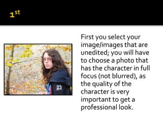
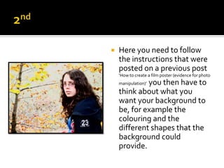
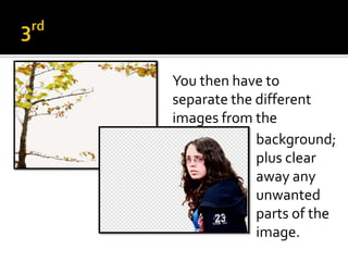
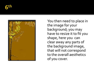
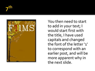
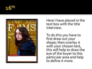
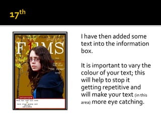
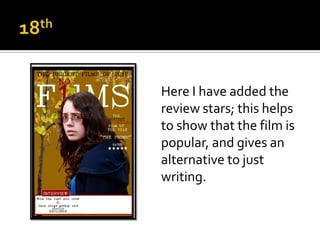
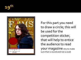
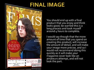
Hannah George
First you select your
image/images that are
unedited; you will have
to choose a photo that
has the character in full
focus (not blurred), as
the quality of the
character is very
important to get a
professional look.
   Here you need to follow
    the instructions that were
    posted on a previous post
    ‘How to create a film poster (evidence for photo
             you then have to
    manipulation)’
    think about what you
    want your background to
    be, for example the
    colouring and the
    different shapes that the
    background could
    provide.
You then have to
separate the different
images from the
             background;
             plus clear
             away any
             unwanted
             parts of the
             image.
First I started with a
black background on the
computer programme
‘Macromedia Flash 8’.
With this I opened a new
document and changed
the canvas size to fit my
means, and had the
colour black to give an
alternative to white.
   Then over the black
    you need to put a
    base colour on ( I have
    used a gold colour) That will
    match in to the
    images, and will give a
    contrast to the sharp
    blue, that is present
    on the character’s
    clothing.
You then need to place in
the image for your
background; you may
have to resize it to fit you
shape, here you can
clear away any parts of
the background image,
that will not correspond
to the overall aesthetics
of you cover.
You then need to start
to add in your text; I
would start first with
the title, I have used
capitals and changed
the font of the letter ‘1’
to correspond with an
earlier post, and will be
more apparent why in
the next slide.
   Here I have then added
    the last part of the title
    ‘NO.’ with having this
    and the letter ‘1’ in red
    this contrasts with the
    white of the title, and
    helps to segregate it
    off so that it forms a
    different part of the
    title, it also adds
    interest and variety.
You then need to add in
the character shot; this
is just a simple copy
and paste, but you may
have to resize the
character so be careful
to keep the body in
proportion.
On this image I have
placed black line at the
bottom of the image as
it helps to frame it; and
gives a clear indication
to the boundaries to
the editing and placing
of objects.
Here I have added a text
box; that contains the
magazine’s quote, this is
to make the magazine
seem more impressive,
and will help to give it
status: which will help it
in comparison to the
other magazines, that it
will be competing
against.
I have now started to
place the text over the
character; to get a better
looking image you
should change the font
colour in different areas,
this will make the
different parts standout
against each other, and
looks more aesthetically
pleasing.
Here I have added a
border on the right to
help give a more
finished approach to
magazine, and it gives
a clear indication to
were the writing can go
up to.
In this slide I have just
finished off the border
on the left hand side;
this finishes off the
border around the
image, and makes the
image standout against
the gold background.
In this image I have placed
in a rectangle that will be
used as an information box.

This will allow me to add in
more information to the
magazine front; and to
make it separate from the
image, and to help define
the area, as well as giving
variation ( plus follows the general
convention).
Here I have placed in the
text box with the title
interview.
To do this you have to
first draw out your
shape; then overlay it
with your chosen text,
this will help to draw the
eye of the buyer to this
particular area and help
to define it more.
I have then added some
text into the information
box.

It is important to vary the
colour of your text; this
will help to stop it
getting repetitive and
will make your text (in this
area) more eye catching.
Here I have added the
review stars; this helps
to show that the film is
popular, and gives an
alternative to just
writing.
For this part you need
to draw a circle; this will
be used for the
competition sticker,
that will help to entice
the audience to read
your magazine (try to make
sure that is round and not a oval)
In this section you have to
add text to your
competition sticker.

Here I have done it in three
sections; this was because it
was easier to then move the
information around ( due to
the shape of the circle), also
with the different fonts
made it easier to get a more
professional appearance.
Here I have placed a
rectangle over the area
were I am going to place
the barcode.
This is to give it a border
and to soften its
appearance, so that it
will tie into the over all
aesthetics of the
magazine.
Here I have added
some more information
to the ‘information box’
to help to fill up the
space; as well as to try
to vary the information
given, this will help to
entice more potential
customers in.
With this I created my
own clapper board as I
wanted the authenticity,
but you can use an image
off the internet; this is
used to break up the
different information
present in the
information box, this also
adds interest instead of
just having writing.
I went onto Google to find a
barcode generator that
would help me to customise
a personal barcode that
relates to your magazine.

Again this is not necessary
as you could find an image
off the internet, but I
wanted something that
would tie into the magazine
and not look out of place.
I then wanted to try to
show that I had used
more different media
links; to do this I found a
mobile tag generator; I
used this to link directly
to my blog, so to tie in
all the different usages
of media together.
You have then finished
off your poster; what you
could now do is to refine
it, to get a better image
  ( if it is then go to the next slide).

Or if you are happy with
this then you have
completed your
magazine cover.
Once you have saved your
final image; you can then
edit it more (if you desire) to
give it a better overall look,
here I have removed the
imperfections on the
character’s face.
This was accomplished by
using the ‘clone’ tool in Paint
Shop Pro, but this can be
done with any other photo
manipulation software.
You should end up with a final
product that you enjoy and think
looks good; be warned this is a
long process and took myself
around 4 hours to complete.
I would say though that the more
amount of time that you spend on
creating this product; will increase
the amount of detail, and will make
your image more precise, and so I
would not recommend doing this
quickly as it will make your
magazine cover look like an
amateurs attempt, and will not
look the part.

Creating my magazine cover

  • 1.
  • 2.
    First you selectyour image/images that are unedited; you will have to choose a photo that has the character in full focus (not blurred), as the quality of the character is very important to get a professional look.
  • 3.
    Here you need to follow the instructions that were posted on a previous post ‘How to create a film poster (evidence for photo you then have to manipulation)’ think about what you want your background to be, for example the colouring and the different shapes that the background could provide.
  • 4.
    You then haveto separate the different images from the background; plus clear away any unwanted parts of the image.
  • 5.
    First I startedwith a black background on the computer programme ‘Macromedia Flash 8’. With this I opened a new document and changed the canvas size to fit my means, and had the colour black to give an alternative to white.
  • 6.
    Then over the black you need to put a base colour on ( I have used a gold colour) That will match in to the images, and will give a contrast to the sharp blue, that is present on the character’s clothing.
  • 7.
    You then needto place in the image for your background; you may have to resize it to fit you shape, here you can clear away any parts of the background image, that will not correspond to the overall aesthetics of you cover.
  • 8.
    You then needto start to add in your text; I would start first with the title, I have used capitals and changed the font of the letter ‘1’ to correspond with an earlier post, and will be more apparent why in the next slide.
  • 9.
    Here I have then added the last part of the title ‘NO.’ with having this and the letter ‘1’ in red this contrasts with the white of the title, and helps to segregate it off so that it forms a different part of the title, it also adds interest and variety.
  • 10.
    You then needto add in the character shot; this is just a simple copy and paste, but you may have to resize the character so be careful to keep the body in proportion.
  • 11.
    On this imageI have placed black line at the bottom of the image as it helps to frame it; and gives a clear indication to the boundaries to the editing and placing of objects.
  • 12.
    Here I haveadded a text box; that contains the magazine’s quote, this is to make the magazine seem more impressive, and will help to give it status: which will help it in comparison to the other magazines, that it will be competing against.
  • 13.
    I have nowstarted to place the text over the character; to get a better looking image you should change the font colour in different areas, this will make the different parts standout against each other, and looks more aesthetically pleasing.
  • 14.
    Here I haveadded a border on the right to help give a more finished approach to magazine, and it gives a clear indication to were the writing can go up to.
  • 15.
    In this slideI have just finished off the border on the left hand side; this finishes off the border around the image, and makes the image standout against the gold background.
  • 16.
    In this imageI have placed in a rectangle that will be used as an information box. This will allow me to add in more information to the magazine front; and to make it separate from the image, and to help define the area, as well as giving variation ( plus follows the general convention).
  • 17.
    Here I haveplaced in the text box with the title interview. To do this you have to first draw out your shape; then overlay it with your chosen text, this will help to draw the eye of the buyer to this particular area and help to define it more.
  • 18.
    I have thenadded some text into the information box. It is important to vary the colour of your text; this will help to stop it getting repetitive and will make your text (in this area) more eye catching.
  • 19.
    Here I haveadded the review stars; this helps to show that the film is popular, and gives an alternative to just writing.
  • 20.
    For this partyou need to draw a circle; this will be used for the competition sticker, that will help to entice the audience to read your magazine (try to make sure that is round and not a oval)
  • 21.
    In this sectionyou have to add text to your competition sticker. Here I have done it in three sections; this was because it was easier to then move the information around ( due to the shape of the circle), also with the different fonts made it easier to get a more professional appearance.
  • 22.
    Here I haveplaced a rectangle over the area were I am going to place the barcode. This is to give it a border and to soften its appearance, so that it will tie into the over all aesthetics of the magazine.
  • 23.
    Here I haveadded some more information to the ‘information box’ to help to fill up the space; as well as to try to vary the information given, this will help to entice more potential customers in.
  • 24.
    With this Icreated my own clapper board as I wanted the authenticity, but you can use an image off the internet; this is used to break up the different information present in the information box, this also adds interest instead of just having writing.
  • 25.
    I went ontoGoogle to find a barcode generator that would help me to customise a personal barcode that relates to your magazine. Again this is not necessary as you could find an image off the internet, but I wanted something that would tie into the magazine and not look out of place.
  • 26.
    I then wantedto try to show that I had used more different media links; to do this I found a mobile tag generator; I used this to link directly to my blog, so to tie in all the different usages of media together.
  • 27.
    You have thenfinished off your poster; what you could now do is to refine it, to get a better image ( if it is then go to the next slide). Or if you are happy with this then you have completed your magazine cover.
  • 28.
    Once you havesaved your final image; you can then edit it more (if you desire) to give it a better overall look, here I have removed the imperfections on the character’s face. This was accomplished by using the ‘clone’ tool in Paint Shop Pro, but this can be done with any other photo manipulation software.
  • 29.
    You should endup with a final product that you enjoy and think looks good; be warned this is a long process and took myself around 4 hours to complete. I would say though that the more amount of time that you spend on creating this product; will increase the amount of detail, and will make your image more precise, and so I would not recommend doing this quickly as it will make your magazine cover look like an amateurs attempt, and will not look the part.