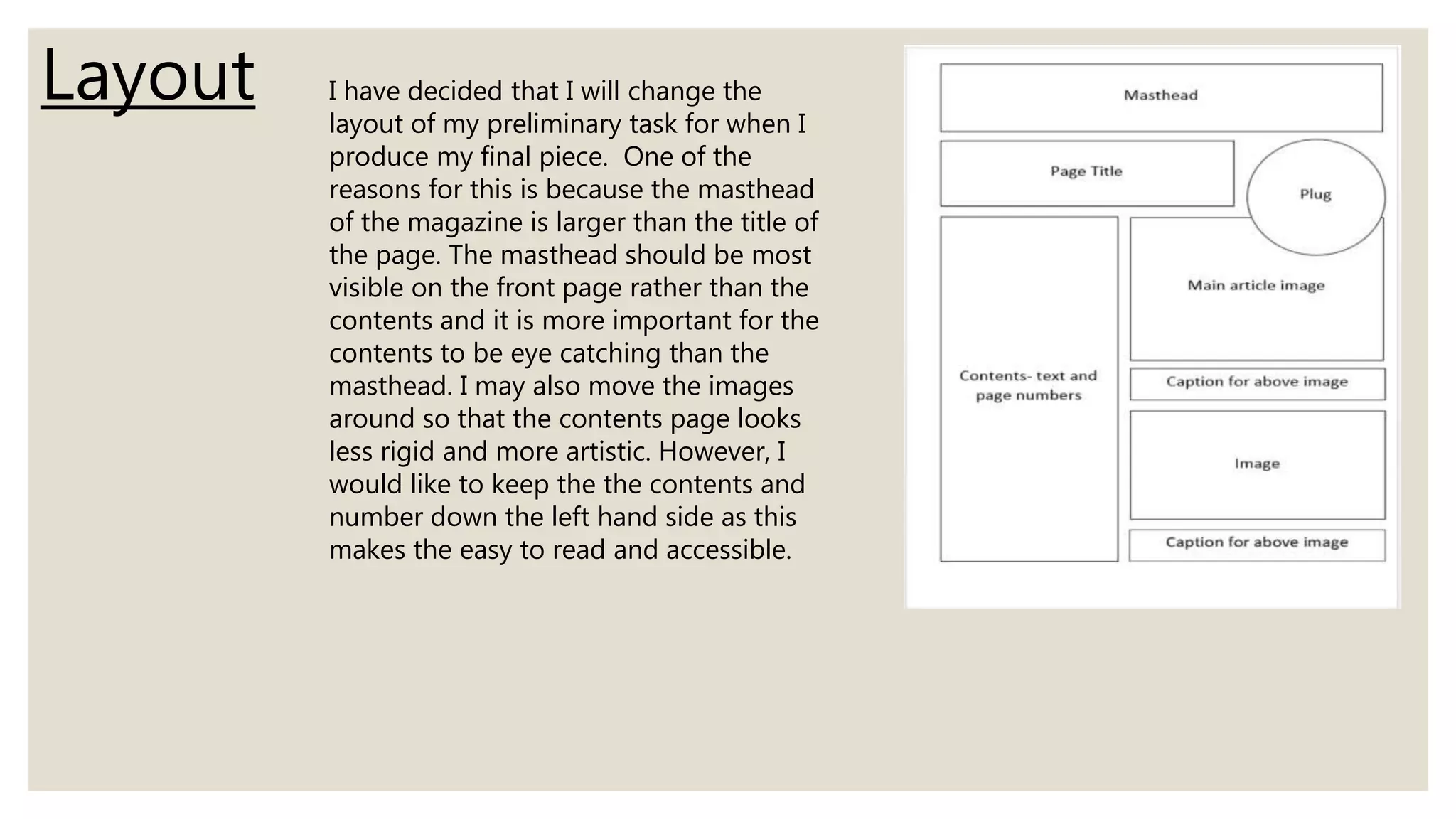
The document discusses lessons learned from the preliminary task to the final product of a magazine. Specifically, it addresses improvements made in the use of images, color scheme, fonts, and layout. For images, stretching was avoided and a banner was added to fill white space. The color scheme was made more cohesive using a pink and grey palette. Custom fonts replaced basic ones to make the magazine more professional. Finally, the layout was adjusted to make the masthead more prominent than the contents and use a less rigid design.