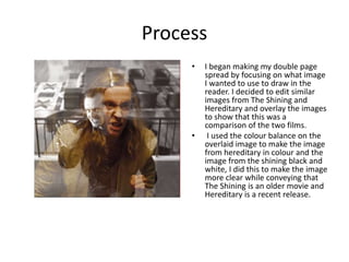
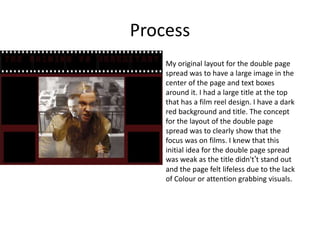
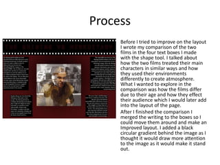
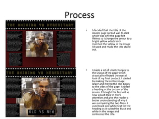
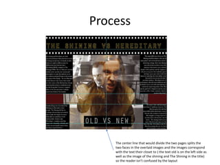
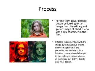
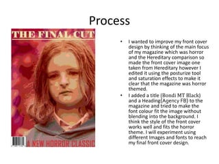
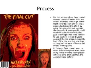
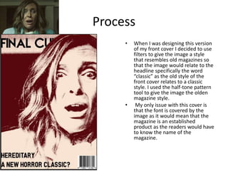
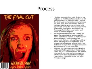
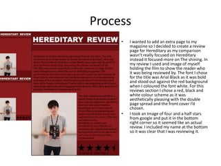
This document discusses the process of creating a double page magazine spread comparing the films The Shining and Hereditary. It describes editing images from the films and experimenting with layouts and designs. The creator tested different title designs, placements of images and text, and color schemes to improve the overall look. They also summarized the films in text boxes before refining the layout. The same process of experimenting with images, colors, fonts and styles is described for designing the magazine cover. The creator ultimately selected their final designs for achieving the horror theme of the magazine.