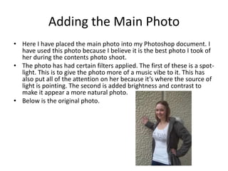
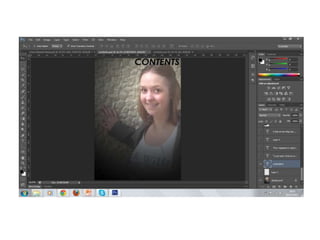
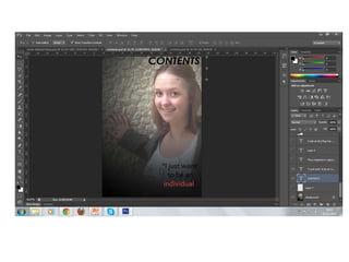
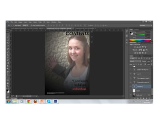
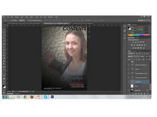
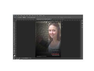
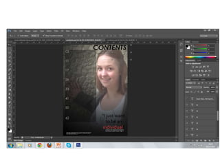
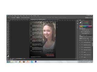
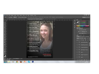
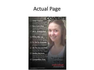
Producing the Contents
Adding the Main Photo
• Here I have placed the main photo into my Photoshop document. I
  have used this photo because I believe it is the best photo I took of
  her during the contents photo shoot.
• The photo has had certain filters applied. The first of these is a spot-
  light. This is to give the photo more of a music vibe to it. This has
  also put all of the attention on her because it’s where the source of
  light is pointing. The second is added brightness and contrast to
  make it appear a more natural photo.
• Below is the original photo.
Adding the Title
• Using the text tool I have added the title to
  the page. I have made it big and bold so that it
  stands out and is more noticeable on the
  page. It appears to be a page heading
  because of this. It is conventional of real
  magazines (from my research) to do this with
  their covers, so having mine big and bold looks
  more conventional and professional of real
  magazines.
Adding the Quote
• Using the text tool I have added a pull quote.
  This creates a link between her and the article
  for her on the contents page. I have made the
  word ‘individual’ red because it is the most
  powerful word in the quote. This draws the
  audience into the word and want to know why
  it’s being used, how it’s being used and they
  are therefore more likely to read the article.
Copyright Information
• All of the contents pages I researched into had
  a copyright notice at the bottom of the page.
  To make my magazine more realistic and more
  conventional I have added one to my cover so
  that it looks more professional.
Photo Caption
• Most of the contents pages I researched into
  had a caption on their photo(s) to link it with
  an article listed. I have done this to not only
  make it appear more conventional but to also
  create a further link between my photo and
  the articles that will soon be listed.
Black box
• This is based on The Source Contents page as I
  thought it made a stronger, nicer looking
  contents page so I have used this element in my
  contents page.
• I have drawn a black box with the polygonal lasso
  tool and used the paint bucket tool to fill it in
  black on a new layer. I have then lowered the
  layer opacity to 65% so that it is more
  opactie, allowing the listed articles to stand out
  more and the main photo to be seen.
Page and Article Information
• Using the text tool I have added in the article
  information and page numbers of the contents. I have
  done this because this is the function of a contents
  page and if I didn’t have them on my contents page
  then it would make the page useless.
• I have put page numbers in a different colour so that
  they stand out. I have put the article names in bold as
  this is what all the contents pages I researched into did
  making my contents appear more conventional and
  more realistic. For the same reason I have made article
  information text smaller and not in bold.
Actual Page

Producing the contents

  • 1.
  • 3.
    Adding the MainPhoto • Here I have placed the main photo into my Photoshop document. I have used this photo because I believe it is the best photo I took of her during the contents photo shoot. • The photo has had certain filters applied. The first of these is a spot- light. This is to give the photo more of a music vibe to it. This has also put all of the attention on her because it’s where the source of light is pointing. The second is added brightness and contrast to make it appear a more natural photo. • Below is the original photo.
  • 5.
    Adding the Title •Using the text tool I have added the title to the page. I have made it big and bold so that it stands out and is more noticeable on the page. It appears to be a page heading because of this. It is conventional of real magazines (from my research) to do this with their covers, so having mine big and bold looks more conventional and professional of real magazines.
  • 7.
    Adding the Quote •Using the text tool I have added a pull quote. This creates a link between her and the article for her on the contents page. I have made the word ‘individual’ red because it is the most powerful word in the quote. This draws the audience into the word and want to know why it’s being used, how it’s being used and they are therefore more likely to read the article.
  • 9.
    Copyright Information • Allof the contents pages I researched into had a copyright notice at the bottom of the page. To make my magazine more realistic and more conventional I have added one to my cover so that it looks more professional.
  • 11.
    Photo Caption • Mostof the contents pages I researched into had a caption on their photo(s) to link it with an article listed. I have done this to not only make it appear more conventional but to also create a further link between my photo and the articles that will soon be listed.
  • 13.
    Black box • Thisis based on The Source Contents page as I thought it made a stronger, nicer looking contents page so I have used this element in my contents page. • I have drawn a black box with the polygonal lasso tool and used the paint bucket tool to fill it in black on a new layer. I have then lowered the layer opacity to 65% so that it is more opactie, allowing the listed articles to stand out more and the main photo to be seen.
  • 17.
    Page and ArticleInformation • Using the text tool I have added in the article information and page numbers of the contents. I have done this because this is the function of a contents page and if I didn’t have them on my contents page then it would make the page useless. • I have put page numbers in a different colour so that they stand out. I have put the article names in bold as this is what all the contents pages I researched into did making my contents appear more conventional and more realistic. For the same reason I have made article information text smaller and not in bold.
  • 18.