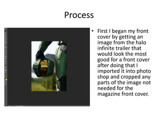
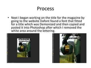
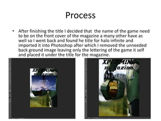
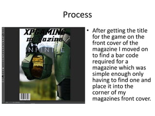
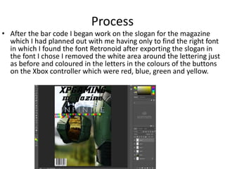
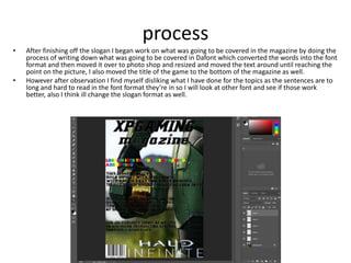
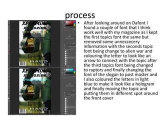
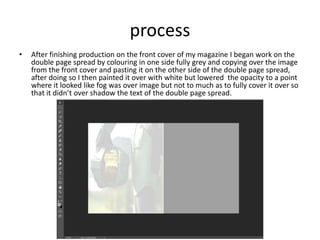
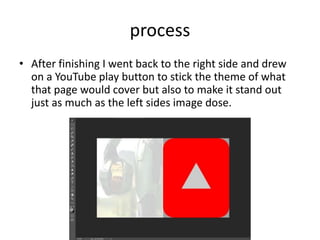
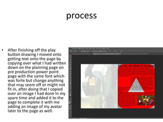
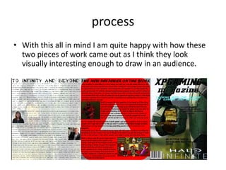
2. Process
• First I began my front
cover by getting an
image from the halo
infinite trailer that
would look the most
good for a front cover
after doing that I
imported it into photo
shop and cropped any
parts of the image not
needed for the
magazine front cover.
3. Process
• Next I began working on the title for the magazine by
going to the website Dafont found a font that fitted
for a title which was Demonized and then copied and
pasted it into Photoshop after which I removed the
white area around the lettering.
4. Process
• After finishing the title I decided that the name of the game need
to be on the front cover of the magazine a many other have as
well so I went back and found he title for halo infinite and
imported it into Photoshop after which I removed the unneeded
back ground image leaving only the lettering of the game it self
and placed it under the title for the magazine.
5. Process
• After getting the title
for the game on the
front cover of the
magazine I moved on
to find a bar code
required for a
magazine which was
simple enough only
having to find one and
place it into the
corner of my
magazines front cover.
6. Process
• After the bar code I began work on the slogan for the magazine
which I had planned out with me having only to find the right font
in which I found the font Retronoid after exporting the slogan in
the font I chose I removed the white area around the lettering just
as before and coloured in the letters in the colours of the buttons
on the Xbox controller which were red, blue, green and yellow.
7. process
• After finishing off the slogan I began work on what was going to be covered in the magazine by doing the
process of writing down what was going to be covered in Dafont which converted the words into the font
format and then moved it over to photo shop and resized and moved the text around until reaching the
point on the picture, I also moved the title of the game to the bottom of the magazine as well.
• However after observation I find myself disliking what I have done for the topics as the sentences are to
long and hard to read in the font format they’re in so I will look at other font and see if those work
better, also I think ill change the slogan format as well.
8. process
• After looking around on Dafont I
found a couple of font that I think
work well with my magazine as I kept
the first topics font the same but
removed some unneccecery
information with the seconds topic
font being change to alien war and
colouring the letter to look like an
arrow to connect with the topic after
the third topics font being changed
to raptors and finally changing the
font of the slogan to post master and
I also coloured the letters in light
blue to make it look like a hologram
and finally moving the topic and
putting them in different spot around
the front cover
9. process
• After finishing production on the front cover of my magazine I began work on the
double page spread by colouring in one side fully grey and copying over the image
from the front cover and pasting it on the other side of the double page spread,
after doing so I then painted it over with white but lowered the opacity to a point
where it looked like fog was over image but not to much as to fully cover it over so
that it didn’t over shadow the text of the double page spread.
10. process
• After finishing I went back to the right side and drew
on a YouTube play button to stick the theme of what
that page would cover but also to make it stand out
just as much as the left sides image dose.
11. process
• After finishing off the play
button drawing I moved onto
getting text onto the page by
copying over what I had written
down on the planning page on
pre production power point
page with the same font which
was forte but change anything
that may seem off or might not
fit in, after doing that I copied
over an image I had done In my
spare time and added it to the
page to complete it with me
adding an image of my avatar
later to the page as well.
12. process
• After finishing work
on the right side I
went back to the left
side and began filling
that page as well with
text and images from
the planning page on
pre production power
point page however I
changed the font of
the text from calibre
to halo to match with
the page and the
theme it covers which
was to do with halo.
13. process
• Finally after
finishing off the left
side of the double
page spread I
finished it all off
and completing it
by taking an image
of my avatar from a
review I did a while
back and added it
to empty space on
the right side of the
double page spread.
14. process
• With this all in mind I am quite happy with how these
two pieces of work came out as I think they look
visually interesting enough to draw in an audience.
Editor's Notes
Discuss the tools and processes used in your production. Log your thoughts and feelings about your work.