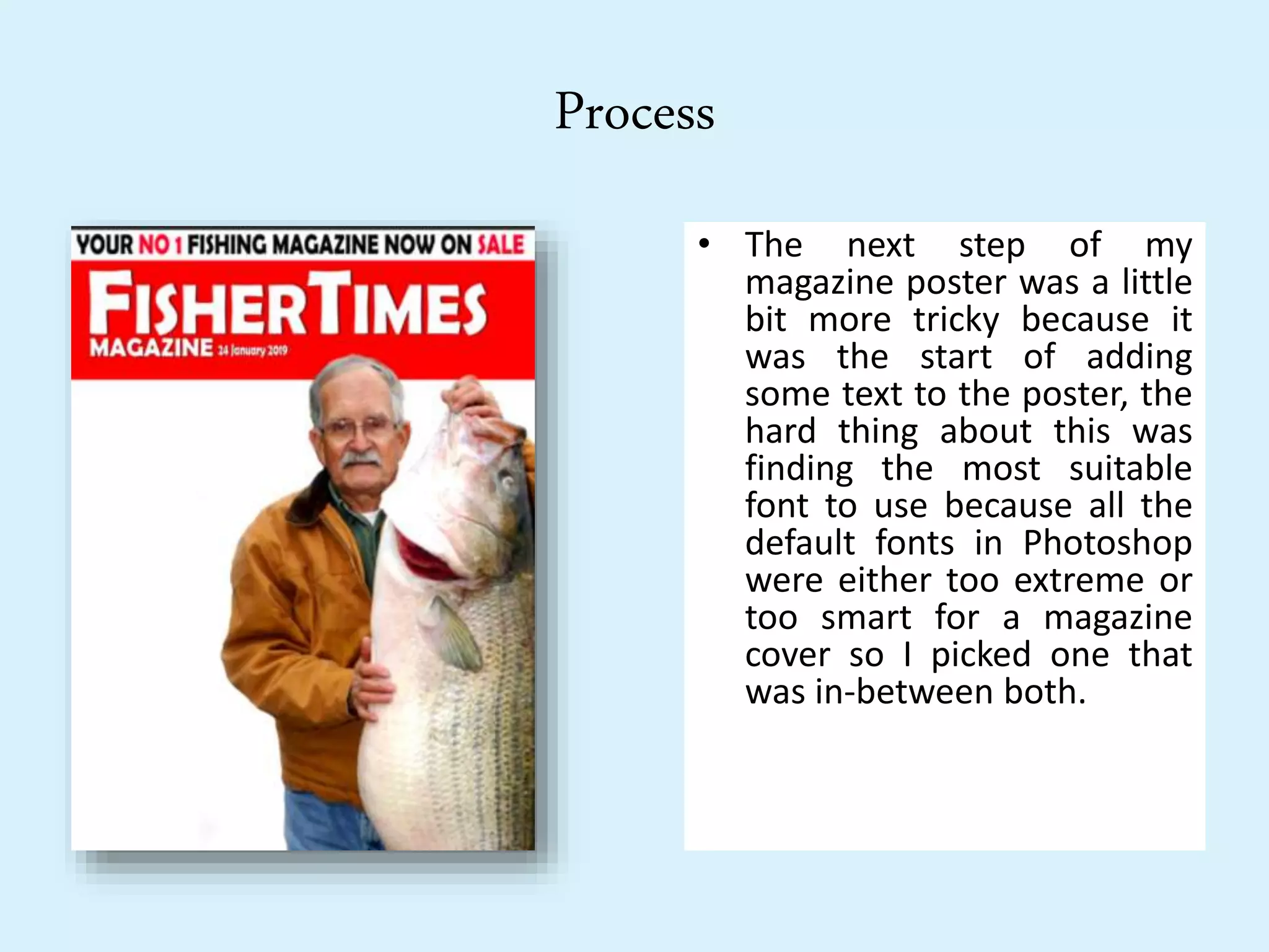
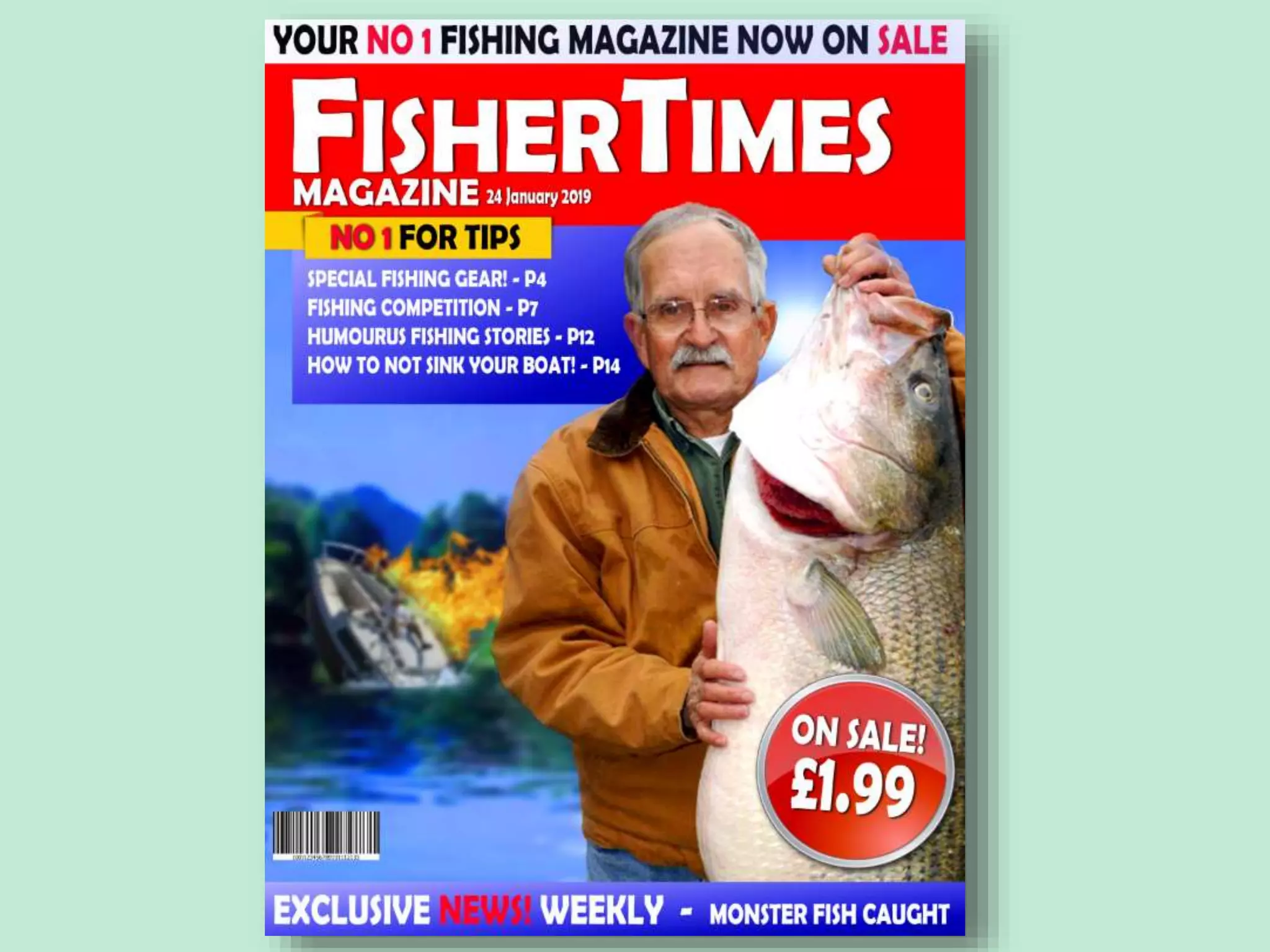
Experiments
Alfie Pimblett
Process
• For the first step of my
magazine experiment I had
to find a picture of someone
holding a fish in their hands
posing for a picture. I
wanted to make this poster
look comedic in a way so I
chose an old man holding a
fish that was almost as tall
as him. When I found the
picture I wanted I had to cut
around him and remove his
background so I could put
him in front of mine.
Process
• The next step of my
magazine poster was a little
bit more tricky because it
was the start of adding
some text to the poster, the
hard thing about this was
finding the most suitable
font to use because all the
default fonts in Photoshop
were either too extreme or
too smart for a magazine
cover so I picked one that
was in-between both.
Process
• The third step of creating my
magazine poster was creating the
background, I did this by getting a
normal photo of a lake and a
picture of a boat sinking, the
reason why I added the sinking
boat to my cover was because I
wanted to make it funny and not
too professional, I did try to make
it all look like a real professional
magazine cover but only with a
few comedic details to it. After I
merged the boat to the photo of
the river I placed it behind all the
other layers and I gave it a blur
and increased the saturation to
give it more colour.
Process
• After I finished with my
background I went on to
add some text boxes to
add some more texts, I
added a yellow flag just
under the main title and
under the yellow flag I
added a blue rectangle
where I can put some
more texts and I also
added a smaller blue
rectangle at the bottom
of my page.
Process
• I then went onto adding the
final pieces of texts into my
text boxes, In the yellow lag I
added that this magazine is the
best for giving tips and in the
blue rectangles I added things
the magazine includes with a
list of pages and I put that
every week there is new
exclusive news in each
magazine. I also added a few
more little effects such as the
lens flare in the corner next to
the old man, the barcode in
the bottom left corner and the
ticker in the bottom right
corner saying that the
magazine is on sale for £1.99.
Reflection
• What elements of your experiments will you
include in your final product?
• The elements that I will use from my experiment in my final product are
the same style of layout. I will keep it neat and professional but I will not
try and make is seem like a joke magazine. I will use photos to show what I
am advertising. I will also use similar fonts and use different slogans from
my chosen brand. I will use similar effects choices such as on sale prices,
barcodes and maybe lens flares just to give a more real look to my
magazine cover.

3. visual production experiments (done)

  • 1.
  • 2.
    Process • For thefirst step of my magazine experiment I had to find a picture of someone holding a fish in their hands posing for a picture. I wanted to make this poster look comedic in a way so I chose an old man holding a fish that was almost as tall as him. When I found the picture I wanted I had to cut around him and remove his background so I could put him in front of mine.
  • 3.
    Process • The nextstep of my magazine poster was a little bit more tricky because it was the start of adding some text to the poster, the hard thing about this was finding the most suitable font to use because all the default fonts in Photoshop were either too extreme or too smart for a magazine cover so I picked one that was in-between both.
  • 4.
    Process • The thirdstep of creating my magazine poster was creating the background, I did this by getting a normal photo of a lake and a picture of a boat sinking, the reason why I added the sinking boat to my cover was because I wanted to make it funny and not too professional, I did try to make it all look like a real professional magazine cover but only with a few comedic details to it. After I merged the boat to the photo of the river I placed it behind all the other layers and I gave it a blur and increased the saturation to give it more colour.
  • 5.
    Process • After Ifinished with my background I went on to add some text boxes to add some more texts, I added a yellow flag just under the main title and under the yellow flag I added a blue rectangle where I can put some more texts and I also added a smaller blue rectangle at the bottom of my page.
  • 6.
    Process • I thenwent onto adding the final pieces of texts into my text boxes, In the yellow lag I added that this magazine is the best for giving tips and in the blue rectangles I added things the magazine includes with a list of pages and I put that every week there is new exclusive news in each magazine. I also added a few more little effects such as the lens flare in the corner next to the old man, the barcode in the bottom left corner and the ticker in the bottom right corner saying that the magazine is on sale for £1.99.
  • 8.
    Reflection • What elementsof your experiments will you include in your final product? • The elements that I will use from my experiment in my final product are the same style of layout. I will keep it neat and professional but I will not try and make is seem like a joke magazine. I will use photos to show what I am advertising. I will also use similar fonts and use different slogans from my chosen brand. I will use similar effects choices such as on sale prices, barcodes and maybe lens flares just to give a more real look to my magazine cover.

Editor's Notes

  • #3 Discuss the tools and processes used in your experiments
  • #4 Discuss the tools and processes used in your experiments
  • #5 Discuss the tools and processes used in your experiments
  • #6 Discuss the tools and processes used in your experiments
  • #7 Discuss the tools and processes used in your experiments