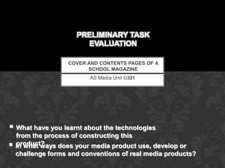
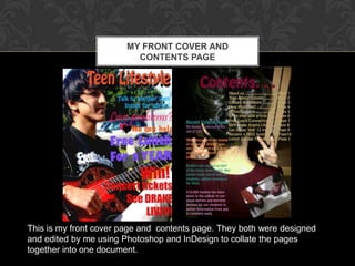
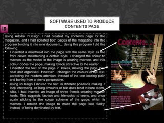
The document discusses the process of creating a school magazine cover and contents page. It describes using various software programs like Photoshop, InDesign, and Publisher to design and layout the pages. Specifically, it discusses taking photos with a digital camera and editing them in Photoshop. It also covers using InDesign to combine pages into one document and organize text and images on the contents page. The purpose of the magazine and design choices are analyzed in comparison to an existing magazine.
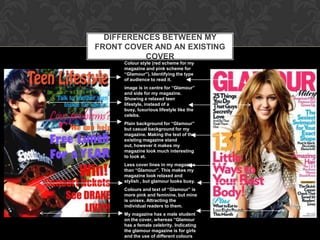
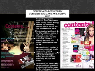
![SIMILARITIES BETWEEN MY
FRONT COVER AND AN EXISTING
COVER
Both magazines have a
Masthead. To show
what the page is about.
Both of them include a
number of Cover
Lines. Giving the
reader an idea of what
to expect inside the
magazine.
Dominant Images
separating text around
the image. [rule of
thirds] Making the
page look interesting.](https://image.slidesharecdn.com/preliminarytaskpresentation-121017180545-phpapp02/85/Preliminary-task-evaluation-3-320.jpg)


![Evaluation[1]](https://cdn.slidesharecdn.com/ss_thumbnails/evaluation1-120420041325-phpapp02-thumbnail.jpg?width=640&height=640&fit=bounds)


![Analysing nme dizzee cover prep for blog ppt [autosaved]](https://cdn.slidesharecdn.com/ss_thumbnails/analysingnmedizzeecover-prepforblogpptautosaved-121130021032-phpapp01-thumbnail.jpg?width=640&height=640&fit=bounds)


