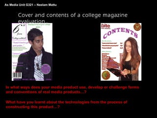
The document discusses a college magazine cover and contents page created by Media Unit G321 - Neelam Mattu.
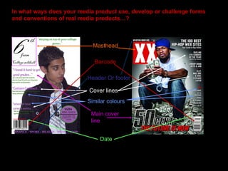
It compares the created cover and contents page to real magazines, noting differences in color choices, positioning of elements, and use of images versus text.
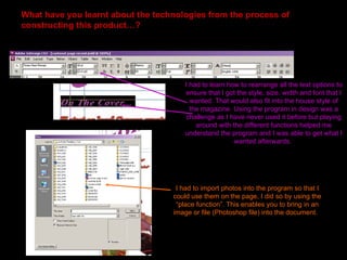
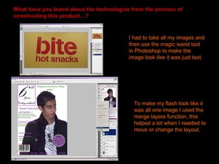
The document also describes technologies learned through constructing the magazine pages, including arranging text styles, importing photos, changing text effects, matching colors between elements, using selection and layer tools in Photoshop, and warping text.