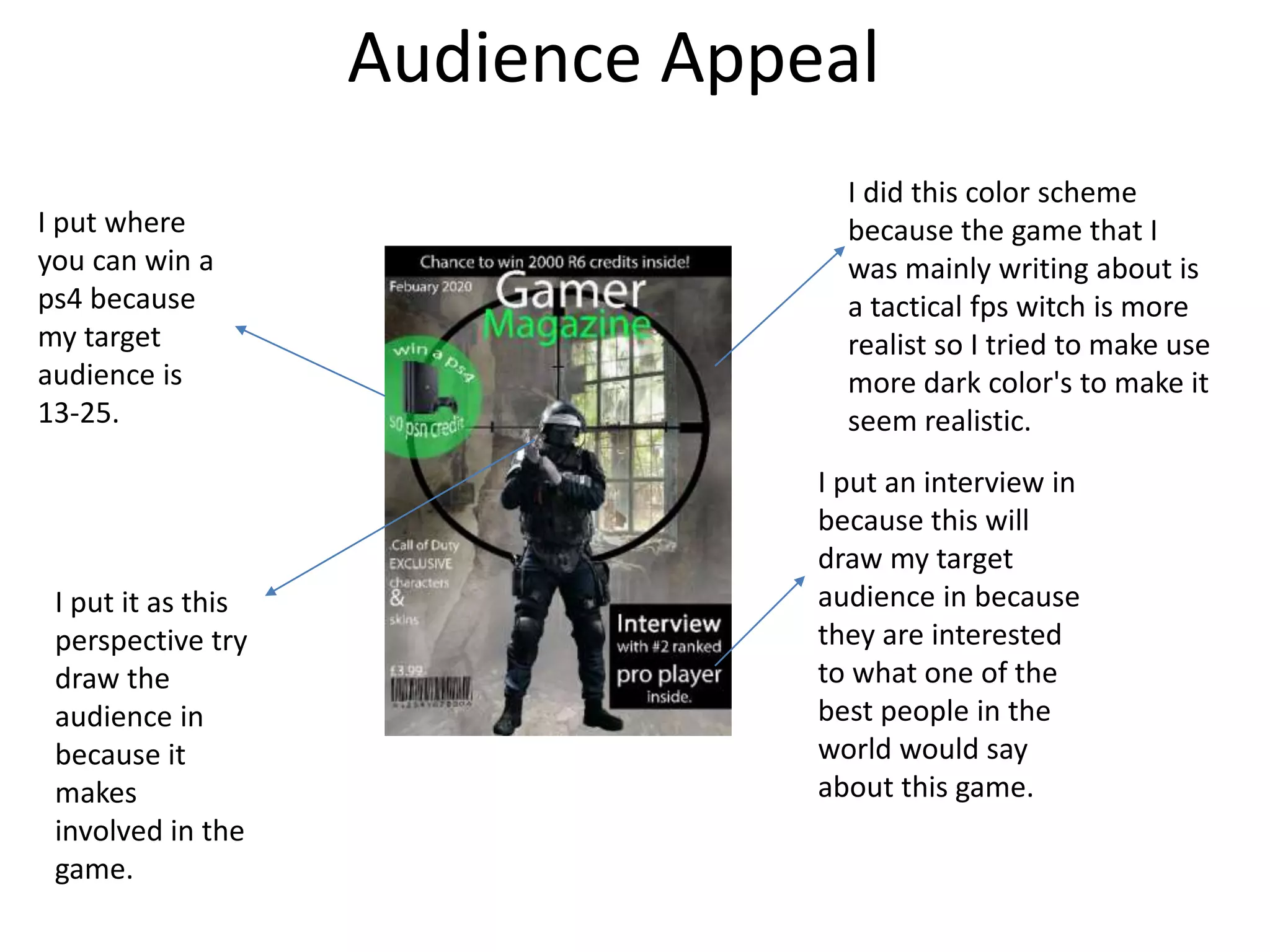
Visual
Evaluation
Ben McFadyen
Production Process Evaluation
Research
• The strengths of the research is that I liked knowing what all of the front
cover of the gaming magazine looks like so I can get an idea about what to
put and use on my front cover. The research helped me with my product I
because get to see what works and what does not work. The weakness of
it is that it is very time consuming. I could of written a little bit more for all
of them. This had an effect on my product because I like the use of the
cross hair so I wanted to use it. Also I think I could of written it more in
death.
Planning
• I think I wrote a lot about the style sheet. Also I think hat I could have put
more examples in it. The layout plan I did not follow because I realised
that it would not work. It was very useful because I got a understanding of
the layout. The strength of the planning is that you got to roughly plan out
what you are doing. Also I get to know what fonts, pictures and colours. I
get to pick which ne is the best. The weakness of it is that it is time
consuming.
Time Management
I did not management my time very well I got behind on the first power point.
On the main product the front cover took very long. The double page spread
took quicker than I thought I just struggled to start the sentence off. I also
found the experiment very tricky because I don really know how to use
photoshop. I also forgot to screenshot the stages of my production so I had to
trace back and remember what I did.
Technical Qualities
In my final product I tried to make it perfectional as possible. I made a title, also I ad
o be carful because of copy write. I made the banner at op something that will draw
he people closer to the product. I also have a couple of plugs on there, hey do the
same thing they draw people closer. Also I tried to make it a different colour, to make
it sand out. Also I had a crosshair to show you that it is a FPS (first person shooter).
Also I put the main person on the main game that I am talking about.
Aesthetic Qualities
The smoke effect
made a bit of a
abounded and
mysteries effect.
I like the plugs,
because it draws
people in and
makes them want
to buy it.
The interview will
draw people in
because it they
what some
information about
a pro player
Plug makes its more
interesting more
thing for you to have
a chance of winning
I think the price
is fair because
you don’t get
any in game
content.
I think the background is the best part of the magazine cover. I think the weakness is the
plugs, I think the plugs are in the way. I think it would look better with less plugs.
Audience Appeal
I put where
you can win a
ps4 because
my target
audience is
13-25.
I put an interview in
because this will
draw my target
audience in because
they are interested
to what one of the
best people in the
world would say
about this game.
I put it as this
perspective try
draw the
audience in
because it
makes
involved in the
game.
I did this color scheme
because the game that I
was mainly writing about is
a tactical fps witch is more
realist so I tried to make use
more dark color's to make it
seem realistic.
Peer
Feedback
Feedback 1
• What did you like about the product?
– Its set out like a professional magazine
– I like the use of effects
• What improvements could have been made to
the product?
– The text is small and hard to read
– There is a lot of text
Feedback 2
• What did you like about the product?
– Good font can see from a distance very clearly
– Good effects used such as the smoke on the front
page
– Good use of images to keep the audience interested in
the product
• What improvements could have been made to
the product?
– Put something more on the front page to fill in some
of the spaces
Feedback 3
• What did you like about the product?
– I liked the images and the choice of where you
place them.
– I liked the fonts and the layout.
• What improvements could have been made to
the product?
– Maybe add more details to the front cover for
information.
Peer Feedback Summary
• What do you agree with from your peer
feedback?
– I agree with most of the improvements, the one that I
agree the most is the use of effects because I
download smoke brush to make a abounded and
mysterious look to the background.
• What do you disagree with from your peer feedback?
– I disagree with is the one where its says it is a lot of
texts. I think a magazine needs a lot of text and
pictures and I think I have all of that.
Peer Feedback Summary
I would change the front cover because I think I could have made it
better and look more professional. I would do this by I would make the
main picture a bit bigger to fill up the space a bit more. Also I will put
more plugs in to draw more people in and also to put excusive
information such as leaks.

7. evaluation(3)

  • 1.
  • 2.
  • 3.
    Research • The strengthsof the research is that I liked knowing what all of the front cover of the gaming magazine looks like so I can get an idea about what to put and use on my front cover. The research helped me with my product I because get to see what works and what does not work. The weakness of it is that it is very time consuming. I could of written a little bit more for all of them. This had an effect on my product because I like the use of the cross hair so I wanted to use it. Also I think I could of written it more in death.
  • 4.
    Planning • I thinkI wrote a lot about the style sheet. Also I think hat I could have put more examples in it. The layout plan I did not follow because I realised that it would not work. It was very useful because I got a understanding of the layout. The strength of the planning is that you got to roughly plan out what you are doing. Also I get to know what fonts, pictures and colours. I get to pick which ne is the best. The weakness of it is that it is time consuming.
  • 5.
    Time Management I didnot management my time very well I got behind on the first power point. On the main product the front cover took very long. The double page spread took quicker than I thought I just struggled to start the sentence off. I also found the experiment very tricky because I don really know how to use photoshop. I also forgot to screenshot the stages of my production so I had to trace back and remember what I did.
  • 6.
    Technical Qualities In myfinal product I tried to make it perfectional as possible. I made a title, also I ad o be carful because of copy write. I made the banner at op something that will draw he people closer to the product. I also have a couple of plugs on there, hey do the same thing they draw people closer. Also I tried to make it a different colour, to make it sand out. Also I had a crosshair to show you that it is a FPS (first person shooter). Also I put the main person on the main game that I am talking about.
  • 7.
    Aesthetic Qualities The smokeeffect made a bit of a abounded and mysteries effect. I like the plugs, because it draws people in and makes them want to buy it. The interview will draw people in because it they what some information about a pro player Plug makes its more interesting more thing for you to have a chance of winning I think the price is fair because you don’t get any in game content. I think the background is the best part of the magazine cover. I think the weakness is the plugs, I think the plugs are in the way. I think it would look better with less plugs.
  • 8.
    Audience Appeal I putwhere you can win a ps4 because my target audience is 13-25. I put an interview in because this will draw my target audience in because they are interested to what one of the best people in the world would say about this game. I put it as this perspective try draw the audience in because it makes involved in the game. I did this color scheme because the game that I was mainly writing about is a tactical fps witch is more realist so I tried to make use more dark color's to make it seem realistic.
  • 9.
  • 10.
    Feedback 1 • Whatdid you like about the product? – Its set out like a professional magazine – I like the use of effects • What improvements could have been made to the product? – The text is small and hard to read – There is a lot of text
  • 11.
    Feedback 2 • Whatdid you like about the product? – Good font can see from a distance very clearly – Good effects used such as the smoke on the front page – Good use of images to keep the audience interested in the product • What improvements could have been made to the product? – Put something more on the front page to fill in some of the spaces
  • 12.
    Feedback 3 • Whatdid you like about the product? – I liked the images and the choice of where you place them. – I liked the fonts and the layout. • What improvements could have been made to the product? – Maybe add more details to the front cover for information.
  • 13.
    Peer Feedback Summary •What do you agree with from your peer feedback? – I agree with most of the improvements, the one that I agree the most is the use of effects because I download smoke brush to make a abounded and mysterious look to the background. • What do you disagree with from your peer feedback? – I disagree with is the one where its says it is a lot of texts. I think a magazine needs a lot of text and pictures and I think I have all of that.
  • 14.
    Peer Feedback Summary Iwould change the front cover because I think I could have made it better and look more professional. I would do this by I would make the main picture a bit bigger to fill up the space a bit more. Also I will put more plugs in to draw more people in and also to put excusive information such as leaks.

Editor's Notes

  • #4 What were the strengths of your research? How did your research help your product? What were the weaknesses of your research? What could you have done better/improve? What effect would this have had on your product?
  • #5 What were the strengths of your planning? How did your planning help your product? What were the weaknesses of your planning? What could you have done better/improve? What effect would this have had on your product?
  • #6 Did you manage your time well? Did you complete your project on time or would your products have improved with additional time? What would you have done if you had more time to produce your work?
  • #7 Compare your work to similar existing products and discuss the similarities and differences Put your final piece(s) in the centre of a page alongside an existing product Use text boxes and arrows
  • #8 Does your work look good? Was it creative? What aspects of your game’s visuals do you like? What would you improve? How would you improve it? Discuss the strengths and weaknesses Put your final piece(s) in the centre of a page and analyse them Use text boxes and arrows
  • #9 How have you appealed to your target audience? What specific bits of content would appeal to your target audience. Refer to your findings from your questionnaire. Put your final piece(s) in the centre of a page and analyse them Use text boxes and arrows
  • #15 What changes would you make to your product based upon your peer feedback and why?