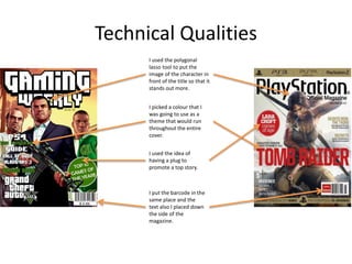
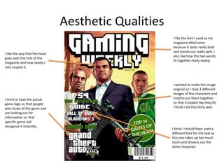
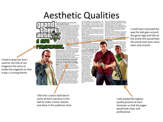
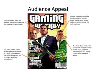
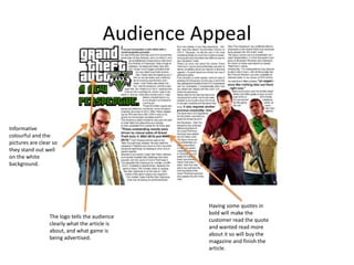
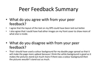
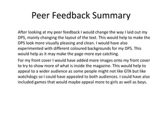
The document provides an evaluation of a magazine production project. It includes sections on research, planning, time management, target audience, technical qualities, aesthetic qualities, audience appeal, and peer feedback. For research, the strengths were deciding on layout and font, while the weakness was potential restriction of ideas. Planning helped with colors, layout, and scheduling. Time management challenges included focusing on specific pieces. The target audience was teenagers for the game advertised. Technical elements included image placement and consistent branding. Aesthetic qualities included image selection and font choices. Peer feedback suggested improving the double page spread layout and adding more images.
Publikasi Kegiatan Work Shop Bahasa Inggris SMP Tahun 2013henyrini
Kegiatan Peningkatan Karier PTK SMP melalui MGMP B.Inggris SMP tahun 2013 ini diselenggarakan selama 8 hari dari tanggal 22 Oktober 2013 sampai dengan16 Nopember 2013 bertempat di SMP Negeri 1 Mejayan.
Alamat: Jalan P.Sudirman no.71 Desa Mejayan Kecamatan Mejayan Kabupaten Madiun
Synthetic Fiber Construction in lab .pptxPavel ( NSTU)
Synthetic fiber production is a fascinating and complex field that blends chemistry, engineering, and environmental science. By understanding these aspects, students can gain a comprehensive view of synthetic fiber production, its impact on society and the environment, and the potential for future innovations. Synthetic fibers play a crucial role in modern society, impacting various aspects of daily life, industry, and the environment. ynthetic fibers are integral to modern life, offering a range of benefits from cost-effectiveness and versatility to innovative applications and performance characteristics. While they pose environmental challenges, ongoing research and development aim to create more sustainable and eco-friendly alternatives. Understanding the importance of synthetic fibers helps in appreciating their role in the economy, industry, and daily life, while also emphasizing the need for sustainable practices and innovation.
A Strategic Approach: GenAI in EducationPeter Windle
Artificial Intelligence (AI) technologies such as Generative AI, Image Generators and Large Language Models have had a dramatic impact on teaching, learning and assessment over the past 18 months. The most immediate threat AI posed was to Academic Integrity with Higher Education Institutes (HEIs) focusing their efforts on combating the use of GenAI in assessment. Guidelines were developed for staff and students, policies put in place too. Innovative educators have forged paths in the use of Generative AI for teaching, learning and assessments leading to pockets of transformation springing up across HEIs, often with little or no top-down guidance, support or direction.
This Gasta posits a strategic approach to integrating AI into HEIs to prepare staff, students and the curriculum for an evolving world and workplace. We will highlight the advantages of working with these technologies beyond the realm of teaching, learning and assessment by considering prompt engineering skills, industry impact, curriculum changes, and the need for staff upskilling. In contrast, not engaging strategically with Generative AI poses risks, including falling behind peers, missed opportunities and failing to ensure our graduates remain employable. The rapid evolution of AI technologies necessitates a proactive and strategic approach if we are to remain relevant.
Macroeconomics- Movie Location
This will be used as part of your Personal Professional Portfolio once graded.
Objective:
Prepare a presentation or a paper using research, basic comparative analysis, data organization and application of economic information. You will make an informed assessment of an economic climate outside of the United States to accomplish an entertainment industry objective.
Operation “Blue Star” is the only event in the history of Independent India where the state went into war with its own people. Even after about 40 years it is not clear if it was culmination of states anger over people of the region, a political game of power or start of dictatorial chapter in the democratic setup.
The people of Punjab felt alienated from main stream due to denial of their just demands during a long democratic struggle since independence. As it happen all over the word, it led to militant struggle with great loss of lives of military, police and civilian personnel. Killing of Indira Gandhi and massacre of innocent Sikhs in Delhi and other India cities was also associated with this movement.
Read| The latest issue of The Challenger is here! We are thrilled to announce that our school paper has qualified for the NATIONAL SCHOOLS PRESS CONFERENCE (NSPC) 2024. Thank you for your unwavering support and trust. Dive into the stories that made us stand out!
Francesca Gottschalk - How can education support child empowerment.pptxEduSkills OECD
Francesca Gottschalk from the OECD’s Centre for Educational Research and Innovation presents at the Ask an Expert Webinar: How can education support child empowerment?
Acetabularia Information For Class 9 .docxvaibhavrinwa19
Acetabularia acetabulum is a single-celled green alga that in its vegetative state is morphologically differentiated into a basal rhizoid and an axially elongated stalk, which bears whorls of branching hairs. The single diploid nucleus resides in the rhizoid.
How to Make a Field invisible in Odoo 17Celine George
It is possible to hide or invisible some fields in odoo. Commonly using “invisible” attribute in the field definition to invisible the fields. This slide will show how to make a field invisible in odoo 17.
3. Research
• The strengths of my research where that it helped me to decide on how to
compose my cover so that it looks realistic and clean. It also helped me to
decide on a font that would look more professional and stand out.
• The weaknesses of my research are that it might restrict my ideas as they
have set conventions.
• To improve my research I could have looked at some double page spreads
this would have helped me to make my double page spread more realistic.
4. Planning
• It helped me to pick a font and get ideas about colours and layouts.
• A weakness would be that the colours I chose didn’t suit my final product
so I changed them.
• It also helped me to keep to a schedule so that I could get my product
finished in time.
• I would improve my schedule to allow me time to focus on specific parts
which would have benefited with more time.
5. Time Management
• Parts of my project which needed more time where my practical pieces as
I took a lot of time going over it making sure that everything was in the
right place and that it looked right.
• I stuck to my schedule from the planning stages until production so this
worked well.
• In future I will try to organise my time better and also work on my
production reflection at that same time as production to help me stay on
time.
6. Target Audience Appeal
• Age: I aimed my magazine at teenagers because the game I advertised on
the cover and on the double page spread was aimed at teenagers and
young adults.
• Gender: although the game could be mainly aimed at a more male
audience you can also play as a female. This makes the game more aimed
at both genders instead of just one.
• Psychographic: I chose balanced because I thought it would appeal most
to people who wanted to achieve something i.e finish the game, and also
it would be priced so just about everyone could buy it.
• Social status: I aimed my product at any social status because anyone can
play games and in every social status I feel like there is at least one person
who plays games.
7. Technical Qualities
I used the polygonal
lasso tool to put the
image of the character in
front of the title so that it
stands out more.
I picked a colour that I
was going to use as a
theme that would run
throughout the entire
cover.
I used the idea of
having a plug to
promote a top story.
I put the barcode in the
same place and the
text also I placed down
the side of the
magazine.
8. Aesthetic Qualities
I like the way that the head
goes over the title of the
magazine and how neatly I
rote scoped it.
I tired to have the actual
game logo so that people
who know of the game and
are looking out for
information on that
specific game will
recognise it instantly.
I like the font I used as my
magazine title/name
because it looks really bold
and stands out really well, I
also like how the two words
fit together really neatly.
I wanted to make the image
original so I took 3 different
images of the characters and
tired to put them together
so that it looked like they fit,
I think I did this fairly well.
I think I should have used a
different font for the text as
this one takes up too much
room and drowns out the
other character.
9. Aesthetic Qualities
I like that I used a bold text in
some sections (quotes) in the
text to make it more realistic
and draw in the audience more.
I tired to keep the font I
used for the title of my
magazine the same as
inside the magazine so that
it was a running theme.
I only picked the highest
quality pictures of each
character so that the pages
would look clean and
professional.
I could have improved the
way the text goes around
the game logo and title of
the article this would help
the article look even more
clean and smooth.
10. Audience Appeal
The game itself is aimed
at teenagers/young adults
so I chose to use a game
that most people who are
of the age would be
interested in.
I should have incorporated a
female character so that it
would appeal to the female
audience just as much as the
male audience.
The colours are bright and
vibrant, this means they stand
out drawing the audience in.
The font I chose for the title
is similar to the font used on
twitch which is a game
streaming site so it is very
closely associated with
games.
11. Audience Appeal
Informative
colourful and the
pictures are clear so
they stand out well
on the white
background.
The logo tells the audience
clearly what the article is
about, and what game is
being advertised.
Having some quotes in
bold will make the
customer read the quote
and wanted read more
about it so will buy the
magazine and finish the
article.
13. Feedback 1
• What did you like about the product?
– Very professional looking
– Very informative
– Good layout on cover
• What improvements could have been made to
the product?
– The layout of the text on DPS could be better
– DPS could have more images or something to
make it look more appealing
14. Feedback 2
• What did you like about the product?
– I like the layout of the dps because it looks like a
professional magazine
– The front cover is good because the text is easy to
read and it is nice to look at
• What improvements could have been made to
the product?
• Could have some images on the front cover to show what else
is inside
15. Feedback 3
• What did you like about the product?
– You have used the space provided really well,
making the cover and double paged spread look
professional.
• What improvements could have been made to
the product?
You could have had a colour background so that
the double page came across more up beet,
making it more eye catching to the audience.
16. Peer Feedback Summary
• What do you agree with from your peer
feedback?
• I agree that the layout of the text on my DPS could have been laid out better.
• I also agree that I could have had other images on my front cover to show more of
what else is inside.
• What do you disagree with from your peer
feedback?
• That I should have used a colour background for my double page spread so that it
will make the page more upbeat because I think the white background is good as it
makes the pictures stand out much more if there was a colour background then
the pictures wouldn’t stand out as much.
17. Peer Feedback Summary
After looking at my peer feedback I would change the way I laid out my
DPS, mainly changing the layout of the text. This would help to make the
DPS look more visually pleasing and clean. I would have also
experimented with different coloured backgrounds for my DPS. This
would help as it may make the page more eye catching.
For my front cover I would have added more images onto my front cover
to try to show more of what is inside the magazine. This would help to
appeal to a wider audience as some people might not like GTA but like
watchdogs so I could have appealed to both audiences. I could have also
included games that would maybe appeal more to girls as well as boys.
Editor's Notes
What were the strengths of your research? How did your research help your product?
What were the weaknesses of your research? What could you have done better/improve? What effect would this have had on your product?
What were the strengths of your planning? How did your planning help your product?
What were the weaknesses of your planning? What could you have done better/improve? What effect would this have had on your product?
Did you manage your time well? Did you complete your project on time or would your products have improved with additional time?
What would you have done if you had more time to produce your work?
How does your final product appeal to your target audience? Reference specific content
Compare your work to similar existing products and discuss the similarities and differences
Put your final piece(s) in the centre of a page alongside an existing product
Use text boxes and arrows
Does your work look good? Was it creative? What aspects of your game’s visuals do you like? What would you improve? How would you improve it?
Discuss the strengths and weaknesses
Put your final piece(s) in the centre of a page and analyse them
Use text boxes and arrows
Does your work look good? Was it creative? What aspects of your game’s visuals do you like? What would you improve? How would you improve it?
Discuss the strengths and weaknesses
Put your final piece(s) in the centre of a page and analyse them
Use text boxes and arrows
How have you appealed to your target audience? What specific bits of content would appeal to your target audience.
Refer to your findings from your questionnaire.
Put your final piece(s) in the centre of a page and analyse them
Use text boxes and arrows
How have you appealed to your target audience? What specific bits of content would appeal to your target audience.
Refer to your findings from your questionnaire.
Put your final piece(s) in the centre of a page and analyse them
Use text boxes and arrows
What changes would you make to your product based upon your peer feedback and why?