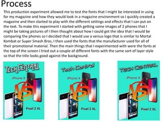
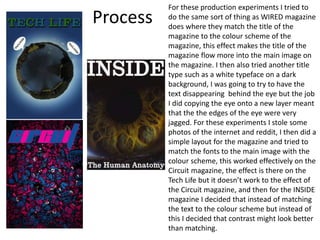
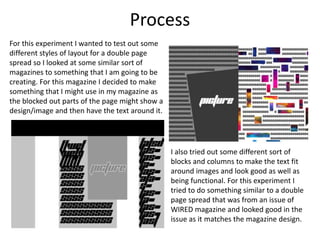
2. Process
This production experiment allowed me to test the fonts that I might be interested in using
for my magazine and how they would look in a magazine environment so I quickly created a
magazine and then started to play with the different settings and effects that I can put on
the text. To make this experiment I started with getting some images of 2 phones that I
might be taking pictures of I then thought about how I could get the idea that I would be
comparing the phones so I decided that I would use a versus logo that is similar to Mortal
Kombat or Super Smash Bros, I then used the fonts that the manufacturer used for all of
their promotional material. Then the main things that I experimented with were the fonts at
the top of the screen I tried out a couple of different fonts with the same sort of layer style
so that the title looks good against the background.
3. Process
For these production experiments I tried to
do the same sort of thing as WIRED magazine
does where they match the title of the
magazine to the colour scheme of the
magazine, this effect makes the title of the
magazine flow more into the main image on
the magazine. I then also tried another title
type such as a white typeface on a dark
background, I was going to try to have the
text disappearing behind the eye but the job
I did copying the eye onto a new layer meant
that the the edges of the eye were very
jagged. For these experiments I stole some
photos of the internet and reddit, I then did a
simple layout for the magazine and tried to
match the fonts to the main image with the
colour scheme, this worked effectively on the
Circuit magazine, the effect is there on the
Tech Life but it doesn’t work to the effect of
the Circuit magazine, and then for the INSIDE
magazine I decided that instead of matching
the text to the colour scheme but instead of
this I decided that contrast might look better
than matching.
4. Process
For this experiment I wanted to test out some
different styles of layout for a double page
spread so I looked at some similar sort of
magazines to something that I am going to be
creating. For this magazine I decided to make
something that I might use in my magazine as
the blocked out parts of the page might show a
design/image and then have the text around it.
I also tried out some different sort of
blocks and columns to make the text fit
around images and look good as well as
being functional. For this experiment I
tried to do something similar to a double
page spread that was from an issue of
WIRED magazine and looked good in the
issue as it matches the magazine design.
5. Reflection
• What elements of your experiments will you include in your final
product?
I think that I will keep the colour scheme matching as it makes the
front of the magazine flow together. Either that or I will use the
contrast as it looks more sophisticated, depending on which direction I
will take the magazine in, if I think that I want a less serious style of
magazine I will go for something similar to my first experiments and
the colour match experiments, if not I will go for the inside experiment
style as it looks more sophisticated and professional. For the inside of
the magazine I am going to have something very similar to the two
experiments that I have done as the layouts work very well in the
magazine. I will obviously change the images and colour schemes of
the magazine as I don’t want to copy the experiments to be my actual
magazine. But I will use the themes that I have made for my
experiments as they work very well.
Editor's Notes
Discuss the tools and processes used in your experiments