This document provides an overview of introductory statistics concepts including:
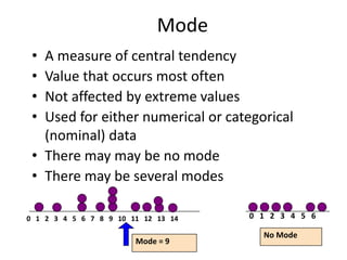
- Descriptive statistics such as frequency distributions, histograms, and measures of central tendency are used to summarize and present data.
- Inferential statistics such as estimation and hypothesis testing are used to draw conclusions about populations based on sample data.
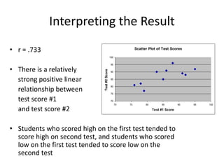
- Data can be organized and presented through tables, graphs including bar charts, pie charts, and scatter plots.