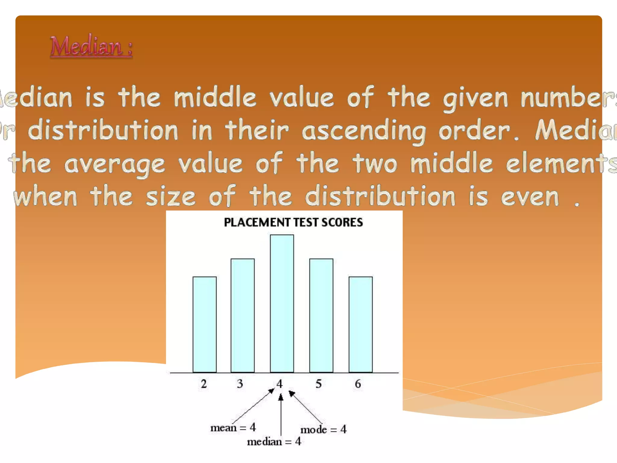
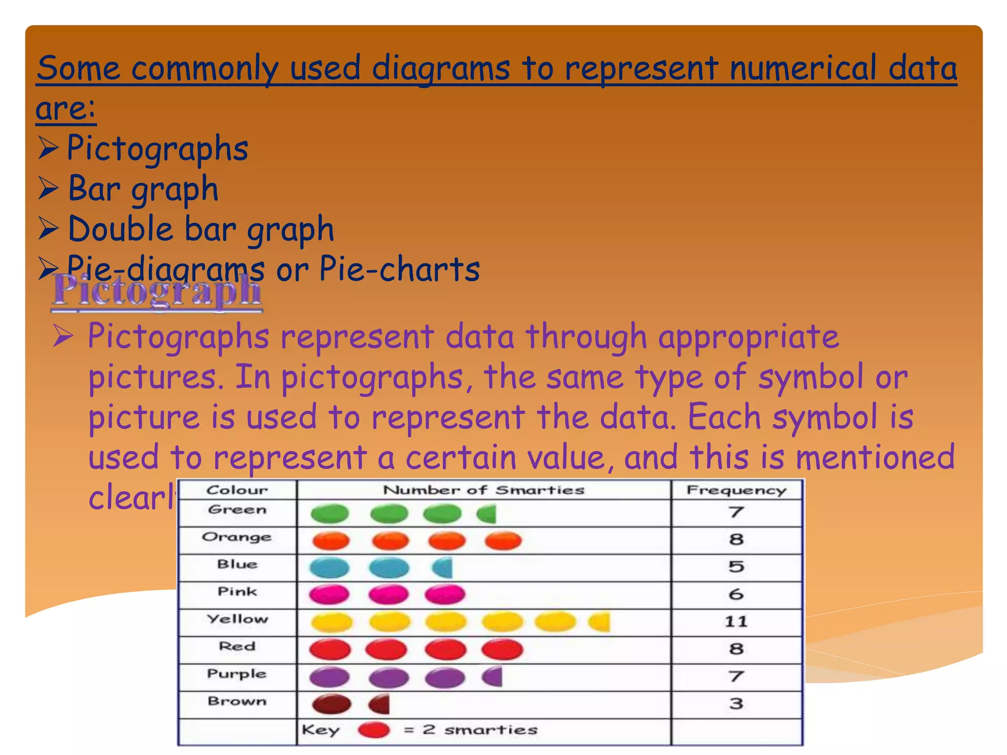
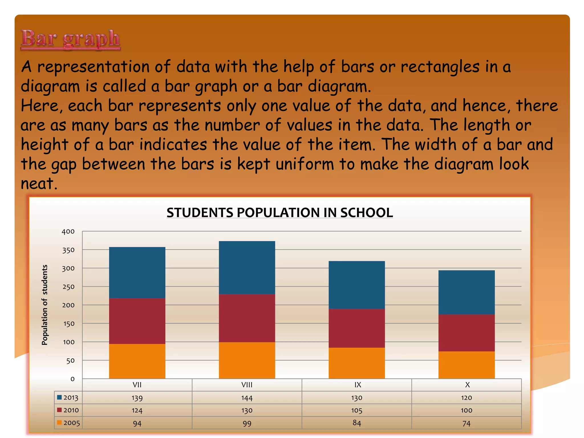
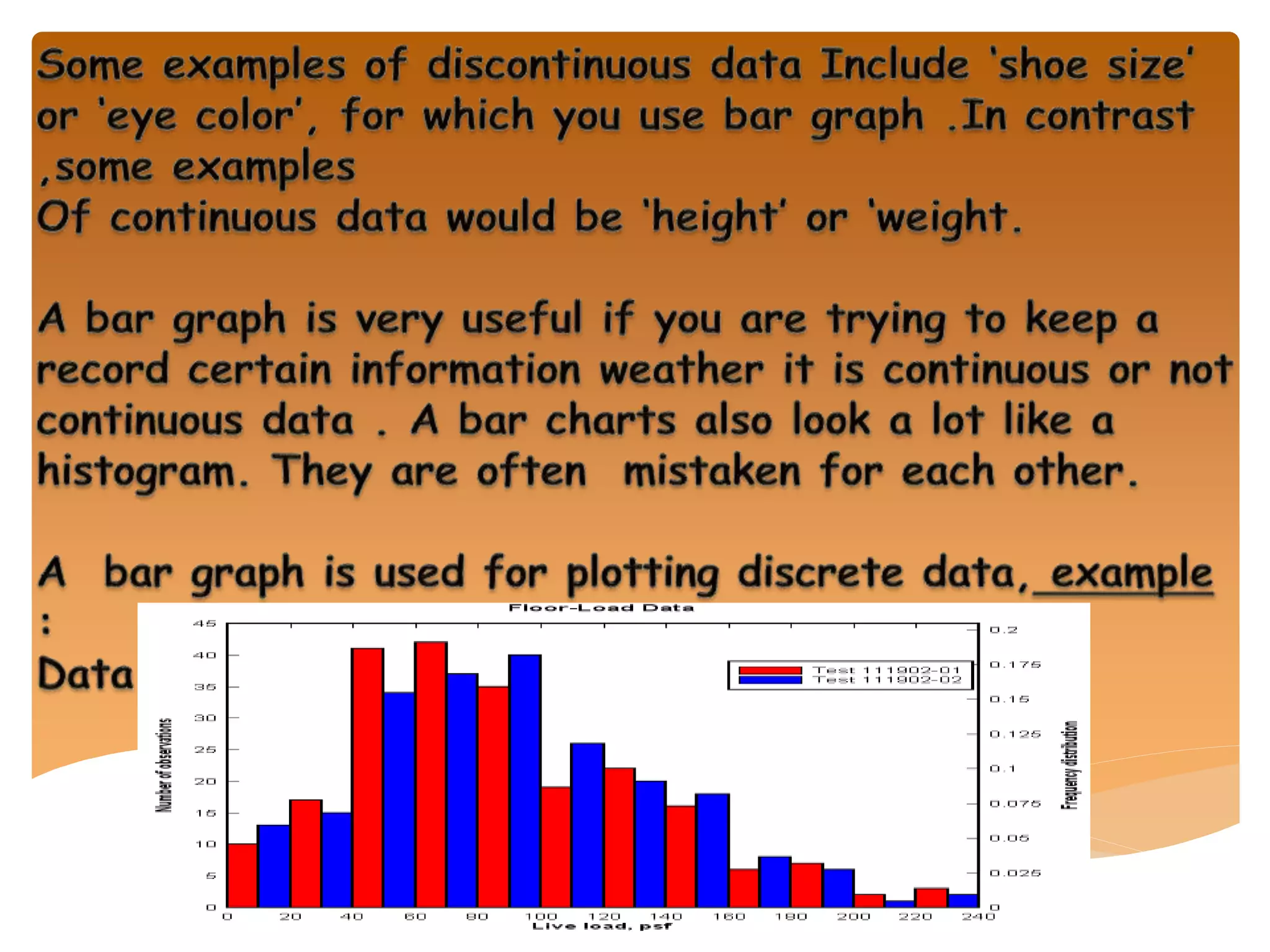
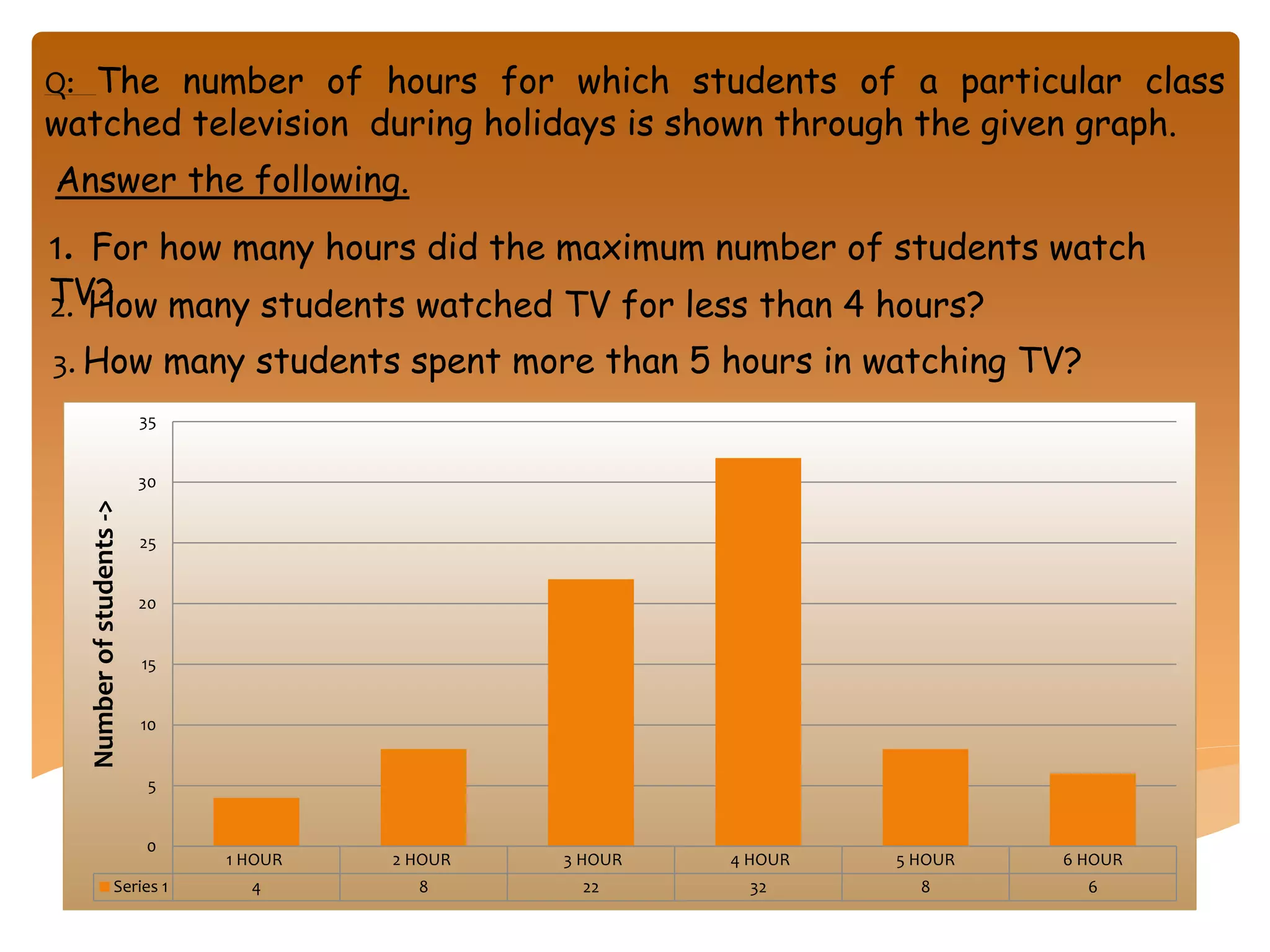
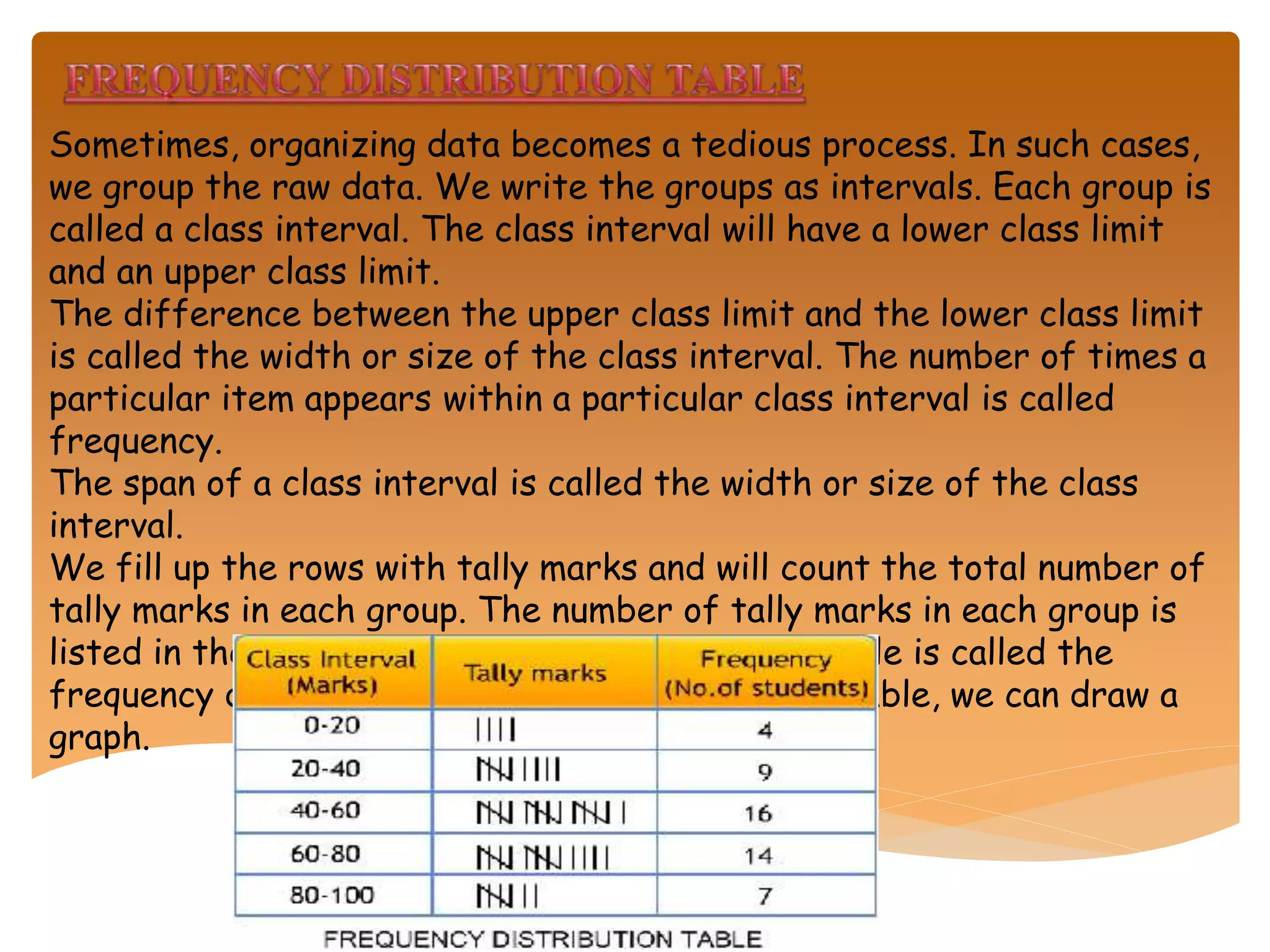
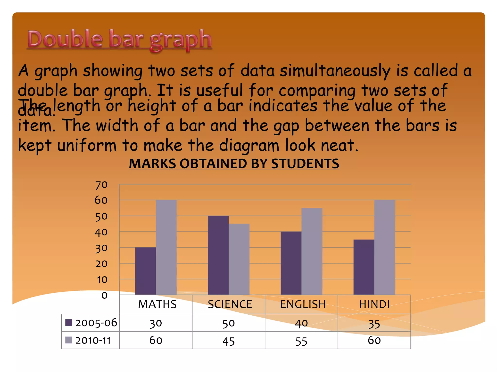
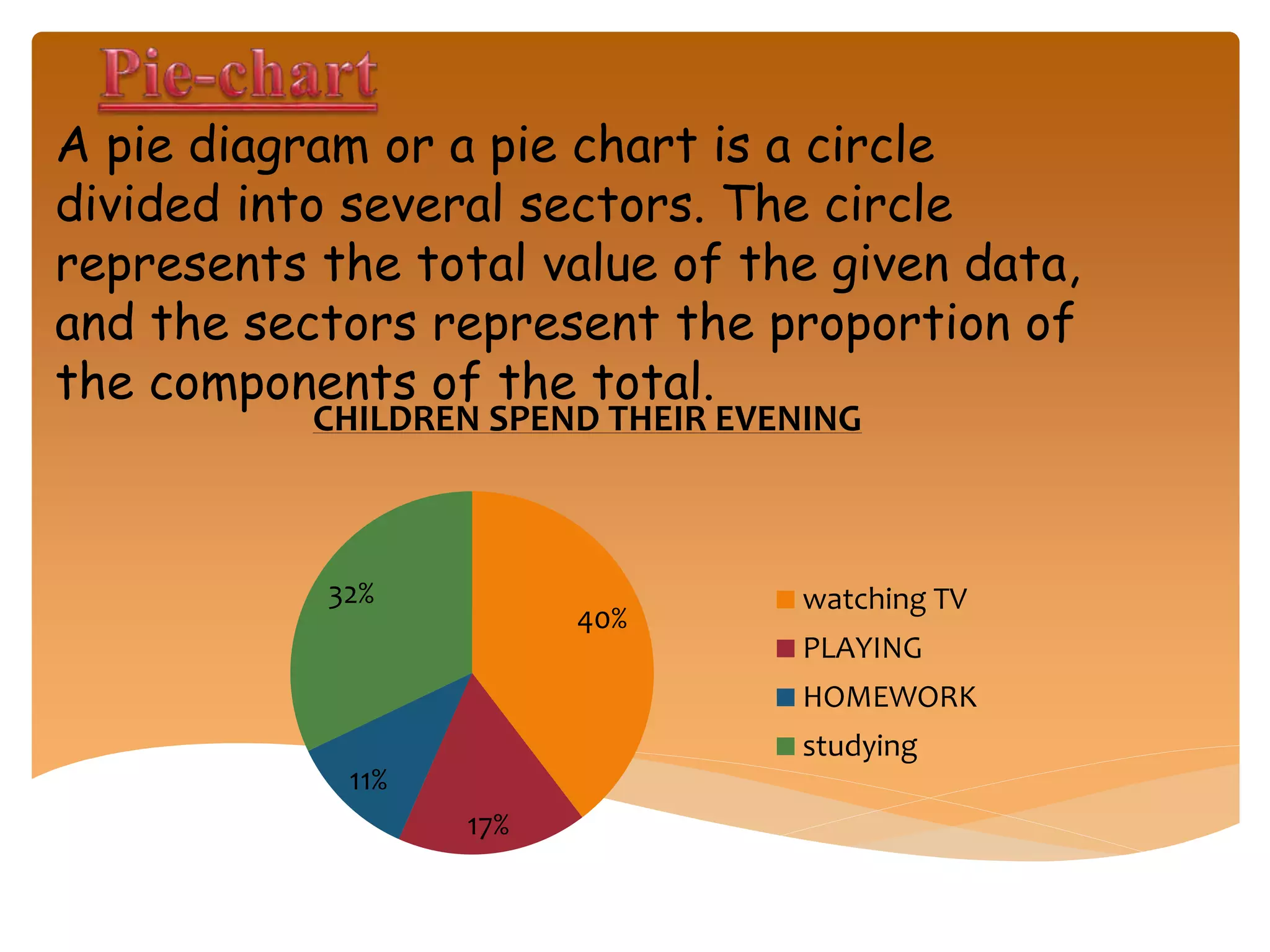
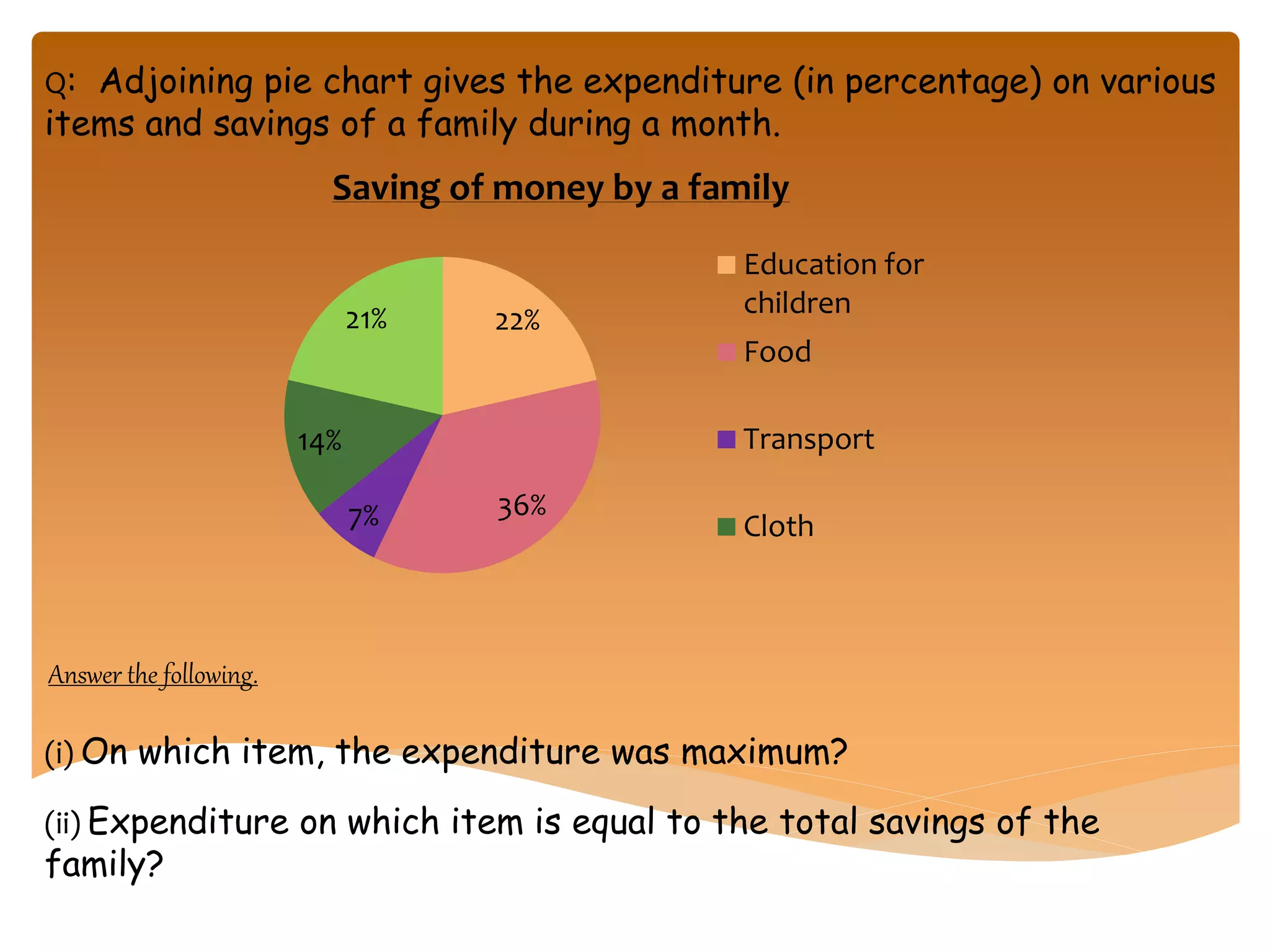
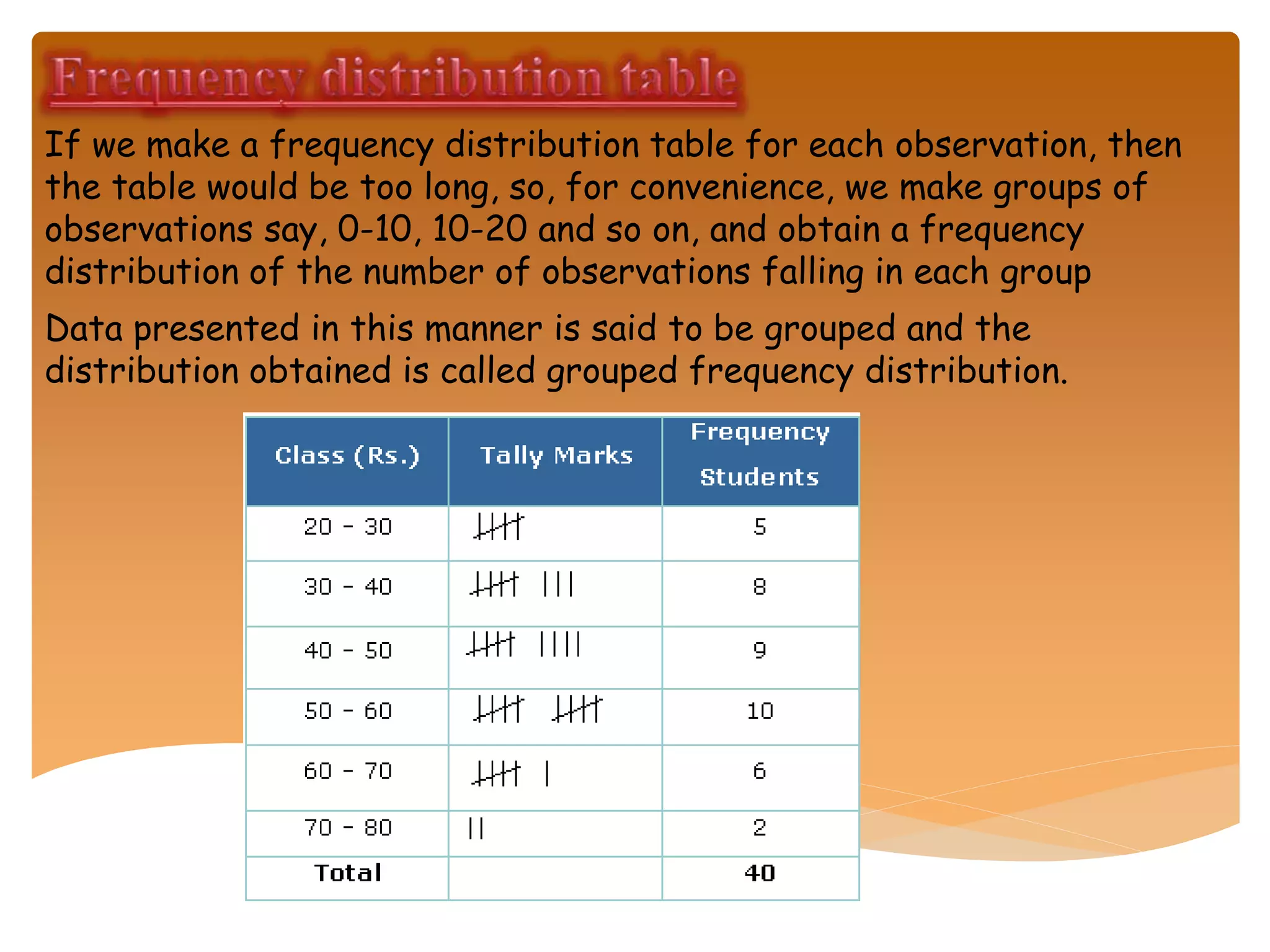
This document discusses data, how it can be organized and represented visually. It provides definitions of key terms like data, raw data, and grouped data. It also describes various visual representations of data like bar graphs, pie charts, and histograms. These visual representations make data easier to understand, compare and analyze. The document also discusses how raw data can be organized and grouped into frequency distribution tables for clearer interpretation.
Data handling Presentation with solved examplesrithikkapoor7
This is a presentation on data handling. It contains information about bar graphs, pictographs, tally charts and more. I hope it helps you students. Please like and comment, it gives tons of inspiration.
Data handling Presentation with solved examplesrithikkapoor7
This is a presentation on data handling. It contains information about bar graphs, pictographs, tally charts and more. I hope it helps you students. Please like and comment, it gives tons of inspiration.
chapter 8- data handling
terms related to it, types of graphs i.e bar graph, histogram , double bar graph and graphs interpretation with examples.
tally marks and frequency distributions and related questions to it
Introduction to graph of class 8th students. Find a new easy way to understand graph, histogram, double-bar graph, pie-chart etc....This ppt could lead to u a better picture of maths
Necesităţile mondiale de energie sunt într-o creştere rapidă, în pofida preocupărilor publicului legate de implicaţiile surselor de energie competitoare asupra mediului.
Problema susţinerii diferitelor surse de energie rămâne de o importanţă deosebită, şi în acest context, energia nucleară are unele avantaje legate atât de generarea de electricitate şi căldură fără emisii de dioxid de carbon în atmosferă cât şi de securitatea aprovizionării.
Chiếc Lexus Và Cây Ôliu của tác giả Thomas L.Friedman là cuốn sách kinh tế đặc sắc về Toàn cầu hoá, nhưng xa hơn, nó còn là những mô tả cặn kẽ với đầy đủ ưu, khuyết điểm, được, mất của một quá trình tất yếu trong quy luật phát triển.
Thomas L.Friedman viết: “Toàn cầu hóa có thể tiếp sức vô hạn nhưng cũng có thể chèn ép con người vô cùng. Toàn cầu hóa có thể phân bổ các cơ hội nhưng cũng khiến tràn lan sự hoang mang”
This slides introduce the descriptive statistics and its differences with inferential statistics. It also discusses about organizing data and graphing data.
Grouping and Displaying Data to Convey Meaning: Tables & Graphs chapter_2 _fr...Prashant Borkar
This presentation is about Grouping and Displaying Data to Convey Meaning: Tables and Graphs
Contents were taken from Statistics for Management by Levin & Rubin.
Presentation includes,
How can we Arrange Data?
Raw Data
Arranging Data using Data Array & Frequency Distribution
Constructing a Frequency Distribution
Graphing Frequency Distributions
It also covers some solved examples of it.
Civilising the Natives , educating the nationAdvetya Pillai
This slide is based on the educationists who helped India to discover their own heritage during the Colonial rule . This slide is also useful for the students who studying in class VIII , CBSE/ NCERT
This ppt , gives us an idea about the courses in world in many field such as Engineering , medicine , humanities and commerce . There are also some courses , that we had not heard in the present . So , I hope that by watching this ppt , you would be able to decide , what type of course you can do in the future and make your future .bright .
This ppt is based on polynomial of mathematics , It is very useful for the students of all the boards and especially for the students of class IX and X
Model Attribute Check Company Auto PropertyCeline George
In Odoo, the multi-company feature allows you to manage multiple companies within a single Odoo database instance. Each company can have its own configurations while still sharing common resources such as products, customers, and suppliers.
Read| The latest issue of The Challenger is here! We are thrilled to announce that our school paper has qualified for the NATIONAL SCHOOLS PRESS CONFERENCE (NSPC) 2024. Thank you for your unwavering support and trust. Dive into the stories that made us stand out!
Welcome to TechSoup New Member Orientation and Q&A (May 2024).pdfTechSoup
In this webinar you will learn how your organization can access TechSoup's wide variety of product discount and donation programs. From hardware to software, we'll give you a tour of the tools available to help your nonprofit with productivity, collaboration, financial management, donor tracking, security, and more.
How to Create Map Views in the Odoo 17 ERPCeline George
The map views are useful for providing a geographical representation of data. They allow users to visualize and analyze the data in a more intuitive manner.
How to Split Bills in the Odoo 17 POS ModuleCeline George
Bills have a main role in point of sale procedure. It will help to track sales, handling payments and giving receipts to customers. Bill splitting also has an important role in POS. For example, If some friends come together for dinner and if they want to divide the bill then it is possible by POS bill splitting. This slide will show how to split bills in odoo 17 POS.
Ethnobotany and Ethnopharmacology:
Ethnobotany in herbal drug evaluation,
Impact of Ethnobotany in traditional medicine,
New development in herbals,
Bio-prospecting tools for drug discovery,
Role of Ethnopharmacology in drug evaluation,
Reverse Pharmacology.
The Indian economy is classified into different sectors to simplify the analysis and understanding of economic activities. For Class 10, it's essential to grasp the sectors of the Indian economy, understand their characteristics, and recognize their importance. This guide will provide detailed notes on the Sectors of the Indian Economy Class 10, using specific long-tail keywords to enhance comprehension.
For more information, visit-www.vavaclasses.com
Palestine last event orientationfvgnh .pptxRaedMohamed3
An EFL lesson about the current events in Palestine. It is intended to be for intermediate students who wish to increase their listening skills through a short lesson in power point.
1.4 modern child centered education - mahatma gandhi-2.pptx
Data handling
1.
2. Data is a collection of observations. Visual representation of
data will help us to understand it better and remember the
facts easily.
The word ‘data’ means collection of information in the form
of numerical figures, or a set of given facts.
Examples:
The marks obtained by 10 students of a class in a test are:
76, 83, 95, 100, 56, 32, 80, 67, 75, 46
When some information is collected and presented randomly,
then it is called raw data. A data classified into groups is
called grouped data.
Data in raw form can be represented in the form of pictures
and diagrams. It makes the given data attractive to the
observer. Also, it is easy to understand and to compare it
with other information.
3.
4.
5.
6. Some commonly used diagrams to represent numerical data
are:
Pictographs
Bar graph
Double bar graph
Pie-diagrams or Pie-charts
Pictographs represent data through appropriate
pictures. In pictographs, the same type of symbol or
picture is used to represent the data. Each symbol is
used to represent a certain value, and this is mentioned
clearly in the graph
7. A representation of data with the help of bars or rectangles in a
diagram is called a bar graph or a bar diagram.
Here, each bar represents only one value of the data, and hence, there
are as many bars as the number of values in the data. The length or
height of a bar indicates the value of the item. The width of a bar and
the gap between the bars is kept uniform to make the diagram look
neat.
VII VIII IX X
2013 139 144 130 120
2010 124 130 105 100
2005 94 99 84 74
0
50
100
150
200
250
300
350
400
Populationofstudents
STUDENTS POPULATION IN SCHOOL
8.
9. Q: The number of hours for which students of a particular class
watched television during holidays is shown through the given graph.
Answer the following.
1. For how many hours did the maximum number of students watch
TV?2. How many students watched TV for less than 4 hours?
3. How many students spent more than 5 hours in watching TV?
1 HOUR 2 HOUR 3 HOUR 4 HOUR 5 HOUR 6 HOUR
Series 1 4 8 22 32 8 6
0
5
10
15
20
25
30
35
Numberofstudents->
10. Sometimes, organizing data becomes a tedious process. In such cases,
we group the raw data. We write the groups as intervals. Each group is
called a class interval. The class interval will have a lower class limit
and an upper class limit.
The difference between the upper class limit and the lower class limit
is called the width or size of the class interval. The number of times a
particular item appears within a particular class interval is called
frequency.
The span of a class interval is called the width or size of the class
interval.
We fill up the rows with tally marks and will count the total number of
tally marks in each group. The number of tally marks in each group is
listed in the frequency column. The completed table is called the
frequency distribution table. With the data in a table, we can draw a
graph.
11. A graph showing two sets of data simultaneously is called a
double bar graph. It is useful for comparing two sets of
data.The length or height of a bar indicates the value of the
item. The width of a bar and the gap between the bars is
kept uniform to make the diagram look neat.
MATHS SCIENCE ENGLISH HINDI
2005-06 30 50 40 35
2010-11 60 45 55 60
0
10
20
30
40
50
60
70
MARKS OBTAINED BY STUDENTS
12. 40%
17%
11%
32%
CHILDREN SPEND THEIR EVENING
watching TV
PLAYING
HOMEWORK
studying
A pie diagram or a pie chart is a circle
divided into several sectors. The circle
represents the total value of the given data,
and the sectors represent the proportion of
the components of the total.
13. Q: Adjoining pie chart gives the expenditure (in percentage) on various
items and savings of a family during a month.
(i) On which item, the expenditure was maximum?
22%
36%7%
14%
21%
Saving of money by a family
Education for
children
Food
Transport
Cloth
(ii) Expenditure on which item is equal to the total savings of the
family?
Answer the following.
14. If we make a frequency distribution table for each observation, then
the table would be too long, so, for convenience, we make groups of
observations say, 0-10, 10-20 and so on, and obtain a frequency
distribution of the number of observations falling in each group
Data presented in this manner is said to be grouped and the
distribution obtained is called grouped frequency distribution.
15. WHATHAVEWE learn ?
1. Data mostly available to us in an unorganized form is called raw
data.
2. In order to draw meaningful inferences from any data, we need to organize
the
data systematically.
3. Frequency gives the number of times that a particular entry
occurs.
4. Raw data can be ‘grouped’ and presented systematically through
‘grouped
frequency distribution’.
5. Grouped data can be presented using histogram. Histogram is a type
of bar diagram, where the class intervals are shown on the horizontal
axis and the heights of the bars show the frequency of the class
interval. Also, there is no gap between the bars as there is no gap
between the class intervals. 6. Data can also presented using circle graph or pie chart . A circle
graph shows the relationship between a whole and its part.
7. There are certain experiments whose outcomes have an equal
chance of occurring.
16. 8. A random experiment is one whose outcome cannot be predicted
exactly in advance.
9. Outcomes of an experiment are equally likely if each has the
same chance of occurring.
1o. One or more outcomes of an experiment make an event.
11. Chances and probability are related to real life.