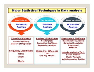
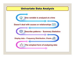
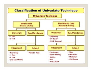
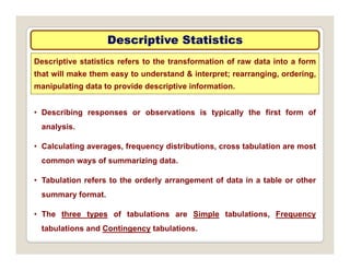
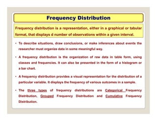
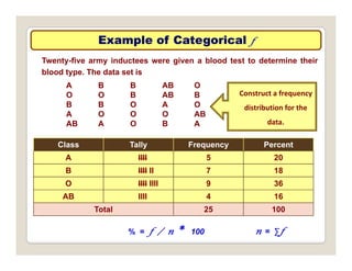
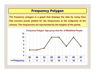
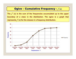
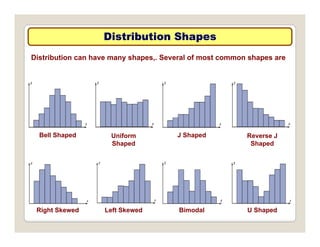
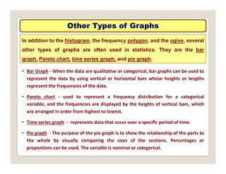
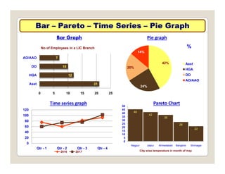
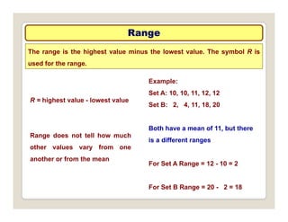
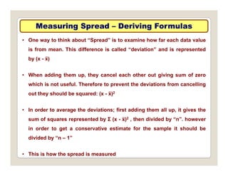
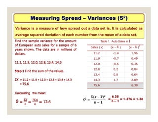
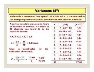
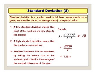
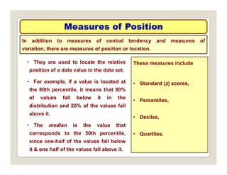
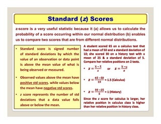
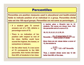
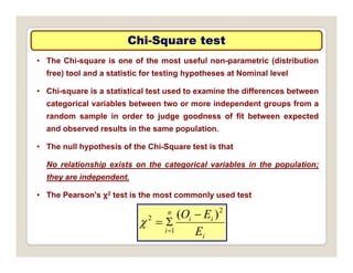
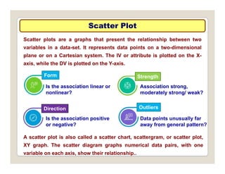
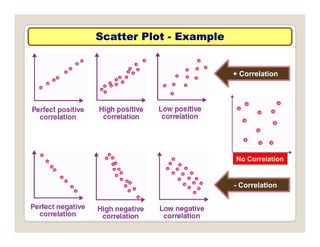
Dr. J D Chandrapal
MBA (Marketing) PGDHRM Ph D CII (Award) London
MBA (Marketing), PGDHRM, Ph. D, CII (Award) – London
Development Officer - LIC of India – Ahmedabad - 9825070933
Major Statistical Techniques in Data analysis
One Variable Two Variables Three Variables
Univariate
Analysis
Bivariate
Analysis
Multivariate
Analysis
Summary Statistics Analyze relationships
Scatter plots
Dependence Technique
Discrimination Analysis
Central Tendency
Measure of Dispersion
Scatter plots
Correlation Coefficient
Regression Analysis
Discrimination Analysis
Canonical Correlation
Regression
MANOVA
Frequency Distribution
Tables
Graphs
Measuring Difference
t test
One way ANOVA
Interdependence Tech.
Factor Analysis
Cluster Analysis
M ltidi i l S lli
Charts
Multidimensional Scalling
One Variable
Univariate
One Variable
Univariate
Analysis
Univariate Data Analysis
One variable is analyzed at a time
Doesn’t deal with causes or relationships
p
Describe patterns - Summary Statistics
Display data – Frequency Distribution, Charts
The simplest form of analyzing data
Classification of Univariate Technique
Univariate Technique
Metric Data
(Interval & Ratio)
Non-Metric Data
(Nominal & Ordinal)
One Sample Two/More Sample One Sample Two/More Sample
• Frequency
• Chi-Square
• t Test
• z Test
Independent Related Independent Related
• K-S & Binomial
• Chi-Square
• Mann-Whitney
• Median
• Sign
• Wilcoxon
• McNemar
• Two Group
• t Test
• z Test
• Paired t Test
• K-S
• K-W ANOVA
• Chi-Square
z Test
• One-way ANOVA
Descriptive Statistics
Descriptive statistics refers to the transformation of raw data into a form
that will make them easy to understand & interpret; rearranging, ordering,
i l ti d t t id d i ti i f ti
• Describing responses or observations is typically the first form of
manipulating data to provide descriptive information.
analysis.
• Calculating averages, frequency distributions, cross tabulation are most
common ways of summarizing data.
• Tabulation refers to the orderly arrangement of data in a table or other
summary format.
• The three types of tabulations are Simple tabulations, Frequency
tabulations and Contingency tabulations.
Frequency Distribution
Frequency distribution is a representation, either in a graphical or tabular
format, that displays d number of observations within a given interval.
• To describe situations, draw conclusions, or make inferences about events the
researcher must organize data in some meaningful way.
• A frequency distribution is the organization of raw data in table form, using
classes and frequencies. It can also be presented in the form of a histogram or
a bar chart
a bar chart.
• A frequency distribution provides a visual representation for the distribution of a
particular variable. It displays the frequency of various outcomes in a sample.
p p y q y p
• The three types of frequency distributions are Categorical Frequency
Distribution, Grouped Frequency Distribution and Cumulative Frequency
Distribution.
Example of Categorical
Example of Categorical f
Twenty-five army inductees were given a blood test to determine their
blood type. The data set is
A B B AB O
A B B AB O
O O B AB B
B B O A O
A O O O AB
Construct a frequency
distribution for the
AB A O B A
Class Tally Frequency Percent
data.
A IIII 5 20
B IIII II 7 18
O IIII IIII 9 36
AB IIII 4 16
Total 25 100
% = f / n * 100 n = ∑f
Example of Grouped
Example of Grouped f
The ages of the Top 50 wealthiest people in the world. Organize a
frequency distribution in 8 Class
49 57 38 73 81 74 59 76 65 69 54 56 69 68 78 65 85 49 69 61 48 81 68 37 43
78 82 43 64 67 52 56 81 77 79 85 40 85 59 80 60 71 57 61 69 61 83 90 87 74
Class limits Class Boundaries Tally Frequency
35–41 34.5-41.5 III 3
42–48 41.5-48.5 III 3
49–55 48.5-55.5 IIII 4
56–62 55.5-62.5 IIII IIII 10
63–69 62.5-69.5 IIII IIII 10
70–76 69.5-76.5 IIII 5
77 83 76 5 83 5 IIII IIII 10
77–83 76.5-83.5 IIII IIII 10
84–90 83.5-90.5 IIII 5
Example of Cumulative
Example of Cumulative f
Cumulative frequencies are used to show how many data values are
accumulated up to and including a specific class.
The values are found by adding the frequencies of the classes less than
or equal to the upper class boundary of a specific class. This gives an
ascending cumulative frequency.
Class limits Frequency
Less than 99.5 0
In this Example,
Less than 104.5 2
Less than 109.5 10
Less than 114.5 28
28 of the total record high
temperatures are less
than or equal to 114F.
Less than 119.5 41
Less than 124.5 48
Less than 129 5 49
q
48 of the total record high
temperatures are less
Less than 129.5 49
Less than 134.5 50
than or equal to 124F.
Visual Representation
It is easier for most people to comprehend the meaning of data presented
graphically than data presented numerically in tables or frequency
distributions. This is especially true if the users have little or no statistical
knowledge.
• Statistical graphs can be used to describe the data set or to analyze it.
• They can be used to discuss issue, reinforce a critical point, or
summarize data set; can also be used to discover a trend or pattern in a
situation over a period of time.
• . The three most commonly used graphs in research are
1. The histogram
2 The frequency polygon
2. The frequency polygon.
3. The cumulative frequency graph, or ogive (pronounced o-jive).
Histogram
Histogram
The histogram is a graph that displays the data by using contiguous
vertical bars (unless the frequency of a class is 0) of various heights to
Histogram for Age group wise No. of Wealthiest People
represent the frequencies of the classes.
8
10
12
est
People
g g g p p
4
6
8
No
of
Wealthi
0
2
34.5-41.5 41.5-48.5 48.5-55.5 55.5-62.5 62.5-69.5 69.5-76.5 76.5-83.5 83.5-90.5
Age Class Boundaries
Frequency Polygon
Frequency Polygon
The frequency polygon is a graph that displays the data by using lines
that connect points plotted for the frequencies at the midpoints of the
Frequency Polygon Age group wise No. of Wealthiest People
classes. The frequencies are represented by the heights of the points.
8
10
12
4
6
8
38 45 52 59 66 73 80 87
0
2
Frequency 3 3 4 10 10 5 10 5
Ogive
Ogive –
– Cumulative Frequency
Cumulative Frequency -
- f (c)
The f (c) is the sum of the frequencies accumulated up to the upper
boundary of a class in the distribution. The ogive is a graph that
60
represents f (c) for the classes in a frequency distribution.
40
50
cy
20
30
Frequenc
Frequency
0
10
Less than
99 5
Less than
104 5
Less than
109 5
Less than
114 5
Less than
119 5
Less than
124 5
Less than
129 5
Less than
134 5
99.5 104.5 109.5 114.5 119.5 124.5 129.5 134.5
Temperatures F
Distribution Shapes
Distribution Shapes
Distribution can have many shapes,. Several of most common shapes are
Bell Shaped Uniform J Shaped Reverse J
Shaped Shaped
Right Skewed Left Skewed Bimodal U Shaped
Other Types of Graphs
In addition to the histogram, the frequency polygon, and the ogive, several
other types of graphs are often used in statistics. They are the bar
• Bar Graph ‐ When the data are qualitative or categorical, bar graphs can be used to
graph, Pareto chart, time series graph, and pie graph.
represent the data by using vertical or horizontal bars whose heights or lengths
represent the frequencies of the data.
• Pareto chart ‐ used to represent a frequency distribution for a categorical
Pareto chart used to represent a frequency distribution for a categorical
variable, and the frequencies are displayed by the heights of vertical bars, which
are arranged in order from highest to lowest.
• Time series graph ‐ represents data that occur over a specific period of time.
• Pie graph ‐ The purpose of the pie graph is to show the relationship of the parts to
the whole by visually comparing the sizes of the sections. Percentages or
proportions can be used. The variable is nominal or categorical.
Bar
Bar –
– Pareto
Pareto –
– Time Series
Time Series –
– Pie Graph
Pie Graph
No of Employees in a LIC Branch
14%
%
Bar Graph Pie graph
12
10
7
HGA
DO
AO/AAO
42%
20%
Asst
HGA
DO
21
12
0 5 10 15 20 25
Asst
HGA
24%
O
AO/AAO
80
100
120
Time series graph
46
42
38
30
35
40
45
50
Pareto Chart
20
40
60
80
28
22
0
5
10
15
20
25
30
0
Qtr - 1 Qtr - 2 Qtr - 3 Qtr - 4
2016 2017
0
Nagpur Jaipur Ahmedabad Banglore Shrinagar
City wise temperature in month of may
Stem and Leaf Plot
Stem and Leaf Plot
The stem and leaf plot is a method of organizing data and is a
combination of sorting and graphing. It has advantage over a grouped of
• A stem and leaf plot is a data plot that uses part of the data value as the stem and
part of the data value as the leaf to form groups or classes
retaining the actual data while showing them in graphical form.
part of the data value as the leaf to form groups or classes.
Data
25 31 20 32 13 14 43 02 57 23 36 32 33
32 44 32 52 44 51 45 Trailing digit
(leaf)
Leading digit
(stem)
Step 1
stem and leaf plot should be arranged in order
02, 13, 14, 20, 23, 25, 31, 32, 32, 32, 32,
33, 36, 43, 44, 44, 45, 51, 52, 57
(leaf)
2
3 4
(stem)
0
1
33, 36, 43, 44, 44, 45, 5 , 5 , 57
Step 2
A display can be made by using the leading
digit as the stem and the trailing digit as the
0 3 5
1 2 2 2 2 3 6
3 4 4 5
2
3
4
leaf. For example, for the value 32, the leading
digit, 3, is the stem and the trailing digit, 2,
3 4 4 5
1 2 7
4
5
Descriptive Statistics Associated with
Descriptive Statistics Associated with f
f
A Frequency table is easy to read and provides basic information, but
sometimes this information may be too detailed and the researcher must
• Descriptive statistics are brief descriptive coefficients that summarize a
summarize it by the use of descriptive statistics.
given data set, which can be either a representation of the entire population or
a sample of it.
• Descriptive statistics are broken down into measures of central tendency
and measures of variability, or spread.
• Inferential statistics are a function of the sample data that assists you to
draw inferences and predictions regarding an hypothesis about a population
parameter
parameter.
• Classic inferential statistics include z, t, χ2, F-ratio, etc..
Measures of Central Tendency
A measure of central tendency (also referred to as measures of
centre or central location) is a summary measure that attempts to
describe a whole set of data with a single value that represents the middle
or centre of its distribution.
There are three main measures of central tendency: the mode, the median
and the mean. Each of these measures describes a different indication of
th t i l t l l i th di t ib ti
Measure Definition Symbol(s)
Mean Sum of values divided by total number of values μ Ẍ
the typical or central value in the distribution.
Mean Sum of values, divided by total number of values μ, Ẍ
Median Middle point in data set that has been ordered MD
Mode Most frequency data value Z
Midrange Lowest value plus highest value, divided by 2 MR
The Mean
The Mean –
– an Example
an Example
The data represent the number of
miles run during one week for a
l f 20
1. The mean varies less than
median or mode, when samples
Class
Frequency
(f )
Mid Point
(Xm)
f * Xm
sample of 20 runners. are taken from same population
2. Used in computing other
statistics, such as variance.
5.5‐10.5 1 8 8
10.5‐15.5 2 13 26
15.5‐20.5 3 18 54
,
3. Mean for data set is unique and
not necessarily one of the data
values
20.5‐25.5 5 23 115
25.5‐30.5 4 28 112
30.5‐35.5 3 33 99
35 5 40 5 2 38 76
values.
4. Mean cannot be computed for
the open-ended class.
35.5‐40.5 2 38 76
20 ∑f * Xm 490
Σf * Xm 490
5. Affected by extremely high or
low values, called outliers, &
may not be appropriate average
X =
Σf Xm
n
490
20
= = 24.5 Miles
may not be appropriate average
to use in these situations.
The Median
The Median –
– an Example
an Example
Determine median from the following Marks in Marketing Research:
31, 29, 27, 33, 35, 41, 39, 41, 43, 45, 47.
A th d t i di d di d
n + 1 11 + 1
Arrange the data in ascending or descending order
27, 29, 31, 33, 35, 39, 41, 41, 43, 45, 47.
39
M =
n + 1
2
11 + 1
2
= = 6th Value = 39
1. Median is used to find the centre or middle value of a data set.
2. The median is used when it is necessary to find out whether the data
values fall into the upper half or lower half of the distribution
values fall into the upper half or lower half of the distribution.
3. Median is used for an open-ended distribution.
4. Median is less affected by outliers & skewed data than mean, and is
usually preferred when the distribution is not symmetrical.
The Mode
The Mode –
– an Example
an Example
the mode is the number that occurs
most often in a set of data. A
1. The mode is used when the most
typical case is desired. The mode
number that appears most often is
the mode.
yp
is the easiest average to compute.
2. It can be used when the data are
Data Set:
3, 7, 5, 13, 20, 23, 39,
23, 40, 23, 14, 12, 56, 23, 29
nominal, such as religious
preference, gender.
3. In a data set the value occurs with
In order these numbers are:
3, 5, 7, 12, 13, 14, 20,
the greatest frequency ; if one
value occurs is said to be uni-
d l if l i id
23, 23, 23, 23, 29, 39, 40, 56
which numbers appear most often:
modal, if two value occurs is said
to be Bimodal and if more than two
values occurs is said to be
In this case the mode is 23. Multimodal
Measures of Variances
In statistics, to describe the data set accurately, statisticians must know
more than the measures of central tendency. Measures of variability
Example:
means a statistic that indicates the distribution’s dispersion.
1. An average is an attempt to summarize a
Set A: 10, 10, 11, 12, 12
Set B: 2, 4, 11, 18, 20
Both have a mean of 11
set of data using just one number. An
average taken by itself may not always be
very meaningful. We need a statistical
f th t th d Both have a mean of 11.
*
* *
*
*
cross-reference that measures the spread
of the data.
2. The measures of variability can be
* * * * *
Set A
calculated on interval or ratio data.
3. For the spread or variability of a data
set three measures are commonly used:
Set B
set, three measures are commonly used:
range, variance, and standard deviation.
Range
Range
The range is the highest value minus the lowest value. The symbol R is
used for the range.
Example:
Set A: 10, 10, 11, 12, 12
Set B: 2, 4, 11, 18, 20
R = highest value - lowest value
Both have a mean of 11, but there
is a different ranges
Range does not tell how much
other values vary from one
For Set A Range = 12 - 10 = 2
another or from the mean
For Set B Range = 20 - 2 = 18
Measuring Spread
Measuring Spread –
– Deriving Formulas
Deriving Formulas
• One way to think about “Spread” is to examine how far each data value
is from mean. This difference is called “deviation” and is represented
by (x - ẍ)
• When adding them up, they cancel each other out giving sum of zero
g p, y g g
which is not useful. Therefore to prevent the deviations from cancelling
out they should be squared: (x - ẍ)2
• In order to average the deviations; first adding them all up, it gives the
sum of squares represented by Σ (x - ẍ)2 , then divided by “n”. however
q p y ( ) , y
in order to get a conservative estimate for the sample it should be
divided by “n – 1”
• This is how the spread is measured
Measuring Spread
Measuring Spread –
– Variances (S
Variances (S2
2)
)
Variance is a measure of how spread out a data set is. It is calculated as
average squared deviation of each number from the mean of a data set.
Table 1. Auto Sales in $
Sales (x) (x - Ẍ ) (x - Ẍ )
2
11 2 -1 4 1 96
11.2 -1.4 1.96
11.9 -0.7 0.49
12.0 -0.6 0.36
12 8 0 2 0 04
12.8 0.2 0.04
13.4 0.8 0.64
14.3 1.7 2.89
75.6 6.38
Variances (S
Variances (S2
2)
)
Variance is a measure of how spread out a data set is. It is calculated as
the average squared deviation of each number from mean of a data set.
x (x−ẍ) (x - ẍ )
2
7 7 - 5.8 = 1.2 1.44
6 6 - 5 8 = 0 2 0 04
A survey was done on sleeping hours
of students in America. A sample of
10 students was found to be (in
hours) as follows: 6 6 - 5.8 = 0.2 0.04
8 8 - 5.8 = 2.2 4.84
4 4 - 5.8 = -1.8 3.24
hours) as follows:
7, 6, 8, 4, 2, 7, 6, 7, 6, 5
2 2 - 5.8 = -3.8 14.44
7 7 - 5.8 = 1.2 1.44
6 6 - 5.8 = 0.2 0.04
ẍ =
Σ x
n
58
10
= = 5.8 hours
Table is constructed for the
7 7 - 5.8 = 1.2 1.44
6 6 - 5.8 = 0.2 0.04
5 5 5 8 = 0 8 0 64
Table is constructed for the
calculation of variance.
27.60 3 067 5 5 - 5.8 = -0.8 0.64
58 27.60
9
= =
3.067
hours
Standard Deviation (S)
Standard deviation is a number used to tell how measurements for a
group are spread out from the average (mean), or expected value.
1. A low standard deviation means that
most of the numbers are very close to
Formula
the average.
2. A high standard deviation means that
or
2. A high standard deviation means that
the numbers are spread out..
3 St d d d i ti b l l t d
=
3. Standard deviation can be calculated
by taking the square root of the
variance, which itself is the average of
= 1.7513
, g
the squared differences of the mean.
Measures of Position
In addition to measures of central tendency and measures of
variation, there are measures of position or location.
• They are used to locate the relative
position of a data value in the data set.
These measures include
• For example, if a value is located at
the 80th percentile, it means that 80%
of values fall below it in the
• Standard (z) scores,
P til
of values fall below it in the
distribution and 20% of the values fall
above it.
• Percentiles,
• Deciles,
• The median is the value that
corresponds to the 50th percentile,
since one-half of the values fall below
• Quartiles.
since one half of the values fall below
it & one half of the values fall above it.
Standard (
Standard (z
z) Scores
) Scores
z-score is a very useful statistic because it (a) allows us to calculate the
probability of a score occurring within our normal distribution (b) enables
t t th t f diff t l di t ib ti
us to compare two scores that are from different normal distributions.
• Standard score is signed number
of standard deviations by which the
value of an observation or data point
is above the mean value of what is
being observed or measured
being observed or measured.
• Observed values above the mean have
positive std scores. while values below
the mean have negative std scores.
• z score represents the number of std
deviations that a data value falls
above or below the mean.
Percentiles
Percentiles
Percentiles are position measures used in educational and health-related
fields to indicate position of an individual in a group. Percentiles divide
data set into 100 equal groups Percentiles are not same as percentages
• If a student gets 72 correct
answers out of a 100 obtains a
data set into 100 equal groups. Percentiles are not same as percentages.
answers out of a 100, obtains a
percentage score of 72.
• There is no indication of her
position with respect to rest of
the class. He/She could have
scored the highest, the lowest, or
somewhere in between.
• On the other hand, if a raw score
of 72 corresponds to the 64th
percentile then he/she did better
percentile, then he/she did better
than 64% of students in her class
Quartiles
Quartiles
Quartiles divide the distribution into four groups, separated by Q1, Q2, Q3. Note
that Q1 is the same as the 25th percentile; Q2 is the same as the 50th percentile, or
the median; Q3 corresponds to the 75th percentile
• Finding Data Values Corresponding to Q1, Q2, and Q3
Step 1 Arrange the data in order from lowest to highest.
the median; Q3 corresponds to the 75th percentile
Step 2 Find the median of the data values. This is the value for Q2.
Step 3 Find the median of data values that fall below Q2. This is value for Q1.
Step 4 Find the median of data values that fall above Q2. This is value for Q3.
• In addition to dividing the data set into four groups, quartiles can be used as
a rough measurement of variability.
• Interquartile range (IQR) is defined as the difference between Q1 and Q3 and
is the range of the middle 50% of the data.
• The interquartile range is used to identify outliers, and it is also used as a
measure of variability in exploratory data analysis.
• An outlier is an extremely high or an extremely low data value
Deciles
Deciles
• Note that D1 corresponds to P10; D2 corresponds to P20; etc.
Deciles divide the distribution into 10 groups. They are denoted by D1, D2, etc.
• Deciles can be found by using formulas given for percentiles.
Deciles are denoted by D1, D2, D3, . . , D9, & they correspond to
P10, P20, P30, . . , P90
Quartiles are denoted by Q1, Q2, Q3 & they correspond to
P25, P50, P75.
The median is the same as P50 or Q2 or D5..
Summary of Position Measures
Measure Definition Symbol
Std (z) score No. of Std. deviations that a data value is above or below the mean Z
Percentile Position in hundredths that a data value holds in the distribution Pn
D il P iti i t th th t d t l h ld i th di t ib ti D
Decile Position in tenths that a data value holds in the distribution Dn
Quartile Position in fourths that a data value holds in the distribution Qn
Cross Tabulation
Cross Tabulation
Organizing and analysing data by groups, categories, or classes to
facilitate comparisons; a joint Freq. distributions of observations on two
t f i bl
• Upon the construction of the one-way frequency table, the next logical
step in preliminary data analysis is to perform cross-tabulation.
or more set of variables.
step in preliminary data analysis is to perform cross tabulation.
• Cross-tabulation is extremely useful when the analyst wishes to study
relationships among and between variables.
• Purpose of cross-tabulation is to determine whether certain variables
differ when compared among various subgroups of the total sample.
I f t t b l ti i ll th i f f d t l i i
• In fact, cross-tabulation is normally the main form of data analysis in
most marketing research projects.
• Two key elements of cross-tabulation are how to develop the cross-
y p
tabulation and how to interpret the outcome.
Cross Tabulation
Cross Tabulation
Student
Career Seen as
Prestigious
Student
Gender
Student
Career Seen as
Prestigious
Student
Gender
1 Doctor F 11 Doctor F
2 S i ti t M 12 Milit Offi M
2 Scientist M 12 Military Officer M
3 Military Officer M 13 Scientist F
4 Military Officer F 14 Lawyer F
5 Doctor M 15 Lawyer F
6 S i ti t F 16 Milit Offi M
6 Scientist F 16 Military Officer M
7 Military Officer M 17 Doctor F
8 Athlete F 18 Scientist M
9 Doctor F 19 Doctor F
10 S i ti t M 20 L M
10 Scientist M 20 Lawyer M
Career
Gender
Total
Female Male
Doctor 5 1 6
Doctor 5 1 6
Scientist 2 3 5
Military Officer 1 4 5
Lawyer 2 1 3
Athlete 1 0 1
Total 11 9 20
Two
Variables
Bivariate
Analysis
The Bivariate analysis involves the analysis of two variables, X:
independent/explanatory/outcome variable and Y: dependent/outcome
p p y p
variable, to determine the relationship between them.
Bivariate Data Analysis
• Bivariate analysis explores how the dependent (“outcome”) variable
depends or is explained by the independent (“explanatory”) variable or
it explores the association between the two variables without any
cause and effect relationship..
• Examples
What is the correlation between “Volume of Sales” and “Profit”?
What is the correlation between Volume of Sales and Profit ?
Bivariate analysis is slightly more analytical than Univariate analysis.
In a survey of a classroom, let us check analysis the ratio of students
who scored above 85% corresponding to their genders. In this case,
there are two variables gender = X (IV) and result = Y (DV) A Bivariate
there are two variables – gender = X (IV) and result = Y (DV). A Bivariate
analysis is will measure the correlations between the two variables.
Types of Bivariate Correlations
Numerical and Numerical
Both the variables have a numerical value.
Categorical and Categorical
Numerical and Categorical
Both the variables are in static form;
sometimes called a nominal variable
Numerical and Categorical
One variable is numerical, and
the other is categorical
Bivariate analyses could be used to answer the question of whether
There is an association between income (Numerical) and Expenditure(Numerical)
There is an association between income (Numerical) and quality of life(Categorical)
There is association b/w Social Status (Categorical) & quality of life(Categorical)
Types of Bivariate Tests
Analyze relationships
Chi-square
Scatter plots
Correlation Coefficient
Regression Analysis
Measuring Difference
t test
t test
One way ANOVA
Chi
Chi-
-Square test
Square test
• The Chi-square is one of the most useful non-parametric (distribution
free) tool and a statistic for testing hypotheses at Nominal level
• Chi-square is a statistical test used to examine the differences between
categorical variables between two or more independent groups from a
random sample in order to judge goodness of fit between expected
p j g g p
and observed results in the same population.
• The null hypothesis of the Chi-Square test is that
No relationship exists on the categorical variables in the population;
they are independent.
• The Pearson's χ2 test is the most commonly used test
i
i
n E
O 2
2 )
( 



i
i E
1




Scatter Plot
Scatter Plot
Scatter plots are a graphs that present the relationship between two
variables in a data-set. It represents data points on a two-dimensional
l C t i t Th IV tt ib t i l tt d th X
plane or on a Cartesian system. The IV or attribute is plotted on the X-
axis, while the DV is plotted on the Y-axis.
Form Strength
Form Strength
Is the association linear or
nonlinear?
Association strong,
moderately strong/ weak?
Direction Outliers
Is the association positive Data points unusually far
Is the association positive
or negative?
Data points unusually far
away from general pattern?
A scatter plot is also called a scatter chart, scattergram, or scatter plot,
XY graph. The scatter diagram graphs numerical data pairs, with one
variable on each axis, show their relationship..
Scatter Plot
Scatter Plot -
- Example
Example
+ Correlation
No Correlation
- Correlation
Correlation
Correlation
Overview of Statistical Techniques
• Appropriate when there is a single measurement
of each of the 'n' sample objects or there are
several measurements of each of the `n'
observations but each variable is analyzed in
Univariate
Techniques y
isolation
• A collection of procedures for analyzing
association between two or more sets of
Multivariate
measurements that have been made on each
object in one or more samples of objects
Dependence or interdependence techniques
Techniques
Dependence or interdependence techniques
Multivariate Data Analysis
• Multivariate analysis is the analysis of three or more variables. There are many
ways to perform multivariate analysis depending on your goals.
• More than two variables are analyzed together for any possible association or
interactions. Example – What is correlation between “Sales Volume”,
“Expenditure on promotion” and “Profit”?.
• MVA is a more complex form of statistical analysis technique as it would be
required to understand the relationship of each variable with each other
• Commonly used multivariate analysis technique include –
Factor Analysis
Cluster Analysis
Variance Analysis
Discriminant Analysis
Multidimensional Scaling
Principal Component Analysis
Multiple Regression Analysis
Canonical Correlation Analysis
Conjoint Analysis
Structural Equation Modelling
Classification of Multivariate Technique
Multivariate Technique
Dependence Technique Interdependence Technique
One Dependent
Variable
Two/More
Dependent Variable
Variable
Interdependence
Inter‐Object
Similarity
• MANOVA & • Cluster Analysis
• Factor Analysis
• Cross Tabulation
MANCOVA
• Canonical
Correlation
• Cluster Analysis
• Multidimensional
Scaling
y
• Chi-Square
• K-S & Binomial
(More than two
variables)
• ANOVA & ANCOVA
• Structural Equation
Modelling & Path
Analysis
• Multiple Regression
• Two Group
Discriminant Analysis
• Logit Analysis
• Conjoint Analysis
Hypothesis Testing
yp g
Researchers are interested in answering many types of questions. These types of
questions can be addressed through statistical hypothesis testing, which is a
decision making process for evaluating claims about a population
decision‐making process for evaluating claims about a population.
• In hypothesis testing, the researcher must
Define the population under study,
State the particular hypotheses that will be investigated,
Give the significance level,
Select a sample from the population,
Collect the data
Collect the data,
Perform the calculations required for the statistical test, and
Reach a conclusion.
• Hypotheses concerning parameters such as means and proportions can be investigated.
yp g p p p g
• There are two specific statistical tests used for hypotheses concerning means: the z test and
the t test.
• The hypothesis‐testing procedure along with the z test and the t test. In addition, a
hypothesis‐testing procedure for testing a single variance or standard deviation using the
chi‐square distribution
Types of Hypothesis Testing
yp yp g
Researchers are interested in answering many types of questions. These types of
questions can be addressed through statistical hypothesis testing, which is a
decision making process for evaluating claims about a population
decision‐making process for evaluating claims about a population.
• In hypothesis testing, the researcher must
Define the population under study, Methods of Hypothesis
State the particular hypotheses that will be investigated,
Give the significance level,
Select a sample from the population,
Collect the data
1. Traditional method
2. P‐value method
Collect the data,
Perform the calculations required for the statistical test,
Reach a conclusion.
• Hypotheses concerning parameters such as means and proportions can be investigated.
3. Confidence interval method
yp g p p p g
• There are two specific statistical tests used for hypotheses concerning means: the z test and
the t test.
• The hypothesis‐testing procedure along with the z test and the t test. In addition, a
hypothesis‐testing procedure for testing a single variance or standard deviation using the
chi‐square distribution
Statistical Hypothesis
yp
A statistical hypothesis is a conjecture about a population parameter. This
conjecture may or may not be true..
• There are two types of statistical hypotheses for
each situation: the null hypothesis and the
alternative hypothesis
Two-tailed test
H0: µ = k
alternative hypothesis.
• The null hypothesis, symbolized by H0, is a
statistical hypothesis that states that there is no
difference between a parameter and a specific
H1: µ ≠ k
Right-tailed test
difference between a parameter and a specific
value, or that there is no difference between two
parameters.
H0: µ = k
H1: µ > k
• The alternative hypothesis, symbolized by H1, is a
statistical hypothesis that states the existence of a
difference between a parameter and a specific
value or states that there is a difference between
Left-tailed test
H0: µ = k
H1: µ < k
value, or states that there is a difference between
two parameters.
µ
State H0 and H1 for each conjecture.
1. A researcher thinks that if expectant mothers
use vitamin pills, the birth weight of the
babies will increase The average birth weight
1. Right-tailed test
H0: µ = 8 6
babies will increase. The average birth weight
of the population is 8.6 pounds.
2. An engineer hypothesizes that the mean
H0: µ = 8.6
H1: µ > 8.6
e g ee ypot es es t at t e ea
number of defects can be decreased in a
manufacturing process of compact disks by
using robots instead of humans for certain
2. Left-tailed test
H0: µ = 18
H1: µ < 18
tasks. The mean number of defective disks
per 1000 is 18.
3 A psychologist feels that playing soft music
H1: µ < 18
3. Two-tailed test
3. A psychologist feels that playing soft music
during a test will change the results of the
test. The psychologist is not sure whether the
grades will be higher or lower. In the past, the
H0: µ = 73
H1: µ ≠ 73
grades will be higher or lower. In the past, the
mean of the scores was 73.

00 - Lecture - 02_MVA - Major Statistical Techniques.pdf

  • 1.
    Dr. J DChandrapal MBA (Marketing) PGDHRM Ph D CII (Award) London MBA (Marketing), PGDHRM, Ph. D, CII (Award) – London Development Officer - LIC of India – Ahmedabad - 9825070933
  • 2.
    Major Statistical Techniquesin Data analysis Major Statistical Techniques in Data analysis One Variable Two Variables Three Variables Univariate Analysis Bivariate Analysis Multivariate Analysis Summary Statistics Analyze relationships Scatter plots Dependence Technique Discrimination Analysis Central Tendency Measure of Dispersion Scatter plots Correlation Coefficient Regression Analysis Discrimination Analysis Canonical Correlation Regression MANOVA Frequency Distribution Tables Graphs Measuring Difference t test One way ANOVA Interdependence Tech. Factor Analysis Cluster Analysis M ltidi i l S lli Charts Multidimensional Scalling
  • 3.
  • 4.
    Univariate Data Analysis UnivariateData Analysis One variable is analyzed at a time One variable is analyzed at a time Doesn’t deal with causes or relationships p Describe patterns - Summary Statistics Display data – Frequency Distribution, Charts The simplest form of analyzing data
  • 5.
    Classification of UnivariateTechnique Classification of Univariate Technique Univariate Technique Metric Data (Interval & Ratio) Non-Metric Data (Nominal & Ordinal) One Sample Two/More Sample One Sample Two/More Sample • Frequency • Chi-Square • t Test • z Test Independent Related Independent Related • K-S & Binomial • Chi-Square • Mann-Whitney • Median • Sign • Wilcoxon • McNemar • Two Group • t Test • z Test • Paired t Test • K-S • K-W ANOVA • Chi-Square z Test • One-way ANOVA
  • 6.
    Descriptive Statistics Descriptive Statistics Descriptivestatistics refers to the transformation of raw data into a form that will make them easy to understand & interpret; rearranging, ordering, i l ti d t t id d i ti i f ti • Describing responses or observations is typically the first form of manipulating data to provide descriptive information. analysis. • Calculating averages, frequency distributions, cross tabulation are most common ways of summarizing data. • Tabulation refers to the orderly arrangement of data in a table or other summary format. • The three types of tabulations are Simple tabulations, Frequency tabulations and Contingency tabulations.
  • 7.
    Frequency Distribution Frequency Distribution Frequencydistribution is a representation, either in a graphical or tabular format, that displays d number of observations within a given interval. • To describe situations, draw conclusions, or make inferences about events the researcher must organize data in some meaningful way. • A frequency distribution is the organization of raw data in table form, using classes and frequencies. It can also be presented in the form of a histogram or a bar chart a bar chart. • A frequency distribution provides a visual representation for the distribution of a particular variable. It displays the frequency of various outcomes in a sample. p p y q y p • The three types of frequency distributions are Categorical Frequency Distribution, Grouped Frequency Distribution and Cumulative Frequency Distribution.
  • 8.
    Example of Categorical Exampleof Categorical f Twenty-five army inductees were given a blood test to determine their blood type. The data set is A B B AB O A B B AB O O O B AB B B B O A O A O O O AB Construct a frequency distribution for the AB A O B A Class Tally Frequency Percent data. A IIII 5 20 B IIII II 7 18 O IIII IIII 9 36 AB IIII 4 16 Total 25 100 % = f / n * 100 n = ∑f
  • 9.
    Example of Grouped Exampleof Grouped f The ages of the Top 50 wealthiest people in the world. Organize a frequency distribution in 8 Class 49 57 38 73 81 74 59 76 65 69 54 56 69 68 78 65 85 49 69 61 48 81 68 37 43 78 82 43 64 67 52 56 81 77 79 85 40 85 59 80 60 71 57 61 69 61 83 90 87 74 Class limits Class Boundaries Tally Frequency 35–41 34.5-41.5 III 3 42–48 41.5-48.5 III 3 49–55 48.5-55.5 IIII 4 56–62 55.5-62.5 IIII IIII 10 63–69 62.5-69.5 IIII IIII 10 70–76 69.5-76.5 IIII 5 77 83 76 5 83 5 IIII IIII 10 77–83 76.5-83.5 IIII IIII 10 84–90 83.5-90.5 IIII 5
  • 10.
    Example of Cumulative Exampleof Cumulative f Cumulative frequencies are used to show how many data values are accumulated up to and including a specific class. The values are found by adding the frequencies of the classes less than or equal to the upper class boundary of a specific class. This gives an ascending cumulative frequency. Class limits Frequency Less than 99.5 0 In this Example, Less than 104.5 2 Less than 109.5 10 Less than 114.5 28 28 of the total record high temperatures are less than or equal to 114F. Less than 119.5 41 Less than 124.5 48 Less than 129 5 49 q 48 of the total record high temperatures are less Less than 129.5 49 Less than 134.5 50 than or equal to 124F.
  • 11.
    Visual Representation Visual Representation Itis easier for most people to comprehend the meaning of data presented graphically than data presented numerically in tables or frequency distributions. This is especially true if the users have little or no statistical knowledge. • Statistical graphs can be used to describe the data set or to analyze it. • They can be used to discuss issue, reinforce a critical point, or summarize data set; can also be used to discover a trend or pattern in a situation over a period of time. • . The three most commonly used graphs in research are 1. The histogram 2 The frequency polygon 2. The frequency polygon. 3. The cumulative frequency graph, or ogive (pronounced o-jive).
  • 12.
    Histogram Histogram The histogram isa graph that displays the data by using contiguous vertical bars (unless the frequency of a class is 0) of various heights to Histogram for Age group wise No. of Wealthiest People represent the frequencies of the classes. 8 10 12 est People g g g p p 4 6 8 No of Wealthi 0 2 34.5-41.5 41.5-48.5 48.5-55.5 55.5-62.5 62.5-69.5 69.5-76.5 76.5-83.5 83.5-90.5 Age Class Boundaries
  • 13.
    Frequency Polygon Frequency Polygon Thefrequency polygon is a graph that displays the data by using lines that connect points plotted for the frequencies at the midpoints of the Frequency Polygon Age group wise No. of Wealthiest People classes. The frequencies are represented by the heights of the points. 8 10 12 4 6 8 38 45 52 59 66 73 80 87 0 2 Frequency 3 3 4 10 10 5 10 5
  • 14.
    Ogive Ogive – – CumulativeFrequency Cumulative Frequency - - f (c) The f (c) is the sum of the frequencies accumulated up to the upper boundary of a class in the distribution. The ogive is a graph that 60 represents f (c) for the classes in a frequency distribution. 40 50 cy 20 30 Frequenc Frequency 0 10 Less than 99 5 Less than 104 5 Less than 109 5 Less than 114 5 Less than 119 5 Less than 124 5 Less than 129 5 Less than 134 5 99.5 104.5 109.5 114.5 119.5 124.5 129.5 134.5 Temperatures F
  • 15.
    Distribution Shapes Distribution Shapes Distributioncan have many shapes,. Several of most common shapes are Bell Shaped Uniform J Shaped Reverse J Shaped Shaped Right Skewed Left Skewed Bimodal U Shaped
  • 16.
    Other Types ofGraphs Other Types of Graphs In addition to the histogram, the frequency polygon, and the ogive, several other types of graphs are often used in statistics. They are the bar • Bar Graph ‐ When the data are qualitative or categorical, bar graphs can be used to graph, Pareto chart, time series graph, and pie graph. represent the data by using vertical or horizontal bars whose heights or lengths represent the frequencies of the data. • Pareto chart ‐ used to represent a frequency distribution for a categorical Pareto chart used to represent a frequency distribution for a categorical variable, and the frequencies are displayed by the heights of vertical bars, which are arranged in order from highest to lowest. • Time series graph ‐ represents data that occur over a specific period of time. • Pie graph ‐ The purpose of the pie graph is to show the relationship of the parts to the whole by visually comparing the sizes of the sections. Percentages or the whole by visually comparing the sizes of the sections. Percentages or proportions can be used. The variable is nominal or categorical.
  • 17.
    Bar Bar – – Pareto Pareto– – Time Series Time Series – – Pie Graph Pie Graph No of Employees in a LIC Branch 14% % Bar Graph Pie graph 12 10 7 HGA DO AO/AAO 42% 20% Asst HGA DO 21 12 0 5 10 15 20 25 Asst HGA 24% O AO/AAO 80 100 120 Time series graph 46 42 38 30 35 40 45 50 Pareto Chart 20 40 60 80 28 22 0 5 10 15 20 25 30 0 Qtr - 1 Qtr - 2 Qtr - 3 Qtr - 4 2016 2017 0 Nagpur Jaipur Ahmedabad Banglore Shrinagar City wise temperature in month of may
  • 18.
    Stem and LeafPlot Stem and Leaf Plot The stem and leaf plot is a method of organizing data and is a combination of sorting and graphing. It has advantage over a grouped of • A stem and leaf plot is a data plot that uses part of the data value as the stem and part of the data value as the leaf to form groups or classes retaining the actual data while showing them in graphical form. part of the data value as the leaf to form groups or classes. Data 25 31 20 32 13 14 43 02 57 23 36 32 33 32 44 32 52 44 51 45 Trailing digit (leaf) Leading digit (stem) Step 1 stem and leaf plot should be arranged in order 02, 13, 14, 20, 23, 25, 31, 32, 32, 32, 32, 33, 36, 43, 44, 44, 45, 51, 52, 57 (leaf) 2 3 4 (stem) 0 1 33, 36, 43, 44, 44, 45, 5 , 5 , 57 Step 2 A display can be made by using the leading digit as the stem and the trailing digit as the 0 3 5 1 2 2 2 2 3 6 3 4 4 5 2 3 4 leaf. For example, for the value 32, the leading digit, 3, is the stem and the trailing digit, 2, 3 4 4 5 1 2 7 4 5
  • 19.
    Descriptive Statistics Associatedwith Descriptive Statistics Associated with f f A Frequency table is easy to read and provides basic information, but sometimes this information may be too detailed and the researcher must • Descriptive statistics are brief descriptive coefficients that summarize a summarize it by the use of descriptive statistics. given data set, which can be either a representation of the entire population or a sample of it. • Descriptive statistics are broken down into measures of central tendency and measures of variability, or spread. • Inferential statistics are a function of the sample data that assists you to draw inferences and predictions regarding an hypothesis about a population parameter parameter. • Classic inferential statistics include z, t, χ2, F-ratio, etc..
  • 20.
    Measures of CentralTendency Measures of Central Tendency A measure of central tendency (also referred to as measures of centre or central location) is a summary measure that attempts to describe a whole set of data with a single value that represents the middle or centre of its distribution. There are three main measures of central tendency: the mode, the median and the mean. Each of these measures describes a different indication of th t i l t l l i th di t ib ti Measure Definition Symbol(s) Mean Sum of values divided by total number of values μ Ẍ the typical or central value in the distribution. Mean Sum of values, divided by total number of values μ, Ẍ Median Middle point in data set that has been ordered MD Mode Most frequency data value Z Midrange Lowest value plus highest value, divided by 2 MR
  • 21.
    The Mean The Mean– – an Example an Example The data represent the number of miles run during one week for a l f 20 1. The mean varies less than median or mode, when samples Class Frequency (f ) Mid Point (Xm) f * Xm sample of 20 runners. are taken from same population 2. Used in computing other statistics, such as variance. 5.5‐10.5 1 8 8 10.5‐15.5 2 13 26 15.5‐20.5 3 18 54 , 3. Mean for data set is unique and not necessarily one of the data values 20.5‐25.5 5 23 115 25.5‐30.5 4 28 112 30.5‐35.5 3 33 99 35 5 40 5 2 38 76 values. 4. Mean cannot be computed for the open-ended class. 35.5‐40.5 2 38 76 20 ∑f * Xm 490 Σf * Xm 490 5. Affected by extremely high or low values, called outliers, & may not be appropriate average X = Σf Xm n 490 20 = = 24.5 Miles may not be appropriate average to use in these situations.
  • 22.
    The Median The Median– – an Example an Example Determine median from the following Marks in Marketing Research: 31, 29, 27, 33, 35, 41, 39, 41, 43, 45, 47. A th d t i di d di d n + 1 11 + 1 Arrange the data in ascending or descending order 27, 29, 31, 33, 35, 39, 41, 41, 43, 45, 47. 39 M = n + 1 2 11 + 1 2 = = 6th Value = 39 1. Median is used to find the centre or middle value of a data set. 2. The median is used when it is necessary to find out whether the data values fall into the upper half or lower half of the distribution values fall into the upper half or lower half of the distribution. 3. Median is used for an open-ended distribution. 4. Median is less affected by outliers & skewed data than mean, and is usually preferred when the distribution is not symmetrical.
  • 23.
    The Mode The Mode– – an Example an Example the mode is the number that occurs most often in a set of data. A 1. The mode is used when the most typical case is desired. The mode number that appears most often is the mode. yp is the easiest average to compute. 2. It can be used when the data are Data Set: 3, 7, 5, 13, 20, 23, 39, 23, 40, 23, 14, 12, 56, 23, 29 nominal, such as religious preference, gender. 3. In a data set the value occurs with In order these numbers are: 3, 5, 7, 12, 13, 14, 20, the greatest frequency ; if one value occurs is said to be uni- d l if l i id 23, 23, 23, 23, 29, 39, 40, 56 which numbers appear most often: modal, if two value occurs is said to be Bimodal and if more than two values occurs is said to be In this case the mode is 23. Multimodal
  • 24.
    Measures of Variances Measuresof Variances In statistics, to describe the data set accurately, statisticians must know more than the measures of central tendency. Measures of variability Example: means a statistic that indicates the distribution’s dispersion. 1. An average is an attempt to summarize a Set A: 10, 10, 11, 12, 12 Set B: 2, 4, 11, 18, 20 Both have a mean of 11 set of data using just one number. An average taken by itself may not always be very meaningful. We need a statistical f th t th d Both have a mean of 11. * * * * * cross-reference that measures the spread of the data. 2. The measures of variability can be * * * * * Set A calculated on interval or ratio data. 3. For the spread or variability of a data set three measures are commonly used: Set B set, three measures are commonly used: range, variance, and standard deviation.
  • 25.
    Range Range The range isthe highest value minus the lowest value. The symbol R is used for the range. Example: Set A: 10, 10, 11, 12, 12 Set B: 2, 4, 11, 18, 20 R = highest value - lowest value Both have a mean of 11, but there is a different ranges Range does not tell how much other values vary from one For Set A Range = 12 - 10 = 2 another or from the mean For Set B Range = 20 - 2 = 18
  • 26.
    Measuring Spread Measuring Spread– – Deriving Formulas Deriving Formulas • One way to think about “Spread” is to examine how far each data value is from mean. This difference is called “deviation” and is represented by (x - ẍ) • When adding them up, they cancel each other out giving sum of zero g p, y g g which is not useful. Therefore to prevent the deviations from cancelling out they should be squared: (x - ẍ)2 • In order to average the deviations; first adding them all up, it gives the sum of squares represented by Σ (x - ẍ)2 , then divided by “n”. however q p y ( ) , y in order to get a conservative estimate for the sample it should be divided by “n – 1” • This is how the spread is measured
  • 27.
    Measuring Spread Measuring Spread– – Variances (S Variances (S2 2) ) Variance is a measure of how spread out a data set is. It is calculated as average squared deviation of each number from the mean of a data set. Table 1. Auto Sales in $ Sales (x) (x - Ẍ ) (x - Ẍ ) 2 11 2 -1 4 1 96 11.2 -1.4 1.96 11.9 -0.7 0.49 12.0 -0.6 0.36 12 8 0 2 0 04 12.8 0.2 0.04 13.4 0.8 0.64 14.3 1.7 2.89 75.6 6.38
  • 28.
    Variances (S Variances (S2 2) ) Varianceis a measure of how spread out a data set is. It is calculated as the average squared deviation of each number from mean of a data set. x (x−ẍ) (x - ẍ ) 2 7 7 - 5.8 = 1.2 1.44 6 6 - 5 8 = 0 2 0 04 A survey was done on sleeping hours of students in America. A sample of 10 students was found to be (in hours) as follows: 6 6 - 5.8 = 0.2 0.04 8 8 - 5.8 = 2.2 4.84 4 4 - 5.8 = -1.8 3.24 hours) as follows: 7, 6, 8, 4, 2, 7, 6, 7, 6, 5 2 2 - 5.8 = -3.8 14.44 7 7 - 5.8 = 1.2 1.44 6 6 - 5.8 = 0.2 0.04 ẍ = Σ x n 58 10 = = 5.8 hours Table is constructed for the 7 7 - 5.8 = 1.2 1.44 6 6 - 5.8 = 0.2 0.04 5 5 5 8 = 0 8 0 64 Table is constructed for the calculation of variance. 27.60 3 067 5 5 - 5.8 = -0.8 0.64 58 27.60 9 = = 3.067 hours
  • 29.
    Standard Deviation (S) StandardDeviation (S) Standard deviation is a number used to tell how measurements for a group are spread out from the average (mean), or expected value. 1. A low standard deviation means that most of the numbers are very close to Formula the average. 2. A high standard deviation means that or 2. A high standard deviation means that the numbers are spread out.. 3 St d d d i ti b l l t d = 3. Standard deviation can be calculated by taking the square root of the variance, which itself is the average of = 1.7513 , g the squared differences of the mean.
  • 30.
    Measures of Position Measuresof Position In addition to measures of central tendency and measures of variation, there are measures of position or location. • They are used to locate the relative position of a data value in the data set. These measures include • For example, if a value is located at the 80th percentile, it means that 80% of values fall below it in the • Standard (z) scores, P til of values fall below it in the distribution and 20% of the values fall above it. • Percentiles, • Deciles, • The median is the value that corresponds to the 50th percentile, since one-half of the values fall below • Quartiles. since one half of the values fall below it & one half of the values fall above it.
  • 31.
    Standard ( Standard (z z)Scores ) Scores z-score is a very useful statistic because it (a) allows us to calculate the probability of a score occurring within our normal distribution (b) enables t t th t f diff t l di t ib ti us to compare two scores that are from different normal distributions. • Standard score is signed number of standard deviations by which the of standard deviations by which the value of an observation or data point is above the mean value of what is being observed or measured being observed or measured. • Observed values above the mean have positive std scores. while values below the mean have negative std scores. • z score represents the number of std deviations that a data value falls above or below the mean.
  • 32.
    Percentiles Percentiles Percentiles are positionmeasures used in educational and health-related fields to indicate position of an individual in a group. Percentiles divide data set into 100 equal groups Percentiles are not same as percentages • If a student gets 72 correct answers out of a 100 obtains a data set into 100 equal groups. Percentiles are not same as percentages. answers out of a 100, obtains a percentage score of 72. • There is no indication of her position with respect to rest of position with respect to rest of the class. He/She could have scored the highest, the lowest, or somewhere in between. • On the other hand, if a raw score of 72 corresponds to the 64th percentile then he/she did better percentile, then he/she did better than 64% of students in her class
  • 33.
    Quartiles Quartiles Quartiles divide thedistribution into four groups, separated by Q1, Q2, Q3. Note that Q1 is the same as the 25th percentile; Q2 is the same as the 50th percentile, or the median; Q3 corresponds to the 75th percentile • Finding Data Values Corresponding to Q1, Q2, and Q3 Step 1 Arrange the data in order from lowest to highest. the median; Q3 corresponds to the 75th percentile Step 2 Find the median of the data values. This is the value for Q2. Step 3 Find the median of data values that fall below Q2. This is value for Q1. Step 4 Find the median of data values that fall above Q2. This is value for Q3. • In addition to dividing the data set into four groups, quartiles can be used as a rough measurement of variability. • Interquartile range (IQR) is defined as the difference between Q1 and Q3 and is the range of the middle 50% of the data. • The interquartile range is used to identify outliers, and it is also used as a measure of variability in exploratory data analysis. measure of variability in exploratory data analysis. • An outlier is an extremely high or an extremely low data value
  • 34.
    Deciles Deciles • Note thatD1 corresponds to P10; D2 corresponds to P20; etc. Deciles divide the distribution into 10 groups. They are denoted by D1, D2, etc. • Deciles can be found by using formulas given for percentiles. Deciles are denoted by D1, D2, D3, . . , D9, & they correspond to P10, P20, P30, . . , P90 Quartiles are denoted by Q1, Q2, Q3 & they correspond to P25, P50, P75. The median is the same as P50 or Q2 or D5.. Summary of Position Measures Measure Definition Symbol Measure Definition Symbol Std (z) score No. of Std. deviations that a data value is above or below the mean Z Percentile Position in hundredths that a data value holds in the distribution Pn D il P iti i t th th t d t l h ld i th di t ib ti D Decile Position in tenths that a data value holds in the distribution Dn Quartile Position in fourths that a data value holds in the distribution Qn
  • 35.
    Cross Tabulation Cross Tabulation Organizingand analysing data by groups, categories, or classes to facilitate comparisons; a joint Freq. distributions of observations on two t f i bl • Upon the construction of the one-way frequency table, the next logical step in preliminary data analysis is to perform cross-tabulation. or more set of variables. step in preliminary data analysis is to perform cross tabulation. • Cross-tabulation is extremely useful when the analyst wishes to study relationships among and between variables. • Purpose of cross-tabulation is to determine whether certain variables differ when compared among various subgroups of the total sample. I f t t b l ti i ll th i f f d t l i i • In fact, cross-tabulation is normally the main form of data analysis in most marketing research projects. • Two key elements of cross-tabulation are how to develop the cross- y p tabulation and how to interpret the outcome.
  • 36.
    Cross Tabulation Cross Tabulation Student CareerSeen as Prestigious Student Gender Student Career Seen as Prestigious Student Gender 1 Doctor F 11 Doctor F 2 S i ti t M 12 Milit Offi M 2 Scientist M 12 Military Officer M 3 Military Officer M 13 Scientist F 4 Military Officer F 14 Lawyer F 5 Doctor M 15 Lawyer F 6 S i ti t F 16 Milit Offi M 6 Scientist F 16 Military Officer M 7 Military Officer M 17 Doctor F 8 Athlete F 18 Scientist M 9 Doctor F 19 Doctor F 10 S i ti t M 20 L M 10 Scientist M 20 Lawyer M Career Gender Total Female Male Doctor 5 1 6 Doctor 5 1 6 Scientist 2 3 5 Military Officer 1 4 5 Lawyer 2 1 3 Athlete 1 0 1 Total 11 9 20
  • 37.
    Two Variables Bivariate Analysis The Bivariate analysisinvolves the analysis of two variables, X: independent/explanatory/outcome variable and Y: dependent/outcome p p y p variable, to determine the relationship between them.
  • 38.
    Bivariate Data Analysis BivariateData Analysis • Bivariate analysis explores how the dependent (“outcome”) variable depends or is explained by the independent (“explanatory”) variable or it explores the association between the two variables without any cause and effect relationship.. • Examples What is the correlation between “Volume of Sales” and “Profit”? What is the correlation between Volume of Sales and Profit ? Bivariate analysis is slightly more analytical than Univariate analysis. In a survey of a classroom, let us check analysis the ratio of students who scored above 85% corresponding to their genders. In this case, there are two variables gender = X (IV) and result = Y (DV) A Bivariate there are two variables – gender = X (IV) and result = Y (DV). A Bivariate analysis is will measure the correlations between the two variables.
  • 39.
    Types of BivariateCorrelations Types of Bivariate Correlations Numerical and Numerical Both the variables have a numerical value. Categorical and Categorical Numerical and Categorical Both the variables are in static form; sometimes called a nominal variable Numerical and Categorical One variable is numerical, and the other is categorical Bivariate analyses could be used to answer the question of whether There is an association between income (Numerical) and Expenditure(Numerical) There is an association between income (Numerical) and quality of life(Categorical) There is an association between income (Numerical) and quality of life(Categorical) There is association b/w Social Status (Categorical) & quality of life(Categorical)
  • 40.
    Types of BivariateTests Types of Bivariate Tests Analyze relationships Chi-square Scatter plots Correlation Coefficient Correlation Coefficient Regression Analysis Measuring Difference t test t test One way ANOVA
  • 41.
    Chi Chi- -Square test Square test •The Chi-square is one of the most useful non-parametric (distribution free) tool and a statistic for testing hypotheses at Nominal level • Chi-square is a statistical test used to examine the differences between categorical variables between two or more independent groups from a random sample in order to judge goodness of fit between expected p j g g p and observed results in the same population. • The null hypothesis of the Chi-Square test is that No relationship exists on the categorical variables in the population; they are independent. • The Pearson's χ2 test is the most commonly used test i i n E O 2 2 ) (     i i E 1    
  • 42.
    Scatter Plot Scatter Plot Scatterplots are a graphs that present the relationship between two variables in a data-set. It represents data points on a two-dimensional l C t i t Th IV tt ib t i l tt d th X plane or on a Cartesian system. The IV or attribute is plotted on the X- axis, while the DV is plotted on the Y-axis. Form Strength Form Strength Is the association linear or nonlinear? Association strong, moderately strong/ weak? Direction Outliers Is the association positive Data points unusually far Is the association positive or negative? Data points unusually far away from general pattern? A scatter plot is also called a scatter chart, scattergram, or scatter plot, XY graph. The scatter diagram graphs numerical data pairs, with one variable on each axis, show their relationship..
  • 43.
    Scatter Plot Scatter Plot- - Example Example + Correlation No Correlation - Correlation
  • 44.
  • 45.
    Overview of StatisticalTechniques • Appropriate when there is a single measurement of each of the 'n' sample objects or there are several measurements of each of the `n' observations but each variable is analyzed in Univariate Techniques y isolation • A collection of procedures for analyzing association between two or more sets of Multivariate measurements that have been made on each object in one or more samples of objects Dependence or interdependence techniques Techniques Dependence or interdependence techniques
  • 46.
    Overview of StatisticalTechniques • Appropriate when there is a single measurement of each of the 'n' sample objects or there are several measurements of each of the `n' observations but each variable is analyzed in Univariate Techniques y isolation • A collection of procedures for analyzing association between two or more sets of Multivariate measurements that have been made on each object in one or more samples of objects Dependence or interdependence techniques Techniques Dependence or interdependence techniques
  • 47.
    Multivariate Data Analysis MultivariateData Analysis • Multivariate analysis is the analysis of three or more variables. There are many ways to perform multivariate analysis depending on your goals. • More than two variables are analyzed together for any possible association or • More than two variables are analyzed together for any possible association or interactions. Example – What is correlation between “Sales Volume”, “Expenditure on promotion” and “Profit”?. • MVA is a more complex form of statistical analysis technique as it would be required to understand the relationship of each variable with each other • Commonly used multivariate analysis technique include – Factor Analysis Cluster Analysis Variance Analysis Discriminant Analysis Discriminant Analysis Multidimensional Scaling Principal Component Analysis Multiple Regression Analysis Canonical Correlation Analysis Canonical Correlation Analysis Conjoint Analysis Structural Equation Modelling
  • 48.
    Classification of MultivariateTechnique Classification of Multivariate Technique Multivariate Technique Dependence Technique Interdependence Technique One Dependent Variable Two/More Dependent Variable Variable Interdependence Inter‐Object Similarity • MANOVA & • Cluster Analysis • Factor Analysis • Cross Tabulation MANCOVA • Canonical Correlation • Cluster Analysis • Multidimensional Scaling y • Chi-Square • K-S & Binomial (More than two variables) • ANOVA & ANCOVA • Structural Equation Modelling & Path Analysis • Multiple Regression • Two Group Discriminant Analysis • Logit Analysis • Conjoint Analysis
  • 49.
    Hypothesis Testing yp g Researchersare interested in answering many types of questions. These types of questions can be addressed through statistical hypothesis testing, which is a decision making process for evaluating claims about a population decision‐making process for evaluating claims about a population. • In hypothesis testing, the researcher must Define the population under study, State the particular hypotheses that will be investigated, Give the significance level, Select a sample from the population, Collect the data Collect the data, Perform the calculations required for the statistical test, and Reach a conclusion. • Hypotheses concerning parameters such as means and proportions can be investigated. yp g p p p g • There are two specific statistical tests used for hypotheses concerning means: the z test and the t test. • The hypothesis‐testing procedure along with the z test and the t test. In addition, a hypothesis‐testing procedure for testing a single variance or standard deviation using the chi‐square distribution
  • 50.
    Types of HypothesisTesting yp yp g Researchers are interested in answering many types of questions. These types of questions can be addressed through statistical hypothesis testing, which is a decision making process for evaluating claims about a population decision‐making process for evaluating claims about a population. • In hypothesis testing, the researcher must Define the population under study, Methods of Hypothesis State the particular hypotheses that will be investigated, Give the significance level, Select a sample from the population, Collect the data 1. Traditional method 2. P‐value method Collect the data, Perform the calculations required for the statistical test, Reach a conclusion. • Hypotheses concerning parameters such as means and proportions can be investigated. 3. Confidence interval method yp g p p p g • There are two specific statistical tests used for hypotheses concerning means: the z test and the t test. • The hypothesis‐testing procedure along with the z test and the t test. In addition, a hypothesis‐testing procedure for testing a single variance or standard deviation using the chi‐square distribution
  • 51.
    Statistical Hypothesis yp A statisticalhypothesis is a conjecture about a population parameter. This conjecture may or may not be true.. • There are two types of statistical hypotheses for each situation: the null hypothesis and the alternative hypothesis Two-tailed test H0: µ = k alternative hypothesis. • The null hypothesis, symbolized by H0, is a statistical hypothesis that states that there is no difference between a parameter and a specific H1: µ ≠ k Right-tailed test difference between a parameter and a specific value, or that there is no difference between two parameters. H0: µ = k H1: µ > k • The alternative hypothesis, symbolized by H1, is a statistical hypothesis that states the existence of a difference between a parameter and a specific value or states that there is a difference between Left-tailed test H0: µ = k H1: µ < k value, or states that there is a difference between two parameters. µ
  • 52.
    State H0 andH1 for each conjecture. 1. A researcher thinks that if expectant mothers use vitamin pills, the birth weight of the babies will increase The average birth weight 1. Right-tailed test H0: µ = 8 6 babies will increase. The average birth weight of the population is 8.6 pounds. 2. An engineer hypothesizes that the mean H0: µ = 8.6 H1: µ > 8.6 e g ee ypot es es t at t e ea number of defects can be decreased in a manufacturing process of compact disks by using robots instead of humans for certain 2. Left-tailed test H0: µ = 18 H1: µ < 18 tasks. The mean number of defective disks per 1000 is 18. 3 A psychologist feels that playing soft music H1: µ < 18 3. Two-tailed test 3. A psychologist feels that playing soft music during a test will change the results of the test. The psychologist is not sure whether the grades will be higher or lower. In the past, the H0: µ = 73 H1: µ ≠ 73 grades will be higher or lower. In the past, the mean of the scores was 73.