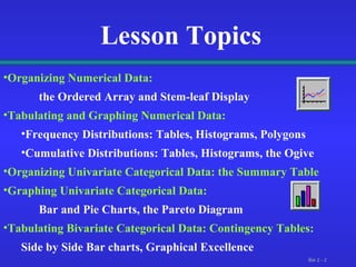
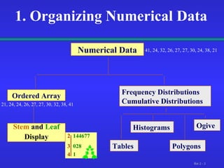
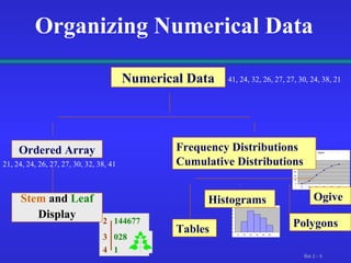
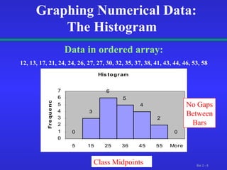
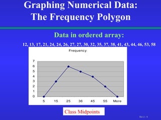
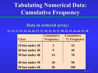
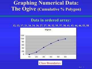
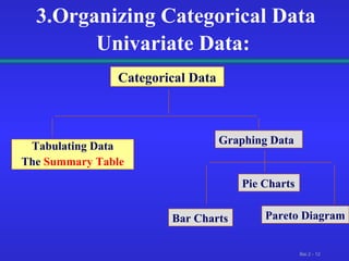
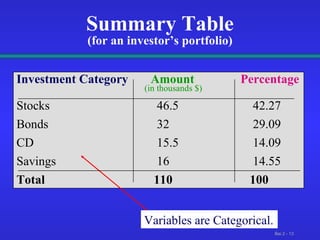
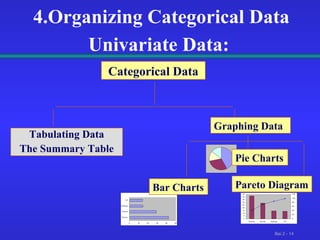
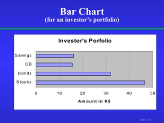
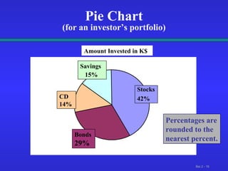
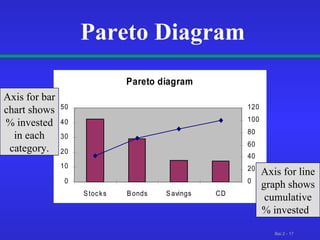
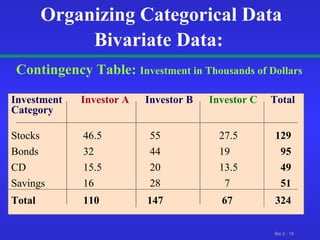
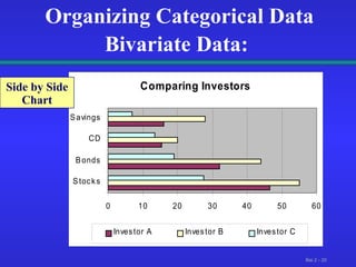
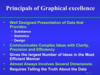
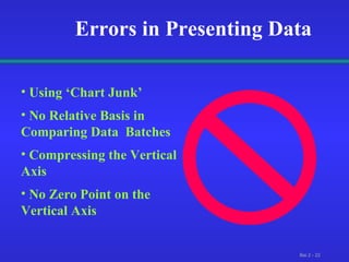
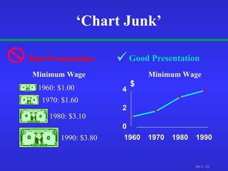
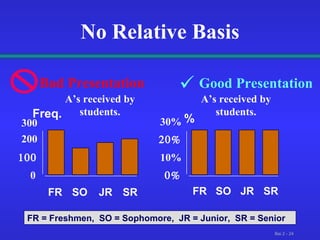
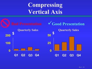
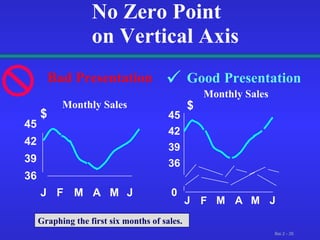
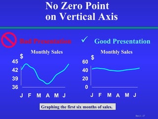
Statistics  for Management Presenting Data in Tables and Charts
Lesson Topics Organizing Numerical Data: the Ordered Array and Stem-leaf Display Tabulating and Graphing Numerical Data: Frequency Distributions: Tables, Histograms, Polygons Cumulative Distributions: Tables, Histograms, the Ogive  Organizing Univariate Categorical Data: the Summary Table Graphing Univariate Categorical Data: Bar and Pie Charts, the Pareto Diagram Tabulating Bivariate Categorical Data: Contingency Tables: Side by Side Bar charts, Graphical Excellence
2   144677 3  028 4   1 1. Organizing Numerical Data  Numerical Data Ordered Array Stem   and  Leaf Display Frequency Distributions Cumulative Distributions Histograms Polygons Ogive Tables 41, 24, 32, 26, 27, 27, 30, 24, 38, 21 21, 24, 24, 26, 27, 27, 30, 32, 38, 41
2  1 4 4 6 7 7  Organizing Numerical Data: Data in Raw form (as collected): 24, 26, 24, 21, 27, 27, 30, 41, 32, 38 Date  Ordered  from Smallest to Largest:   21, 24, 24, 26, 27, 27,  3 0 , 32, 38, 41 Stem   and  Leaf   display: 3  0 2 8 4  1
2   144677 3  028 4   1 Organizing Numerical Data  Numerical Data Ordered Array Stem   and   Leaf Display Histograms Ogive Tables 41, 24, 32, 26, 27, 27, 30, 24, 38, 21 21, 24, 24, 26, 27, 27, 30, 32, 38, 41 Frequency Distributions Cumulative Distributions Polygons
2.Tabulating Numerical Data:  Sort Raw Data in Ascending Order: 12, 13, 17, 21, 24, 24, 26, 27, 27, 30, 32, 35, 37, 38, 41, 43, 44, 46, 53, 58 Find Range:   58 - 12  = 46 Select Number of Classes:  5   (usually between 5 and 15) Compute Class Interval ( width ):  10  ( 46/5 then round up ) Determine Class Boundaries ( limits ):   10, 20, 30, 40, 50 Compute Class  Midpoints:  15, 25, 35, 45,  55 Count Observations & Assign to Classes
Tabulating Numerical Data: Frequency Distributions Data in ordered array: 12, 13, 17, 21, 24, 24, 26, 27, 27, 30, 32, 35, 37, 38, 41, 43, 44, 46, 53, 58 Class  Frequency 10 but under 20  3  .15  15 20 but under 30   6  .30  30 30 but under 40   5  .25  25  40 but under 50  4  .20  20 50 but under 60   2  .10  10  Total   20  1  100 Relative Frequency Percentage
Graphing Numerical Data: The Histogram  Data in ordered array: 12, 13, 17, 21, 24, 24, 26, 27, 27, 30, 32, 35, 37, 38, 41, 43, 44, 46, 53, 58 Class Midpoints No Gaps Between Bars
Graphing Numerical Data: The Frequency Polygon Data in ordered array: 12, 13, 17, 21, 24, 24, 26, 27, 27, 30, 32, 35, 37, 38, 41, 43, 44, 46, 53, 58 Class Midpoints
  Cumulative  Cumulative Class    Frequency  % Frequency   10 but under 20  3  15 20 but under 30   9  45 30 but under 40   14  70  40 but under 50  18  90 50 but under 60   20  100  Tabulating Numerical Data: Cumulative Frequency Data in ordered array: 12, 13, 17, 21, 24, 24, 26, 27, 27, 30, 32, 35, 37, 38, 41, 43, 44, 46, 53, 58
Graphing Numerical Data: The Ogive  (Cumulative % Polygon) Data in ordered array: 12, 13, 17, 21, 24, 24, 26, 27, 27, 30, 32, 35, 37, 38, 41, 43, 44, 46, 53, 58 Class Boundaries
3.Organizing Categorical Data Univariate Data:   Categorical Data Tabulating Data The  Summary Table Graphing Data Pie Charts Pareto Diagram Bar Charts
Summary Table (for an investor’s portfolio) Investment Category   Amount Percentage (in thousands $) Stocks   46.5   42.27 Bonds   32   29.09 CD   15.5   14.09 Savings   16   14.55 Total   110   100 Variables are Categorical.
4.Organizing Categorical Data Univariate Data:   Categorical Data Tabulating Data The Summary Table Graphing Data Pie Charts Pareto Diagram Bar Charts
Bar Chart (for an investor’s portfolio)
Pie Chart (for an investor’s portfolio) Percentages are rounded to the nearest percent. Amount Invested in K$ Savings  15% CD 14% Bonds  29% Stocks 42%
Pareto Diagram Axis for bar chart shows % invested in each category. Axis for line graph shows cumulative % invested .
  5. Organizing  Bivariate Categorical Data Contingency Tables Side by Side Charts
Organizing Categorical Data Bivariate Data:   Contingency Table:  Investment in Thousands of Dollars Investment  Investor A  Investor B  Investor C  Total Category Stocks   46.5   55   27.5   129 Bonds   32   44   19   95 CD   15.5  20  13.5  49 Savings   16   28  7  51 Total   110   147    67   324
Organizing Categorical Data Bivariate Data:   Side by Side Chart
Principals of Graphical excellence Well Designed Presentation of Data that Provides: Substance Statistics Design Communicates Complex Ideas with Clarity, Precision and Efficiency Gives the largest Number of Ideas in the Most Efficient Manner Almost Always Involves Several Dimensions Requires Telling the Truth About the Data
Using ‘Chart Junk’ No Relative Basis in Comparing Data  Batches Compressing the Vertical Axis No Zero Point on the Vertical Axis  Errors in Presenting Data
‘ Chart Junk’ Good Presentation 1960: $1.00 1970: $1.60 1980: $3.10 1990: $3.80 Minimum Wage Minimum Wage 0 2 4 1960 1970 1980 1990 $ Bad Presentation 
No Relative Basis Good Presentation A’s received by students. A’s received by students. Bad Presentation 0  200 300 FR SO JR SR Freq.  10%  30% FR SO JR SR % FR = Freshmen,  SO = Sophomore,  JR = Junior,  SR = Senior 
Compressing Vertical Axis Good Presentation Quarterly Sales Quarterly Sales Bad Presentation 0 25 50 Q1 Q2 Q3 Q4 $ 0 100 200 Q1 Q2 Q3 Q4 $ 
No Zero Point  on Vertical Axis Good   Presentation Monthly Sales Monthly Sales Bad Presentation 0 39 42 45 J F M A M J $ 36 39 42 45 J F M A M J $ Graphing the first six months of sales. 36 
No Zero Point  on Vertical Axis Good Presentation Monthly Sales Monthly Sales Bad Presentation 0 20 40 60 J F M A M J $ 36 39 42 45 J F M A M J $ Graphing the first six months of sales. 
Lesson Summary Organized Numerical Data: the Ordered Array and Stem-leaf Display Tabulated and Graphed Numerical Data Frequency Distributions:  Tables, Histograms, Polygons Cumulative Distributions:   Tables, the Ogive   Organized Univariate Categorical Data:  the Summary Table Graphed Univariate Categorical Data: Bar and Pie Charts, the Pareto diagram Tabulated Bivariate Categorical Data:   Contingency Tables and Side by  Side charts Discussed Graphical Excellence and Common Errors in  Presenting Data

Lesson02_Static.11

  • 1.
    Statistics forManagement Presenting Data in Tables and Charts
  • 2.
    Lesson Topics OrganizingNumerical Data: the Ordered Array and Stem-leaf Display Tabulating and Graphing Numerical Data: Frequency Distributions: Tables, Histograms, Polygons Cumulative Distributions: Tables, Histograms, the Ogive Organizing Univariate Categorical Data: the Summary Table Graphing Univariate Categorical Data: Bar and Pie Charts, the Pareto Diagram Tabulating Bivariate Categorical Data: Contingency Tables: Side by Side Bar charts, Graphical Excellence
  • 3.
    2 144677 3 028 4 1 1. Organizing Numerical Data Numerical Data Ordered Array Stem and Leaf Display Frequency Distributions Cumulative Distributions Histograms Polygons Ogive Tables 41, 24, 32, 26, 27, 27, 30, 24, 38, 21 21, 24, 24, 26, 27, 27, 30, 32, 38, 41
  • 4.
    2 14 4 6 7 7 Organizing Numerical Data: Data in Raw form (as collected): 24, 26, 24, 21, 27, 27, 30, 41, 32, 38 Date Ordered from Smallest to Largest: 21, 24, 24, 26, 27, 27, 3 0 , 32, 38, 41 Stem and Leaf display: 3 0 2 8 4 1
  • 5.
    2 144677 3 028 4 1 Organizing Numerical Data Numerical Data Ordered Array Stem and Leaf Display Histograms Ogive Tables 41, 24, 32, 26, 27, 27, 30, 24, 38, 21 21, 24, 24, 26, 27, 27, 30, 32, 38, 41 Frequency Distributions Cumulative Distributions Polygons
  • 6.
    2.Tabulating Numerical Data: Sort Raw Data in Ascending Order: 12, 13, 17, 21, 24, 24, 26, 27, 27, 30, 32, 35, 37, 38, 41, 43, 44, 46, 53, 58 Find Range: 58 - 12 = 46 Select Number of Classes: 5 (usually between 5 and 15) Compute Class Interval ( width ): 10 ( 46/5 then round up ) Determine Class Boundaries ( limits ): 10, 20, 30, 40, 50 Compute Class Midpoints: 15, 25, 35, 45, 55 Count Observations & Assign to Classes
  • 7.
    Tabulating Numerical Data:Frequency Distributions Data in ordered array: 12, 13, 17, 21, 24, 24, 26, 27, 27, 30, 32, 35, 37, 38, 41, 43, 44, 46, 53, 58 Class Frequency 10 but under 20 3 .15 15 20 but under 30 6 .30 30 30 but under 40 5 .25 25 40 but under 50 4 .20 20 50 but under 60 2 .10 10 Total 20 1 100 Relative Frequency Percentage
  • 8.
    Graphing Numerical Data:The Histogram Data in ordered array: 12, 13, 17, 21, 24, 24, 26, 27, 27, 30, 32, 35, 37, 38, 41, 43, 44, 46, 53, 58 Class Midpoints No Gaps Between Bars
  • 9.
    Graphing Numerical Data:The Frequency Polygon Data in ordered array: 12, 13, 17, 21, 24, 24, 26, 27, 27, 30, 32, 35, 37, 38, 41, 43, 44, 46, 53, 58 Class Midpoints
  • 10.
    Cumulative Cumulative Class Frequency % Frequency 10 but under 20 3 15 20 but under 30 9 45 30 but under 40 14 70 40 but under 50 18 90 50 but under 60 20 100 Tabulating Numerical Data: Cumulative Frequency Data in ordered array: 12, 13, 17, 21, 24, 24, 26, 27, 27, 30, 32, 35, 37, 38, 41, 43, 44, 46, 53, 58
  • 11.
    Graphing Numerical Data:The Ogive (Cumulative % Polygon) Data in ordered array: 12, 13, 17, 21, 24, 24, 26, 27, 27, 30, 32, 35, 37, 38, 41, 43, 44, 46, 53, 58 Class Boundaries
  • 12.
    3.Organizing Categorical DataUnivariate Data: Categorical Data Tabulating Data The Summary Table Graphing Data Pie Charts Pareto Diagram Bar Charts
  • 13.
    Summary Table (foran investor’s portfolio) Investment Category Amount Percentage (in thousands $) Stocks 46.5 42.27 Bonds 32 29.09 CD 15.5 14.09 Savings 16 14.55 Total 110 100 Variables are Categorical.
  • 14.
    4.Organizing Categorical DataUnivariate Data: Categorical Data Tabulating Data The Summary Table Graphing Data Pie Charts Pareto Diagram Bar Charts
  • 15.
    Bar Chart (foran investor’s portfolio)
  • 16.
    Pie Chart (foran investor’s portfolio) Percentages are rounded to the nearest percent. Amount Invested in K$ Savings 15% CD 14% Bonds 29% Stocks 42%
  • 17.
    Pareto Diagram Axisfor bar chart shows % invested in each category. Axis for line graph shows cumulative % invested .
  • 18.
    5.Organizing Bivariate Categorical Data Contingency Tables Side by Side Charts
  • 19.
    Organizing Categorical DataBivariate Data: Contingency Table: Investment in Thousands of Dollars Investment Investor A Investor B Investor C Total Category Stocks 46.5 55 27.5 129 Bonds 32 44 19 95 CD 15.5 20 13.5 49 Savings 16 28 7 51 Total 110 147 67 324
  • 20.
    Organizing Categorical DataBivariate Data: Side by Side Chart
  • 21.
    Principals of Graphicalexcellence Well Designed Presentation of Data that Provides: Substance Statistics Design Communicates Complex Ideas with Clarity, Precision and Efficiency Gives the largest Number of Ideas in the Most Efficient Manner Almost Always Involves Several Dimensions Requires Telling the Truth About the Data
  • 22.
    Using ‘Chart Junk’No Relative Basis in Comparing Data Batches Compressing the Vertical Axis No Zero Point on the Vertical Axis Errors in Presenting Data
  • 23.
    ‘ Chart Junk’Good Presentation 1960: $1.00 1970: $1.60 1980: $3.10 1990: $3.80 Minimum Wage Minimum Wage 0 2 4 1960 1970 1980 1990 $ Bad Presentation 
  • 24.
    No Relative BasisGood Presentation A’s received by students. A’s received by students. Bad Presentation 0  200 300 FR SO JR SR Freq.  10%  30% FR SO JR SR % FR = Freshmen, SO = Sophomore, JR = Junior, SR = Senior 
  • 25.
    Compressing Vertical AxisGood Presentation Quarterly Sales Quarterly Sales Bad Presentation 0 25 50 Q1 Q2 Q3 Q4 $ 0 100 200 Q1 Q2 Q3 Q4 $ 
  • 26.
    No Zero Point on Vertical Axis Good Presentation Monthly Sales Monthly Sales Bad Presentation 0 39 42 45 J F M A M J $ 36 39 42 45 J F M A M J $ Graphing the first six months of sales. 36 
  • 27.
    No Zero Point on Vertical Axis Good Presentation Monthly Sales Monthly Sales Bad Presentation 0 20 40 60 J F M A M J $ 36 39 42 45 J F M A M J $ Graphing the first six months of sales. 
  • 28.
    Lesson Summary OrganizedNumerical Data: the Ordered Array and Stem-leaf Display Tabulated and Graphed Numerical Data Frequency Distributions: Tables, Histograms, Polygons Cumulative Distributions: Tables, the Ogive Organized Univariate Categorical Data: the Summary Table Graphed Univariate Categorical Data: Bar and Pie Charts, the Pareto diagram Tabulated Bivariate Categorical Data: Contingency Tables and Side by Side charts Discussed Graphical Excellence and Common Errors in Presenting Data