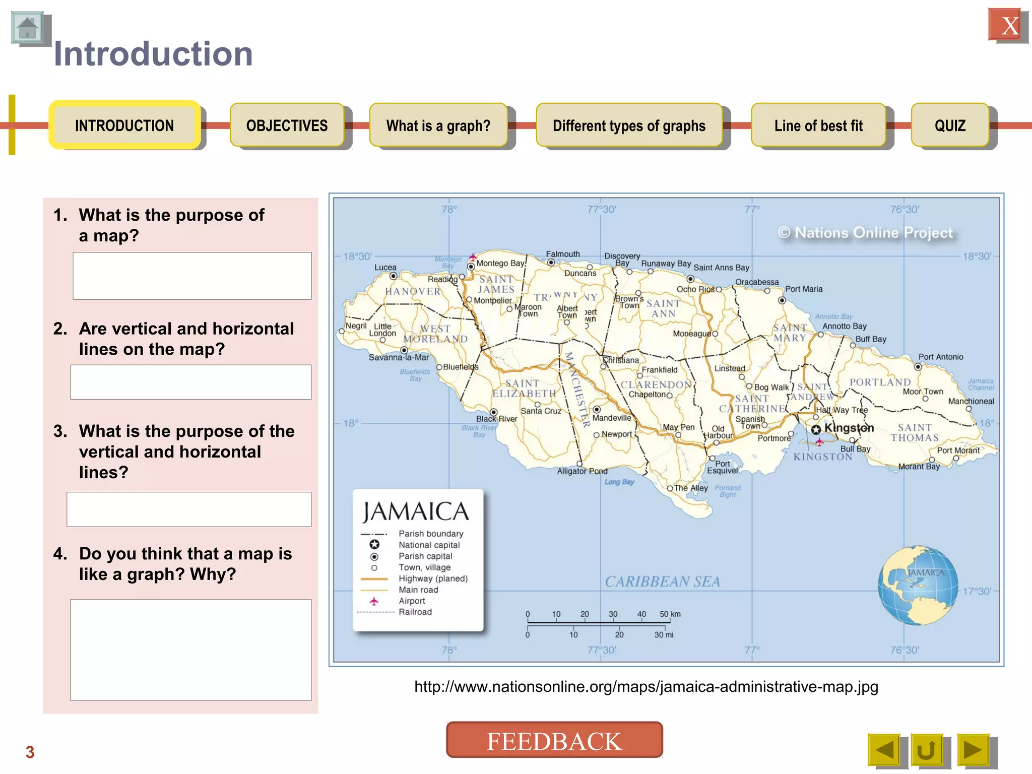
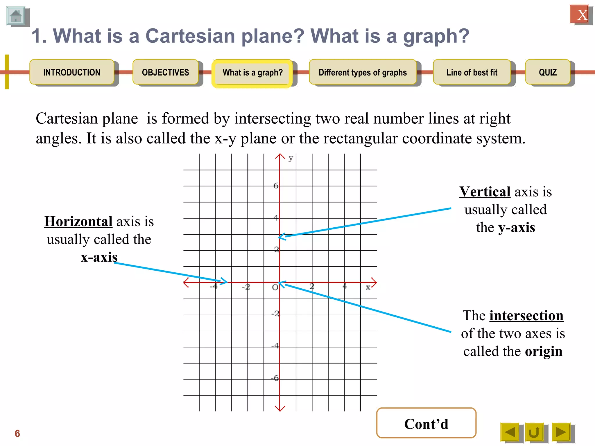
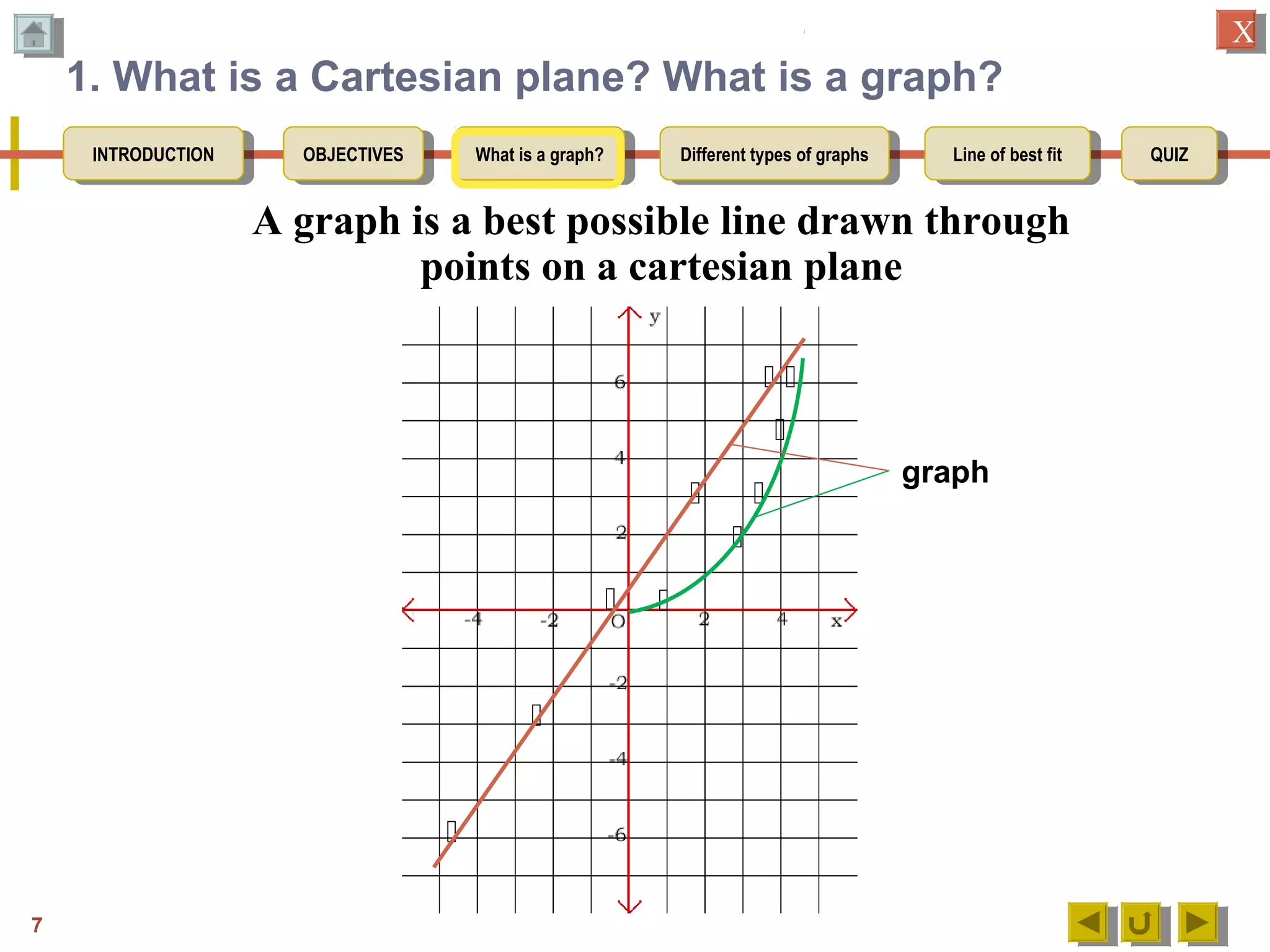
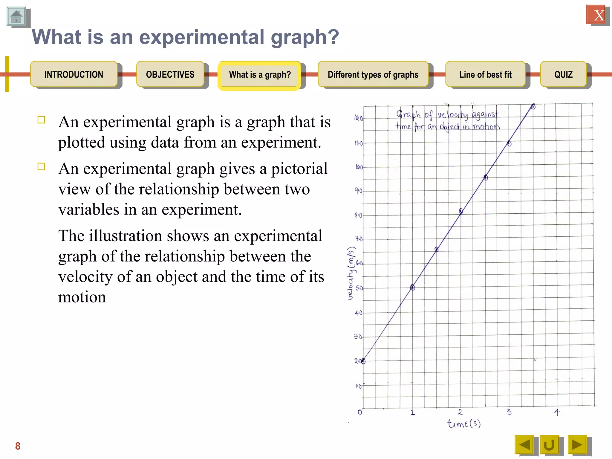
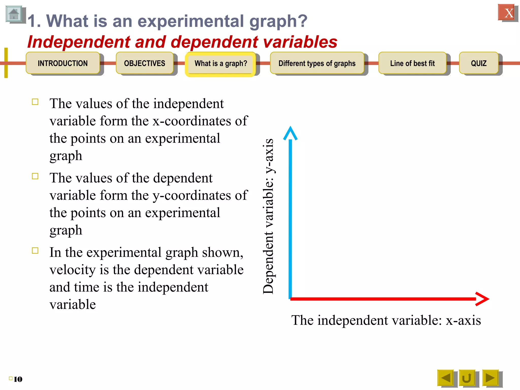
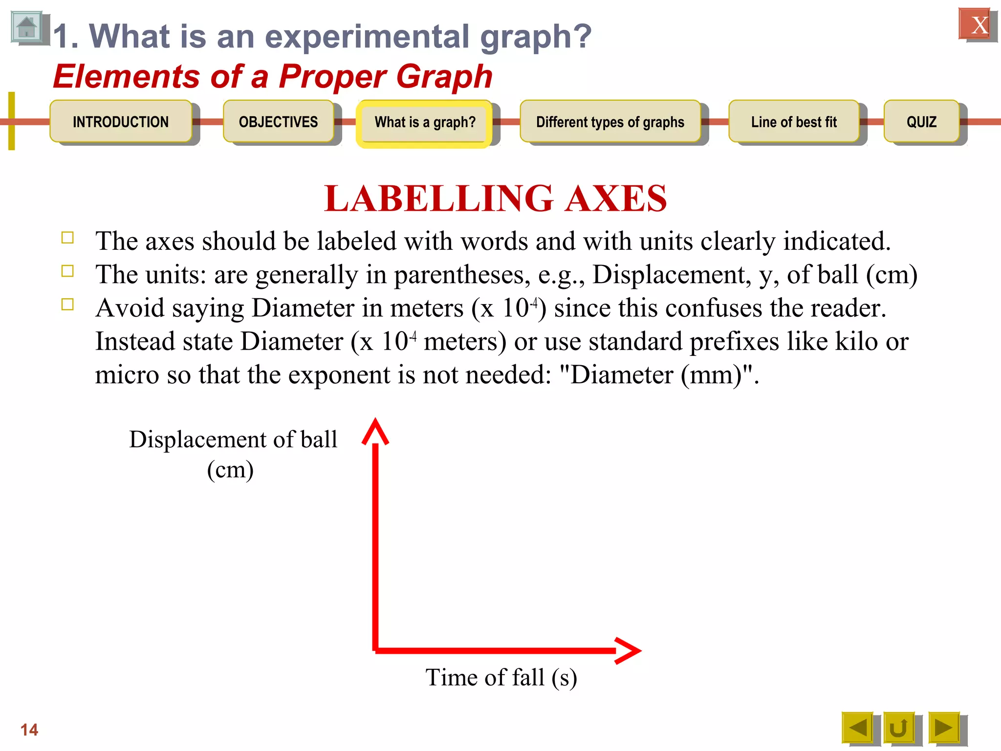
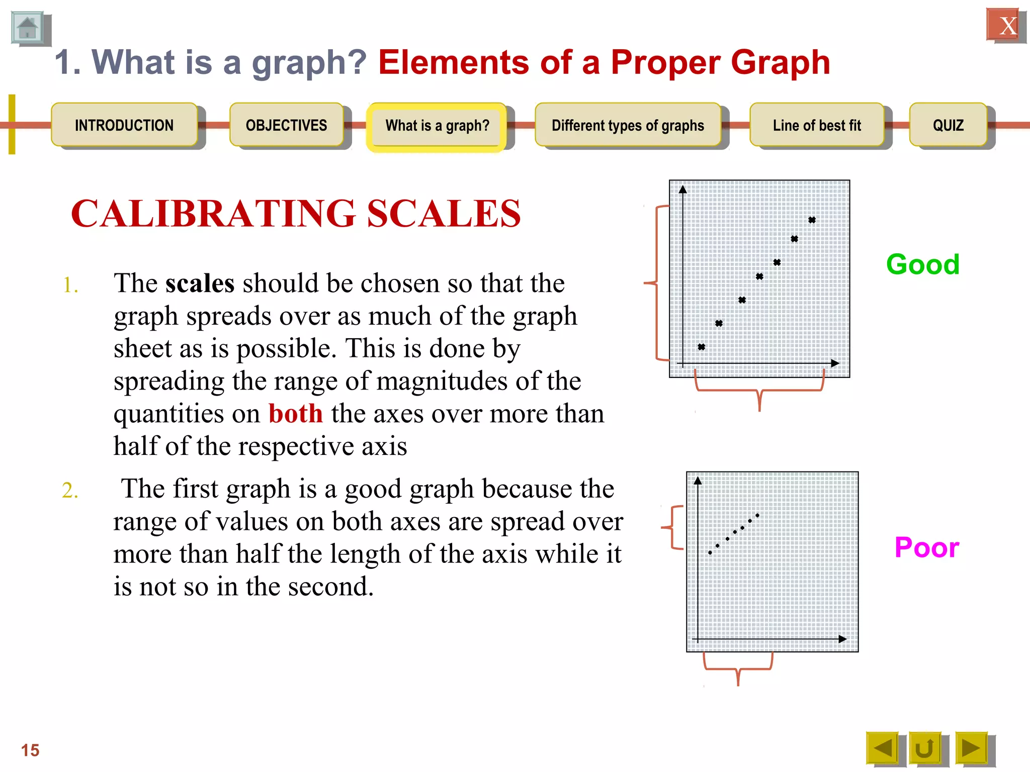
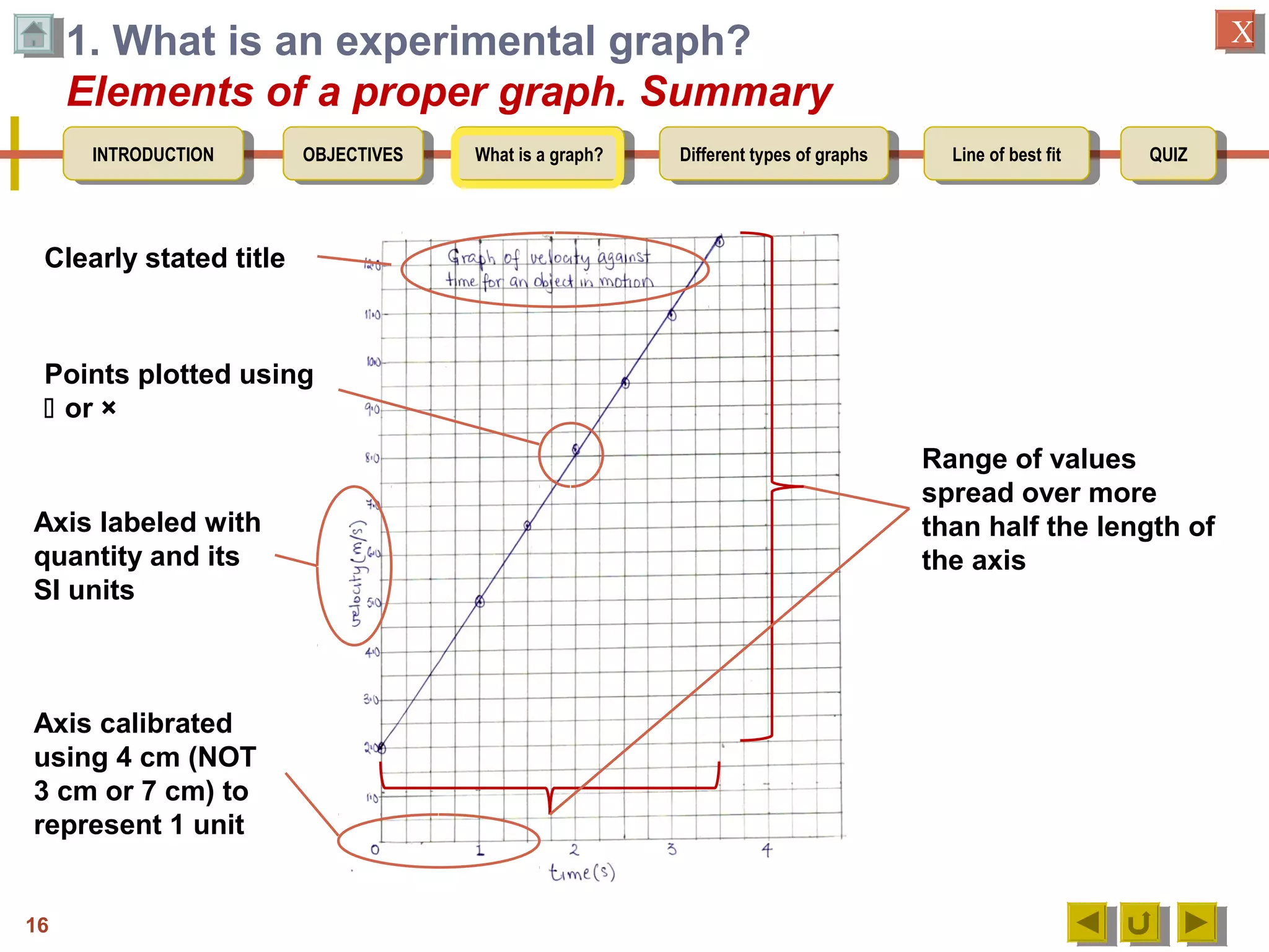
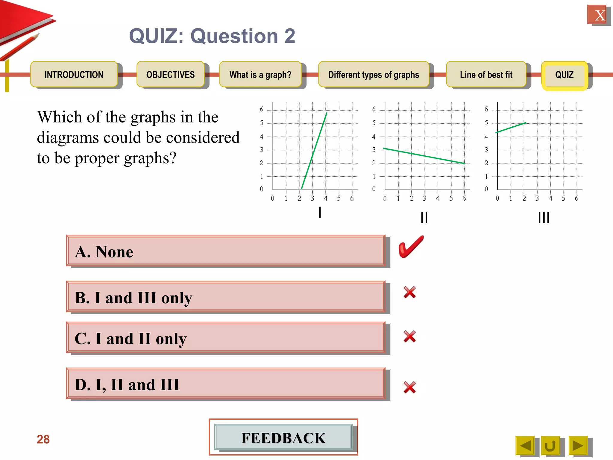
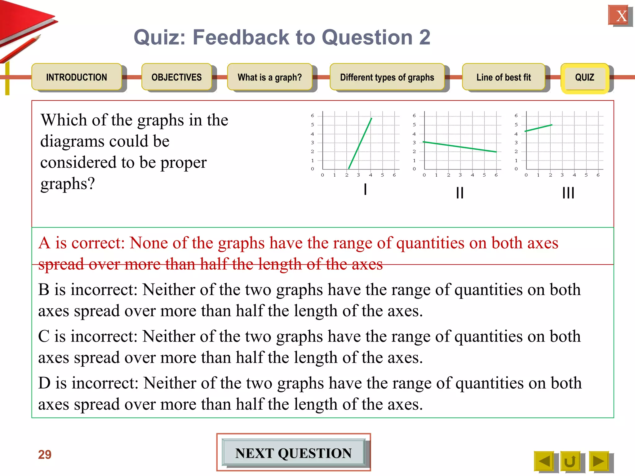
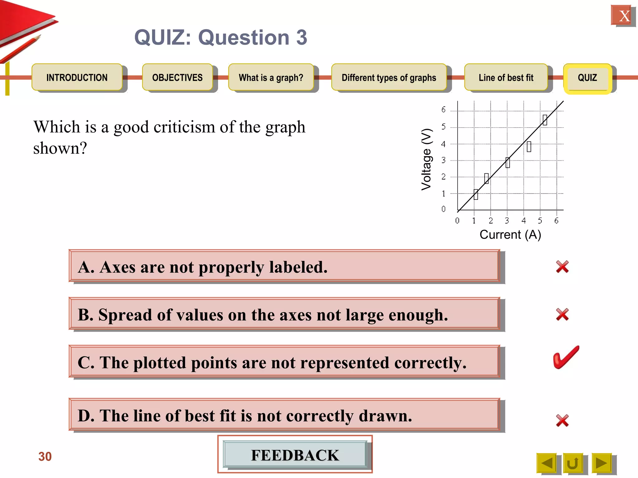
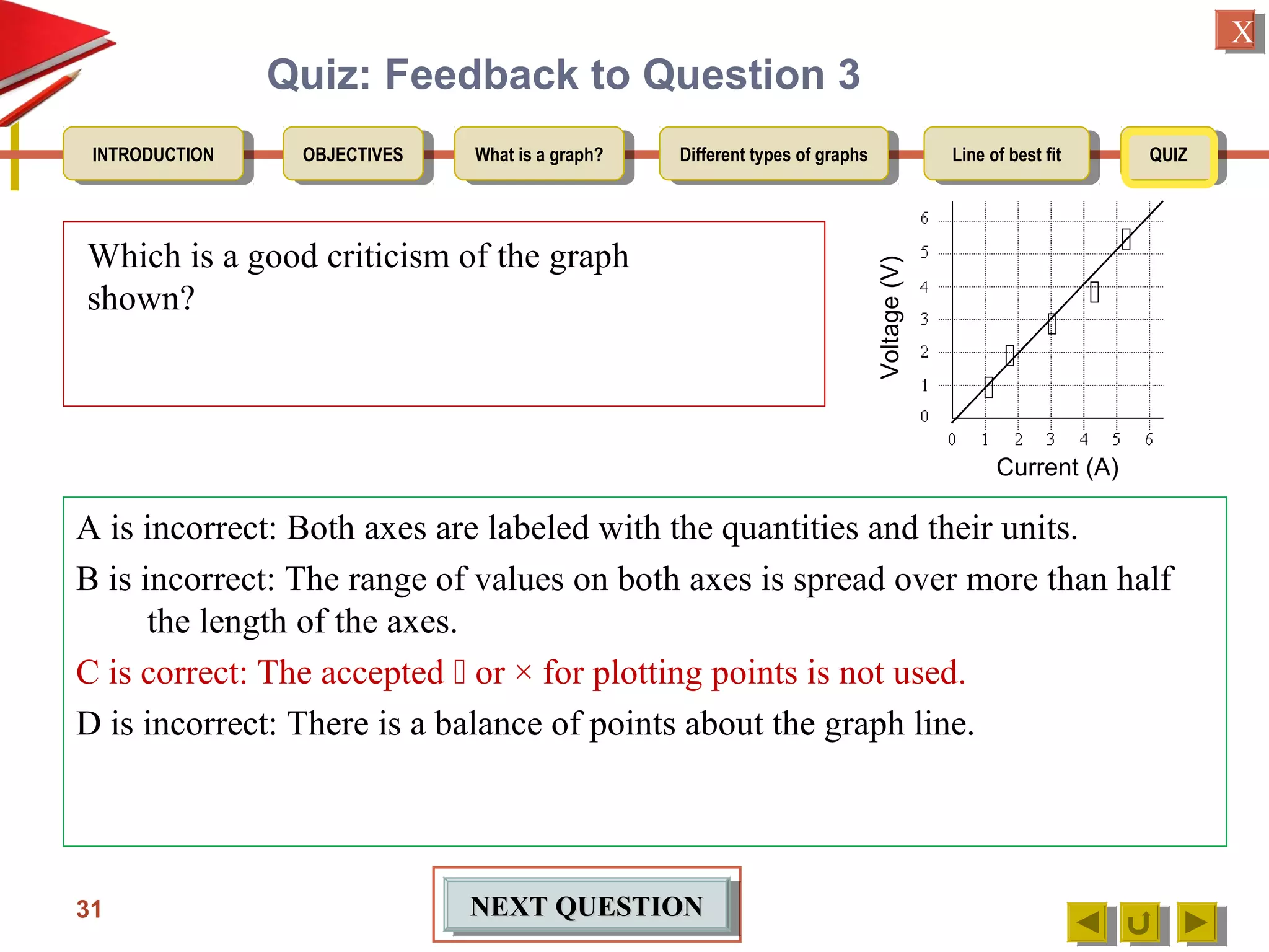
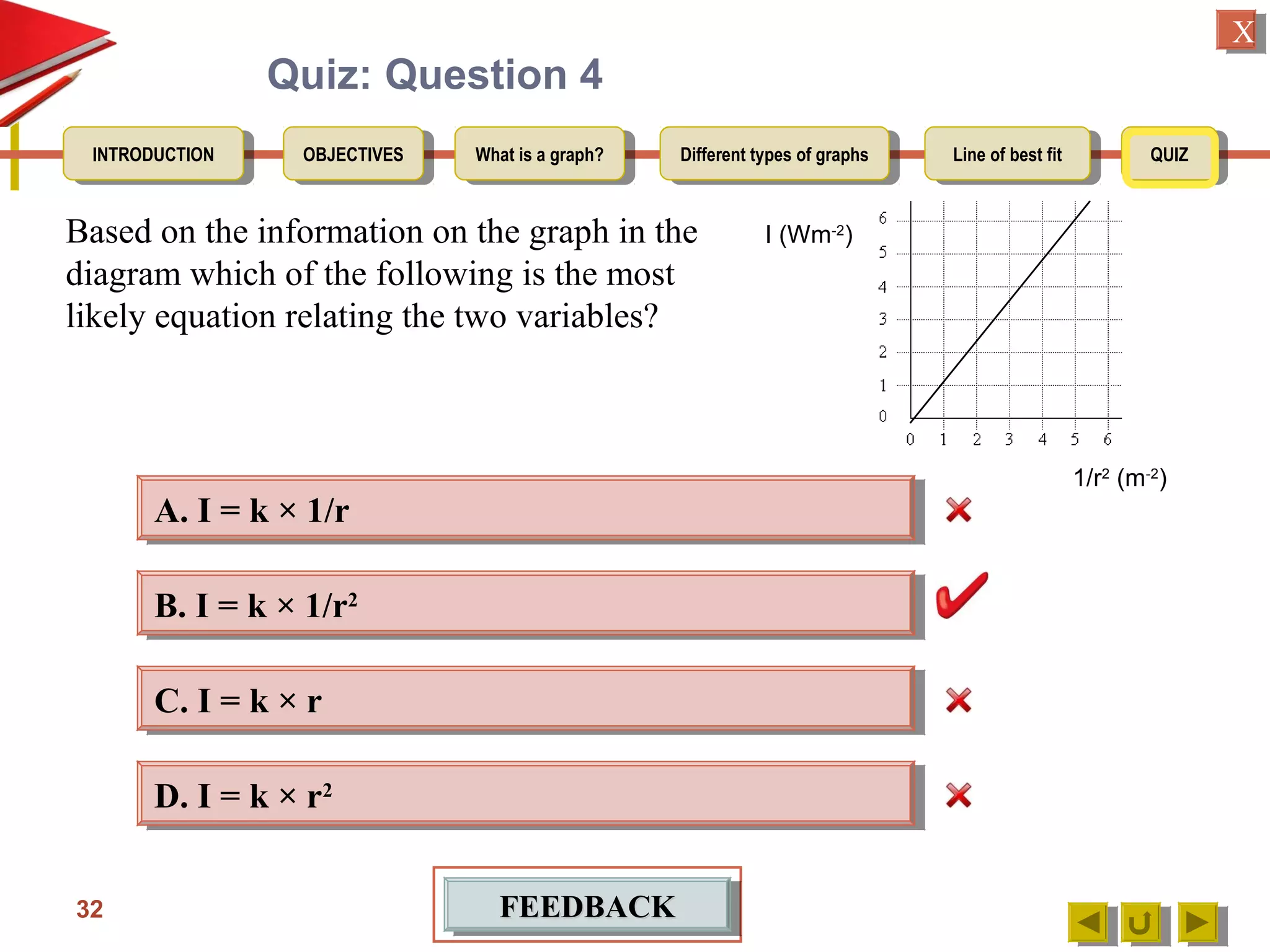
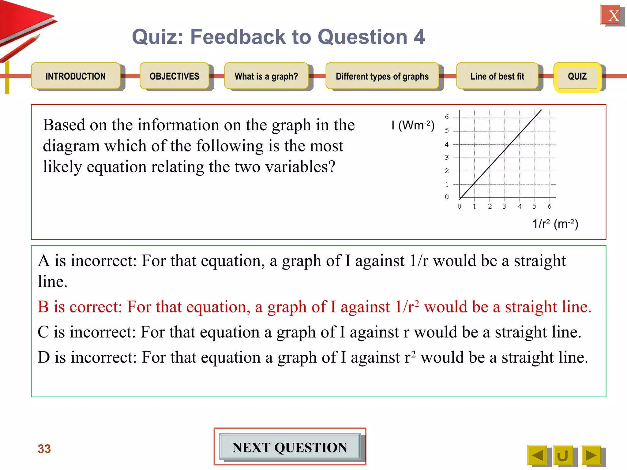
The document provides an introduction to graphs, including:
1. Defining a graph as a line drawn through points on a Cartesian plane.
2. Explaining that an experimental graph shows the relationship between an independent and dependent variable from an experiment.
3. Detailing the key elements of a proper graph, including a title, labeled and calibrated axes, and points that take up over half the length of the axes.
Graphs are used to visually represent numerical data or relationships between objects. There are different types of graphs including bar graphs, pictographs, and digraphs. Bar graphs display data using rectangular bars to make comparisons easy to see. Pictographs use pictures to represent quantities. Digraphs are directed graphs represented by nodes connected by arrows to model relationships. Some key aspects are then described in more detail such as symmetric and asymmetric graphs, and examples are provided.
Graphs can be used to visually represent numerical data or relationships between objects. There are different types of graphs like bar graphs, pictographs, and line graphs that display data in various ways. Graphs have advantages like showing qualitative behavior and overall features of data at a glance, but may lack accuracy. The document then discusses different types of graphs like directed/undirected graphs and symmetric/asymmetric graphs in more detail.
Download the original presentation for animation and clear understanding. This Presentation describes the concepts of Engineering Drawing of VTU Syllabus. However same can also be used for learning drawing concepts. Please write to me for suggestions and criticisms here: hareeshang@gmail.com or visit this website for more details: www.hareeshang.wikifoundry.com.
The document discusses textile mathematics and different types of graphs used in textiles and the textile industry. It provides examples of linear graphs, pictographs, line graphs, bar graphs, and pie charts. It also defines what a graph is and discusses coordinates of graphs. Key types of relationships that can be displayed graphically include linear, periodic, exponential, and power functions.
This lecture contains the detail of isometric projections of an object. This will improve your skills to draw isometric views which is the major part of engineering drawings.
The document describes the Spanish mathematics curriculum for secondary school students aged 12-16. It is divided into four years (ESO 1-4). The curriculum covers topics in numbers, algebra, geometry, functions/graphs, statistics, and probability. In the later years (ESO 3-4), students can choose between Option A (terminal math) or Option B (preparing for further math study). Both options cover the same core topics in greater depth and complexity each year.
Let's solve this step-by-step:
1) Given: Distance between Delhi and Agra is 200 km
It is represented by a line 5 cm long on the map
2) To find R.F.:
Actual Length (L) = 200 km
Length on map (l) = 5 cm
R.F. = L/l = 200000/5000 = 1/40,000
3) Maximum distance to be measured is 600 km
4) Length of scale = R.F. x Maximum distance
= 1/40,000 x 600 km = 15 cm
5) Draw a line of length 15 cm
6) Divide it into 15 equal parts. Each part will represent 40
The document describes the mathematics curriculum for 16-18 year old students in Spain. It is divided into 4 sections: Mathematics I, Mathematics II, Applied Mathematics I, and Applied Mathematics II. The courses cover topics such as algebra, geometry, analysis, statistics, probability, matrices, and functions. Students can choose either science and technology or social studies itineraries.
The document defines terminology and notation used in Euclidean geometry. It provides definitions for terms like parallel, perpendicular, congruent, and similar. It also describes conventions for naming angles, polygons, and parallel lines. The document concludes by outlining rules for constructing proofs in geometry, including stating given information, constructions, theorems, and logical reasoning.
Geometry has a long history dating back to ancient times. The term 'Geometry' comes from the Greek words 'Geo' meaning Earth and 'metron' meaning Measurement. Geometric ideas were developed due to needs in art, architecture, construction and land measurement. Even today, geometric concepts are reflected in art, measurements, architecture and engineering. Basic geometric shapes include points, lines, line segments, rays, curves and polygons. Points determine locations, lines extend indefinitely, line segments connect two end points, rays start at a point and extend in one direction, curves are non-straight shapes, and polygons are closed figures made of line segments.
All given topics covered with animations how to solve problem of E.G.
1. Scales
2. Engineering Curves - I
3. Engineering Curves - II
4. Loci of Points
5. Orthographic Projections - Basics
6. Conversion of Pictorial View into Orthographic Views
7. Projections of Points and Lines
8. Projection of Planes
9. Projection of Solids
10. Sections & Development
11. Intersection of Surfaces
12. Isometric Projections
13. Exercises
14. Solutions – Applications of Lines
The document is an active learning assignment prepared by 4 students for their Electrical Engineering batch. It provides information on engineering drawing including: the definition of engineering drawing as a way to communicate engineers' ideas through graphical language; types of drawings like freehand and instrument drawings; drawing sheet sizes and scales; line types used in drawings; common drawing equipment; basic geometric shapes; orthographic projections; and engineering curves. Standard formatting of drawings is also discussed.
Userfull for engineers....
Engineering graphics..
PPT made by our sir "A.D.Rajput..
Contact me on whatsapp for more updates.... num-9898528376
Or find me on fb/iamharsh.prajapati
Thnx :)
Okay, here are the steps to solve this problem:
1) The sphere has a radius of 8 inches
2) To find the volume of a sphere we use the formula: V = (4/3)πr^3
3) Plugging in the values:
V = (4/3)π(8)^3
V = (4/3)π(512)
V = 1024π
So the volume of the spherical fish tank with a radius of 8 inches is 1024π cubic inches.
This document provides information about mechanical engineering drawing including:
1. It outlines the syllabus for the ME 1200 Mechanical Engineering Drawing course which covers topics like orthographic projection, oblique projection, isometric projection, and descriptive geometry.
2. It describes the purpose and types of technical drawings including pictorial drawings, orthographic drawings, and dimensioning drawings. Common drawing elements like lines, dimensions, and notes are explained.
3. Guidelines are provided for reading drawings including understanding different line types, placement of views, and handling drawings properly. Instrument requirements are also listed.
Graph theory is the study of graphs, which are mathematical structures used to model pairwise relationships between objects. A graph consists of vertices and edges that connect the vertices. Graph theory is used in computer science to model problems that can be represented as networks, such as determining routes in a city or designing circuits. It allows analyzing properties of graphs like connectivity and determining the minimum number of resources required. A graph can be represented using an adjacency matrix or adjacency list to store information about its vertices and edges.
The document is a student project on geometry by Sitikantha Mishra. It begins by defining key geometric concepts like points, lines, line segments, rays, angles, planes, parallel and intersecting lines. It then discusses 2D and 3D geometric figures. The document also provides an overview of geometry in ancient India as discussed in texts like the Sulba Sutras and the contributions of mathematicians like Brahmagupta. It then discusses Euclid and the importance of geometry in daily life and architecture. Symmetry and the importance of learning geometry are also covered.
This document is a presentation on analytic geometry that was compiled from 6 different sources. It introduces analytic geometry and its history, developed by Descartes and Fermat in the 1630s. It explains that analytic geometry uses algebraic equations to describe geometric shapes on a coordinate system. This allows geometric relationships to be represented by algebraic equations using techniques like slope, gradients, and intercepts. It also covers topics like the Cartesian plane, lines, perpendicular and parallel lines, and finding equations of lines.
This document provides an overview of analytical geometry. It discusses how analytical geometry was introduced in the 1630s and aided the development of calculus. Rene Descartes and Pierre de Fermat independently developed the foundations of analytical geometry. It describes the Cartesian plane and key concepts like the x-axis, y-axis, origin, coordinates, slope of a line, angle between lines, slope of parallel and perpendicular lines, and the equation of a circle. Sample problems and references are also included.
This document provides an overview of analytic geometry in 3 paragraphs or less. It introduces analytic geometry as a branch of mathematics that uses algebraic equations to describe geometric figures on a coordinate system. It was developed in the 1630s by Descartes and Fermat and allowed geometry and algebra to be linked by describing geometric concepts like points and lines with real numbers and equations. The key concept is using a coordinate system to assign unique real number coordinates to each point, allowing geometric shapes to be represented by algebraic equations.
Graphic representation of technological projects
The document discusses various types of technical drawings and their purposes. It provides guidance on techniques for creating drawings, including appropriate tools, line types, annotation rules, perspectives, and scale. Technical drawings must follow specific standards and rules to effectively communicate technical designs and instructions.
It includes:
Introduction to Graphs
Applications
Graph representation
Graph terminology
Graph operations
Adding vertex and edge in Adjacency matrix representation using C++ program
Adjacency List implementation in C++
Homework Problems
References
The document is a textbook on analytic geometry. It provides an overview of some basic algebraic principles used in analytic geometry, including definitions of constants, variables, equations, and their degrees. It also discusses graphical representation of real numbers on a number line and imaginary quantities.
This document provides instruction on different types of graphs, including bar graphs, histograms, line graphs, pie charts, area graphs, and scatter plots. It discusses the key components of setting up a graph, including the title, axes, scale, intervals, and labels. Examples are given of experiments with identified dependent and independent variables and how they would be graphed. The document concludes with sample problems asking students to identify the appropriate graph, variables, and title and draw the graph to display the given data.
There are 6 main types of graphs used to present data: 1) pictographs use pictures to represent data simply for small numbers, 2) bar graphs use columns to compare bigger numbers and categories, 3) double bar graphs compare sets of data by grouping results for the same category, 4) circle graphs/pie charts represent proportions as percentages to compare samples of different sizes, 5) line graphs track values measured at intervals over time, and 6) double line graphs have two or more lines on the same graph. The best graph type depends on the purpose and amount of data being presented.
Graphic aids 1. chart A lecture By Allah Dad Khan VP The University Of Agric...Mr.Allah Dad Khan
1. The document discusses various types of charts that can be used for data visualization including narrative charts, tabulation charts, bar charts, pie charts, flow charts, line charts, area charts, column charts, scatter charts, polar charts, doughnut charts, bubble charts, and candlestick charts.
2. It provides brief descriptions of each chart type, explaining their purpose and how they represent and compare data visually.
3. Examples include that bar charts are like column charts with switched axes, pie charts show proportions of a whole, line charts connect data points over time, and candlestick charts specifically show open, high, low, and close prices.
Prelude
PART (A) TYPES OF GRAPHS
Line graphs
Pie charts
Bar graph
Scatter plot
Stem and plot
Histogram
Frequency polygon
Frequency curve
Cumulative frequency or ogives
PART (B) FLOW CHART
PART (C) LOG AND SEMILOG GRAPH
This document provides instruction on applying derivatives to solve various types of application problems. It begins by outlining objectives of analyzing and solving application problems involving derivatives as instantaneous rates of change or tangent line slopes. Examples of application problems covered include writing equations of tangent and normal lines, curve tracing, optimization problems, and related rates problems involving time rates. The document then provides definitions and examples of using derivatives to find slopes of curves and tangent lines. It also covers concepts like concavity, points of inflection, maxima/minima, and solving optimization problems using derivatives. Finally, it gives examples of solving related rates problems involving time-dependent variables.
The document discusses various types of statistical diagrams and graphs that can be used to represent numerical data in a visual format. It describes line diagrams, bar diagrams, component bar diagrams, percentage bar diagrams, pie charts, pictograms, frequency graphs including histograms, frequency polygons, frequency curves and ogives. It also covers scatter diagrams, dot plots, stem-and-leaf plots, box-and-whisker plots and their uses in visually representing data distributions.
This document provides an overview of unit 3 in statistics which focuses on creating and interpreting different types of graphs including bar graphs, histograms, line graphs, and circle graphs. It describes key concepts such as determining the appropriate graph to represent a data set, creating graphs with or without technology, interpreting trends in graphs, and solving problems that involve graph interpretation. The document also provides examples and guidance on how to properly construct different graph types such as defining titles, axes, scales, intervals and labels. It distinguishes between bar graphs and line graphs and provides details on how to create histograms.
1. The research question investigates the relationship between the force applied to one side of a cantilever beam and the maximum acceleration reached by the free end.
2. Materials used include an acrylic plastic cantilever beam, accelerometer, string, and force meter.
3. Experiments are conducted to pull the cantilever with varying forces and measure the corresponding maximum accelerations using the accelerometer.
4. Results are analyzed to understand the elastic properties of the cantilever beam based on the relationship between applied force and acceleration. Potential and kinetic energy concepts are also explored.
This document provides information about different types of graphs, including line graphs and bar graphs. It defines a line graph as a diagram that connects points on an x-y plane to show the relationship between two variables. Bar graphs use vertical or horizontal bars to show comparisons between categories. The document explains the key parts of line graphs and bar graphs, such as the title, labels, scales, points and bars. It also provides steps to construct a line graph using sample data on daily earnings. For bar graphs, it outlines how to create bars of uniform width and height according to a chosen scale. An example bar graph shows the number of children in different activities.
This document provides an overview of Lesson 17 from the NYS COMMON CORE MATHEMATICS CURRICULUM. The lesson teaches students how to draw coordinate planes and locate points on the plane given as ordered pairs. It includes 4 examples of drawing coordinate planes with different scales for the axes in order to properly display the given points. The lesson emphasizes the importance of first examining the range of values in a set of points before assigning scales to the axes.
This document provides an overview of regression analysis. It defines regression analysis as a predictive modeling technique used to investigate relationships between dependent and independent variables. It describes simple linear regression as involving one independent variable and one dependent variable, with the goal of finding the best fitting straight line through the data points. An example is provided to demonstrate how to conduct a simple linear regression to predict population in the year 2005 based on population data from previous years.
The document provides a summary of coordinate geometry. It begins with definitions of key terms like the coordinate plane, axes, quadrants, and coordinates. It then discusses finding the midpoint, distance, and section formula between two points. Methods for finding the coordinates of the centroid and area of a triangle are presented. The document outlines different forms of equations for straight lines, including their slopes and the general equation of a line. It concludes with some uses of coordinate geometry, such as determining if lines are parallel/perpendicular.
This document discusses how to graph linear equations using intercepts. It explains that the x-intercept is the x-coordinate where the graph crosses the x-axis and the y-intercept is the y-coordinate where the graph crosses the y-axis. To find the intercepts, set either x or y equal to 0 in the equation and solve for the other variable. Using the intercepts, linear equations can be graphed by plotting the points where they cross the axes.
1. Graphical analysis is a powerful tool for determining relationships between experimental variables. Key is plotting variables such that the relationship appears as a straight line.
2. Linear relationships yield straight lines with slope equaling m and intercept b. Nonlinear relationships may require log-log or semilog plots.
3. Sources of error include measurement uncertainties. Propagating these through calculations yields final result uncertainties.
The document discusses simple linear regression. It defines key terms like regression equation, regression line, slope, intercept, residuals, and residual plot. It provides examples of using sample data to generate a regression equation and evaluating that regression model. Specifically, it shows generating a regression equation from bivariate data, checking assumptions visually through scatter plots and residual plots, and interpreting the slope as the marginal change in the response variable from a one unit change in the explanatory variable.
This document provides an overview of key concepts in Algebra II Chapter 2 on functions, equations, and graphs. It introduces the concept of slope as the ratio of vertical to horizontal change between points on a line. Students will learn to graph linear equations, write equations of lines given slope and a point, and identify parallel and perpendicular lines based on their slopes. The objectives are to graph and write equations of lines in different forms including slope-intercept, point-slope, and standard form.
This document discusses different ways to mathematically represent curves, including polynomial representations and parametric forms. It focuses on cubic polynomials and parametric representations, explaining that parametric form solves problems with explicit and implicit forms by allowing representation of curves with infinite slopes or multiple y-values for a given x-value. Parametric form also makes it easier to combine curve segments continuously. The document then discusses spline curves, which use piecewise cubic polynomial functions to fit smooth curves through points, and cubic splines specifically, providing the equations used to define cubic splines.
The document discusses graphs and graph algorithms. It defines what a graph is and how they can be represented. It also explains graph traversal algorithms like depth-first search (DFS) and breadth-first search (BFS). Additionally, it covers algorithms for finding the shortest path using Dijkstra's algorithm and calculating minimum spanning trees using Kruskal's algorithm.
A linear graph uses a straight line to represent the relationship between two quantities, where the straight line is plotted on a coordinate plane with perpendicular x- and y-axes to show how one variable depends on the other. Linear graphs can take various forms depending on whether the line is parallel to the x- or y-axis or intersecting at an angle, and they have important applications in areas like data analysis, health monitoring, and interpreting information in daily life. Formulas are provided to calculate and graph lines in slope-intercept or standard form.
This document describes a lesson plan for teaching students about transformations of quadratics. The lesson uses TI-Inspire software to allow students to explore how changing the coefficients a, b, and c affects the graph of a quadratic function. Students will first investigate how a affects the shape of the graph using sliders. They will then explore how b changes the location of the vertex and how c changes the y-intercept. Finally, students will graph multiple functions with roots of 3 and 5 to analyze similarities and differences between the graphs. The technology enables efficient exploration and comparison of graphs to build conceptual understanding of quadratic transformations.
This document discusses techniques for modeling curves and surfaces in computer graphics. It introduces three common representations of curves and surfaces: explicit, implicit, and parametric forms. It focuses on parametric polynomial forms, specifically discussing cubic polynomial curves, Hermite curves, Bezier curves, B-splines, and NURBS. It also covers rendering curves and surfaces by evaluating polynomials, recursive subdivision of Bezier polynomials, and ray casting for implicit surfaces like quadrics. Finally, it discusses mesh subdivision techniques like Catmull-Clark and Loop subdivision for generating smooth surfaces.
This document provides information about study resources for exams, including quick study options with over 400 YouTube videos and 200 slideshare presentations covering 11 subjects, as well as comprehensive studying with 250 lessons per subject broken into modules and over 30,000 test items. Users can create an account to access these resources through a Moodle online learning platform by searching courses or topics.
This document outlines the key concepts and examples for matrices including: addition and subtraction of matrices with the same dimensions; scalar multiplication by multiplying each element of the matrix by the scalar; matrix multiplication where the number of columns of the first matrix equals the number of rows of the second matrix; determinants of 2x2 matrices; inverse matrices for non-singular 2x2 matrices; solving systems of equations using matrices; and geometric transformations using matrices including rotation, reflection, translation and examples of applying transformations.
This document contains 6 presentations on vectors:
1) Identifying equivalent and opposite vectors in a diagram
2) Calculating components of vectors
3) Writing vector expressions in terms of other vectors
4) Illustrating vector addition and subtraction on a grid
5) Expressing vectors in terms of other vectors using properties of midpoints
6) Expressing vectors in terms of other vectors and proving collinearity using properties of parallelograms
Math unit36 contructions and enlargementseLearningJa
This document discusses geometric transformations including lines of symmetry, rotational symmetry, enlargements, and finding the scale factor and center of enlargement. Lines of symmetry and orders of rotational symmetry are identified for different shapes. Enlargements are performed using given scale factors and centers. The ratio of areas for different enlargements is calculated. Scale factors and centers of enlargement are determined for shapes.
This document covers trigonometric concepts and problems involving right-angled triangles, bearings, and trigonometric functions. It includes 7 presentations on finding angles in right triangles using trig functions, problems using trigonometry including elevation and depression, the sine rule, cosine rule, problems with bearings, and trig functions. Examples are provided for each topic to demonstrate how to set up and solve various trigonometric problems.
This document covers the topics of congruence, similarity, and ratios between similar shapes. It includes 4 tests for determining if triangles are congruent based on side lengths and angles. It also discusses identifying similar shapes and using corresponding parts of similar triangles to determine unknown lengths and angles. Finally, it examines how linear dimensions, areas, and volumes are scaled between similar cuboids based on common scale factors.
Math unit32 angles, circles and tangentseLearningJa
This document contains 8 presentations on the topics of angles, circles, and tangents. It includes definitions, results, and examples related to compass bearings, angles formed with circles, properties of circles and tangents, and the relationships between angles on circles and chords. Practice problems are provided for students to apply the concepts to geometric diagrams.
Math unit29 using graphs to solve equationseLearningJa
This document discusses using graphs to solve equations. It covers solving simultaneous equations by graphing the lines and finding their intersection point. It also discusses graphs of quadratic, cubic, and reciprocal functions, including their key characteristics and shapes. Examples of each type of function are shown. The document concludes by discussing using graphs to find specific values or intervals related to equations.
This document contains 6 presentations on functions, mappings, and domains:
1) It introduces functions, mappings, and domains.
2) It further explores functions, mappings, and domains with examples.
3) It provides another example and asks about domain and range.
4) It covers composite functions, finding functions of other functions.
5) It introduces the concept of inverse functions.
6) It gives another example of finding the inverse of a function.
This document covers straight lines and their properties including positive and negative gradient, the relationship between perpendicular lines, using graphs to determine speed and distance, and finding equations of lines. It provides examples of calculating gradient, determining if two lines are perpendicular, finding speed from a distance-time graph, and deriving equations of lines given points or being parallel/perpendicular to another line. The content builds understanding of key concepts involving straight lines through worked examples.
This document discusses solving inequalities and linear programming problems. It covers inequalities on a number line, solving linear inequalities, inequalities involving quadratic terms, using a graphical approach, and linear programming problems. Examples are provided for illustrating inequalities on number lines, solving various types of inequalities, finding the region defined by inequality constraints on a graph, and analyzing a linear programming problem about profit from cricket club uniform sales to determine the minimum possible profit.
This document contains 6 presentations on the topic of coordinates:
1. Positive coordinates and plotting points in a plane
2. Writing coordinates of points and identifying locations
3. Plotting straight lines by connecting points
4. Plotting curves by connecting points in a smooth curve
5. Finding the midpoint of a line segment by averaging the x and y coordinates
6. Three-dimensional coordinates by extending points into the z-axis
This document contains summaries of 8 presentations about formulas:
1. Using formulas to calculate the perimeter and area of a rectangle given the length and width.
2. Constructing a formula to calculate an engineer's charge based on a fixed fee plus an hourly rate multiplied by hours worked.
3. Reviewing rules for performing calculations with negative numbers.
4. Using information provided to calculate temperature differences between various cities.
5. Substituting values into a formula to calculate the length of a metal rod at different temperatures.
6. Substituting values into a more complex formula involving fractions to calculate a focal length.
7. Rewriting a formula connecting Celsius and Fahrenheit
This document outlines 8 presentations covering algebraic concepts taught in Unit 22. The presentations include simplifying expressions, solving simple and linear equations, equations in context, algebraic manipulation, and algebraic fractions. Each presentation provides example problems and solutions to illustrate the concepts and skills covered.
This document contains explanations and examples related to probability concepts. It includes 4 presentations: 1) Simple Probability, 2) Probabilities, 3) Determining Probabilities, and 4) Misconceptions. The presentations provide examples of calculating probabilities of events, common probability misconceptions, and explanations for why the misconceptions are incorrect.
The document contains information about measures of variation and distributions, including:
1) A table showing the age distribution of Nigeria's population in 1991, with the lower quartile around 11 years, median around 24 years, and upper quartile around 40.5 years.
2) A table with test marks for 70 students, including constructing a cumulative frequency curve and determining that 28 students passed with a mark over 47.
3) Box and whisker plots are constructed to represent the goals scored in football matches by two teams, comparing their median, quartiles, and range.
4) Standard deviation is defined as a measure of spread from the mean, and the standard deviations of three data sets S1, S2,
Math unit20 probability of one or more eventseLearningJa
This document is a presentation on probability of two or more events. It includes sections on probability outcomes for rolling a dice and flipping a coin simultaneously, rolling two dice and adding the scores, using tree diagrams to calculate probabilities of outcomes from rolling two dice or drawing balls from containers. It also addresses common misconceptions about probability, such as assuming the number of possible outcomes corresponds to the probability of a specific outcome, or that order matters in independent events. The presentation provides examples and prompts users to complete probability calculations to demonstrate their understanding of fundamental probability concepts involving two or more random events.
The document discusses different data presentation methods including pie charts, line graphs, histograms, and histograms with unequal class intervals. It provides examples of how to represent various data sets visually using these different graph types, including steps for constructing the graphs, calculating values, and interpreting the results.
This document contains 4 presentations on volume, sectors, and arcs. The first presentation defines the formulas for calculating the volumes of cubes, cuboids, cylinders, and triangular prisms. The second presentation covers the relationships between mass, volume, and density. The third presentation provides the formulas for finding the areas of sectors and arc lengths of circles. The final presentation defines the volume formulas for pyramids, cones, and spheres and includes an example problem calculating the height of a cone with the same volume and radius as a sphere.
How to Manage Your Lost Opportunities in Odoo 17 CRMCeline George
Odoo 17 CRM allows us to track why we lose sales opportunities with "Lost Reasons." This helps analyze our sales process and identify areas for improvement. Here's how to configure lost reasons in Odoo 17 CRM
Beyond Degrees - Empowering the Workforce in the Context of Skills-First.pptxEduSkills OECD
Iván Bornacelly, Policy Analyst at the OECD Centre for Skills, OECD, presents at the webinar 'Tackling job market gaps with a skills-first approach' on 12 June 2024
LAND USE LAND COVER AND NDVI OF MIRZAPUR DISTRICT, UPRAHUL
This Dissertation explores the particular circumstances of Mirzapur, a region located in the
core of India. Mirzapur, with its varied terrains and abundant biodiversity, offers an optimal
environment for investigating the changes in vegetation cover dynamics. Our study utilizes
advanced technologies such as GIS (Geographic Information Systems) and Remote sensing to
analyze the transformations that have taken place over the course of a decade.
The complex relationship between human activities and the environment has been the focus
of extensive research and worry. As the global community grapples with swift urbanization,
population expansion, and economic progress, the effects on natural ecosystems are becoming
more evident. A crucial element of this impact is the alteration of vegetation cover, which plays a
significant role in maintaining the ecological equilibrium of our planet.Land serves as the foundation for all human activities and provides the necessary materials for
these activities. As the most crucial natural resource, its utilization by humans results in different
'Land uses,' which are determined by both human activities and the physical characteristics of the
land.
The utilization of land is impacted by human needs and environmental factors. In countries
like India, rapid population growth and the emphasis on extensive resource exploitation can lead
to significant land degradation, adversely affecting the region's land cover.
Therefore, human intervention has significantly influenced land use patterns over many
centuries, evolving its structure over time and space. In the present era, these changes have
accelerated due to factors such as agriculture and urbanization. Information regarding land use and
cover is essential for various planning and management tasks related to the Earth's surface,
providing crucial environmental data for scientific, resource management, policy purposes, and
diverse human activities.
Accurate understanding of land use and cover is imperative for the development planning
of any area. Consequently, a wide range of professionals, including earth system scientists, land
and water managers, and urban planners, are interested in obtaining data on land use and cover
changes, conversion trends, and other related patterns. The spatial dimensions of land use and
cover support policymakers and scientists in making well-informed decisions, as alterations in
these patterns indicate shifts in economic and social conditions. Monitoring such changes with the
help of Advanced technologies like Remote Sensing and Geographic Information Systems is
crucial for coordinated efforts across different administrative levels. Advanced technologies like
Remote Sensing and Geographic Information Systems
9
Changes in vegetation cover refer to variations in the distribution, composition, and overall
structure of plant communities across different temporal and spatial scales. These changes can
occur natural.
This slide is special for master students (MIBS & MIFB) in UUM. Also useful for readers who are interested in the topic of contemporary Islamic banking.
This document provides an overview of wound healing, its functions, stages, mechanisms, factors affecting it, and complications.
A wound is a break in the integrity of the skin or tissues, which may be associated with disruption of the structure and function.
Healing is the body’s response to injury in an attempt to restore normal structure and functions.
Healing can occur in two ways: Regeneration and Repair
There are 4 phases of wound healing: hemostasis, inflammation, proliferation, and remodeling. This document also describes the mechanism of wound healing. Factors that affect healing include infection, uncontrolled diabetes, poor nutrition, age, anemia, the presence of foreign bodies, etc.
Complications of wound healing like infection, hyperpigmentation of scar, contractures, and keloid formation.
ISO/IEC 27001, ISO/IEC 42001, and GDPR: Best Practices for Implementation and...PECB
Denis is a dynamic and results-driven Chief Information Officer (CIO) with a distinguished career spanning information systems analysis and technical project management. With a proven track record of spearheading the design and delivery of cutting-edge Information Management solutions, he has consistently elevated business operations, streamlined reporting functions, and maximized process efficiency.
Certified as an ISO/IEC 27001: Information Security Management Systems (ISMS) Lead Implementer, Data Protection Officer, and Cyber Risks Analyst, Denis brings a heightened focus on data security, privacy, and cyber resilience to every endeavor.
His expertise extends across a diverse spectrum of reporting, database, and web development applications, underpinned by an exceptional grasp of data storage and virtualization technologies. His proficiency in application testing, database administration, and data cleansing ensures seamless execution of complex projects.
What sets Denis apart is his comprehensive understanding of Business and Systems Analysis technologies, honed through involvement in all phases of the Software Development Lifecycle (SDLC). From meticulous requirements gathering to precise analysis, innovative design, rigorous development, thorough testing, and successful implementation, he has consistently delivered exceptional results.
Throughout his career, he has taken on multifaceted roles, from leading technical project management teams to owning solutions that drive operational excellence. His conscientious and proactive approach is unwavering, whether he is working independently or collaboratively within a team. His ability to connect with colleagues on a personal level underscores his commitment to fostering a harmonious and productive workplace environment.
Date: May 29, 2024
Tags: Information Security, ISO/IEC 27001, ISO/IEC 42001, Artificial Intelligence, GDPR
-------------------------------------------------------------------------------
Find out more about ISO training and certification services
Training: ISO/IEC 27001 Information Security Management System - EN | PECB
ISO/IEC 42001 Artificial Intelligence Management System - EN | PECB
General Data Protection Regulation (GDPR) - Training Courses - EN | PECB
Webinars: https://pecb.com/webinars
Article: https://pecb.com/article
-------------------------------------------------------------------------------
For more information about PECB:
Website: https://pecb.com/
LinkedIn: https://www.linkedin.com/company/pecb/
Facebook: https://www.facebook.com/PECBInternational/
Slideshare: http://www.slideshare.net/PECBCERTIFICATION
Walmart Business+ and Spark Good for Nonprofits.pdfTechSoup
"Learn about all the ways Walmart supports nonprofit organizations.
You will hear from Liz Willett, the Head of Nonprofits, and hear about what Walmart is doing to help nonprofits, including Walmart Business and Spark Good. Walmart Business+ is a new offer for nonprofits that offers discounts and also streamlines nonprofits order and expense tracking, saving time and money.
The webinar may also give some examples on how nonprofits can best leverage Walmart Business+.
The event will cover the following::
Walmart Business + (https://business.walmart.com/plus) is a new shopping experience for nonprofits, schools, and local business customers that connects an exclusive online shopping experience to stores. Benefits include free delivery and shipping, a 'Spend Analytics” feature, special discounts, deals and tax-exempt shopping.
Special TechSoup offer for a free 180 days membership, and up to $150 in discounts on eligible orders.
Spark Good (walmart.com/sparkgood) is a charitable platform that enables nonprofits to receive donations directly from customers and associates.
Answers about how you can do more with Walmart!"
How to Setup Warehouse & Location in Odoo 17 InventoryCeline George
In this slide, we'll explore how to set up warehouses and locations in Odoo 17 Inventory. This will help us manage our stock effectively, track inventory levels, and streamline warehouse operations.
Pengantar Penggunaan Flutter - Dart programming language1.pptx
Physics M1 Graphs I
1. OBJECTIVESOBJECTIVES What is a graph?What is a graph? Different types of graphsDifferent types of graphs Line of best fitLine of best fit QUIZQUIZINTRODUCTIONINTRODUCTION
XX
3. OBJECTIVESOBJECTIVES What is a graph?What is a graph? Different types of graphsDifferent types of graphs Line of best fitLine of best fit QUIZQUIZINTRODUCTIONINTRODUCTION
XX
Introduction
http://www.nationsonline.org/maps/jamaica-administrative-map.jpg
FEEDBACK3
1. What is the purpose of
a map?
2. Are vertical and horizontal
lines on the map?
3. What is the purpose of the
vertical and horizontal
lines?
4. Do you think that a map is
like a graph? Why?
4. OBJECTIVESOBJECTIVES What is a graph?What is a graph? Different types of graphsDifferent types of graphs Line of best fitLine of best fit QUIZQUIZINTRODUCTIONINTRODUCTION
XX
Introduction
http://www.nationsonline.org/maps/jamaica-administrative-map.jpg
4
1. What is the purpose of
a map?
2. Are vertical and horizontal
lines on the map?
3. What is the purpose of the
vertical and horizontal
lines?
4. Do you think that a map is
like a graph? Why?
To locate places
Yes
They are used to state the
location of a place on the
map
Yes. The lines on a map are
used to write coordinates of
places in the same way the
lines on a graph are used to
write coordinates of points
on the graph
5. OBJECTIVESOBJECTIVES What is a graph?What is a graph? Different types of graphsDifferent types of graphs Line of best fitLine of best fit QUIZQUIZINTRODUCTIONINTRODUCTION
XX
Objectives
At the end of this lesson, you will be able to the following:
1. State what is a coordinate grid (Cartesian plane) and a graph.
2. Explain what is an experimental graph.
3. Distinguish between independent and dependent variables.
4. Apply the required rules for plotting experimental graphs.
5. Identify different types of experimental graphs that are commonly found in
physics.
5
6. OBJECTIVESOBJECTIVES What is a graph?What is a graph? Different types of graphsDifferent types of graphs Line of best fitLine of best fit QUIZQUIZINTRODUCTIONINTRODUCTION
XX
1. What is a Cartesian plane? What is a graph?
Cartesian plane is formed by intersecting two real number lines at right
angles. It is also called the x-y plane or the rectangular coordinate system.
Horizontal axis is
usually called the
x-axis
Vertical axis is
usually called
the y-axis
The intersection
of the two axes is
called the origin
6
Cont’d
7. OBJECTIVESOBJECTIVES What is a graph?What is a graph? Different types of graphsDifferent types of graphs Line of best fitLine of best fit QUIZQUIZINTRODUCTIONINTRODUCTION
XX
1. What is a Cartesian plane? What is a graph?
A graph is a best possible line drawn through
points on a cartesian plane
7
graph
8. OBJECTIVESOBJECTIVES What is a graph?What is a graph? Different types of graphsDifferent types of graphs Line of best fitLine of best fit QUIZQUIZINTRODUCTIONINTRODUCTION
XX
What is an experimental graph?
An experimental graph is a graph that is
plotted using data from an experiment.
An experimental graph gives a pictorial
view of the relationship between two
variables in an experiment.
The illustration shows an experimental
graph of the relationship between the
velocity of an object and the time of its
motion
8
9. OBJECTIVESOBJECTIVES What is a graph?What is a graph? Different types of graphsDifferent types of graphs Line of best fitLine of best fit QUIZQUIZINTRODUCTIONINTRODUCTION
XX
1. What is an experimental graph?
Independent and dependent variables
1. An experimental graph shows the relationship between two variables in an
experiment.
2. In an experiment the magnitude of one variable is measured and the
magnitude of another variable that depends on it is measured whenever the
magnitude of the first variable changes. The magnitude of the first variable
is most times varied by the experimenter
3. The variable that is varied by the experimenter in the experiment is called
the independent variable.
4. The variable that depends on the independent variable is called the
dependent variable
9
10. OBJECTIVESOBJECTIVES What is a graph?What is a graph? Different types of graphsDifferent types of graphs Line of best fitLine of best fit QUIZQUIZINTRODUCTIONINTRODUCTION
XX
1. What is an experimental graph?
Independent and dependent variables
The values of the independent
variable form the x-coordinates of
the points on an experimental
graph
The values of the dependent
variable form the y-coordinates of
the points on an experimental
graph
In the experimental graph shown,
velocity is the dependent variable
and time is the independent
variable
10
Dependentvariable:y-axis
The independent variable: x-axis
11. OBJECTIVESOBJECTIVES What is a graph?What is a graph? Different types of graphsDifferent types of graphs Line of best fitLine of best fit QUIZQUIZINTRODUCTIONINTRODUCTION
XX
1. What is an experimental graph?
Elements of a Proper Graph
A proper graph must display the following:
A title
The dependent variable on the y-axis and independent variable on the x-
axis.
Axes labeled with the names of the variable quantities and their units.
Properly calibrated axes. An axis is calibrated when the numbers
representing the magnitudes of the quantity are written along the axis at
evenly spaced intervals
Calibrations must be such that the ranges of values on each axis must take
up more than half the length of the axis. Numbering can begin at a non-zero
value to accommodate this requirement , however this cannot be broken if
intercept values are required from the graph.
DO NOT use 1 cm to represent 3 or 7 units or any multiple or fraction of 3
or 7 units. Similarly DO NOT use 3 or 7 cm to represent 1 unit.
Use or × to plot points on the graph.11
12. OBJECTIVESOBJECTIVES What is a graph?What is a graph? Different types of graphsDifferent types of graphs Line of best fitLine of best fit QUIZQUIZINTRODUCTIONINTRODUCTION
XX
1. What is an experimental graph?
Elements of a Proper Graph
TITLE
Clearly states the purpose of the graph
Should be located on a clear space near the top of the graph
A possible title for a graph would be: Graph showing the variation of the
period of a Simple Pendulum with its length.
The title should uniquely identify the graph
12
13. OBJECTIVESOBJECTIVES What is a graph?What is a graph? Different types of graphsDifferent types of graphs Line of best fitLine of best fit QUIZQUIZINTRODUCTIONINTRODUCTION
XX
1. What is an experimental graph?
Elements of a Proper Graph
EXAMPLES OF POOR CHOICES OF TITLES
Example 1. “v vs t"
The title should be in words and should not just repeat the symbols of the
quantities plotted on the axes!
Example 2. “Velocity versus time“
This title is in words, but just repeats the names of the quantities plotted on the
axes.
13
14. OBJECTIVESOBJECTIVES What is a graph?What is a graph? Different types of graphsDifferent types of graphs Line of best fitLine of best fit QUIZQUIZINTRODUCTIONINTRODUCTION
XX
1. What is an experimental graph?
Elements of a Proper Graph
The axes should be labeled with words and with units clearly indicated.
The units: are generally in parentheses, e.g., Displacement, y, of ball (cm)
Avoid saying Diameter in meters (x 10-4
) since this confuses the reader.
Instead state Diameter (x 10-4
meters) or use standard prefixes like kilo or
micro so that the exponent is not needed: "Diameter (mm)".
Time of fall (s)
Displacement of ball
(cm)
LABELLING AXES
14
15. OBJECTIVESOBJECTIVES What is a graph?What is a graph? Different types of graphsDifferent types of graphs Line of best fitLine of best fit QUIZQUIZINTRODUCTIONINTRODUCTION
XX
1. What is a graph? Elements of a Proper Graph
1. The scales should be chosen so that the
graph spreads over as much of the graph
sheet as is possible. This is done by
spreading the range of magnitudes of the
quantities on both the axes over more than
half of the respective axis
2. The first graph is a good graph because the
range of values on both axes are spread over
more than half the length of the axis while it
is not so in the second.
Good
Poor
CALIBRATING SCALES
15
16. OBJECTIVESOBJECTIVES What is a graph?What is a graph? Different types of graphsDifferent types of graphs Line of best fitLine of best fit QUIZQUIZINTRODUCTIONINTRODUCTION
XX1. What is an experimental graph?
Elements of a proper graph. Summary
16
Clearly stated title
Axis labeled with
quantity and its
SI units
Points plotted using
or ×
Axis calibrated
using 4 cm (NOT
3 cm or 7 cm) to
represent 1 unit
Range of values
spread over more
than half the length of
the axis
17. OBJECTIVESOBJECTIVES What is a graph?What is a graph? Different types of graphsDifferent types of graphs Line of best fitLine of best fit QUIZQUIZINTRODUCTIONINTRODUCTION
XX
2. Types of experimental graphs
Two types of experimental graph that are most commonly used in Physics are:
You will use mostly linear graphs in physics.
17
LinearLinear ExponentialExponential
18. OBJECTIVESOBJECTIVES What is a graph?What is a graph? Different types of graphsDifferent types of graphs Line of best fitLine of best fit QUIZQUIZINTRODUCTIONINTRODUCTION
XX
2. Types of experimental graphs: Linear graphs
Linear graphs can be
1. Directly proportional: The line passes through the origin of
the axes
2. Linear with positive slope: The line slopes upwards to (or
from) the x-axis
3. Linear with negative slope: The line slopes downwards to (or
from) the x-axis.
4. NOTE: Proportional graphs can also have negative slopes.
18
19. OBJECTIVESOBJECTIVES What is a graph?What is a graph? Different types of graphsDifferent types of graphs Line of best fitLine of best fit QUIZQUIZINTRODUCTIONINTRODUCTION
XX
2. Making linear graphs
If the displacement (s) of an object that is traveling with constant
acceleration (a) from rest is plotted against the time (t) the object travels the
graph obtained would be as in the Figure 1.
The reason for this is the time taken varies with distance in the following
way s = ½a t2
If however a graph of s against t2
is plotted the graph in the illustration will
be obtained as in Figure 2.
Other examples are acceleration against mass will give a curved graph but
acceleration against 1/mass will give a proportional graph because
acceleration = force/ mass for constant force.
19
20. OBJECTIVESOBJECTIVES What is a graph?What is a graph? Different types of graphsDifferent types of graphs Line of best fitLine of best fit QUIZQUIZINTRODUCTIONINTRODUCTION
XX
3. Line of best fit. What is it?
What is meant by straight line of best fit?
x
x
x
x
x
x
‘line of best fit’
‘line
of best fit’
This is a line that should pass as close as possible to each of the points but
should not be connected point-to-point.
If the relationship appears to be linear, the line of best fit should be a straight
line.
EXAMPLE 1EXAMPLE 1 EXAMPLE 2EXAMPLE 2
22
21. OBJECTIVESOBJECTIVES What is a graph?What is a graph? Different types of graphsDifferent types of graphs Line of best fitLine of best fit QUIZQUIZINTRODUCTIONINTRODUCTION
XX
3. Line of best fit. What is it?
Is the line best fit linear? Click YES or NO.
x
x
x
x
x x
It is not linear.
This is a line that should pass
as close as possible to each
of the points but should not
be connected point-to-point.
But the relationship appears
to be non linear.
NOYES Try again
23
22. OBJECTIVESOBJECTIVES What is a graph?What is a graph? Different types of graphsDifferent types of graphs Line of best fitLine of best fit QUIZQUIZINTRODUCTIONINTRODUCTION
XX
3. Line of best fit.
Steps to follow to draw a line of best fit
Draw a line of best fit using a ruler for a
straight line graph, or draw free-hand for
a curved graph. The line should be
drawn so that there are roughly the same
number of points above and below.
too high
too low
too steep
too shallow
correct
This is called an
inconsistent point.
Use your apparatus
to check this
measurement again
24
Choose good scales, with the dependent
variable on the y-axis and the
independent variable on the x-axis
Plot the points carefully.
Inconsistent points should be rechecked.
If this is not possible they should be
ignored when drawing the best-fit line
23. OBJECTIVESOBJECTIVES What is a graph?What is a graph? Different types of graphsDifferent types of graphs Line of best fitLine of best fit QUIZQUIZINTRODUCTIONINTRODUCTION
XX
QUIZ
Are you ready to test yourself?
There are five multiple choice questions
For each question, click on the correct response and then click on the
feedback for explanations of the answers being correct or incorrect.
25
BEGIN QUIZ!BEGIN QUIZ!
24. OBJECTIVESOBJECTIVES What is a graph?What is a graph? Different types of graphsDifferent types of graphs Line of best fitLine of best fit QUIZQUIZINTRODUCTIONINTRODUCTION
XX
QUIZ: Question 1
Which is the independent variable
on the graph in the diagram?
26
A. Potential differenceA. Potential difference
B. AmpsB. Amps
C. VoltsC. Volts
D. CurrentD. Current
FEEDBACKFEEDBACKFEEDBACKFEEDBACK
25. OBJECTIVESOBJECTIVES What is a graph?What is a graph? Different types of graphsDifferent types of graphs Line of best fitLine of best fit QUIZQUIZINTRODUCTIONINTRODUCTION
XX
Quiz: Feedback to Question 1
Which is the independent variable on
the graph in the diagram?
27 NEXT QUESTIONNEXT QUESTIONNEXT QUESTIONNEXT QUESTION
A is incorrect: Potential difference is the dependent quantity. It is on the y-axis.
B is incorrect: Amps is a unit and not a quantity.
C is incorrect: Volts is a unit and not a quantity.
D is correct: Current is the independent quantity. It is on the x-axis.
26. OBJECTIVESOBJECTIVES What is a graph?What is a graph? Different types of graphsDifferent types of graphs Line of best fitLine of best fit QUIZQUIZINTRODUCTIONINTRODUCTION
XX
QUIZ: Question 2
28
B. I and III onlyB. I and III only
D. I, II and IIID. I, II and III
C. I and II onlyC. I and II only
A. NoneA. None
FEEDBACKFEEDBACKFEEDBACKFEEDBACK
Which of the graphs in the
diagrams could be considered
to be proper graphs?
I II III
27. OBJECTIVESOBJECTIVES What is a graph?What is a graph? Different types of graphsDifferent types of graphs Line of best fitLine of best fit QUIZQUIZINTRODUCTIONINTRODUCTION
XX
Quiz: Feedback to Question 2
29 NEXT QUESTIONNEXT QUESTIONNEXT QUESTIONNEXT QUESTION
A is correct: None of the graphs have the range of quantities on both axes
spread over more than half the length of the axes
B is incorrect: Neither of the two graphs have the range of quantities on both
axes spread over more than half the length of the axes.
C is incorrect: Neither of the two graphs have the range of quantities on both
axes spread over more than half the length of the axes.
D is incorrect: Neither of the two graphs have the range of quantities on both
axes spread over more than half the length of the axes.
Which of the graphs in the
diagrams could be
considered to be proper
graphs? I II III
28. OBJECTIVESOBJECTIVES What is a graph?What is a graph? Different types of graphsDifferent types of graphs Line of best fitLine of best fit QUIZQUIZINTRODUCTIONINTRODUCTION
XX
QUIZ: Question 3
Which is a good criticism of the graph
shown?
30
A. Axes are not properly labeled.A. Axes are not properly labeled.
D. The line of best fit is not correctly drawn.D. The line of best fit is not correctly drawn.
B. Spread of values on the axes not large enough.B. Spread of values on the axes not large enough.
C. The plotted points are not represented correctly.C. The plotted points are not represented correctly.
FEEDBACKFEEDBACKFEEDBACKFEEDBACK
Current (A)
Voltage(V)
29. OBJECTIVESOBJECTIVES What is a graph?What is a graph? Different types of graphsDifferent types of graphs Line of best fitLine of best fit QUIZQUIZINTRODUCTIONINTRODUCTION
XX
Quiz: Feedback to Question 3
31 NEXT QUESTIONNEXT QUESTIONNEXT QUESTIONNEXT QUESTION
A is incorrect: Both axes are labeled with the quantities and their units.
B is incorrect: The range of values on both axes is spread over more than half
the length of the axes.
C is correct: The accepted or × for plotting points is not used.
D is incorrect: There is a balance of points about the graph line.
Which is a good criticism of the graph
shown?
Current (A)
Voltage(V)
30. OBJECTIVESOBJECTIVES What is a graph?What is a graph? Different types of graphsDifferent types of graphs Line of best fitLine of best fit QUIZQUIZINTRODUCTIONINTRODUCTION
XX
32
Based on the information on the graph in the
diagram which of the following is the most
likely equation relating the two variables?
Quiz: Question 4
A. I = k × 1/rA. I = k × 1/r
D. I = k × r2D. I = k × r2
C. I = k × rC. I = k × r
B. I = k × 1/r2B. I = k × 1/r2
FEEDBACKFEEDBACKFEEDBACKFEEDBACK
1/r2
(m-2
)
I (Wm-2
)
31. OBJECTIVESOBJECTIVES What is a graph?What is a graph? Different types of graphsDifferent types of graphs Line of best fitLine of best fit QUIZQUIZINTRODUCTIONINTRODUCTION
XX
Quiz: Feedback to Question 4
33 NEXT QUESTIONNEXT QUESTIONNEXT QUESTIONNEXT QUESTION
A is incorrect: For that equation, a graph of I against 1/r would be a straight
line.
B is correct: For that equation, a graph of I against 1/r2
would be a straight line.
C is incorrect: For that equation a graph of I against r would be a straight line.
D is incorrect: For that equation a graph of I against r2
would be a straight line.
Based on the information on the graph in the
diagram which of the following is the most
likely equation relating the two variables?
1/r2
(m-2
)
I (Wm-2
)
32. OBJECTIVESOBJECTIVES What is a graph?What is a graph? Different types of graphsDifferent types of graphs Line of best fitLine of best fit QUIZQUIZINTRODUCTIONINTRODUCTION
XX
QUIZ: Question 5
Which is the best reason for the line of best
fit in the diagram being incorrect?
34
B. The points are on a curve and not a straight lineB. The points are on a curve and not a straight line
D. The question is not necessary because the line of best
fit is correct
D. The question is not necessary because the line of best
fit is correct
C. The line should be sloping upwards from the x-axisC. The line should be sloping upwards from the x-axis
A. There is an imbalance of points above the lineA. There is an imbalance of points above the line
FEEDBACKFEEDBACKFEEDBACKFEEDBACK
33. OBJECTIVESOBJECTIVES What is a graph?What is a graph? Different types of graphsDifferent types of graphs Line of best fitLine of best fit QUIZQUIZINTRODUCTIONINTRODUCTION
XX
Quiz: Feedback to Question 5
35 NEXT QUESTIONNEXT QUESTIONNEXT QUESTIONNEXT QUESTION
A is correct: There are more points above the best fit line than below.
B is incorrect: The points do lie on an approximate straight line.
C is incorrect: If the line sloped upwards from the x-axis the points would not
be clustered around the line.
D is incorrect: The line of best fit is NOT correct.
Which is the best reason for the line of best
fit in the diagram being incorrect?
34. OBJECTIVESOBJECTIVES What is a graph?What is a graph? Different types of graphsDifferent types of graphs Line of best fitLine of best fit QUIZQUIZINTRODUCTIONINTRODUCTION
XX
END OF QUIZ
You have reached the end of the quiz.
If you wish to review this lesson, click on Introduction to start the review.
If you have finished viewing the lesson, click the Close (X) button.
36
Editor's Notes
This file is licensed under the Creative Commons Attribution-Share Alike 3.0 Unported license.