1. Magazine Analysis
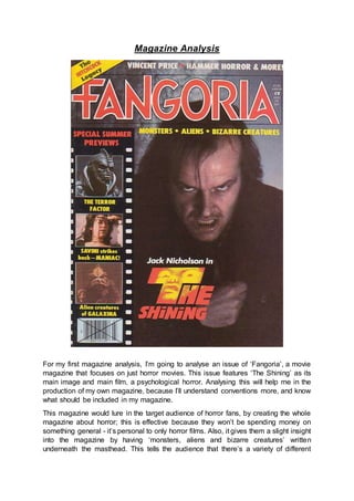
For my first magazine analysis, I’m going to analyse an issue of ‘Fangoria’, a movie
magazine that focuses on just horror movies. This issue features ‘The Shining’ as its
main image and main film, a psychological horror. Analysing this will help me in the
production of my own magazine, because I’ll understand conventions more, and know
what should be included in my magazine.
This magazine would lure in the target audience of horror fans, by creating the whole
magazine about horror; this is effective because they won’t be spending money on
something general - it’s personal to only horror films. Also, it gives them a slight insight
into the magazine by having ‘monsters, aliens and bizarre creatures’ written
underneath the masthead. This tells the audience that there’s a variety of different
2. things in the magazine, persuading them to buy it. The front cover is used as a
promotional tool that will encourage people to watch the films on the front. Because of
the large text for the main sell-line and the eye contact Jack makes, fear is created in
the audience, and they’re convinced to watch it.
The main image on this magazine is a picture of ‘Jack’ from ‘The Shining’. We see him
hunched over holding his jacket closed, with a snowy setting in the background. Jack’s
head is tilted, with his mouth snarling at the audience while he makes eye contact with
them. This eye contact would pull the audience in, making them want to buy the
magazine to find out more about this character. The main sell-line is the name of the
film and the name of the actor who plays the character we see; this links the image
with the sell-line as Nicholson fans would be immediately interested. It also tells the
audience the name of the film, making them intrigued to find out more about the film.
The image tells the audience that Jack is the antagonist, through the look on his face.
This reveals a large part of the film to the audience, although they’re still unsure of the
narrative. Audiences would know straight away that this is a horror film, and because
of the fact that Jack is showing his face, not wearing a mask, they may also know that
the sub-genre is psychological.
The image on the left is the film poster for the shining. A
symbiotic link is established between the two, because in both
images, we see Jack with an angry, murderous expression on
his face, telling the audience he’s the antagonist. The name of
the film is also written in the same font on both pieces,
maintaining this symbiotic link. In both images, we also see
Jack’s hair being messy; this shows that he doesn’t care about
his looks, as he’s more focused on killing Wendy.
On the magazine image, a slight high angle shot is used as we
can see the top of Jack’s head. This shows that he’s looked
down upon, because of all the bad things he tries to do in the
movie. The camera shot is a medium-close up, allowing us to
see his facial expression, and his body language; he’s
hunched over, emphasizing the cold we can see from the
background. This compares to the image in the poster where
we’re presented with a close up of Jack, allowing us to just see his face. However, the
poster also shows us Wendy, revealing more about the film. Because the poster is
released before the magazine, the fans would already know about Wendy, meaning
it’s not crucial information for the magazine. Dark side lighting is used for the magazine
front cover in order to create a shadow on half of Jack’s face. This scares the audience
and makes them intrigued to find out what he’s hiding.
The masthead of this magazine is ‘Fangoria’; the name of the magazine. ‘Fangs’ link
to the horror genre, and the A’s are shaped to look like fangs, immediately telling the
audience what film genre magazine is promoting. The masthead is above the image,
showing it’s not a well-established brand, and people may not know the magazine.
The masthead is written in sans-serif, showing that it’s more casual and informal, not
a magazine that’s going to be talking about serious issues. The masthead is the largest
3. piece of text on the magazine, showing it’s the most important thing and it’s made to
stand out and attract the audience from magazine stands in shops, for example.
Following conventions, the masthead is coloured red, showing connotations of blood,
anger and danger, reminding the audience that it’s a horror magazine. Red also stands
out, and brings text to the foreground, making the magazine noticeable from afar.
White is used around the masthead to outline it, again, making it more noticeable,
while showing the thin line there is between good and evil. The masthead would appeal
to the target audience because it’s easily noticeable, simple and reflects their favourite
genre, horror. In order to maintain brand identity, all issues of Fangoria use the same
font, and they usually use the colour red. This is a successful way of promoting
themselves, as regular buyers would notice it without having to look for it, meaning
they’re more likely to buy it.
In the left hand third of the magazine, there is a section for ‘special summer previews’,
attracting the audience to look at this section. Sell lines, ‘THE TERROR FACTOR’,
‘SAVINI strikes back – MANIAC!’, and ‘Alien creatures of GALAXINA’. All of these
relate to the image above it, giving them an insight to what the article is going to be
about. The sell lines would reflect the interests of the target audience by giving them
the fear factor, for example, words like ‘terror’ and ‘maniac’ are used to pull them in.
The use of exclamation marks also draws the audience in, as they’d be excited by the
sell-line, making them want to buy the magazine to find out more. Capital letters are
also used for the most attractive part of the sell-line. This would ensure that the
audience read the sell-lines, convincing them that the magazine is full of interesting
content. In order to keep symbiosis, sans-serif font is also used here. The sell-lines
are written smaller, in order to not distract attention from the main sell line. The main-
sell line is written in bold, capital letters in red. We see a scared face in the main-sell
line, attracting audiences, showing them that it’s scary. Dull yellow is used for the sell-
lines, having connotations of caution, decay, sickness and jealousy, all themes running
throughout the horror genre.
Above the masthead, we see a skyline introducing the audience to ‘Vincent Price’, a
huge film actor. Film fans would be likely to know who he is, attracting them to find out
more about him. ‘HAMMER HORROR & MORE!’ is also written on the skyline, telling
the audience that the magazine is filled with information about everything to do with
horror, and more. The use of the exclamation mark excites them, making them want
to find out what the ‘more’ is, making them buy the magazine. We also see a banner
saying ‘The HITCHCOCK Legacy’. This would be a main selling point for their
magazine because Alfred Hitchcock was a massive director in the horror industry,
intriguing fans to find out more about what he left behind.
Yellow, red and white dominate this poster, along with dark lighting used for the image.
These are used to create meaning because of their connotations: blood, death and
danger for red; jealousy, decay and sickness for yellow; purity and innocence for white.
These are all themes that link to the horror genre, creating effect for the audience to
want to find out more. The colours reflect the narrative of ‘The Shining’ as Wendy is
innocent, yet she’s the victim of Jack; this scares the audience into thinking they could
be a victim, even when they’ve done nothing wrong. The shining also features scenes
of blood and murder, linking to the horror genre as a whole. These colours also lure in
4. the target audience, as they’re bright and bold, attracting them to the magazine, and
reminding them that it’s a horror magazine.
This magazine is image dominated, meaning that potential buyers won’t be put off by
large amounts of text. This is also successful as through image, we can get a better
insight into the movie. The layout of the front cover is used for effect as in the left hand
third, we see the feature article photographs and the sell-lines in a camera roll. This
ensures the audience will look there before making their way over to the main image
of the Jack from the shining. Conventions are followed in this magazine poster as the
masthead is at the top, with the main sell-line placed at the bottom centre of the
magazine.
Overall, I think this magazine is effective in promoting ‘The Shining’ because it follows
conventions and uses eye contact with the image of Jack to pull the audience in. By
following a strict brand identity, they also ensure that fans would recognise the
magazine from far away, making it certain that they buy the magazine, increasing their
revenue.