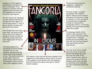
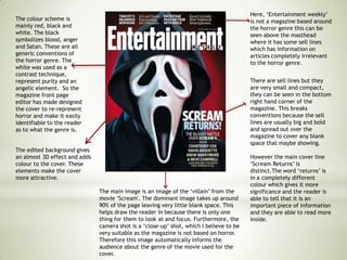
2. This magazine is a great
example of the use of the rule
of third. The masthead being
the first thing is we see, the
main cover line âthe shinningâ
being the second and lastly the
main characters face
expression.
This magazine does not
have a lot of cover lines on
other movies. Even though
it mentions âthe 500
greatest movies of all timeâ
it is not specific as it does
not mention any movies
names. This will make the
audience think of what to
them are one of the 500
greatest movies of all time
and possibly buy the
magazine to check. This is
known as the mode of
address, the way a media
producer âspeaksâ to its
audience. This is what they
believe the audience wants
to read and is interested in.
The number is also bigger
than the text in order to be
distinct. This was also done
in the cover line of â100
covers to choose fromâ.
Both the main image and quote
are iconic. The Iconic actor will
draw attention to the magazine
cover as the use of the
recognisable image means that
people will be interested because
they know about it. The same
applies to a memorable quote.
When looking at the main image
the audience will focus on the
characterâs face expressions
(anger) as it is a close up.
This magazine also breaks some
conventions as the main image usually
takes up the whole front cover rather
than being small with a border around
it. It is also quite simple as it does not
have many cover lines, and also the
does not have the date/price.
The name/ masthead of the
magazine is big, bold and red
like in most empire
magazines. It has become
their trademark as it has been
used with the same
colours/size repeatedly.
3. The main image is a close up
photo of the villain however
we can only see half of his
faces. This connotes that this
man has two sides to him. On
side of him is very dark and
evil, he holds many secrets.
He is staring directly into the
camera and the reader can see
one of his eyes clearly which
may be telling us that this man
is ready to reveal his secrets.
The man has a very serious
look on his face which creates
tension for the readers. Also
the editing done on his red
eye makes it the main focus as
the colour scheme is fitting
with the character's eye.
The other cover lines
include words such as
'exclusiveâ this is a good
way to draw attention to
the cover because it makes
the reader feel like they are
going to know the
information first. However,
the cover must be careful
not to be too revealing so it
ruins the film for the
audience.
The main cover line is a
question in quotation marks,
this will leave the audience
thinking in two ways. Firstly,
they would think of an answer
to this question or wonder why
it has been asked . Secondly
they would wonder who asked
this question since it is in
quotation marks. This is
negotiated reading, a text and
the readerâs own assumptions
and interpretations.
A question in a magazine cover
is usually done to intrigue the
audience and make them feel
involved. I believe this was
done successfully as it
intrigued me as a reader.
The masthead is the same
as most empire magazine,
this has become their
trademark. Even if/when
the audience does not see
the whole word the
audience will recognize it
with only a few visible
words. It was positioned in
a smart way as it links well
with the characterâs eye.
This informs the audience that the
magazine has articles on other actor and
possibly other movies. This might be
essential on the audienceâs decision making
(whether to buy the magazine or not). As
even though the reader might not be
interested in the movie used for the cover,
they might buy it because of the articles
about other actors/movies.
4. Fangoria is a film magazine
specializing in the genres of
horror and slasher. If the
audience is familiar with this
magazine they will know that
this magazine will not have
articles on other genres.
The font used in the masthead
was also created creatively to
connote the horror genre. As
the the long ends of âFâ and âAâ
give an illusion of claws with
blood (the red outline).
This makes it clear that the articles included in this
magazine are only based on horror movies. So even
if the audience is not familiar with this magazine,
this will inform them about what type of movies
will be included.
The main image is a typical
iconography, the audience
doesnât need any texts to know
what genre the picture is trying
to represent. In this case horror
is automatically recognisable
through its characteristic
iconography which is, its low-key
lighting, face expressions and the
props (the candle)
The ideology/beliefs of the
candle is also important. The
white candle symbolize spiritual
enlightenment, cleansing,
healing and truth seeking. This
links well with the horror genre,
more specifically with the
supernatural.
This phrase shows that this
magazine is suitable for
worldwide audience.
Even though there isn't many
cover lines, the strip of other
horror films at the bottom is
enough to create curiosity. As
this is the second (after the
main image) point of focus in
this cover.
The blood splatter is a
convention of horror movies
therefore this is a key
element, specially with the
yellow text on top standing
on out. The yellow stands out
as the colour scheme is
mainly white, black and red.
The common colours used on
horror film magazine covers.
The main cover line is usually
about the movie of the main
picture and usually has more
than just the name of the
movie. However here, theyâve
only put the name as this will
perhaps create more curiosity.
As sometimes cover lines give
too much information about the
article.
5. This is negotiated reading, a text and the
readerâs own assumptions and
interpretations. A question is also the best
way to attract the audience that may not
be familiar with this movie. Furthermore,
this question is asked almost in a âtemptingâ
or âdaringâ manner, influencing the
audienceâs decision.
This magazine has a wide
variety of fonts, sizes and
colours, which is my only
criticism. As I believe that
a smaller verity would
bring order and create a
simple structure to the
cover. Since the main
image speaks for itself, I
believe that the different
fonts and colours made the
cover look too busy.
The words used here are
important as they were
strategically chosen to
intrigue its target
audience. For example
the word âspecialâ
indicates that it has more
articles on the newest
movies that cannot be
found on other
magazines. Also the word
âextremeâ horror shows
that this special issue will
have more horror than
usual.
The main image is the
overriding focus due to the
lighting and editing done in the
post production.
Lighting- chiaroscuro lighting is
used here to highlight certain
parts of the personâs body. For
example, his neck and mouth
are not visible due to the low
key lighting. This automatically
makes the eyes and
chest/shoulders stand out,
highlighting his scars and the
different colour eyes.
Editing-editing was done to
exaggerate his scars, therefore
creating a frightening
atmosphere. Lighting was
possibly also manipulates to
emphasize his face expressions.
Face expressions are a key
element in horror images as it is
the main part that influences
the way the audience feels
when they look at the image.
The eyes were also possibly
edited as they two different
coloured eyes add a disturbing
and sinister feel to the image.
6. The colour scheme is
mainly red, black and
white. The black
symbolizes blood, anger
and Satan. These are all
generic conventions of
the horror genre. The
white was used as a
contrast technique,
represent purity and an
angelic element. So the
magazine front page
editor has made designed
the cover to re-represent
horror and make it easily
identifiable to the reader
as to what the genre is.
Here, âEntertainment weeklyâ
is not a magazine based around
the horror genre this can be
seen above the masthead
where it has some sell lines
which has information on
articles completely irrelevant
to the horror genre.
There are sell lines but they
are very small and compact,
they can be seen in the bottom
right hand corner of the
magazine. This breaks
conventions because the sell
lines are usually big and bold
and spread out over the
magazine to cover any blank
space that maybe showing.
However the main cover line
âScream Returnsâ is
distinct.The word âreturnsâ is
in a completely different
colour which gives it more
significance and the reader is
able to tell that it is an
important piece of information
and they are able to read more
inside.
The main image is an image of the âvillainâ from the
movie âScream'. The dominant image takes up around
90% of the page leaving very little blank space. This
helps draw the reader in because there is only one
thing for them to look at and focus. Furthermore, the
camera shot is a âclose-upâ shot, which I believe to be
very suitable as the magazine is not based on horror.
Therefore this image automatically informs the
audience about the genre of the movie used for the
cover.
The edited background gives
an almost 3D effect and adds
colour to the cover. These
elements make the cover
more attractive.