
Recommended
More Related Content
What's hot
What's hot (17)
Similar to Magazine assignment
Similar to Magazine assignment (20)
More from CLAYTONMILLIGAN1901
More from CLAYTONMILLIGAN1901 (20)
Recently uploaded
Recently uploaded (20)
Magazine assignment
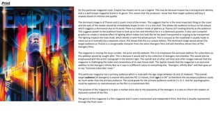
- 1. On this particular magazine cover, Empire has chosen not to use a tagline. This may be because Empire has a strong brand identity and is a well known magazine brand in its genre. This means that the producers know that their target audience will buy it anyway based on interest and quality. The dominant image is of Thanos and it covers most of the screen. This suggests that he is the most important thing on the cover and the eyes of the reader should be immediately drawn to him. It is a mid-shot. This allows the audience to focus on his stature which suggests a dominance due to his build. There is a indirect mode of address as Thanos isn't looking directly at the audience. This suggests power as the audience have to look up to him and therefore he is in a dominant position. It also uses computer graphics to create a rainbow effect of lighting which makes him look like he has been transported or is going to be transported. The lighting impacts the mast head, which blends in with the whole picture. This is unusual as the masthead is usually made to stand out as it normally has a separate colour, this shows that this is a unique edition. This dominant image would attract the target audience as Thanos is a recognizable character from the latest Avengers films and will therefore attract fans of The Avengers films. The magazine is missing the issue number, the price and the website. This is to emphasise the exclusive addition for subscribers so this addition would be sought after. This is because it would add to the collection of Avengers merchandise. This would also be emphasised with the artist’s autograph in the bottom right. The overall lack of other sell-lines and other images indicate that this magazine is challenging the codes and conventions of its own house style. The skyline reveals that the magazine is an exclusive addition to the Avengers Infinity War as it says in a different colour to everything else, “Avengers: Infinity War” and then goes on to say “Exclusive subscriber cover.” This particular magazine has a primary audience which is male with the age range between 16 and 25 however, “The overall target audience [of avengers} is anyone who watches PG-13 movies, from age 6 to 96” so therefore the secondary audience could be much wider than the primary audience. The social grade for the primary audience could be C1, D, E. And for psychographics could be explorers or mainstreamers as the film is a mainstream film. The purpose of the magazine is to gain a market share due to the popularity of the Avengers. It is also to inform the readers of exclusive content of the film. The genre of this magazine is a film magazine and it covers mainstream and independent films. And that is visually represented through the front cover. Print
- 2. The headline, “Previously on the MCU…” contains an elipses which shows that the headline is only the start and the article has a lot more to come. This is effective as it makes the reader want to keep on reading as they know there is more to come in the article. The strapline which says “havent seen any marevl movies? Weve got your back” This is an audience directed question as it uses the pro-noun “your.” This is personal to the audience as the magazine is reffering specifically to them. The dominant image takes up the top middle of the double page spread, this links the two pages. It does this because it wants to reveal that the article is linked across two pages and is therefore a double page spread. The dominant image is the biggest image on the page and seems to be a direct mode of address. This is because the characters on the image are seemingly looking straight at the reader. This image is the biggest because it is the most important thing on the page and it immediately draws the eyes of the reader towards it. This double page spread has the first three words in capitals rather than a singular drop cap. This emphasises the importance of those three words because the words “so there‘s this“ suggests that there is something that the audience dont know and that if they read on they will find the information out which is potrayed as exclusive. This double page spread mainly follows the codes and conventions as it has many of the features usually used in a double page spread. One of these features is a large image which is a direct address and communicates with the audience. Another convention is uses is the collumns that the article is wrote in. These collums are a part of most double page spreads and are important as it makes the article easy to read and understand. However, this double page spread doesnt stick to a colour scheme of two colours. These are also conventions of a double page spread and therefore this particullar article doesn’t fully follow the codes and conventions. The contrast of colour draws the audience’s eyes straight to the purple as it stands out. This is so that the reader begins to read the key information in the purple before reading the article which is in the white. This is effective because the audience is then allowed to know the key information that they needed to know in order to relate to the article they’re about to read. The article is about Avengers infinity War, i know this because the three snapshots are from that film and the article is also about the film. This reveals that the target audience is fans of Mavel and more specifically the Avengers movie franchise. The double page spread appeals to its target audience as it reveals to them exclusive information about the film. The article contains pull quotes that seemingly divide the columns. This is effective because it allows the reader to take a break from taking in the information and also highlights key parts of reading the article in depth. They create a mystery and tension because you want to find out what the quote is related to. It also has the characters names beneath the quoted which tells us who the quote is from. The social grade for the primary audience of this double page spread could also be C1, D, E. And for psychographics could be explorers or mainstreamers as the film shown is a mainstream film.
- 3. Digital On this magazine cover, Total Film has decided to promote the film ‘Once Upon A Time… In Hollywood’ through the use of a skyline. This attracts an audience of fans of the film aswell as the fans of the cast of the film. The words ‘In Hollywood’ are written in gold to emphasise that Hollywood is exclusive as most films are made there. Ths skylne is purposely used to promote ‘Once Upon A Time In Hollywood’ aswell as ‘IT: Chapter Two.’ This is effective because it attracts a demographic of two different films and therefore encourages more people to buy this magazine. The masthead of this magazine cover is very bold and is wrote in white. This is because compared to the other colours on this cover, white stands out a lot. This automatically attracts people who are looking for a digital film magazine to read to buy to be drawn to this particullar magazine. This is because ‘Total Film’ is notably one of the best and most well-known flm magaznes out there. Also in white, is one of the taglnes, “The Smarter Magazine.” Ths attracts an audience because it reveals to them that this magazine is above all other film magazine companies and this is the best to buy. The second tagline, located inside the ‘M’ in the masthead, says ”The worlds most trusted film reviews.” This is also very appealing to the audience as it reveals that what they’re going to find out about the films they’re going to see are trust-worthy reviews and could help them decide whether to see a movie or not. The main sell-line helps sell the magazine as it contains the words, “World Exclusive.” This massively helps sell the magazine as it makes the audience feel like by buying the magazine they’re finding out exclusive information that not many people will know. This is efficient because it attracts fans of horror who want to know this information as well as attracting fans of the ‘IT’ movie franchise. The other sell-lines also massively help in selling the magazine as they talk about many other moves and series from other genres. This is successful as it appeals to many different fans from all different genres who may then buy this magazine. The main image of ‘IT’ indicates a more mature audience as the age rating of the film is 18. This allows us to identify that inside the magazine could be articles not suitable for people under the age of 18. This immediately tells the audience that what they will see inside will be suitable to them and will be interesting for them to read. The magazine uses a strong colour scheme of red in order or highlight the horror side of the contents, as t is mainly based around ‘IT.’ This cover yet again reveals that the contents inside of it are “exclusive” in the form of a plug. The plug says “Exclusive Rambo: Last Blood Stallone Comes Home.” This lures fans of Sylvester Stallone and Rambo as it indicates that inside will be information that they don’t yet know about the film. This magazine follows the codes and conventions of a magazine front cover. This is shown as the masthead is the biggest boldest thing on the cover and reveals to the audience the magazines name. The magazine also uses direct address as the character in the main image is looking directly at the audience and therefore indicates communication. The magazine also follows codes and conventions as the sell-lines are all down the side of the magazine and it contains conventions such as a skyline and a tagline. The purpose of the magazine is to gain a market share due to the popularity of the movies mentioned on the cover. It is also to inform the readers of exclusive content of these films. The genre of this magazine is a film magazine and it covers mainstream as well as independent moves. And that is visually represented through the front cover. The social grade for the primary audience of this magazine is C1, D and E. And for psychographics, the same as the ’Empire’ print magazine, is also explorers and mainstreamers as the magazine talks about mainstream films.
- 4. This double page spread uses a running head in order to help the audience when navigating through the magazine. The running head says “teasers” on either side of the it. This is used to intrigue the audience and make them read this article. This is successful in doing this because the word “teasers” gives the audience a feeling that they’re uneducated on the information in this article and they therefore want to read it. The dominant image on this double spread shows a picture of ‘Rambo’ to represent that he is the most important thing on the page. This is shown as the image is the biggest thing on the page. This immediately reveals to the audience that he article that they’re about to read is about ‘Rambo.’ In this image Rambo is holding a gun, this intimidates the audience as they don’t have the information they need to know why he has the gun so they decide to read the article to find out. The image also shows an in-direct mode of address because Rambo is focusing on who or what he is aiming his gun at. The sub-images are smaller than the main image which emphasises the importance of the character Rambo in the movie. The images are the main pull for the reader to entice them to read the article in depth, the images are mainly on set shots, which gives the audience a feeling of exclusive content as well as behind the scenes shots In the dominant image, Rambo is holding a gun which discloses the information that “Rambo” is a war film. The colour scheme of red also shows this as red connotes blood and death. This immediately lures a fan of war movies and makes them read the article which has a purpose to inform as well as promote. The use of the colour red to border the dominant and sub images ties in with the genre of the film, emphasis the blood that will be shown in this film and indicates the adult content and justification of an 18 age rating. This is effective because the target demographic of 18+ year olds will then be enticed to watch the movie and the magazine will therefore achieve its purpose to promote. The use of a pull quote has been designed to again entice and encourage the reader. The pull quotes are located centre to the left hand side of the double page spread and in the centre of the columns, this follows codes and conventions and is expected by the audience, this allows the audience to navigate whether this article is for them or not. Each image in the article are captioned. This is used in order to anchor the images to the article and make them more relevant to what you’re reading. The captions uses informal language which emphasizes the professionalism of this magazine company. The audience are shown highlights of the film without having to fully read the article and find out the release date for the film, which is visibly shown at the end of the article. This is effective because some people may not have a high concentration span in order to read the whole article and may just want to find out key information such as the release date. The byline challenges codes and conventions as it is only the authors initials in red, “JW.” This indicates that the readers buy this magazine regularly and already know who the author is and respect his opinion. This therefore doesn’t require the article to contain the authors full name as the readers already know who he/she is. The social grade for the primary audience of this magazine and therefore this double page spread is C1, D and E. And for the psychographics, the same as the ’Empire’ double page spread, is also explorers and mainstreamers as main stream films are featured on this double page spread.
- 5. Pros And Cons Print The pro’s which come with print magazines are they tend to be more stable as their technology does not change at a fast pace, it is also a more comfortable reading experience for the buyer as they don’t have adverts ruining the flow. Another pro is that they're taken more seriously than digital magazines as people are under the impression that not everything you see online is true. As well as this, print magazines don’t need to be downloaded and the article won’t crash. However, the cons of a print magazine is they can make less money as they don’t get money from subscriptions, etc. Also most magazines aim for one particular audience whereas digital magazines can be downloaded by anyone online. Another con is that print magazines can be destroyed easily. As well as this you actually need to go to the shop in order to buy a magazine whereas digital magazines can be retrieved from anywhere. Digital The pro’s of a digital magazine are you can buy and access them anywhere, they're also portable as they can be accessed on portable devices such as a mobile phone. As well as this, digital magazines have larger audience because they are much easier to retrieve. Most house holds in the UK have multiple devices and therefore multiple ways to access a digital magazine. Digital magazines are also cheaper than print magazines and also have huge advertising potential. Digital magazines have global coverage as there are devices all over the worlds. However, the cons of digital magazines are they have adverts disrupting your reading flow. As well as this they can be harder to read as it sometimes requires zooming in and out in order to see words.
- 6. Technical Considerations of Print and Digital Magazines The technical considerations of print magazines include: Size – magazines sizes are essential. Most magazines use A4 or A5. Bleed line – without this around the magazine, certain elements may be cut off when it is printed Contents page – this should tell the viewer what page number they need to navigate to in order to find the content they’re looking for. It is also important for articles to include running heads, so that readers can find articles they want to read at a glance. Gutter line – this will make the navigation experience easier Colour settings – ensures that all images are in full colour Distribution– the magazine needs to be sold in an appropriate place so that it will sell to the target audience. It should be placed where it can be spotted by people who might be interested in buying it. Layout – there must be continuity in the layout and headings should be the same on all pages Fonts – choosing the right font will stylize the magazine more, making it more unique and better looking. Fonts should also be consistent throughout the entire magazine The technical considerations of digital magazines include: Colors/fonts – might not look the same on every device. Some stylistic features could be lost Distribution – digital magazines can be distributed in a lot of different ways. The main services used for this are Amazon and Barnes and Noble. However, certain distributors require you to utilize their templates, causing the magazine to look less stylized and more generic Losing files – some audio and videos might be redacted from the internet, causing the magazine to lose some of its meaning Zooming – if the viewer has to zoom in and out to read certain portions of the magazine, it can be discouraging Rotation – when rotating to landscape from portrait, the reader will need to scroll across the screen to view the full page. This can feel unnatural and be a nuisance Support – not all devices work well with digital magazines. They might display wrong and certain elements may not be viewable
- 7. Distribution Print You would be able to buy a print film magazine from a super market, newsagents, online and in film stores. Print magazines need to be in places where their target demographic can easily access them. For example a film magazine could be found in a cinema, likewise a gaming magazine could be found in a game shop. An issue for distributing print magazines are some people may not have access to supermarkets or might not be able to leave the house. This means they can only access a print magazine by ordering it online. Another issue is that most people are moving to read digital magazines and therefore print is dying and not many people are buying it. Digital You can find digital magazines online. You can purchase them and access them on the web. This is the only way of accessing a digital magazine. Readers can access the magazine on the day of its release and don’t have to wait for the magazine to be shipped out to them. An issue for the distribution of digital magazine is they can only be accessed online and not everybody has access to the internet and can therefore not access a digital magazine, in this case, print would be a better option.