
Recommended
More Related Content
What's hot
What's hot (20)
Viewers also liked
Viewers also liked (12)
Similar to Poster Analysis Two
Similar to Poster Analysis Two (20)
More from kirstyharragan2
More from kirstyharragan2 (20)
Recently uploaded
Recently uploaded (20)
Poster Analysis Two
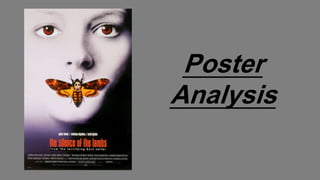
- 2. Introduction This poster promotes ‘The Silence of the Lambs’, a psychological horror film. In this film, Crawford wants Clarice to interview Dr. Hannibal Lecter; a psychiatrist who is also a violent psychopath whose serving in prison for life after committing various acts of murder and cannibalism. Crawford believes that Lecter may have insight into a case, and that Starling, an attractive young woman, may be the bait to draw him out. I chose to analyse this poster because I liked the effect of her face blending in with half of the background, and the fact that she’s stopped from talking because of the moth. Although not a particular scary poster, the genre is shown through the use of the red, and the skull on the butterfly’s head. Poster Conventions This poster follows conventions by having the institutional information placed at the bottom, along with the title of the film. The image also dominates the page which is another convention. Through the use of red, white and black, the audience know that this is a horror film immediately, as these are commonly used colours for horror film posters. Direct address is also made, whilst the character appear emotionless, two more conventions of psychological horror posters. One convention that has been broken is the fact that there is no tagline on this poster; this is unusual as usually a tagline is placed at the top of posters to reveal to the audience what the film is going to be about, in order to pull them into watching the movie.
- 3. Image In this poster, the background is black and white, rather than having a location shown. This links to psychological horror poster conventions as posters usually present a plain colour rather than a setting. The poster shows a contrast between light and dark; the woman’s face is pale white, and as you look to the right of her, the image fades into darkness. This suggests the presence of good and evil in the film, whilst immediately telling the audience what genre the film belongs in. Her face is not clear, and this suggests that she’s hiding something; the audience would then go and watch the movie in order to find out what it is she’s hiding. Key lighting is used coming from the left to illuminate her face on one side, and shadow her face on the other. This again hides her face slightly, and makes the audience feel uneasy about her. In this image, her costume is hidden from us because the image fades into black. This links to the horror theme of having a hidden identity, and creates a sense of mystery in which the audience are eager to find out about. The look on the girls face appears to be innocent, relating to the ‘lamb’ in the title as Lambs have connotations with God and purity. She is also making direct address to the audience, which pulls them into watching the film. Over the girl’s mouth is a moth, linking to the ‘silence’ in the title as the girl is restricted from talking. However, this moth has a skull on the back of its head, showing connotations of death and evil, warning the audience that the film is going to contain scenes of violence, linking to the genre of film. This moth could be used to represent change for the killer, from something ugly into something beautiful. When looked at closely, the moth is cleverly made up of several naked woman; this links sex with death, which creates a creepy atmosphere for the film. It also links to the film where a body is found with a moth stuck in the throat of the dead person. The colour of this moth is red/orange, linking to blood and the horror genre as a whole. The girl’s eyes are also red, signifying evil and death; this suggests to the audience that she’s the antagonist in the film.
- 4. Title The title of this film is ‘The Silence Of The Lambs’, which suggests to the audience that someone innocent is being hurt; the lamb has connotations of innocence and sacrifice. In order for a lamb to become sacrificial, it must be killed under ritual circumstances; this is the case in the film with the Senator’s daughter being help captive by the serial killer. Lector’s victims are perceived to be innocent and trusting in the film, just like these ‘lambs’. Also, when lambs are being led to be slaughtered, they go quietly, which hints some of the narrative to the audience. When Clarice is young and sent to live with her relatives, she hears the screaming of the lambs that are being slaughtered; she tries to save a lamb, but it fails. When she is an adult, she has a recurring nightmare that features the cries of these lambs. This links to the psychological sub-genre through the idea of having nightmares, and links the title by hinting to the audience that something innocent is going to be killed in the film. This increases fear for the audience by thinking they could be hurt for being innocent. The typography uses a sans-serif font, and all lower case-letters; this makes the poster looks tidy, while emphasising the sadness of the title. However, usually film posters feature the title being bold and capitalised; it could be different for this film because the producers wanted the audience to focus more on the content of the film, rather than the title, as the content is what deserves the most admiration. The title is the largest text on the page, in order to make it stand out, and catch the audiences’ attention straight after they look at the image. This is important because the name of the film will then be stuck in their heads, so when it’s released the audience will be inclined to watch it. The title is written in a light red/orange colour; this symbolises the idea that it’s a psychological horror, not a horror that’s based on blood and gore. The title, the moth and Clarice’s eyes are also all the same colour; this could suggest that she’s hiding something she’s seen, and needs to be silenced. Following conventions of horror posters, the title is positioned at the bottom of the frame; this is because the audience will look at the picture, then go down to look at the title leaving it stuck in their heads.
- 5. In terms of taglines, Silence of the Lambs doesn’t have a tagline; this could be because the producers don’t want to give any information away, or overcrowd the poster. A convention of horror film posters is to have the institutional information placed at the very bottom in order to stop it distracting the audience from the more important features. This institutional information reveals to us that there are multiple production companies involved, suggesting a production synergy; this indicates that it may be a less mainstream film than others. The director of the film is written in a box, signifying his importance compared to the other people involved in the movie. There is also star marketing seen on this poster; above the title, ‘Jodie Foster / Anthony Hopkins / Scott Glen’ is written. This interests the audience because they’d more inclined to watch the film if they’re a fan. In order to keep the symbiotic link, their names are written in lowercase, to remind the audience that they’re not the most important thing about the film. Under the title, this poster features ‘from the terrifying best seller’, telling/reminding the audience that the film is based on the book. This is a clever selling point because those who read and enjoyed the book would be excited to see it come to life in a movie. This also reminds the audience of the genre of the film, attracting horror fans by telling the audience its ‘terrifying’. Other Text
- 6. Colour Dominating this poster is white, orange and black; conventional colours of horror film posters. However, orange is used rather than red. This reminds the audience of the fact that this is a psychological horror, and although violence is used, it’s not solely based about death and gore. The posters uses black and white, setting the theme of Good versus Evil; the woman is shown in white, suggesting she’s the protagonist. However, the black background appears to engulf part of her face; this could refer to the idea that the darkness is being bought to her, making her evil. Orange is also the colour used in the middle of traffic lights; green has connotations of good and red has connotations of evil. This links to the idea that she’s in the middle, being pulled away from good into the evil. Orange also has connotations of deceit and distrust, reminding the audience that she’s hiding a secret; this links to the idea of the moth covering her mouth. Conclusion Overall, this poster is effective in luring in the audience because of the simple colour scheme, and the use of orange, making the poster stand out from afar. This poster will be successful because it tells the audience that there is a deeper story behind the image, and this will make the audience want to find out what it is. This poster is also successful in suggesting the film’s narrative without giving too much away; we know she has a secret she can’t tell, and we know she’s seen something she shouldn’t have through the emphasise put on her eyes and mouth. Direct address is also made to attract the audience, pulling them in by making them believe that this is made for them to watch.