
Recommended
More Related Content
What's hot
What's hot (20)
Similar to Assingment analysis
Similar to Assingment analysis (20)
More from RyanLock10
More from RyanLock10 (20)
Recently uploaded
Recently uploaded (20)
Assingment analysis
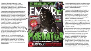
- 1. There is no tagline because Empire is a well established brand which means they know their readers will read on because of the quality they produce their magazines and this is why they are one of the biggest film magazine companies. The dominant image is of the predator and overlaps the masthead which shows the image is important and makes it stand out. The dominant image which is a mid shot and is fill lit to show off the iconic helmet and costume but to also create a sense of mystery as only certain parts of the predator is lit. The dominant image would attract the target audience because it is a recognizable character from the classic film Predator and because it takes up most of the magazine and is eye level to the reader. There is a colour scheme of green and red because the green represents the predators blood and the red represents his thermal vision which is iconic in the movie therefore this will most definitely attract fans as they will recognize the iconic colours and image on the front cover of this magazine. The main sell line ”EXCLUSIVE the predator” will attract the target audience because they will think that the predator is only exclusive to the Empire magazine. Within the the main sell line there is a frequency flowing through it which represents the predators hearing which will be recognizable to the target audience. The sub-image at the top right of the magazine shows a preview of what's in the magazine which will make the reader read through the magazine to find the photos or even buy the magazine. The skyline attracts the target audience because it is celebrating a 30th anniversary and contains unseen photos and stories which will make fans of the predator want the unseen photos and will interest them to buy/read through the magazine. This is effective because it makes the fans want to buy the magazine for the special unseen photos. The splash is used to show show there is more in the magazine than the dominant image(the predator). This is effective because It would make the reader buy the magazine and want to read through it because it is “Retro sci-fi special”. The barcode is the most essential part of the magazine which is located in the middle of the page on the right which also shows the date and price underneath it. There is serval images sprayed with red and green paint which is used to show how the film (The predator) is violent and there will be blood spilt whether it’s the predator’s or a humans. This technique is also used to attract the eye of the audience because its unusual to see colours sprayed on a front cover as if it was blood being sprayed. This is effective because the target audience will enjoy violence and this will make them excited to see the movie and the rest of the content inside the magazine. Print
- 2. The target audience is males or females this magazine company is gender neutral however more males will be fans of EMPIRE because in modern society more males play video games and watch films than females especially when the films are based on comics which mostly males grew up with therefore this magazine will appeal more to males. There social grade would be C1 because it is the most common social grade so the magazine is aimed at the majority and they would be mainstreamers and reformers. I think that the target audience would be interested in action movies because they are fast paced and contain hero's and villains, I also think in their spare time they would go to the cinema or buy comics and collectables. They could also be aged between 15-35 because that’s what most action movies are aimed at and violence and blood is more acceptable at that age. The purpose of this magazine is to entertain and inform the target audience aged 15-35.The magazine is from the film genre and informs the target audience about movies and anniversaries that are happening or coming up which allows them to connect with other people and talk about the events and possibly make plans to go to the events and meet new people. Also the magazine entertains the target audience by showing unseen photos from movies and talk about up coming movies to make them excited, there also could be free posters inside the magazine which will also entertain the target audience. This is effective because the audience will be reading information about their new favorite movie which will make them more excited for when the movie comes out and also sometimes they receive special photos and information which will make them feel special and important, this could also lead to the audience talking to others about what was in the latest film and the exclusive stuff they received in the magazine. Print The distribution channels for print magazines are newsagents, supermarkets and you can have a subscription online which delivers the magazine to your house. However the bad thing about this is if you go to a supermarket to buy the magazine you might not be able to find the specific magazine you want.
- 3. This double page spread contains folio which is the page number and the date the magazine was published. This double page spread completely challenges codes and conventions which engages the audiences immediate attention because it is different to what people are usual use to, the colour scheme and the whole layout of the page is different to normal double page spread which gives this magazines double page spread a unique look. This is effective because it gives the double page spread in the magazine a unique look which will attract the audience a lot more than using something that every other magazine uses. The credits to the publisher is within the title of the double page spread. The dominant image is an image of the predator’s costume being put onto an actor from the first original film, which will appeal to the audience because if they enjoyed the film they will be interested in what happened behind the scenes and how the predator came to be. The dominant image is used to catch the eye of the audience as they flick through the magazine and hopefully catch their attention, the image is surrounded by a film reel to show that the page is based off the original film. This will interest the audience again because if they watched the original predator movie they will be excited to see it is still being featured in the magazine and that it is being compared to the new predator movie which will excite the audience because they get to see how their favorite classic film is being re-created. Print Within this double page spread there is lot of images which is unusual for a double page spread, however where there is text there is a sub-head above it to make it clear and much easier to read. The images that are there are drawings and could possibly be trying to make a link back to the original predator and monster movies, also the film reel photo also references the old predator movie because that what it was filmed on. This will interest and engage the reader because it is unusual to have more pictures than text on a double page spread and also because the audience wont want to read a lot of information, however the text under the sub-heads are little bite sizes of information about the origin of the movies which will appeal to the audience more The image on the right side of the double page spread is mixed with a thermal vision filter which references the predators sight. This will engage the reader because there is a reference to the movie on a picture and will encourage the reader to read more and find out why the picture has been cover with a filter.
- 4. The tagline for this magazine is “ ALL KILLER!NO FILLER! STARRING REBORN HORROR”. This represents Michael Myers who doesn't’t care about who he kills and because the movie that is advertised is based 40 years later after the previous one they are calling him “REBORN” which could suggest he has changed and could kill more people. This would affect the audience because it will make they excited for the new movie and wonder how the killer has been “reborn”. This is effective because they describe him as “all killer” which suggests he will have no remorse this time and will kill everyone in his way until he gets to Laurie Strode (Jamie-leigh Curtis). The masthead “Empire” is highlighted with a neon orange and this represents the colour of a pumpkin which refers to the original Halloween film with a pumpkin face holding a knife on the poster. This will excite the audience because even the title refers to the original movie which could make them think throughout the new movie there will be a lot of references to the first movie. This is effective because the title is bright and bold which will attract readers by the colour of the title and what it represents. The Dominant image is an image of Laurie strode (Jamie-leigh Curtis)which is a mid shot and her face is extremely lit which suggests she is innocent/ a guardian for everyone against Michael Myers. This is effective because the contrast between the character and the dark background shows how stands out from the darkness. This will make the reader curious/ interested about the new movie to see how Jamie-leigh Curtis deals with Michael Myers 40 years later. Also within the darkness on the front cover Michael Myers is lurking in the background as if he is stalking Laurie Strode. Only his face is lit which could suggest he is like a animal stalking his prey by lurking in the shadows. This will make the audience worried because he is stalking Laurie again and they will hope she will survive again and possibly kill Michael to stop the terror. The dominant image is also overlapping the masthead which suggests the dominant image is more important than the magazine. The Skyline “ULTIMATE SPRING 2018 PREVIEW” This is used to attract the reader because it is a preview of a movie no one else has seen yet which would make the reader want to buy the magazine because they want to access the preview before everyone else which will make them feel special. This could create opportunities for the reader to communicate with other people and talk about the preview they have seen in the magazine. There is another skyline which says “THE 25 MOVIES YOU STILL NEED TO SEE THIS YEAR”. This is used to attract the audience by making them feel curious and wonder if they have seen the 25 movies people need to see this year. This will encourage the reader to go and buy the magazine because they want to see if they are correct and if they have seen the 25 must seen movies of this year. Within the skyline the magazine addresses the audience by saying ”you still need to see” this catches the readers eye because it is direct address (you)which is making the reader feel more involved with the magazine and also as if the 25 movies that must been seen this year is aimed at them(who ever is reading the magazine).This will encourage the audience to buy the magazine because the direct address makes the relationship between the buyer and magazine more personal because it addresses them. Digital The distribution channels for digital magazines are online, to access your magazine you have to go to the publishers website and click links until you can download your magazine. The bad thing about this is downloading your magazine takes up storage and to get to the magazine it takes longer than going to the supermarket and picking up a magazine and buying it also sometimes it is difficult to access your magazine because if you don’t have any Wi-Fi or bad Wi-Fi it can take awhile for you to download your magazine.
- 5. The main sell line “HALLOWEEN” will attract the audience because the title covers the dominant image which shows it is important and the title looks as though its been painted over with a new white which could show how the old movies title colour has faded like Michaels mask and it could also suggest that the colour of the title has faded because the new movie is based 40 years later which could show the time gap. This impacts the reader because it may make them wonder what else has changed within the movie considering the title has been “reborn” the same as the killer. This is effective because you can see the title has been colored over and the font the title is in is more of a cartoony font which would be used at Halloween which will attract the reader because it is unusual. The sell line interests the audience because it says “and many more!” which creates a Hermeneutic code just like the dominant image where Michael is lurking in the background which will make the audience want to buy the magazine to find out how many more movies there are and to end the mystery. The target audience is males or females this magazine company is gender neutral however more males will be fans of EMPIRE because in modern society more males play video games and watch films than females especially when the films are based on comics which mostly males grew up with therefore this magazine will appeal more to males. There social grade would be C1 because it is the most common social grade so the magazine is aimed at the majority and they would be mainstreamers and reformers. I think that the target audience would be interested in horror movies because they are fast paced and contain a lot of mystery, I also think in their spare time they would go to the cinema and buy collectables. They could also be aged between 15-35 because that’s what most horror movies are aimed at that because the violence and blood is more acceptable at that age. The purpose of this magazine is to entertain and inform the target audience aged 15-35.The magazine is from the movie genre and informs the target audience about movies that are happening or coming up which allows them to connect with other people and talk about the events and possibly make plans to go to the events and meet new people. Also the magazine entertains the target audience by showing pictures from the movie which will make the audience excited to see the movie once it comes out and this will allow the audience to talk about up the upcoming movie. There also is a preview within the magazine which will entertain the audience because they will get to see a sneak peak of a movie no one else has which will also make them feel important. This is effective because the audience will be reading information about their new favorite movie which will make them more excited to go and see the movie when it comes out and this could also lead to the audience talking to others about what was in the latest film and the exclusive stuff they received in the magazine. Digital
- 6. Digital In this double page spread Michael Myers face is selectively lit and he is backlit which is used to build tension and mystery because the audience don’t know what will happen next and this is a hermeneutic code and a proairetic code. Also Laurie is behind Michael holding a gun which shows how the roles have switched because in the previous film Michael was the one hunting Laurie but in this picture it’s the opposite way around, also on the front cover of this magazine Michael is behind Laurie and this will excite the reader and also create mystery because they don’t know what will happen to Laurie because she is now hunting Michael and they will wonder why and how the roles have changed and essentially the hunter has become the hunted. The image is a wide shot of Michael and Laurie however to the left of Michael you can see the side of a house which suggests Michael is back at Haddonfield where the first movie took place which will excite the audience because they can see a final battle between Laurie and Michael where it all started. A drop cap is used to interest and catch the audience’s eye because the drop cap stands out from all the rest of the text surrounding it which is effective because as the audience flick through the magazine their eyes will automatically go to the drop cap. The image of Michael with his signature weapon will attract fans of the movies and excite them to see their favorite serial killer back in action and see he has not changed much. This is effective because fans of the movie will read the articles within the double page spread and be encouraged to buy the magazine because as they flick through the magazine before buying it they will see Michael and his iconic murder weapon which will excite them and make them wonder how this new movie is going to play out. The format of this double page spread is an interview with Jamie-Leigh Curtis who is Laurie in the movie and there are questions in a sub-head and then underneath the sub-head there is Jamie-leigh Cutis’s answers and this format makes it much easier for the reader to find the answers they are looking for and makes the page look more neat and professional which could suggest this magazine is aimed at people aged 15+ because of how professional the page is and how organized it is. The interview is a calm and relaxed tone because within the text it says “Fuck rock and roll” this quote shows how the interview is trying to be as calm as possible and link to the reader more by trying not to be really professional and censored. This will engage the audience more because it feels more relatable and more personal because of the language used. The colour of the neon orange boarder references the iconic title of the movie ”Halloween” because orange is the colour of pumpkins and orange is the colour that people normally refer to the holiday Halloween. It also refers to the pumpkin face on the first movie’s poster. This will excite the audience because even the boarder refers to the original movie which could make them think throughout the new movie there will be a lot of references to the first movie.
- 7. Pro’s and Con’s of Digital and Print The pro’s about digital magazines is that It is easier to share the magazine to friends and family which allows the audience to connect with each other and share their favorite articles. However print allows you to have a physical copy of the magazine which creates a tactical human experience where the reader can read without the attack of advertisements. Although advertisements allows digital copies of magazines to promote their products more where a bigger audience will see the products and also may conclude in a higher profit because you can get other companies to advertise on the magazine website. Another pro about digital magazines is that the producer can see how long the audience spends on a certain article or page which is a benefit because it means the popular articles will be kept in the magazine and changes will occur to the articles the audience didn't’t spend that long on which will help the magazine improve and become more interesting. Also digital magazines reach a bigger audience than print magazines because more people are going online in modern day society which means more people will be online and would rather buy magazines online where they can access them easily, anywhere and at anytime they want. Digital magazines also don’t have wear and tare which is a benefit because it means the audience get to keep the magazine for as long as they want without it becoming damaged, however print magazines are unable to provide this because if print magazines get water on them they are ruined and you'd have to go out and buy a new one however with digital magazines you have the magazine forever. The Con’s about digital magazines is that it creates a loss of jobs because you will need less people to make the magazine therefore people will loose their jobs and become unemployed. Also you will need an internet connection to access your magazine but if you bought a print copy you would’t need access to the internet and this could cost the user more money as they would have to buy a laptop or a computer so they can access the internet to download the magazine they have already paid for. Another con about digital magazines is that sometimes it can be hard to read the magazine on your device so you will have to zoom in which could cause problems and the reader could forget about where they were reading once they zoomed in. However if you bought a print copy you wouldn't’t need to zoom in you could just move the magazine closer to you so you can see the information. The pro’s of print magazines are that they are more memorable when reading them compared to digital magazines because with digital magazines people will just scroll through the text but with print magazines people take more information in because it is right in front of them and they have a leisurely experience when reading. Also reading print magazines can give people a tactical human experience where the reader can read the magazine without being attacked with advertisements although there will be advertisements but they wont pop up whilst your reading and this occurs in digital magazines. A benefit of print magazines is that the producer can rely on word-of-mouth marketing which is easier to advertise than pop up advertisements on digital magazines. Furthermore print magazines are always accessible you don’t need an internet connection to view them and they also don’t take up much space so they are easy to store, because they are always accessible they are more convenient for the audience. However cons of print magazines are that unsold copies of the magazine is a loss for the publisher which means money income will suffer because most people In modern day society are going online which means there is a decrease in demand for print magazines. Also once you buy the print magazine and you put it away in a draw or on a table you forget about it and where you put it which makes it less convenient for the audience because if they have a digital magazine they can access the magazine when ever they want with access to the internet and not loose the magazine they have payed for.
Editor's Notes
- https://psv4.userapi.com/c848228/u479697494/docs/d10/6a55d29d3e87/Empire_Australia_-_08_2018.pdf?extra=KQxNr_tR2mVOCEsxw7JW5MIiPr6yykHHpmJk7Se-83S6aW_Mo-MGMYbtZywXbpG49EE-nZJXxL-pkUDvfmX-Z7Or1LjocE1njYtXlUFTfAWfIb6DRowqVFghQoXd4M90YlNUuz7I_Q
- https://psv4.userapi.com/c848228/u479697494/docs/d10/6a55d29d3e87/Empire_Australia_-_08_2018.pdf?extra=KQxNr_tR2mVOCEsxw7JW5MIiPr6yykHHpmJk7Se-83S6aW_Mo-MGMYbtZywXbpG49EE-nZJXxL-pkUDvfmX-Z7Or1LjocE1njYtXlUFTfAWfIb6DRowqVFghQoXd4M90YlNUuz7I_Q
- https://psv4.userapi.com/c848320/u479697494/docs/d1/234699ed9a33/Empire_Australia_-_10_2018.pdf?extra=Tj8L6d8mpNb3Dj8Pu7n_VnZpNWxlDI3Q3E52DH7Nbahk-nxnM8dKAawn7mCPtn0sLv37JXIyin7Tp8R_l_i0VQfDTUdYGuWWyxAnXeyQV48bTAGNoWupM1LkJH0pon1Zx-9vJr_ODA
- https://psv4.userapi.com/c848320/u479697494/docs/d1/234699ed9a33/Empire_Australia_-_10_2018.pdf?extra=Tj8L6d8mpNb3Dj8Pu7n_VnZpNWxlDI3Q3E52DH7Nbahk-nxnM8dKAawn7mCPtn0sLv37JXIyin7Tp8R_l_i0VQfDTUdYGuWWyxAnXeyQV48bTAGNoWupM1LkJH0pon1Zx-9vJr_ODA