
Recommended
More Related Content
What's hot
What's hot (20)
Viewers also liked
Viewers also liked (20)
Similar to Magazine Overview
Similar to Magazine Overview (20)
More from kirstyharragan2
More from kirstyharragan2 (17)
Recently uploaded
Recently uploaded (20)
Magazine Overview
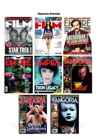
- 2. These eight magazine front covers have been designed to successfully promote films from a range of genres. The ‘Fangoria’ magazine focuses solely on horror movies, whilst ‘Total Film’ and ‘Empire’ look at a broad range of film genres. By carrying out an investigation of them and by comparing them to each other, it is possible to identify shared features throughout them, and establish repeated patterns. All eight of these magazine front covers feature typical film magazine front cover conventions, for example, the masthead is positioned in the top middle, attracting the audience straight away into the magazine. Also, apart from the ‘Total Film’ featuring Megan Fox on the front, all of these magazine covers have the name of the film that the ‘cover model’ is from, written in bigger font that the other sub-headings. This makes that film stand out, and creates a symbiosis with the image. The models on the front are also presented in character, not as the actors who play them. This creates a sense of reality for the audience, drawing fans in and immediately telling the audience more about what type of film it is. On all of these film magazines, the character on the front is making direct address with the audience through the use of eye contact; this attracts them to the magazine, making them feel like they should buy it. The main character features on all of these front covers. For the magazines advertising a horror, the eye contact adds to the fear factor, making the audience think that the antagonist is going to ‘come for them’ next. A variety of shots are used, ranging from long shots to close ups – this makes it hard to find a common convention for the shot type used. However, apart from ‘Empire’ featuring the Joker, all of these images are placed in front of a plain background; this means that the attention is placed on the character and the subheadings, not the location. There is also a consistent pattern with regards to colour; red, white, black, and blue are dominantly used throughout all of these magazine front covers. These are bright colours, which would attract the audience to the magazine. Also, no more than three main colours are used on each of these covers; this keeps it simple and not too crowded with colour as this could put the audience off. The colours used will often help create a symbiosis with other promotional material, such as posters, which feature the same colours.
- 3. The masthead always uses capital letters and is in bubble writing, and bold print in order to make it stand out; symbiosis is kept in each magazine by keeping the masthead the same, allowing audience’s to easily recognise it. Total Film and Empire magazines have consistent mastheads, with one simple colour featuring. Fangoria magazine however has one colour with a white outline, linking to the idea of innocence and horror films. The masthead is also placed on top of the images on Fangoria, whereas it’s placed both on top of and behind the images for total film and empire. This tells us that Fangoria is a less popular franchise. The name of the main film is usually placed at the bottom, apart from the Joker, and Anchorman Two. This is because the audience will look from the masthead at the top, down to the image, and down to the name of the film. Another common feature across all of these magazine front covers is having the subheadings at the sides of the magazine. Also, all of these magazines feature a skyline, revealing more information about the magazine to the audience, for example ‘hot summer preview’ and ‘up – Sherlock Holmes – potter 5’. This would attract audiences as they’re told about what other films are going to be included in the magazine, and why they should buy it. Most of these magazine front covers use dark lighting; this makes the image stand out more, and for the horror magazines, increases fear. A puff also appears on four out of eight of these magazine; half of them. This is a common feature on magazine, attracting the audience with usually something that is only featured in that magazine, or a free gift to entice them. The puff is often placed on the side, by the main sell-line in a colour that will attract audiences to it. On most of these posters, the barcode is placed at the bottom and is small in size. This is done to ensure that no attention is taken away from the important aspects of the magazine front cover. Also, audiences will have already decided to buy the magazine before they look at the price; this links to the idea that the price is hidden and small. All of these magazine front covers have been made to ensure that they’re not too overcrowded, and that it is dominated by image. Both of these conventions will ensure that audiences are attracted
- 4. to the magazine, leading them to buy it, increasing readership. By completing this magazine overview, it has helped me to understand how I should lay out the magazine front cover that I will be making, and what sort of colours I should pick to dominate the page.