
Recommended
More Related Content
What's hot
What's hot (17)
Viewers also liked
Similar to Magazine Conventions
Similar to Magazine Conventions (20)
More from kirstyharragan2
More from kirstyharragan2 (20)
Recently uploaded
Recently uploaded (20)
Magazine Conventions
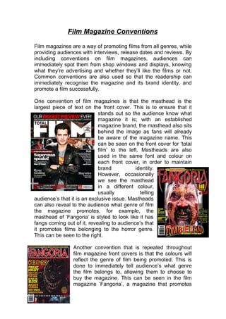
- 1. Film Magazine Conventions Film magazines are a way of promoting films from all genres, while providing audiences with interviews, release dates and reviews. By including conventions on film magazines, audiences can immediately spot them from shop windows and displays, knowing what they’re advertising and whether they’ll like the films or not. Common conventions are also used so that the readership can immediately recognise the magazine and its brand identity, and promote a film successfully. One convention of film magazines is that the masthead is the largest piece of text on the front cover. This is to ensure that it stands out so the audience know what magazine it is; with an established magazine brand, the masthead also sits behind the image as fans will already be aware of the magazine name. This can be seen on the front cover for ‘total film’ to the left. Mastheads are also used in the same font and colour on each front cover, in order to maintain brand identity. However, occasionally we see the masthead in a different colour, usually telling audience’s that it is an exclusive issue. Mastheads can also reveal to the audience what genre of film the magazine promotes, for example, the masthead of ‘Fangoria’ is styled to look like it has fangs coming out of it, revealing to audience’s that it promotes films belonging to the horror genre. This can be seen to the right. Another convention that is repeated throughout film magazine front covers is that the colours will reflect the genre of film being promoted. This is done to immediately tell audience’s what genre the film belongs to, allowing them to choose to buy the magazine. This can be seen in the film magazine ‘Fangoria’, a magazine that promotes
- 2. horror films. As we can see, ‘Fangoria’ focuses on orange, red and black, representing death and blood. When fans of horror films see these colours, they’re immediately going to know that the film belongs to the horror genre, persuading them to buy it. Colours used on front covers are also bright, attracting attention from the readership. This is done to ensure that the magazine stands out in a shop, persuading the readership to pick that magazine. This can be seen in the film magazines to the left. Reds, blues, yellows and whites are the most common used colours for film magazines as these are the most bright and attractive colours to the readership. It is also conventional that the main image takes up the majority of the frame on the front cover of film posters. This is to ensure that the readership know exactly what film is being advertised; fans of this film will be persuaded to purchase the magazine. The main image will usually consist of the main character from the film, with the background slightly hinting the narrative; for example, having fire in the background would tell audience’s that the film is about fighting/war. The main character on the front cover is also always in character, not the actor playing the character to create a sense of realism, and further promote the film. This can be seen in the film magazine for ‘Empire’ where we see Harry Potter taking up the whole frame, not Daniel Radcliffe. He is also making eye contact with the audience, another convention of film magazines; this lures the readership in, making them feel obliged to purchase the film magazine. Another repeated feature we see across film magazine front covers is the left hand third being filled with the most important information. The left hand third is where the audience’s eye is first
- 3. drawn to when they look at a piece of text. This can be seen in both the film magazines below. When looking at the issue below of ‘Fangoria’, the sell-lines and sub-images are seen in the left hand third; this would attract audiences as they’d be finding out more about the content inside the magazine. In the left hand third for ‘Empire’, we see ‘massive preview special!’ Because of the placing of this, audience’s are immediately going to read it, and be convinced to buy this issue as they don’t want to miss something important. The main sell-line is commonly seen at the middle - bottom of the frame, over the main image, and is written in the largest writing on the cover (apart from the masthead). This is done in order to attract audiences to the main articles, and reveal a bit more about the image. The main-sell is also conventionally used to tell the audience the name of the film; this can be seen on the front cover for ‘Empire’ to the left where the main sell-line is ‘Sherlock Holmes 2’. Sell-lines also appear on magazine front covers as they give the readership hints as to what will appear inside the magazine. This persuades audience’s to buy the magazine as if they’re interested in the content inside, they’re not going to miss out on reading it. Skyline’s on magazine front covers also reveal more to the audience, attracting them to the magazine. A skyline is placed above the masthead and is used to tell the audience about more films that will be promoted inside, or reveal to them that the issue is an exclusive/includes a free gift. As seen in the skyline for ‘Empire’, audiences are presented with ‘Free! Spectacular Potter Photo Special’. This would be of interest to Harry Potter fans, who
- 4. would have already been persuaded to buy the magazine through the main image. The use of exclamation marks is also very conventional for film magazines as it excites the audience, convincing them to buy the issue. Additionally, buzz words feature on magazine front covers as they are a common convention used to attract audiences and create excitement for the readership. An example of this is seen on ‘Fangoria’ where audiences are presented with words like ‘Terror’ and ‘Maniac’. The readership would immediately become aware that this magazine will feature lots of horror, increasing their enthusiasm for the issue. The price, date and barcode of the magazine are conventionally hidden on the magazine poster in order to ensure audiences aren’t put off purchasing the magazine by the price. It also ensures that no attention is taken away from the images and sell-lines. This can be seen in the film magazine ‘Total Film’ where the price, date and barcode are hidden away at the bottom right corner of the page. By looking at conventions of film magazines, it has helped me in ensuring that our magazine is successful in luring in the target audience. In my opinion, following these conventions will allow us to be successful in the production of our magazine.