
Recommended
More Related Content
What's hot
What's hot (18)
Similar to Magazine analysis
Similar to Magazine analysis (20)
More from 10marmir
Recently uploaded
Recently uploaded (20)
Magazine analysis
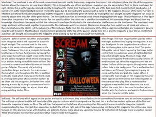
- 1. Masthead: The masthead is one of the most conventional pieces of text to feature on a magazine front cover, not only does it show the title of the magazine but also allows the magazine to keep brand identity. This is through the use of font and colour, magazines use the same style of font for there mastheads for each edition, this is so they can keep brand identity throughout the rest of their front covers. The use of the bold large font makes the text stand out as is it can be seen as the most important piece of text on the page, due to it providing the audience with a name for the magazine. The use of the name ‘Scream’ is effective as it shows the reader straight away that the magazine is based on the genre of horror. By making this clear straight away the magazine can focus on enticing people who are a fan of the genre horror. The font used is creative as it mimics blood almost dripping down the page. This is effective as it once again shows that the genre of the magazine is horror. For this specific edition the colour red is used for the masthead, this connotes danger and blood, from my knowledge of symbiosis I can work out that the colour red is used specifically due to the main character that features on the front cover. The masthead, main image and main sell line work together to promote the film Halloween which is a slasher. Slashers are known for their explicit use of blood and violence, therefore by having the title in red the sub-genre of film is shown. Aside from this the positioning of the title is again conventional of any magazine in general regardless of the genre. Mastheads are most commonly positioned at the top of the page in a large font, this is give the magazine a clear title as mentioned, audiences can straight away recognise the magazine whilst walking by due to just looking at the masthead. Main Image: The main image is often used to entice the target audience into buying the magazine, it acts as a focal point for the target audience to focus on due to it being place in the centre third. This poster follows the rule of thirds, by placing the image in the centre third the audiences vision of sight is directed towards it straight away. The main image that features on magazine front covers usually consists of medium close ups. With this magazine cover we are shown the face of the antagonist through what seems to be a hole in the background. This is a effective shot as it seems as if though the antagonist is going to come out the hole and grab the reader. When it comes to the main image on film magazines the actor never appears as themselves, but instead appear as the character they play. This is evident on this magazine as we see Michael Myers not the actor behind the mask, this is because the audiences are familiar with the character and want to find out more about the character not the actor. Costume : When it comes to further analysing the main image we look at the costume for a more in depth analysis. The costume used for the main image is the same costume which appears in the movie ‘Halloween’ this is so a symbiotic link can be kept between the two, furthermore by having the actor wear the outfit we expect to see in the movie we are able to recognise which movie is being sold to us without having to read the main sell line. The costume is conventional when it comes to the sub- genre of slasher. The use of black clothing symbolises danger and death, this is a common theme which runs throughout the film. In addition to this the mask which features on the front cover is a iconographic piece of costume for slashers as we often see the antagonists in slasher films to be wearing a mask. By sticking to conventional outfits of slasher the main image can attract those who enjoy watching slasher films. Sell lines : The sell lines which appear on the poster are kept to a minimum, they are not laid out in the conventional format we tend to see from magazines. The sell lines are placed and the left hand side of the page in a column which is designed as a film reel, this is a effective method as the use of the film reel shows the magazine is based on films. The sell lines that appear on the left are all promoting other films which feature inside the magazine, typically magazines tend to have their sell lines spaced out on both the left and right side of the page, however due to it being a film magazine the sell lines are more focused on films and interviews with directors and actors to find out more about any upcoming movies. At the bottom of the page there is a section named ‘PLUS’ this includes more sell lines and stories that feature inside the magazine.
- 2. Colour & Lighting : When looking at this magazine front cover there is a lot to say about the type of lighting used along with the colours. Focusing on lighting it is clear that low-key lighting has been used in order to add depth and shadows to the image. By adding shadows to the main image the antagonist appears more scary and ominous. The use of low-key lighting creates the effect that the antagonist is creeping out the shadows and peering at his victims, this makes the reader feel uncomfortable as the image share direct eye contact with them. By having most of the main image shadowed out the mask creates a stark contrast between its self and the background making it stand out. The mask is shown to be the most clearest part of the image, this is due to the mask being known amongst horror fans. When it comes to colour black and red are the most predominant colours on the page. The use of the colour black for a majority of the background signifies the horror genre as the colour black connotes danger and death which as mentioned before is a running theme through horror films. The use of the colour red for the title and sell lines connotes blood. Aside from the obvious connotations of blood it also shows danger as red is commonly associated with dangerous situations. By having it appear on the magazine viewers are aware of the dangerous horrors which are discussed inside. Aside from red and black the colour orange is also used for the main sell line. The text ‘ Halloween’ is written in an orange font, this is a smart choice of colour as the colour orange often relates to Halloween and pumpkins therefore making it fit for the main sell line. Main sell line : The main sell line is conventionally placed at the bottom of the page, typically underneath the main image, this is followed on this magazine as we can clearly see the main sell line underneath the image. The main sell like state ‘We take a look back at John Carpenters classic and how it has influenced modern day horror’, this is an effective sell line for several reasons, one being the use of the word ‘classic’. By using the word classic we are made aware that the film features details on a famous movie, this means that horror fans will want to know more about the film as it was once a big success. Another reason as to why it is a effective sell line is due to the magazine exploring how the magazine has influenced other media texts, for someone who is a horror fan and loves newer horror films they are able to read about where those newer films get their inspiration from. Bar Code: a bar code is a conventional aspect of magazines, the barcode is conventionally positioned at the bottom of the page either on the left or right hand side of the page . They feature the price of the magazine alongside the code, the price is put in a hidden place so the audience do not get put off the price if it is too much. Often we buy magazines on impulse, if the price sign was displayed in a large font and cost quite a bit no one would even pick it up as they would not be willing to pay such a high price for a magazine. Therefore by concealing it with the barcode the reader focuses on the sell lines and main image before the price, by the time they realise the price of the magazine they are already intrigued meaning they buy it anyways. Puff & Sky Line: On a majority of magazines we see a sky line feature, this is short snappy news which is placed above the masthead in order to catch the audiences attention. For this magazine instead of using a snappy sell line the website for the magazine is written, this is effective the reader may go view the website to find out more information and end up subscribing to the magazine due to finding out interesting stories online. By having the website on the magazine shows that the two pieces of media text are working in synergy to promote one thing. The use of a puff is once again conventional, many magazines use a puff to entice the audience as they often feature sell lines such as ‘free gift inside’ or ‘win a trip’ by using these imperatives it entices the audience as direct mode of address is being used. When the audience see things such as ‘free’ written on the front cover they are enticed to buy the magazine in order to receive the free something being given away, even if it is not that good.
- 3. Masthead: The masthead used for this magazine is once again placed at the top of the poster, this is as mentioned previously conventional for magazines as the masthead creates brand identity and allows the reader to be aware of the magazine they are reading. The masthead is in the c colour red, this links to the main image and sell lines that feature on the magazine. The colour red provides us with the connotations of danger and blood. The red masthead against the black background is effective as it allows the masthead to stand out even more than it already does. The masthead once again is the largest piece of text on the magazine, as it is the most important. Main Sell Line: The main sell line of this magazine is from the 2001 film ‘Hannibal’ the film is known for its cannibalistic serial killer therefore the main sell line of ‘What's Cooking’ fits in with the theme of cannibalism. The use of the colour red for the movies name is effective as it shows the movie features blood and death. The main sell line is placed on the left side of the magazine which again is conventional of magazines as we read from left to right. By following this rule it is easy for the audience to follow the sell lines and not get confused. The main sell line is in a larger font in comparison to the other sell lines this makes it easy for us to recognise which one is the main sell line. Main Image : The main image used on this front cover is high effective, when looking for a magazine front cover to analyse this one jumped out to me as it was unique in its style of image. The image used is not a typical close up of a face as it is only half the face. This creates a ominous effect as the audience are left wondering why the other half of the face isn't showing. The image that features once again is the antagonist not the actor as themselves, this is to entice fans of the movie to buy the magazine as they recognise the character at the front rather than the actor. The main focal point of the image is the eye. The eye is shown to be red , this increases the readers curiousness as we are not sure as to why his eye is red making the reader want to find out more.Lighting : The use of lighting on this magazine cover is effective in providing the magazine with a unique look. Profile lighting has been used in order to cast a shadow to half the characters face whilst highlighting the other half. This creates the illusion that the other half of the face has become one with the shadows, showing that the character has been overtaken by evil, the use of the shadow slowly fading creates the effect that the shadow is slowly engulfing the character. The use of the colours red and black are effective as they symbolise death and blood, which feature in the movie. The contrasting colours of red, black and white work well together to show make each of the sell lines and different aspects of the poster stand out. Sell Lines : the other sell lines which feature of the magazine all link to the genre of film which is shown on the front cover. The sell line ‘Gore Blimey’ reinforce the genre of film to be horror. The use of the colour red for this sell line shows that by ‘Gore’ it is in fact referring to the blood that features. Symbiosis : The use of symbiosis is clear throughout the magazine as the masthead ,sell line and main image all work together to show that the film is in fact of the horror genre. The use of the colour red for the masthead, sell line and the eye signifies the blood and danger which occurs in the film. By using the same colour for these three aspects of the magazine a symbiotic link is created as they work together to enforce the idea of danger.